Hi guys! It’s the first time I’m posting something in the “Focused Critiques” area, so please be kind.
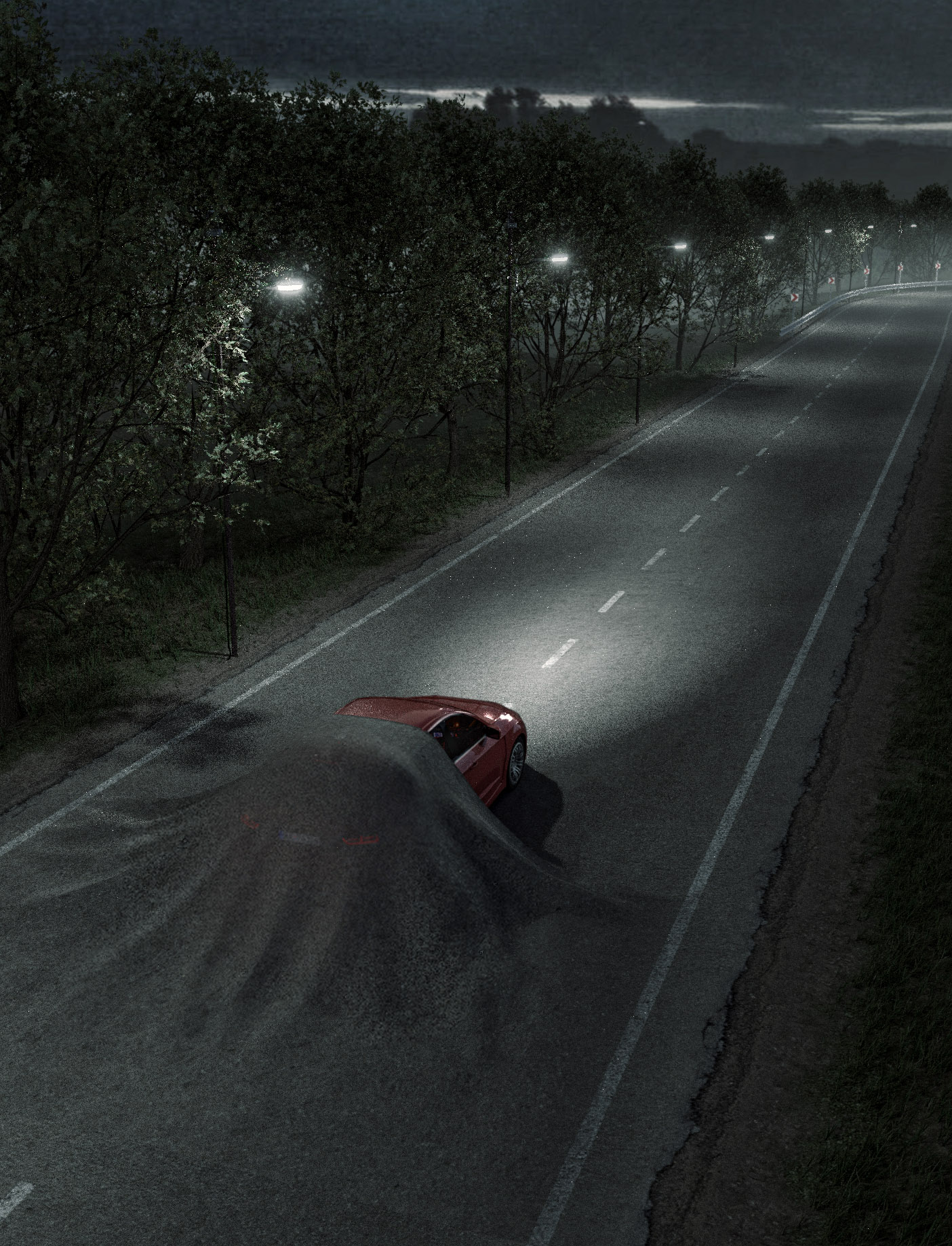
What do you think about this artwork? The idea behind it is the headline - “Some roads can make you feel sleepy”. I know that I have to render it at a better quality, but besides that, what other suggestions do you have?
Also, don’t mind that kind-of-empty space the bottom of the frame. I purposely kept it like that because there will be a few lines of text in that area.
I really like the concept. Nice models, it’s a nice base to work from.
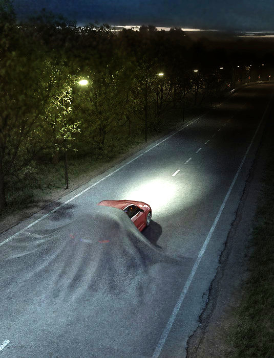
I found the overall contrast a bit lacking, so I tweaked the colors, added some darkness, softened the ‘grit’ etc. I tried to get the picture to tell a story:
We’re moving from awake to sleep: day to night, light to dark, blue to red.
At night, light is harsh - keep sharp edges where it’s lit, blur where darkened.
etc.
The most important thing is the value. Then add some more color variation:
This kind of work is way easier to do in post processing than in the render (in my opinion), so if you’ve only got one frame, just render it at high quality and muck around in gimp/photoshop.
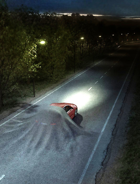
You could actually boost the overall light even more, particularly if you’re going for print. Then you end up with: