I’m working on my first larger animation project and I just finished the newest version of a sculpt of the character I want to animate. The finished result is going to be a short video showing a special movement-cycle of the chinese martial art weng chun kung fu. Since I put a lot of time and energy into this project I thought it would be good to consider your thoughts, ideas and criticism. Also I want to be sure that there’s nothing wierd about the character I am not able to see from my point of view. Any hints how to improve my Model are welcome!
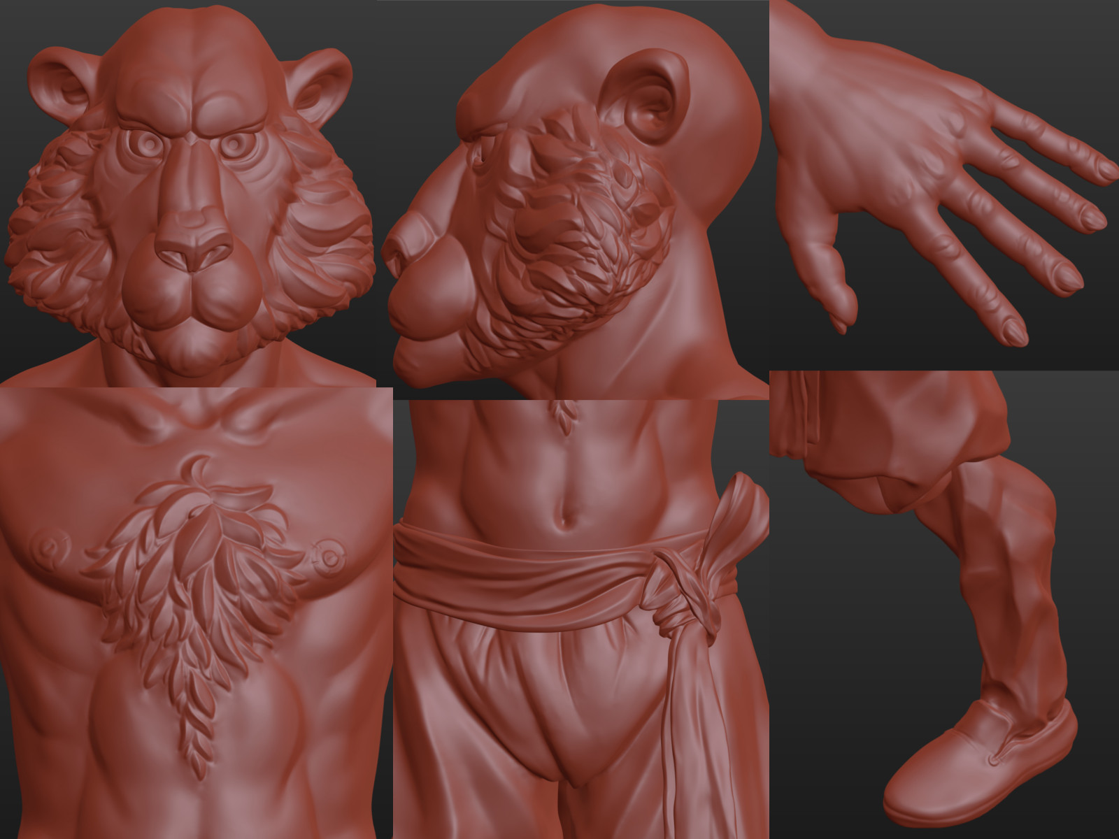
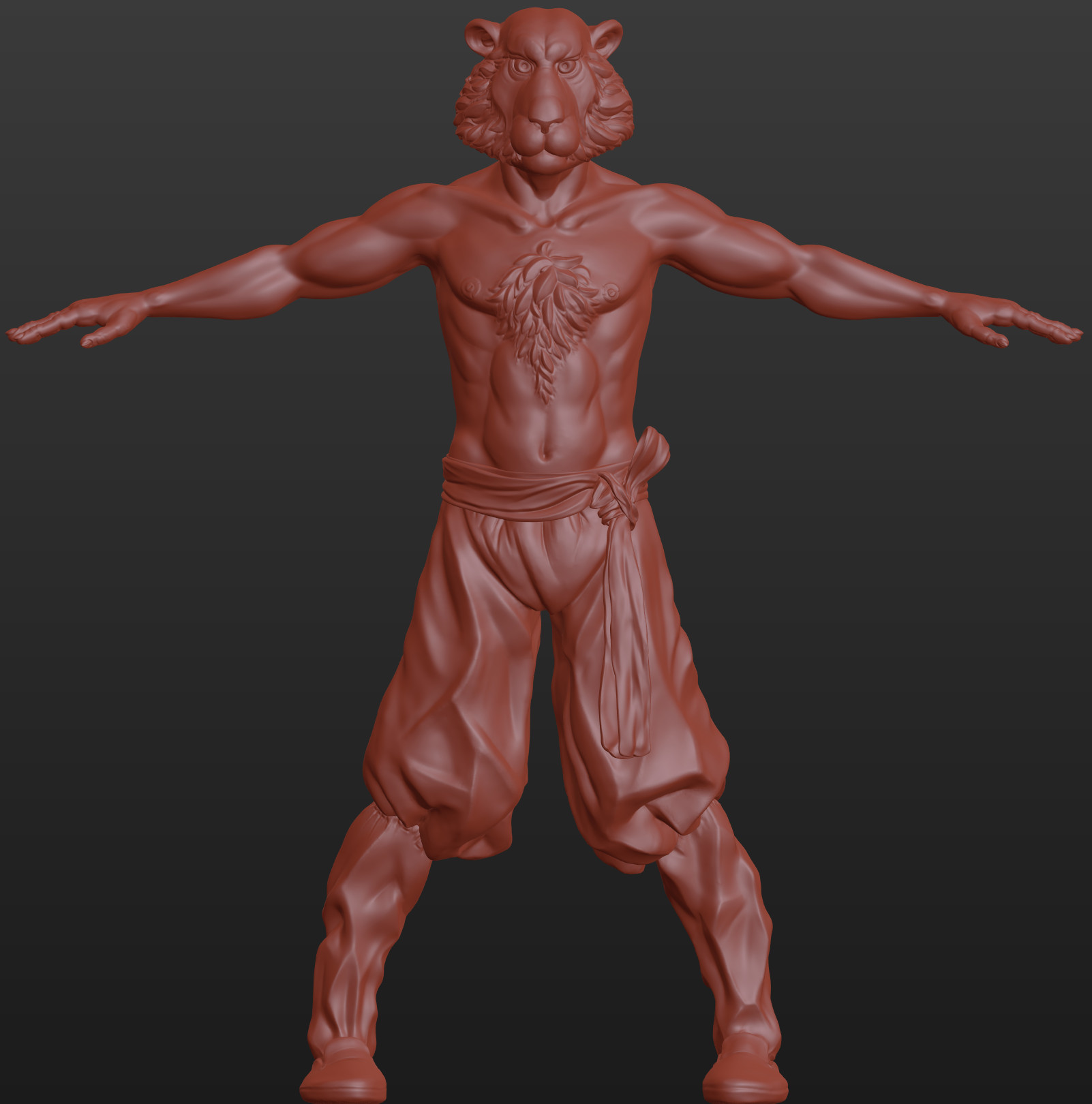
So this is the current state. I wanted to go for a semi-cartoonish look and I do not care too much about realism but it should be believeable. The asymmetry is intended to make the model look more alive. I hope that will not cause trouble in texturing and animation but it will certainly cost more time here and there. I tried to focus on the head and front upper body so thats where most of the detail is. I hope that there’s a good transition between high and low detail throughout the model but please let me know if you notice anything about that. My biggest worry is perhaps the chesthair. I’m not sure if it has to have such sharp edges or if it could be softer. It is hard to anticipate what effect the texturing especially the color will have on this area. But I wanted to check on this whith you guys befor I go further with retopo and texturing. Here are some older versions / previous tries of the model:
I think I have improved a lot in the process but I think i can make bigger steps if I get some advise from the more experienced modellers of this forum. I will update this thread and keep everyone who’s interested up to date with the prograss I make. And I will have more questions along the way of course. This is my first post on this forum and I’ve been a bit careful whith showing my work in the past. So I’m very excited what you think! Thank you very much in advance!
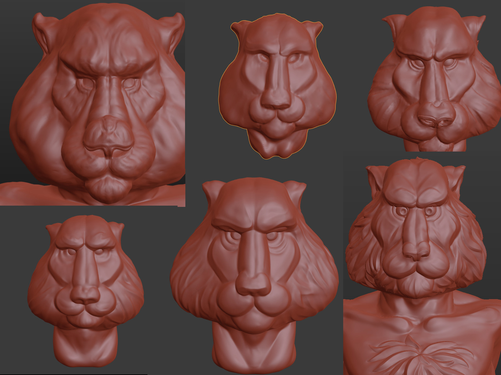
At the moment, your head is quite long and looks more like a mandrill. Tigers have very large jaw muscles, you should definetly take a closer look at big cat anatomy. For example, the nose should be round and not that seperated from the rest of the face
Looks very impressive! I do agree that the head is a bit squished/tapered. This is only subjective view of course as there are so many styles that one could aim for!
I love the work you have done with pants, very realistic folding. I am a bit concerned though that once you rig the legs and make the tiger stand, these pants, being distorted as they are by gravity, will intersect. Might need to give it some thought there.
Chesthair rocks, maybe the outline of chesthair (where it touches skin) can have a better transition (bit blended atm).
Overall very cool project, can’t wait to see him animated.
First of all: Thank you very much for your time and advise!
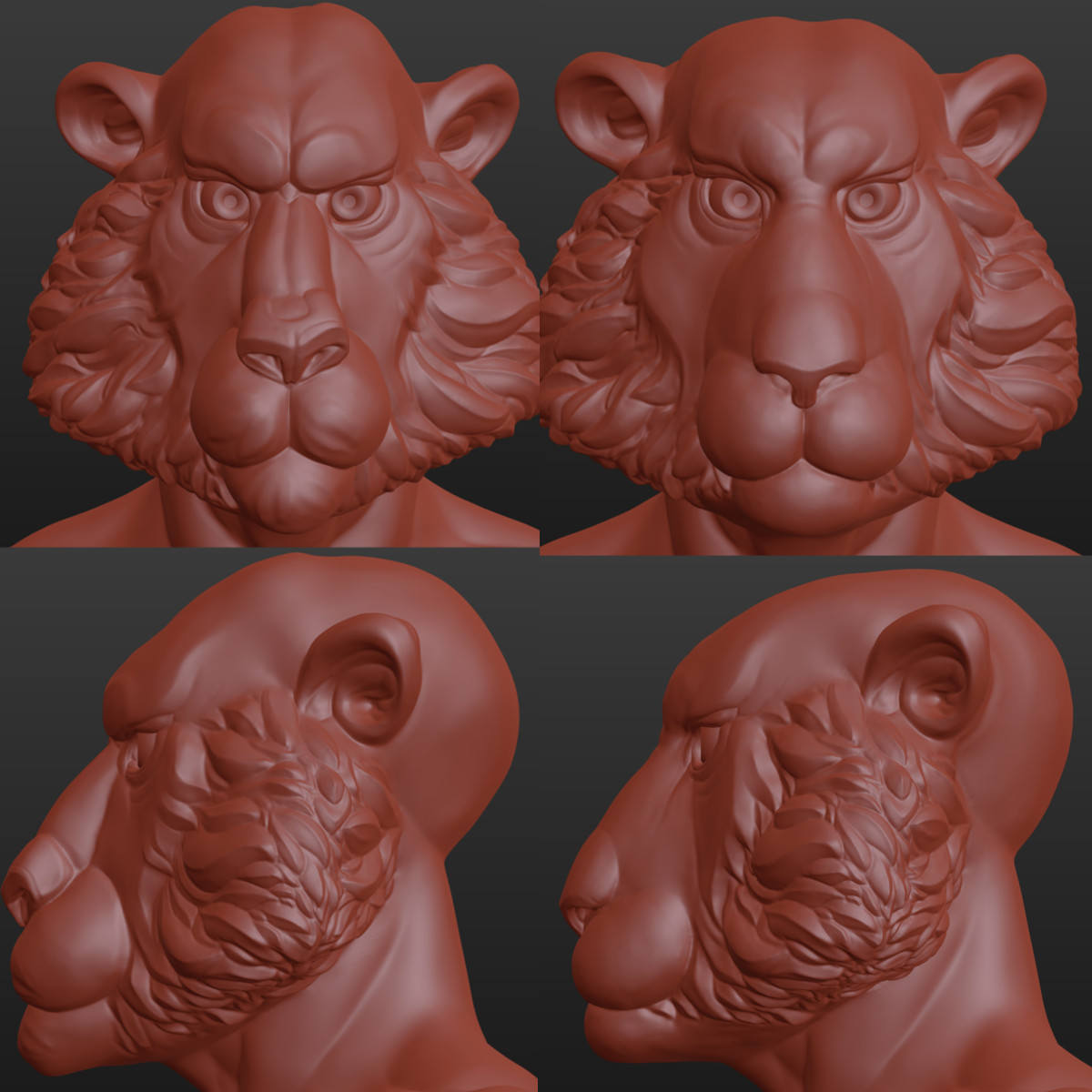
@Yukon: I tried to mix a tiger face with a human face and thats maybe the reason why it made the impression of a mandrill. My idea was that the typical furr-pattern in the color texture would make it easy to identify it as a tiger. But yeah I think you have a point there and its probably better not to rely on the texture alone to deliver this. I checked again with some fotos and schemes of real tigers, tried to make the head less long and reworked the whole nose and mouth. To me it seems that ist has improved the head a great deal. What do you think, have I at least covered some of the issues you mentioned?
@cgstrive: Tanks for the positive Feedback! I think you could be right about the pants, so I made them a less wide to be save from too many intersections. Imagine this to be made out of very thick and stiff cloth, so that its keeping its form during animation and will be influenced very little by gravity. But good hint none the less. I tried to make a better transition for the chesthair but the changes are very subtle by now. I don’t know how i can get better than that.
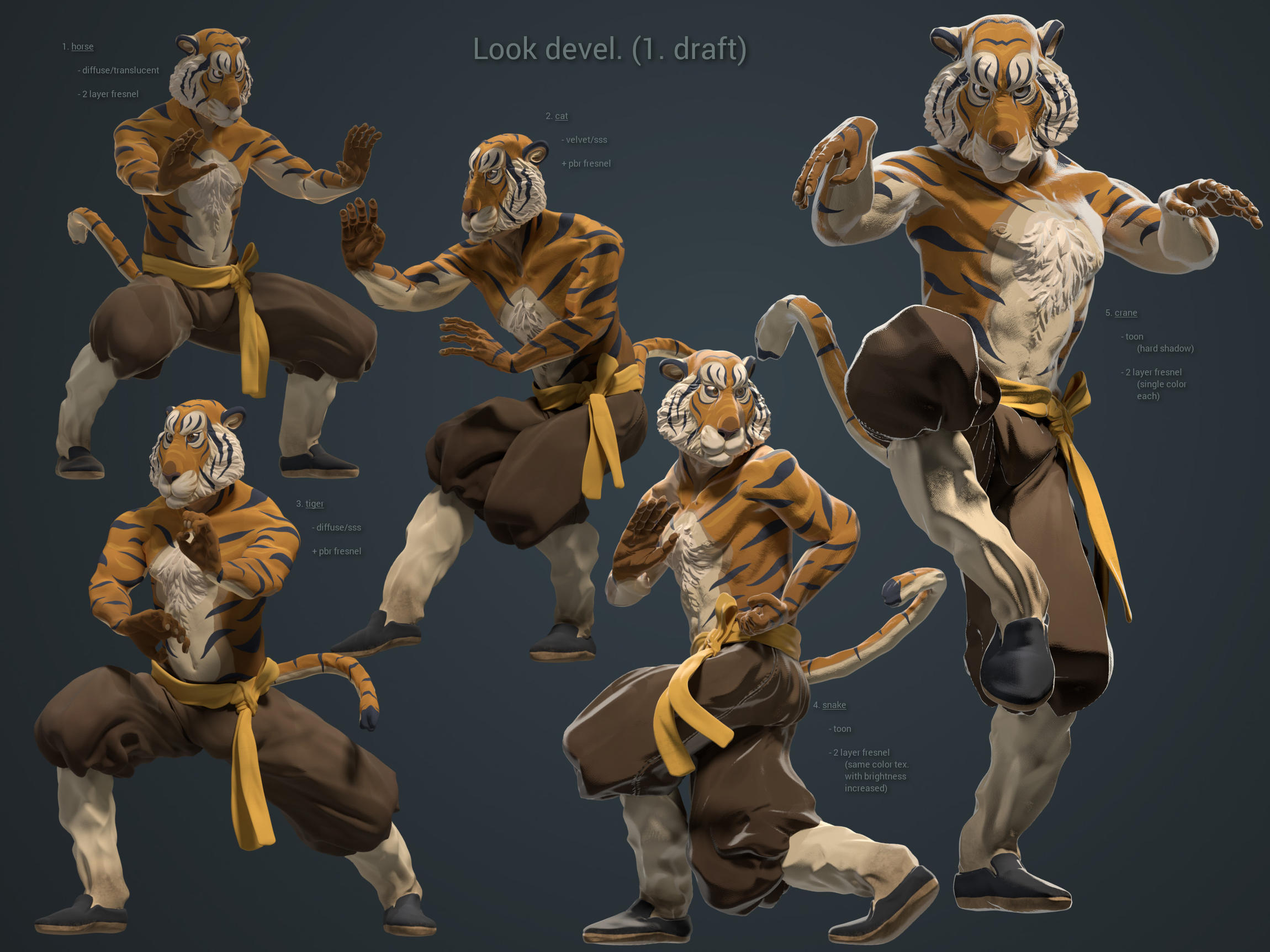
finally it’s time for an update on my animation project. I took my time to make the textures and rig the character to my satisfaction. The last part took forever 'cause I tried mesh deform cages for the first time and didn’t know enough about rigging in the first place so I had to go through a bunch of tutorials and try things. The rig works pretty well now but I need to fix some of the deformations for the animation stage. However I thought it would be a good idea to share some test poses I did to try different shaders. So my main question to you guys is:
What do you think about the overall look of the renders and with wich styler would you rather go?
I kind of like the rightmost comic-stile thing best even though it gives the impression of a pretty unnatural lighting. And also it’s hard do tell how this might look in context (got to try this soon).
If you have any questions or want to have more information or just want to comment other matters thats also appreciated. I’m happy for any thoughts or suggestions that can help me further improve my project! I’m not to keen on revisiting previous phases of the process but I guess if many people think that something sucks really bad I might as well do that.
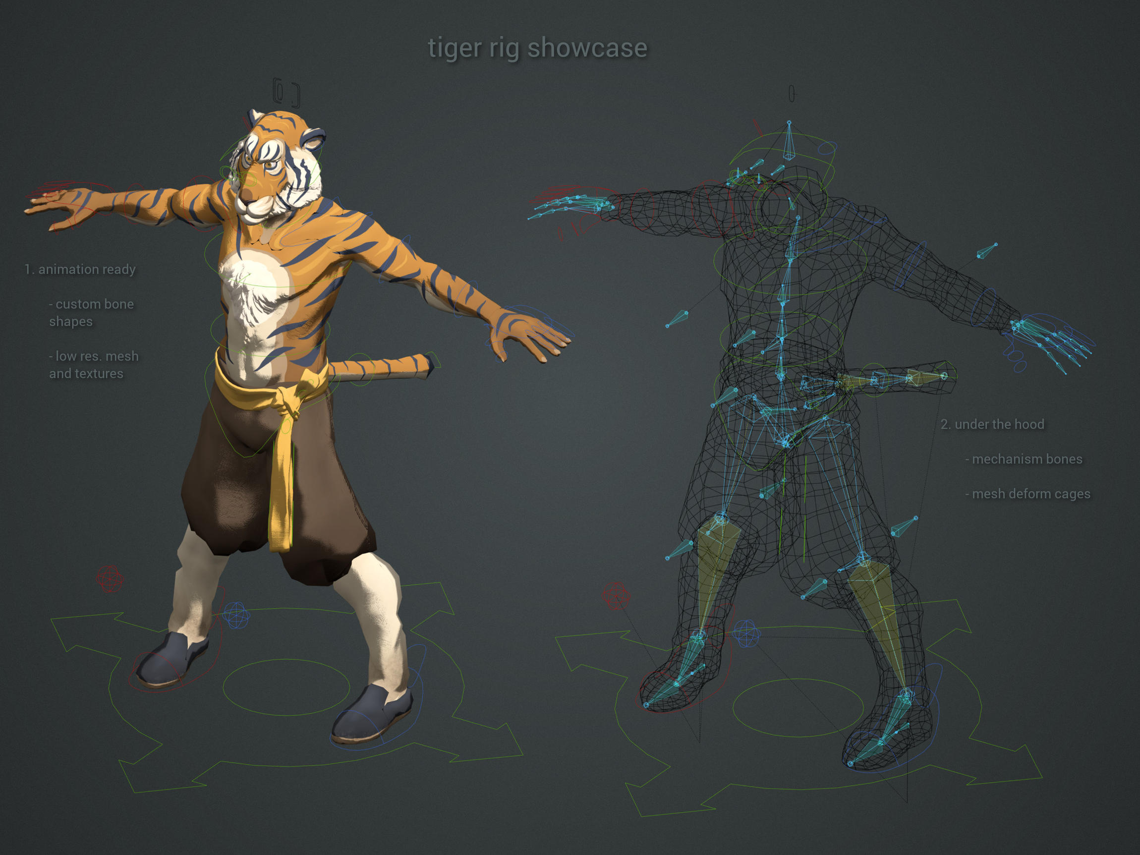
I also made this other picture to show my rig set up.