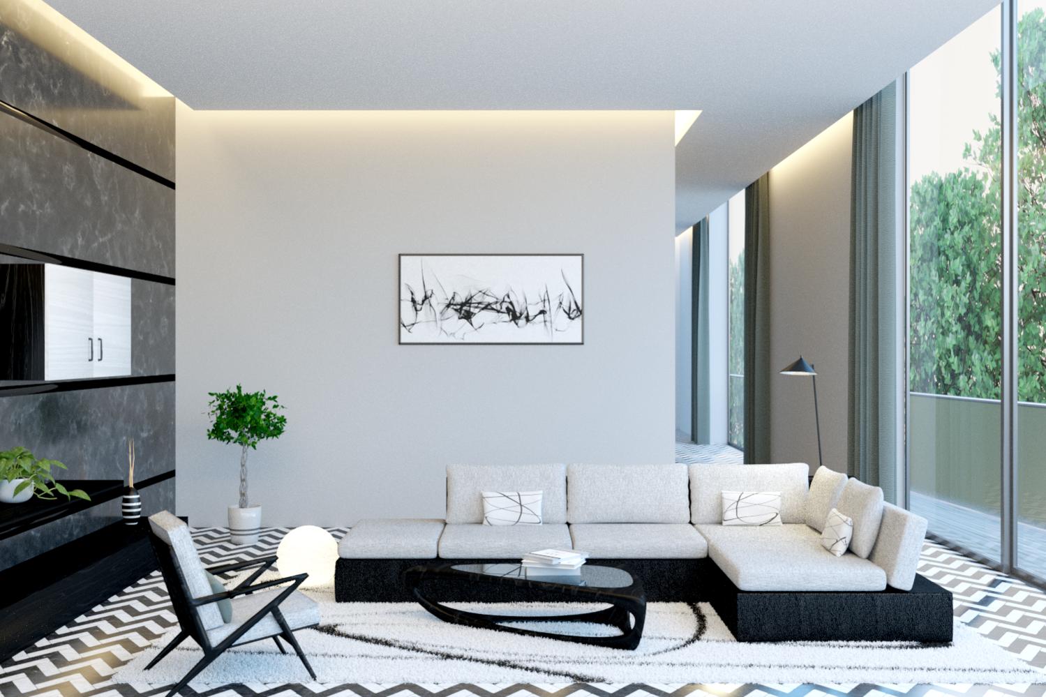
Hoping for critique on composition, color material etz…
THX!
Nice render, but the trees look a little flat / squashed to me. Are the billboards even facing the camera?
Composition wise, it looks pretty good. Maybe a tad bit unbalanced, though.
The right side is very bright, and the left side is dark. When you combine that with the fact that the sofa has its emphasis on the right, my eyes go right out the window. (Wouldn’t you want the sofa towards the window anyways, just so any people who use the room can look out the window?)
The lighting isn’t dynamic enough. It’s really flat because of the window, and it looks like it’s a slightly overcast day because of the even lighting. Try using an HDR, or at least a sky texture and sun lamp (make sure they line up).
Also, try adding some light-based color contrast. The whole room is flooded with cold light. (Maybe you could make that ball brighter and warmer, then make the sky fully overcast) Anyways, whatever it is, make it pop. See gleb alexandrov for some good examples.
As one final nit-picky thing, the room looks… sterile. It looks like one of those sets from an Ikea catalogue. If that’s what you’re going for, great. But I think the room could stand to feel more lived-in. Add a little bit of mess here and there, and add some surface imperfections.
That’s all I can come up with. As you can see, I’m the kind who likes detailed critiques, so I tried to do the same. Hope it helps!
(Seriously, good render, though.)
Nice render but I think lolwel21 has some valid points to consider. I too would like to see it with a strong sun with high contrast. But then I go overboard with contrast. Also couldn’t some small areas of saturated accent color be thrown in. Say the throw pillows on the sofa or the piece on the wall. And, is something not lining up at the top of the left wall. To me it seems like a eye trap right now.
It’s a nice enough render to try say three more versions of. Maybe turning the sofa 90 degrees would give the composition some depth or not. What you have is nice enough where now it’s just fun playing with lighting, color, etc. The pattern on the rug might be a little to busy given the flooring. But, these are small matters and judgment calls. You could very well decide this is what you envisioned. Hell you could probably strip my latest effort down to parade rest. : )
Thanks lolwel21 and theoldghost for your help, i really appreciate it a lot!!
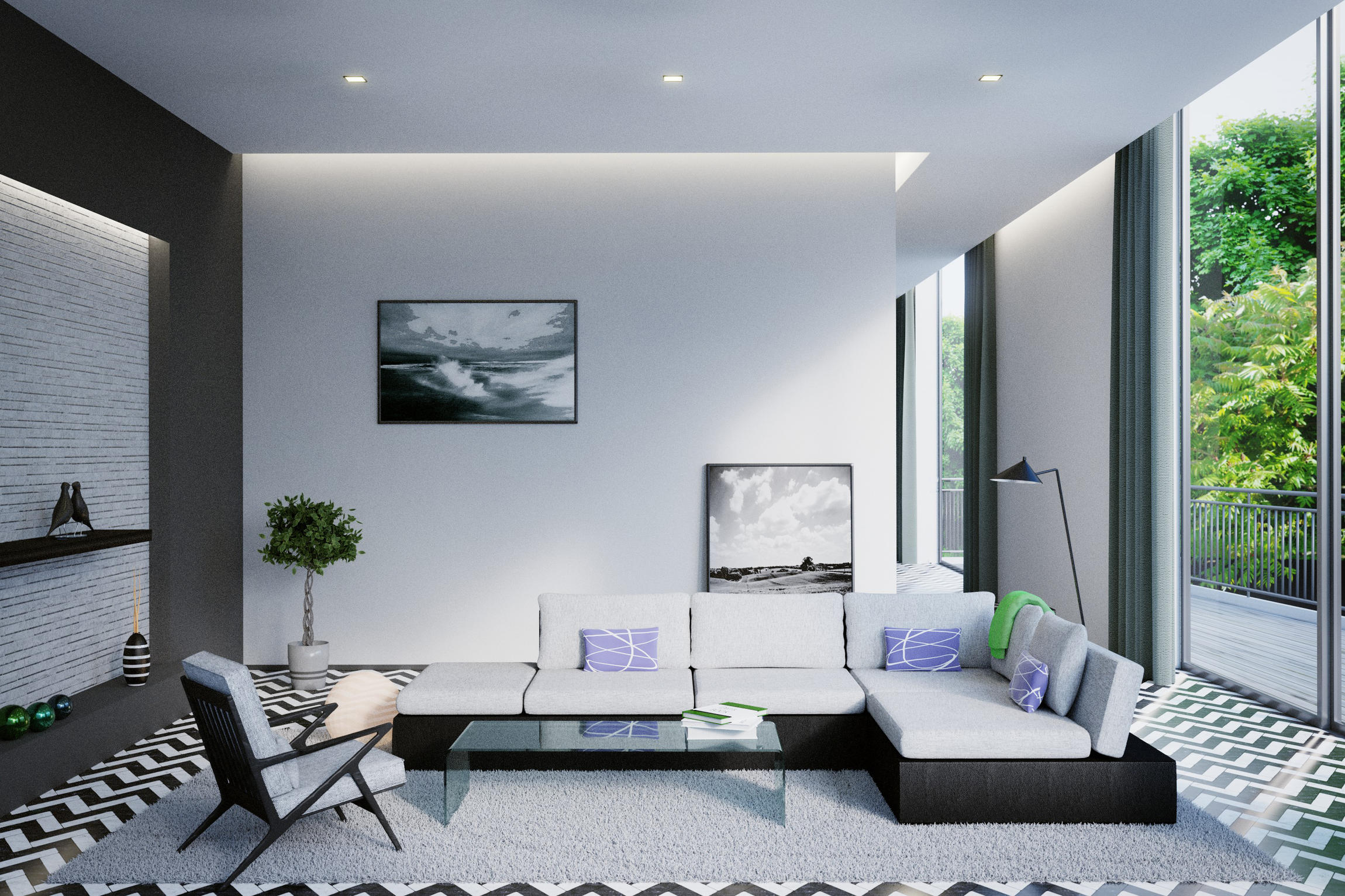
This is a new Version of the room, i changed the lightning as mentioned, made the left side a little lighter, added some saturated details etc…
Good question whether i want it too look like a Ikea setup. I’d like to draw it in a way in which it looks attractive for potential flat buyers. A “neutral character” with a good income is living there.
Has anyone got some tips about this Topic?
I’d like to add a neutral object beneath the left picture to the wall in my scene. Maybe a sideboard with a record player on top?
I´m looking forward to getting a move on with this project.
…one more thing: noticed that the reflection of the window frame on the right side floor should be vertically too, but why isn’t it??
Seems like a refractive index on a flat reflection… ??
nice render and good composition.
excellent work.
OK to my eye that does look nicer. We seemed to have picked up a couple of tangents through. Damn it’s been so long but I believe tangent is the word. # 1 - where the left of the sofa lines right up with the baseboard. Separate or obviously overlap if I remember correctly. # 2 - bottom painting and top of sofa ditto.
Why not Google ‘arranging pictures’ since they’re some simple rules for hanging pictures, arrangements, etc. Rules that someone setting up a room like this would be aware of. Just a thought. Once again looking very nice and what a individual like that would be interested in I GUESS. : )