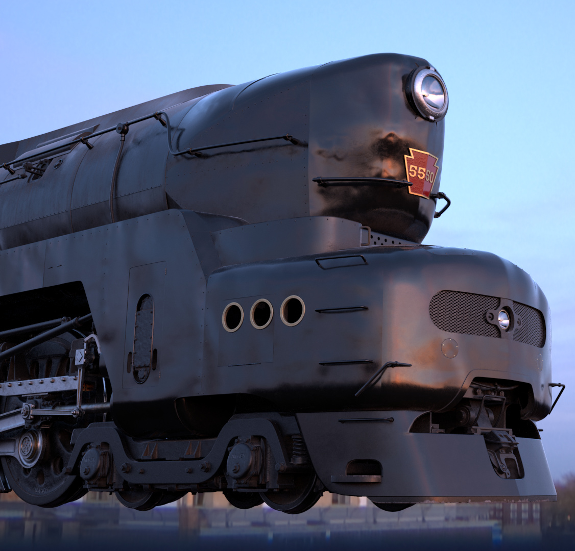
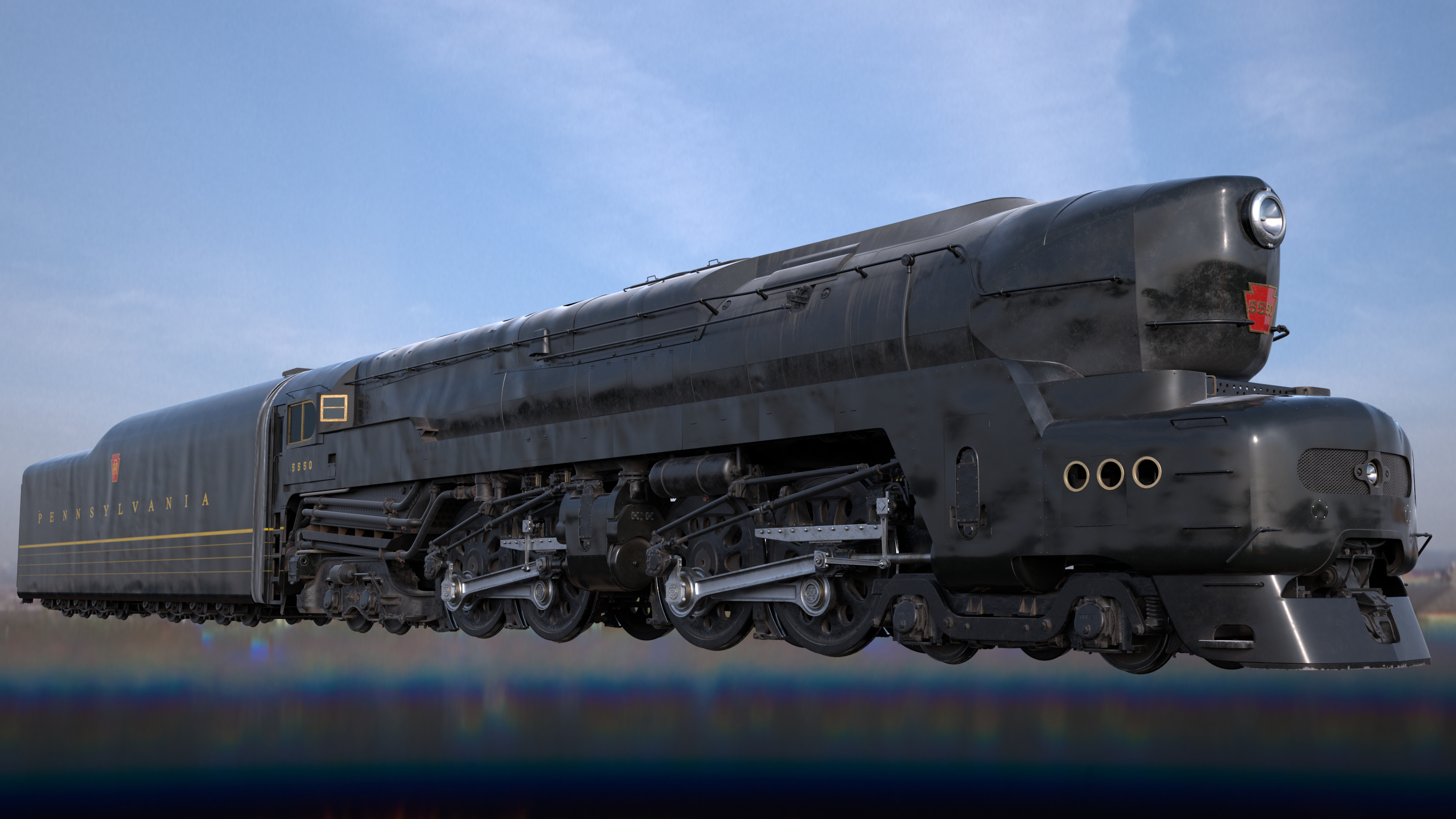
Howdy, i’d like some feedback on my texturing of my T1 model. You can read the WIP Thread here, but i figure i’d move on to here for some proper feedback before i start doing the final rendering.
Hit view image for the full render, the website isn’t too happy about such a big image so i couldn’t thumb it.
Here’s the list of stuff i know is bad and intend to fix:
Dirt on the sheet metal is overbearing, inconsistant and unnatural
Something horrible happened to the rubber cab seal, needs fixing
Roughness on the clean pipe material is too high, seems like rough primer and not glossy paint
dirt on the clean parts of the frame is too low
Too much dirt on the trailing truck
Too little dirt on the pilot truck
Paint on the axle ends doesn’t match the wheels
Paint on the railings, pilot, headlight casing etc doesn’t match streamlining paint
Running board/pilot streamlining has normals which make the thing look cloudy and awful. Also the giant seam on the pilot. Both need a new sculpt to fix
But other than that, I’m hoping folks would have some thoughts. Anything that doesn’t feel natural, anything i can do to improve any part of it, or suggestions on how best to fix the list of stuff i know is bad would be great.
I’m not very good at texturing myself, but I hope my comments may help. Forgive me if they repeat what you already mentioned.
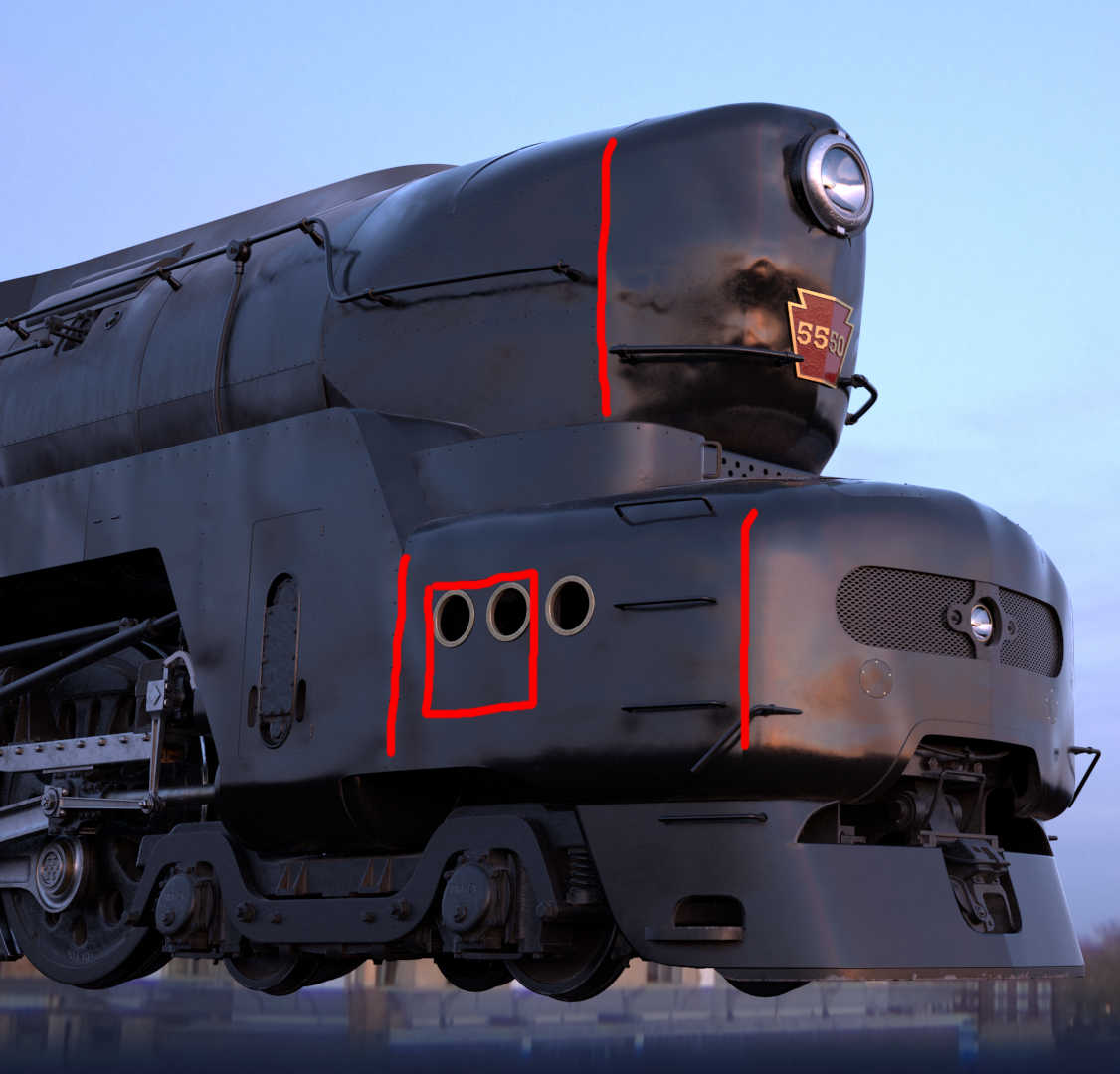
Materials are too similar. Other than small bits of chrome, gold port holes and the red number plate, the image seems to be molded out of one material and color. It needs a larger material to break up the form.
After you are happy with the materials, work on textures to give it wear and tear. You mention above you need work on the dirt, but I can barely see the dirt work you’ve done. Maybe you have overall dirt, but it needs specific dirt and wear; e.g., muck and scratches coming up from the wheels. Rust, water spots and grime in the seams along with leaking grease. Some of this dirt forms while the train is sitting still so it falls downward and some will stream backward from forming while in motion.
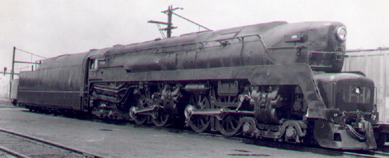
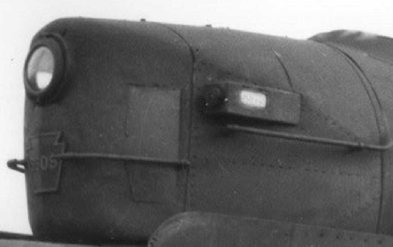
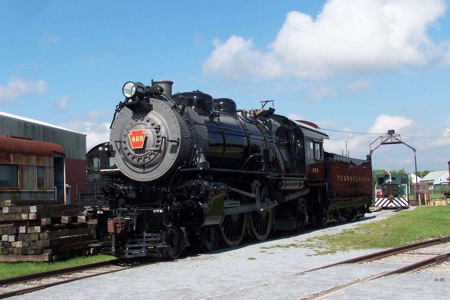
The locomotive in the above ref image, looks a lot like your end result. But, even so, the elements are better separated in the real one. Work on obtaining separation and realism (more diversity in textures and colors, since the 3D model is outstanding, ready for sale:yes:)
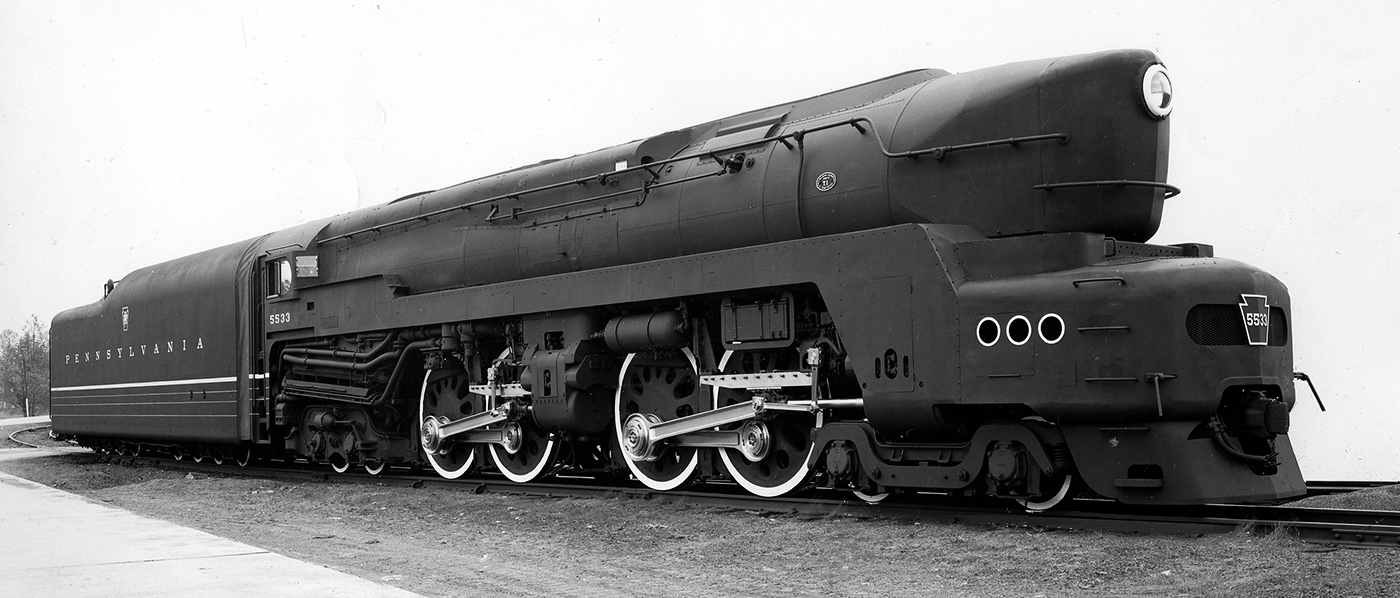
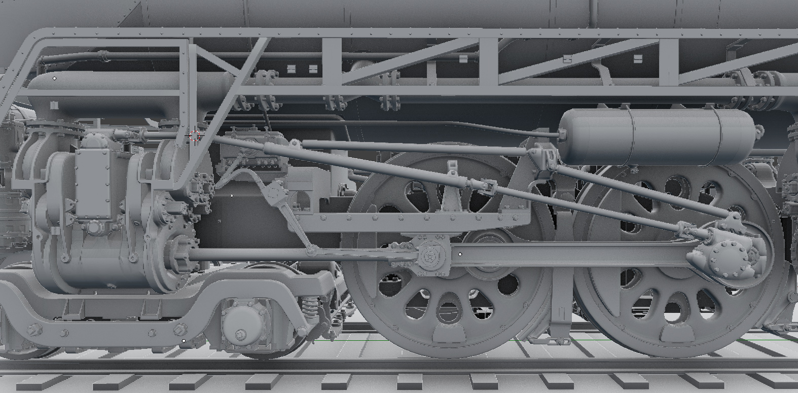
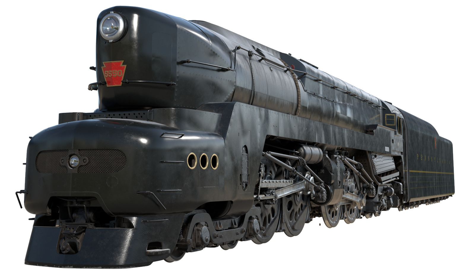
The above second image, is a clean stage, and I would do it to like this, and from this stage, go on with adding dirt, rust, oil etc. in strategic places.
Side and very personal note: As I-am writing this reply, the images that I see in my post are very small. The second reference image is better looking than the first reference. Depending on what you want as a result, is great to have a thumbnail that catches the eye. So while working in details, step back, look after 2-3 days of the result, as a much smaller image. And if it gets your eye then you are on the right track. If not, you either have to much or to less.
Well i’m aiming for as perfect of a realistic representation as i can muster, and i’m trying to avoid your typical CG method of just stuffing contrast and noise into it until it looks good.
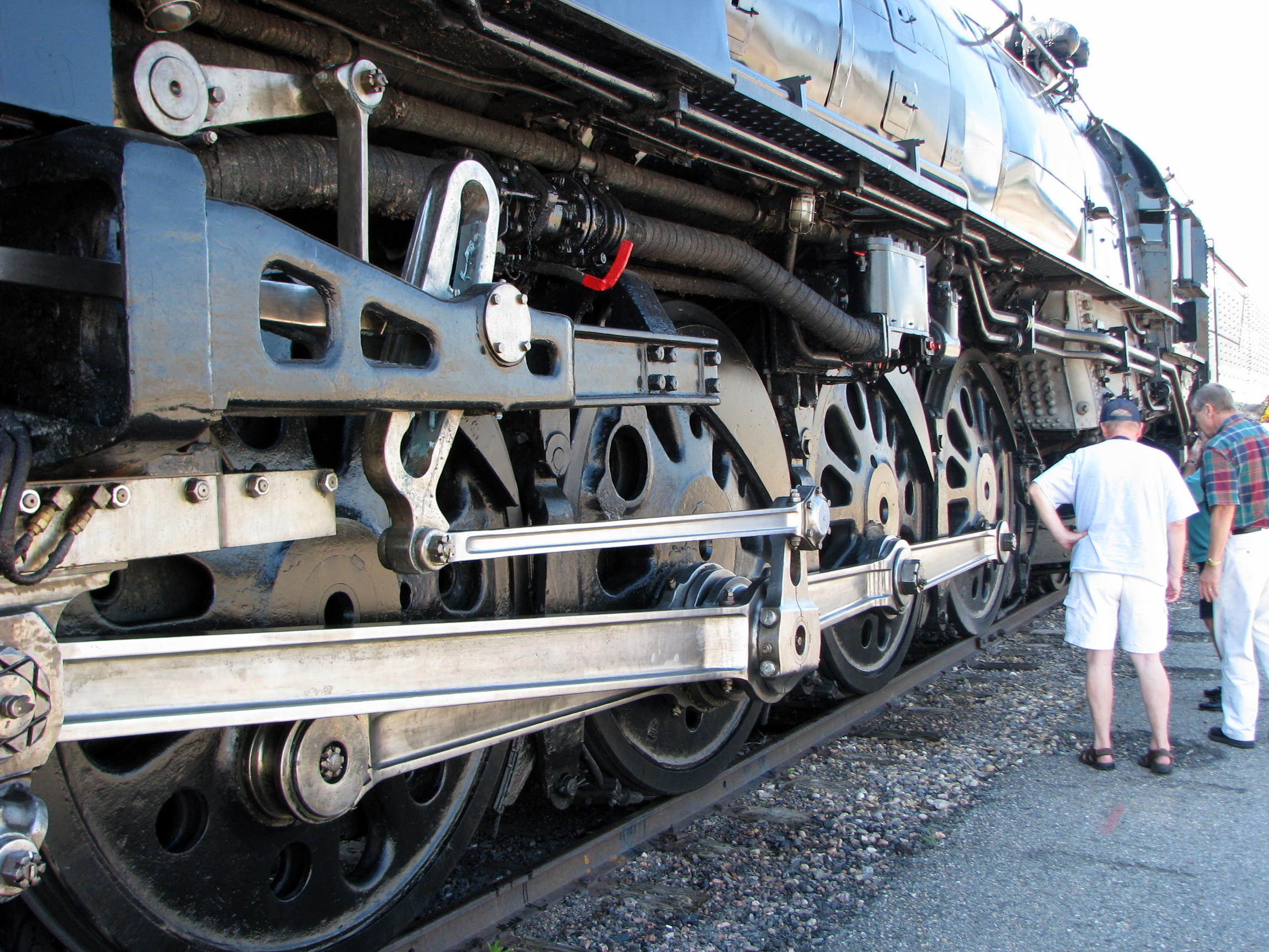
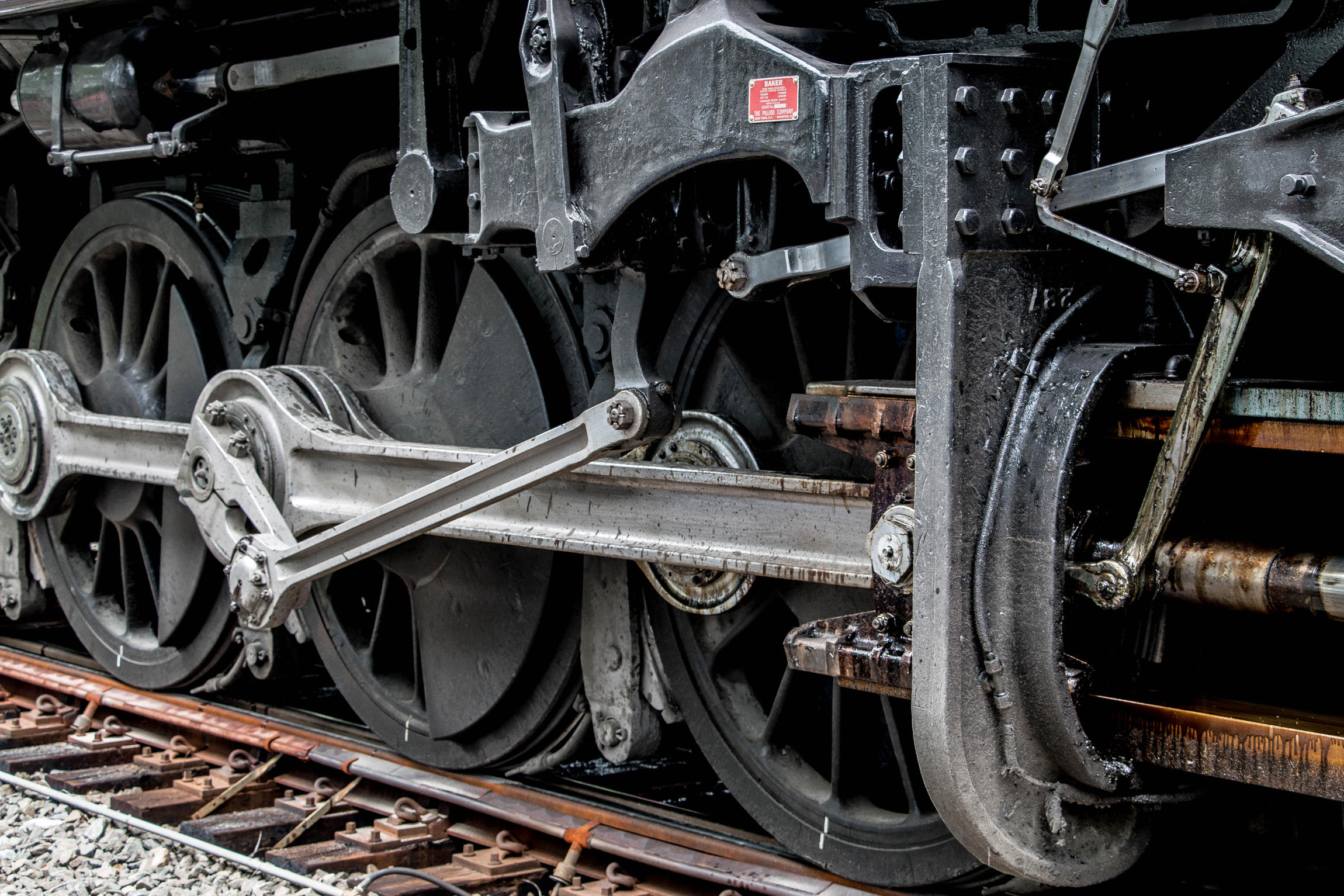
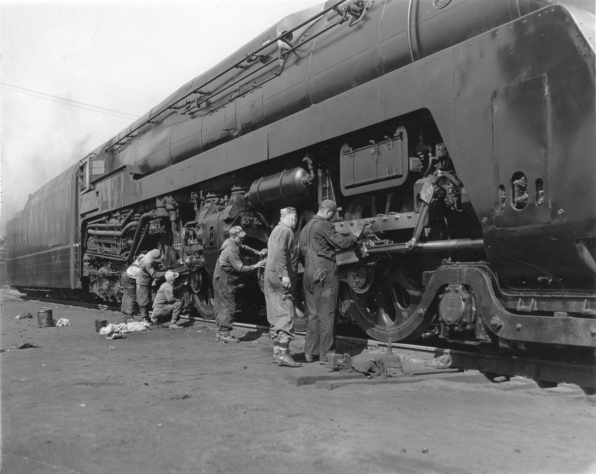
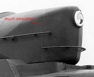
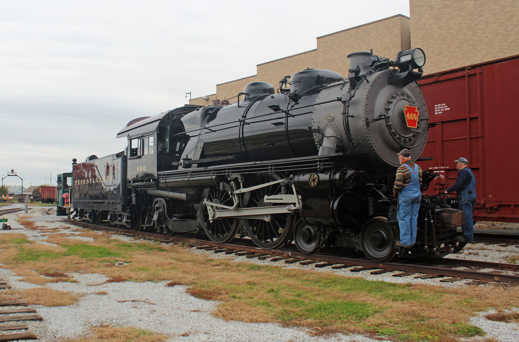
This is my reference for the level of grime and dirt for both the sheet metal and mechanics. I feel if you look at it at full resolution, you’ll see it’s not as clean as 844, but not as dirty as 611 gets.
I suppose the optimal place to aim for is to make sure it reads at that level from a distance
Yeah, that’s what i mean. Getting a realistic result that looks natural, while also broadcasting the form of all the parts from a moderate distance is really hard, and what i was aiming to do.
It’s really looking great already. Comparing your render to the photos, it seems as if you could turn up the bevel on the fairing’s edges a bit. The seams seem a bit too sharp, still. Also, the size of the larger wrinkles in the normal maps may be a bit too large, and they still don’t interact enough with the structure. See for example the tank: On the original, the wrinkles stop somewhere at half the full height, where the plate probably connects to a stiffener. And the wrinkles should also stop (or at least soften) at the borders of the plates in most cases.
I guess a better interaction between the wrinkles and the shape of the machine would make it much more realistic.
Compared to the real photos, these seem too sharp. It may not (exclusively) be a bevel what is needed but a subtile curvature towards the edges of the individual plates.
There is work to be done if you want to transform the „already extraordinary 3D representation” in „a truly masterpiece with hard work into it”. Render times will be off the charts thou. How many objects do you have? (obj and/or faces/tris)
Judging from your commentary you aim for the full masterpiece and I admire you even more :yes:
In my opinion most of the details will be gone while the animation is played. By adding smoke/steam or atmospherics, and other elements such as blur, many unrealistic details will go unseen, „yet a very close to reality end product, you will have” as Master Yoda would say.
From what I know in gaming, hi-res models loose detail due to animation effects, namely blur so a low-res (not so low thou) is just fine.
Polar Express has some crazy shots, that made my Christmas for several years. Perhaps that is why I never tried to compete on making and awesome steam locomotive. And the texturing there is the sweet spot. But I respect more what you are doing.
Yeah that’s just panel gap. The metal has no flanges to it, it’s supposed to be seamless as possible. The very visible gap is a combination of very long exposures and imperfections in fabrication or fitting of panels
You can see the smokebox sheet metal is real loose here.
I mean i could peel some panels back to get that imperfect look but only a few panels are double sided and enabling double sided rendering on all that sheet metal is gonna creep up those render times.
I’ll see what i can do though
Yeah the polar express model was pretty good. IK chain on the union link/baker arm was broke as hell but other than that it’s pretty grand. The low res texture on the tender is pretty visible sometimes though. That and a BR prairie tank i saw on polycount are my targets to kick the shit out of
This model is exceptional! Keep experimenting with the main train shader, I’m seeing more fresnal reflection in the references. Also I’d recommend adding a ground plane, and two simple low poly rails so the bottom will get better ground reflections. You spent so much time creating a beauftiful model, don’t short yourself on lighting and material. Try out some different hdris, some with a sun lamp too, some with some extra mesh emission for softer sky scattering.
Just my two cents since I’m a beginner and complete garbage at texturing. But there aren’t any visible paint defects in the original image. No scratches, or chips on the hard edges, or wear through/polishing on the hand rails. Also it seems just a smidge too glossy. Judging by the first image you posted in post #5 perhaps the reflective properties of the real paint are more anisotropic in effect?
The real 5550 will use the exact same paint that Strasburg Museum used on the E6 restoration, so that’s how it should look. Although there’s no better photos of it since they finished the thing a month ago and it’s not been outdoors since.
There is a rough noise i left in the running boards and tender though, the boiler casing doesn’t have that, so that’s representative of how it actually sits now.