Hi all,
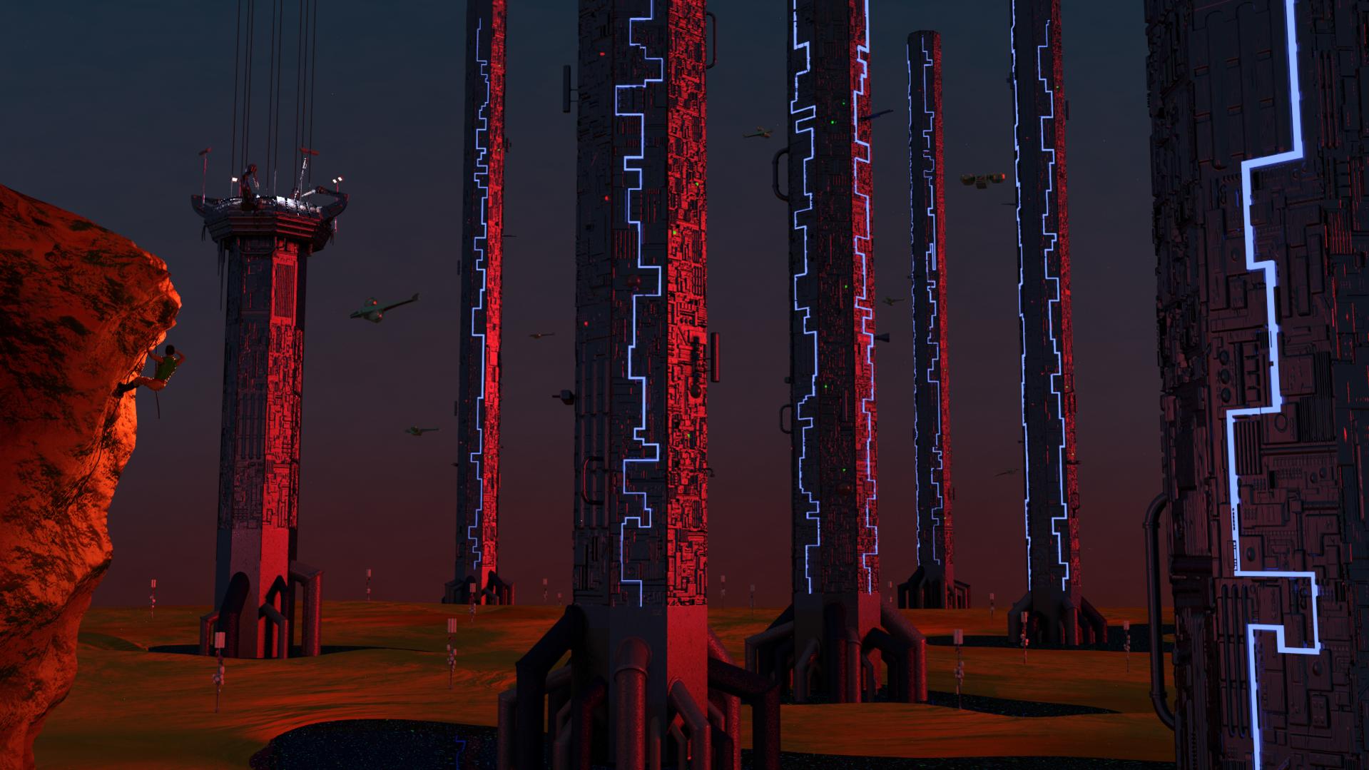
My latest work…I’m mostly looking for advice/criticism on the compostion (but any notes are welcome).
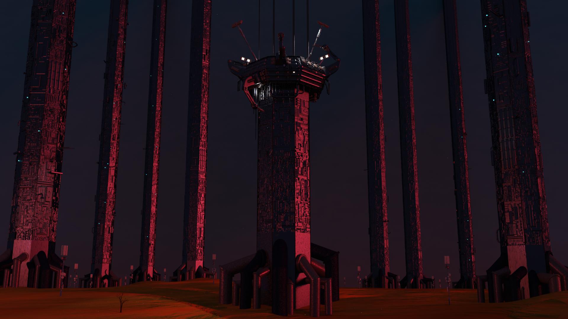
The tower on the far right - I’ve added and removed it multiple times not sure if it overbalances the the image or not.
And the man climbing the rock …not sure if I need more detail or not - he is so small that I’m not sure how to go about that. Also the colouring of his outfit - does his clothes blend into the ground too much? should I go with complimentary colours?
Thanks in advance ![]()
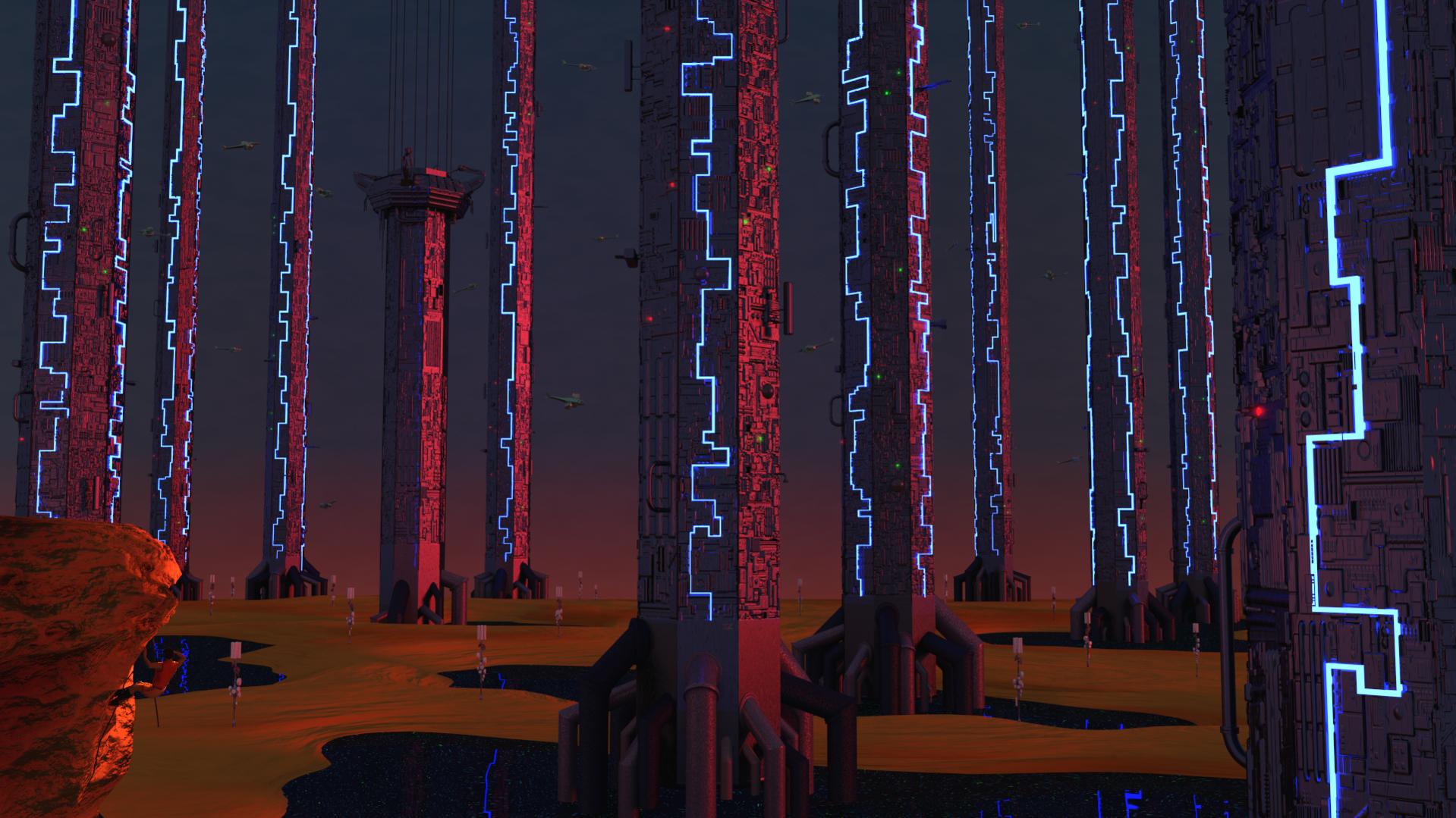
There’s no clear focus point, and the scale is lost because of camera position, and the climber is not enough to give sense of scale. He’s completely lost in the scene, didn’t even know there was a guy in there until reading the post and looking for it, and he’s not positioned so that it could help with the scale. The columns also cast shadows on themselves but none on the ground.
The whole scene is covered with everything so the focus is not clear and nothing leads the eye to anything more important than others.
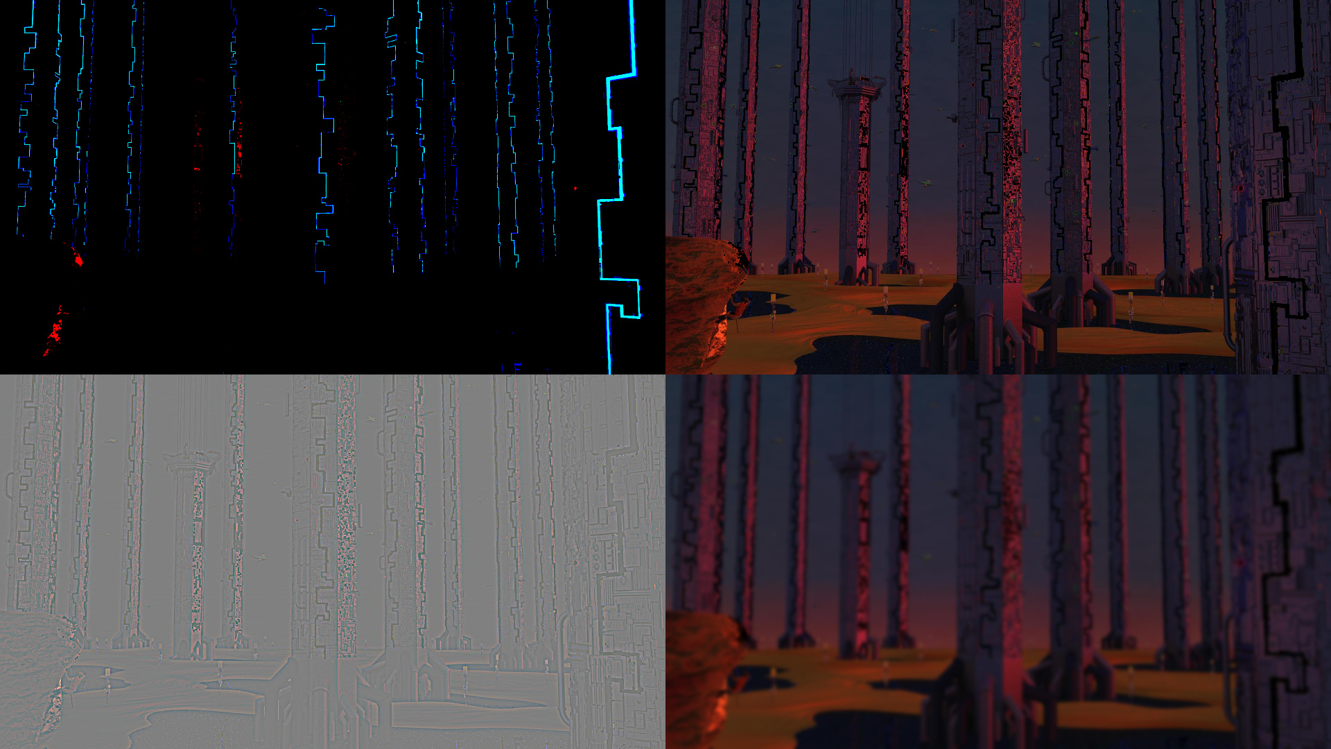
From top left to right:
- The lights are high contrast points and those are spread across
- Could shut those off and then figure out where to look, still nothing
- Could separate the high frequency detail, again all over the place
- and left with low frequency detail, the colors, same all over the image
After looking at it a while one notices there’s one column without lights and then the question is why is that significant. If that is where the viewer should look, would suggest enhancing that. Didn’t manage to do a good edit quickly but hopefully it’s enough to illustrate a point:
Could for example lower the camera angle to make the scale more apparent, organize the columns so they don’t fill the whole image but leave some clear negative space. Those and other elements could also form lines/directions to where the focus should be.
It’s more clear that the column without lights is different from others, and could put some lights and silhouettes around it to make it appear there’s some crew exploring/investigating/repairing the thing, and you have a story.
Obviously don’t have to tell that kind of story but helping the viewer with clear first focus and having some negative space for the eyes to rest should help any image.
Thank you for the fantastic feedback 
Everything you say makes sense, and I realize that in trying to make the image cool, I lost sight of the “story”.
Originally I had the scout on top of the rock, but I thought it would be cooler if he was climbing up.
I know what you mean about the camera angle, but the very sloped towers looked odd when I started. I will revisit that angle.
Thanks again for all the hard work, and great examples. I will work on the pic some more this week and repost.
The pic has some real work left, but I want to post what I have done so far.
I’ve made some modifications based on your feedback. The focal point should be the climber, so I moved him to the middle third and repositioned the “birds” to all point at him. I also moved some of the tower external parts to line up with the climber. I liked the spots lights so I co-oped that idea and used them at the top of the construction 
I modified the camera to point up a little higher (I have some towers to extend), but didn’t go to the extend you showed.
Finally, the comment about the shadows had me puzzled because the system was definitely configured to have them be cast, but they were hard to see. I realized that the issue was that the world light was bluish and the red main light combined to make the shadows green and washed them out on the terrain. I was playing with the lights and this happened - I really like it the colours, but it needs some more work.
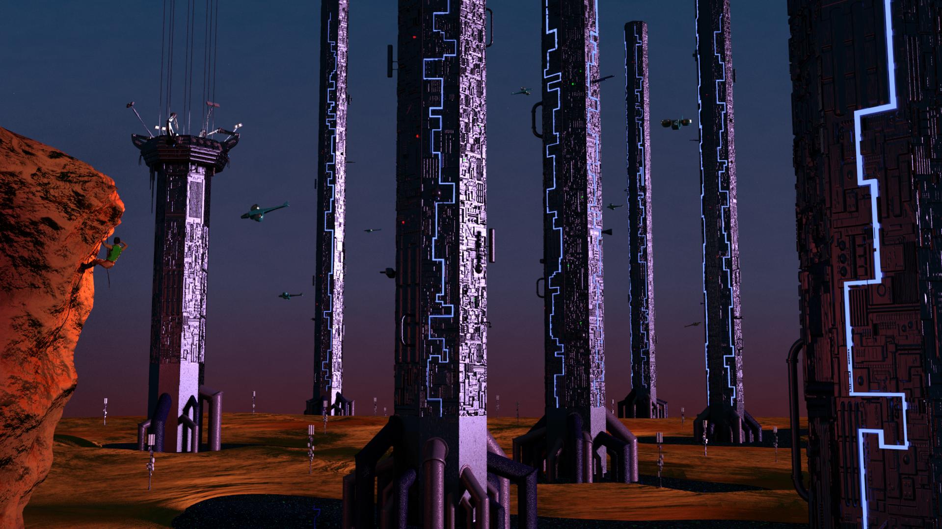
I don’t think it’s working. The image is still about the pillars which are pretty, but you’ve chosen it to be about the climber so the placement of elements in the frame should help him be the first focus.
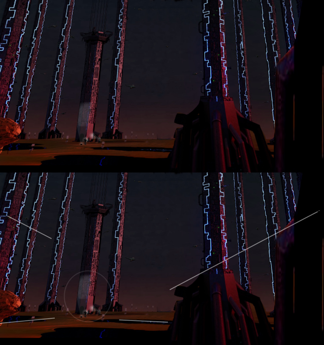
There are a lot of contrast points on the right side of the image, they’re big and are accompanied with complex detail, so my eye gets first drawn to there (1). Far sides on the right and left have elements that frame the image, so I look in the middle (largest element) and to the right.
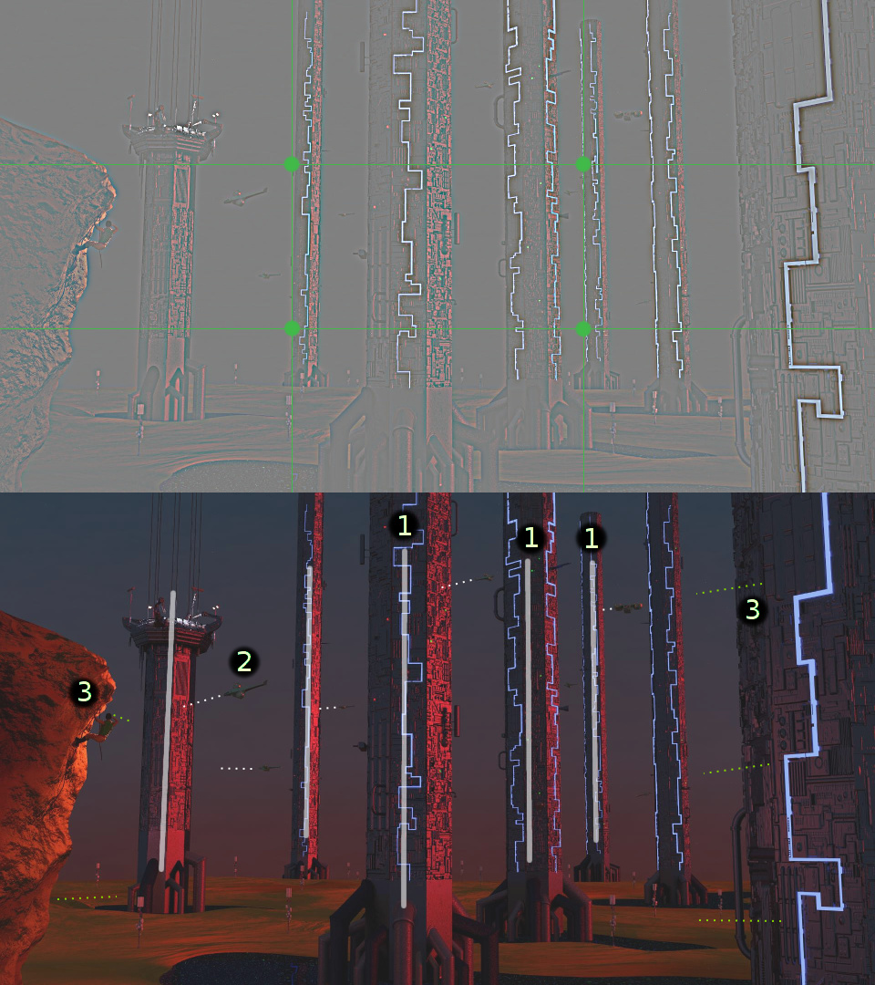
Those are also on the rule of thirds. Eventually the eyes go from the right to left and see the lone pillar. The pillars still dominate the whole image. They also make a huge cut (1) on any guiding lines like with the flying things (2) you try to put there.
The climber is very insignificant part there. If anything, he’s part of the far side elements so when the eyes eventually get to him, he’s looking at one of the pillars so that guides eyes back to one of the pillars instead of off the image (3).
I did a google image search for “climber” for a reference. Most of the images were suitable but I picked some
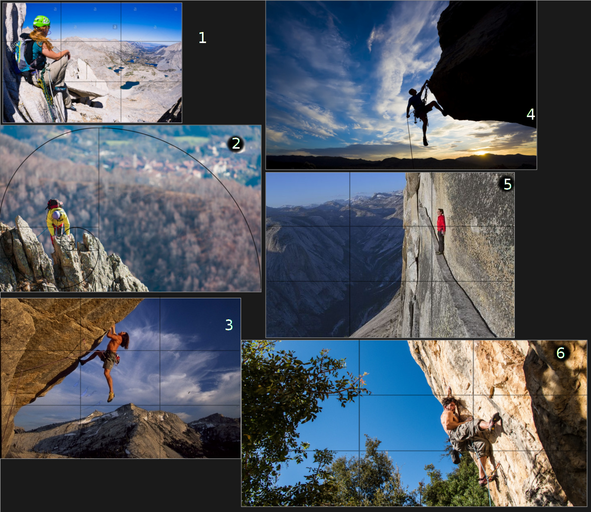
What is common to all of these images is that no matter how spectacular the view, how complex the surrounding elements, the image is mainly about the climber. The first focus is on the climber and then you look at the rest of it.
- The person is the largest single element in the image, he/she is next to and on thirds, we also tend to try finding the eyes when we recognize a person (to communicate) and in this case those are looking at the view so we look there. The lines in the “view” are pointing back to the person
- The ledge frames the climber and the lines on it point at him. He’s a big element in the image, having high contrast against a big negative space. The mountain underneath guide back to him
- similar to 3. but the climber creates most contrast against the lit rock face. Trees on the left side guide to him, so does the edge of the rock, both far left and right sides are framed with big darker elements
Ya, you are right. I need to rethink the picture. The original idea has morphed quite a bit. The original concept was a “forest” of pillars in a desert with solar panels, wind turbines, cel towers and the like substituting for grass, flowers, weeds etc. Basically a tech forest. I used forest pictures as the model, something like this:
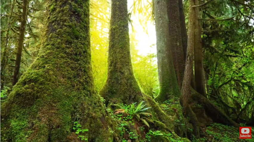
But as I built it, it seemed cluttered (too much on the ground) and a bit boring. And I needed something to show the scale, so I introduced the climber and the “under construction” tower. I am also enamored with the middle tower bisecting the picture (not sure why).
I need to rethink what I’m trying to do.
Thanks again for all work you did and this great feedback, much appreciated 
Attachments
If you like the concept of the tower in construction why not put your climber on that tower as a construction worker doing dangerous work as the focus of the image , it gives him personality and a stronger meaning to the image. Also , sometimes the lack of other things around gives the sense of vastness I think your trying to capture , don’t get me wrong I’ve seen a lot of sci-fi scenes that are cluttered and amazing but I think an alien planet that is that populated with stuff and vehicles would have a lot more infrastructure connecting parts together that just isn’t modelled in your scene. Never be scared to move the camera around the scene as well , ‘N’ in the 3d view pulls up the properties menu , under ‘view’ you can ‘lock camera to view’ and then navigate the scene to find your shot whilst moving the camera.
Thanks for the feedback dean. I’ve been messing with the overall concept, and I plan to focus on the devastation caused by the towers. I have started to put “real” trees on the ground and reduce the number of towers to 3 or 4 to enhance their impact.
I’m likely going to remove the climber (save him for a different picture)
I will definitely post the results here - the critiques are very helpful - just need to find the time to render