Hi guys, how long 
This was made for a friend.
I want to do it right, so… Where can I improve it?
I would tone down the background, it’s distracting. Maybe use a greyish background, and colourful clothes instead?
Also the bench has almost the same colour as the skin.
Thanks for the suggestions @ania :),
I changed the colors a bit, what do you think?
I still have not changed the clothes, because it was a friend’s suggestion (he chose the clothes). I’ll ask him for other options.
In typical photography you really want the subject to be roughly the brightest object in the frame. Intensity of light helps to direct focus. Try giving the background some saturation, but keep it darker than the foreground (you might even want to open up the iris a little). Kind of like the first one up there but darker and without the fog stuff. That will do a lot to balance it. Also, keep the 2/3’s rule in mind as you frame it.
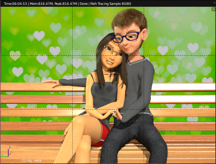
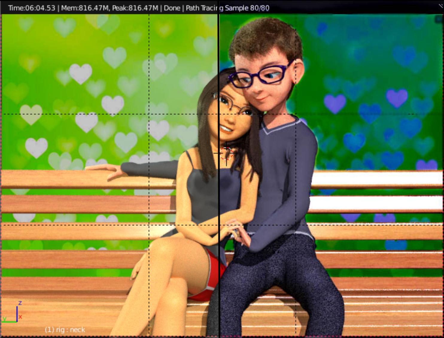
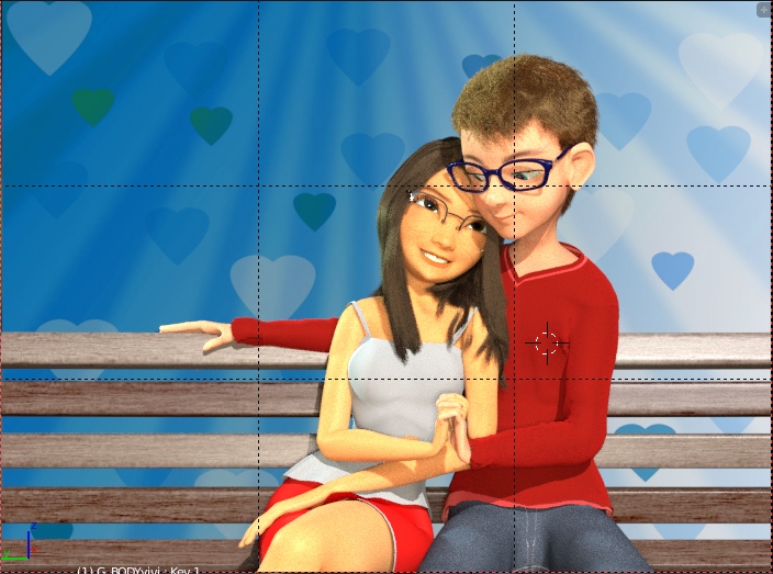
@amprod2, I increased the lighting on the characters and darkened and blurred the background items a bit.
Is it good?
Really nice image! I have some comments regarding the expressions of the couple. She looks to be in love, perfect eyes and face, but her smile maybe feels a little fake, kind of like she’s biting together too hard.
Also it looks like the guy is looking at an insect walking on the bench near the edge of the image. Unless that’s the idea of it, you might be able to change where he looks a little.
Looking forward to see a final render of this 
I appreciate your efforts, and the characters are well designed. Some of suggestions already offered were helpful. I would desaturate and ‘dull’ the finish on the bench, as it is competing with you figures. While the pose is pleasant, the ‘awkward’ nature of the engaged hands are distracting. I can’t tell how they are interacting, and the overly long sweater sleeve, further obscures the wrist transition. Perhaps move it up the arm, and rotate the two hands towards the viewer so that the position can be more easily understood. The focus should be the faces, and not ‘what are those hands doing?’ A little more ‘air’ above his head would help, so drop them a bit in the frame, change the hand position. Her proportions are excellent for this type of character, but his ‘perceived’ crotch to waist dimension is overly long, making him look to have very small chest, which makes his head look too big. Consider scaling up his upper torso, and drop the pull in at the waist. Have someone you can pose, sit in this position and take a reference shot. Character artist’s do it all the time. Proportions and compositional emphasis, elements addressed in life drawing classes. My teacher would say, “I realize that those hands are correct as you have drawn them, from this point of viewing the model, but they don’t work in your composition, so drop them down, or turn them, so that they read more correctly in the composition.” Carry on with your fine efforts.
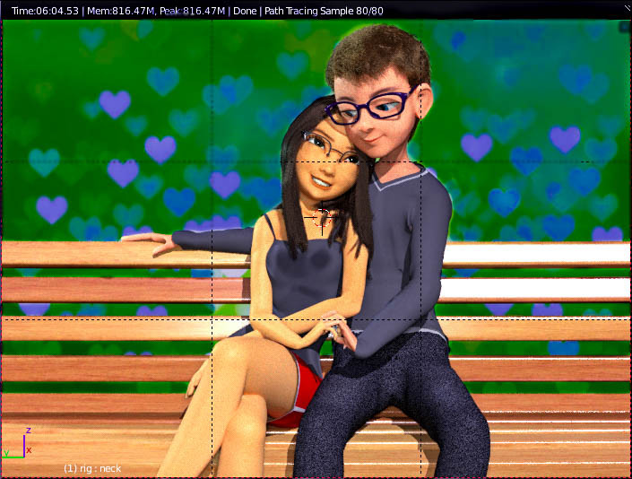
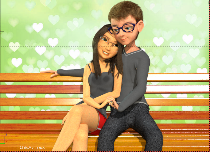
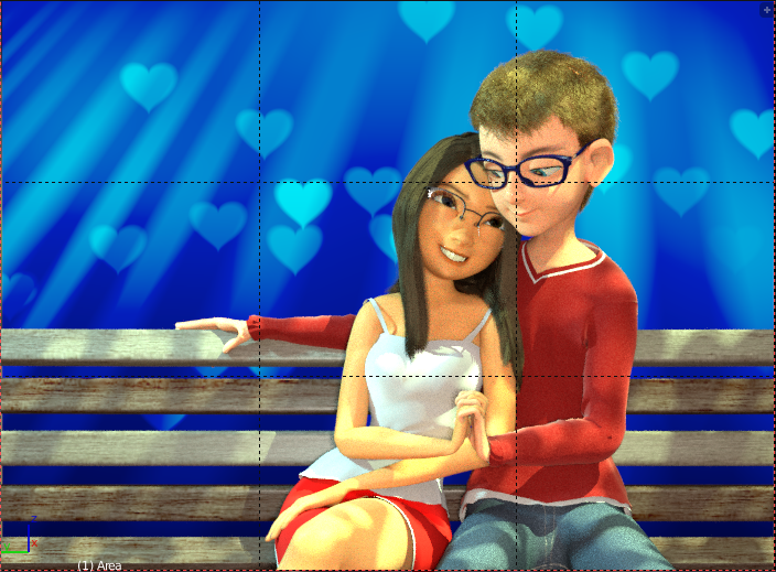
Following the suggestions of @nicmarxp:
- I changed her smile;
- I changed the direction of his gaze;
By the suggestions of @paulhart2, I…:
- desaturate the bank;
- changed the position of the hands (in fact I was postponing this, since I have already changed several times);
- widened his shoulders (only now I saw that it was to be the chest);
I also changed the background. I chose a darker one (as recommended by @amprod2, but I think I need to darken it even more)
In addition to other small changes…
And now, how it is?
Congratulations on the changes, it is working better, IMHO ;->)
I would rotate the hands down into a more relaxed position, since they are mostly focused on their heads and gaze, and the hands up look awkward, tho they do read better than before. Check a reference, have someone pose and photo. The shirt still would not wrap around the wrist, if anything the bent position would tend to pull it back. While the shoulder/waist appears less of a problem (good), his crotch area doesn’t work as it is now, looks weird (sorry), and it contributes to the long torso as I had noted. The buttocks would not show typically but most importantly its position should be several inches back on the bench, putting his pelvis back on the bench more parallel with hers. These elements tend to be distracting from the true focus of the heads area. I like the slightly lower position of the figures, it works better with more ‘air’ above his head. The odd blotchy patterns on her chest seems arbitrary, like grease spots?? Green is a curious choice for background, not usually the best choice for portrait work, doesn’t work well with skin tones, and is a little bit off putting. Usually a blue related tone will be more complementary, as it is a typical background in portrait studios, sky, cloudy, etc. The bench is much better de-saturated, but it is still very newly varnished and unnatural, rougher, with less reflection will help. I appreciate your efforts, the figures are charming and engaging and your efforts to adjust in response to feedback is an excellent way to grow and learn. Keep up ;->)
Looks like movie greenscreen now. Make it darker as amprod2 suggested, and desaturate. Blue would also work fine.
Currently, the view goes first to the background, then to her red butt, and third reaches the faces.
Also the grey cloth colors look sad, but I said that already.
I made an overpaint, if you don’t mind.
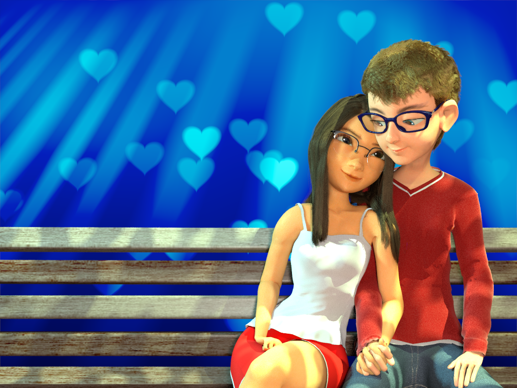
First I moved the couple to the right, to follow rule of thirds (composition). Unless you’re conciously going for a symmetrical composition, you should really avoid placing the main objects in the middle of the frame.
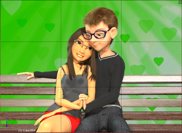
Changed the background colour to blue and the bench to a dark blueish grey. Changed cloth colours, to draw more attention to the figures instead of the background. I made his shirt the colour of her trousers (bit darker), which further connects the figures. I stayed with three colours (blue, red, yellow), kind of triadic colour harmony - read more here http://www.blenderguru.com/tutorials/understanding-colors/
As further suggestion, you should try another light. More from the side. Now it’s frontal from the camera, which is ok but a bit boring and flat. Also by shadowing parts of the image, you could draw more attention to their faces (for example, shadow from some invisible tree falling on their knees and lower parts).
Thank you very much for the suggestions. I followed most of them as you can see
I will do other testes with lighting and follow Andrew Price’s tips (Put the shadow of a tree or something).
I liked the new position of camera (gives a space to write something on the side)
Maybe a should try others backgrounds, but I like the color blue.
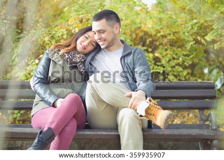
The position of the characters came through some suggestions from my friend, as a reference I used this image:
stock-photo-happy-young-couple-in-love-sitting-on-a-park-bench
I’ll continue here
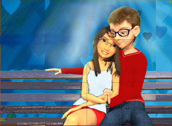
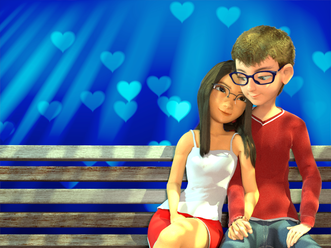
New lighting, new background and a simplified color system.
I am satisfied with the result 
Thank you guys
(There are some things I still want to do with GIMP … later you will see)
Looks heaps better! At least he’s not floating above the bench anymore with this composition Colors of the wood look great too! How would she look with a simple closed-lips smile? Blue might still be a bit too saturated, but the warm foreground vs the cold background is definitely a good choice (maybe add a little blue to the wood in post?) I only have some tiny remarks like; maybe comb the guys hair a bit? The bends in the hand and elbow look slightly little strange, the girl’s hair should be subtly more wavy and have more loose strands since they’re sitting outside in the wind.
Keep up the great work.
Well done, fine improvements. I am sure that you learned a lot along the way, and you are to be complimented for persisting and using feedback to help your growth. Much better hand positions overall. Her right hand gets confused with the leg shading, as the tone on the top part of her hand flows into the same tone on the top of her leg. His left arm could ‘relax’ a bit, which would rotate the hand forward and bring the elbow in, closer to his body. It creates a ‘strong’ negative shape (look this up in drawing references) made all the stronger by the strong contrasted bands of dark/light. “Watch” your eyes and notice how often they move to that area with the elbow ‘pointing’ out of frame. This is nitpicking around the ‘edges’ of an otherwise fine image. Congratulations!! Keep going onward!
Thanks for the suggestions guys (^^)
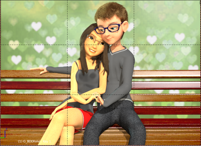
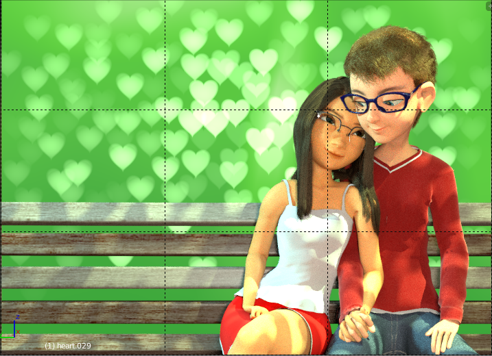
@paulhart2: Here is the result with the changes you suggested:
I like to spend time improving (or just modifying) the Blender models
I prefer your edits in post #5. There the heart look much more realistic like real bokeh effect. The green bg works much better to me, more realistic. Perhaps you should use red? color of love… But i liked the soft green as well, as long as you use the blur 9bokeh effect) you did in post #5.
Yeah, that blue really just doesn’t work for me. Check out this interesting video on color scheme. A red background would be even worse because it would compete far too much with the foreground, and it is a very bold, aggresive color. But the soft, dark green worked very well.