
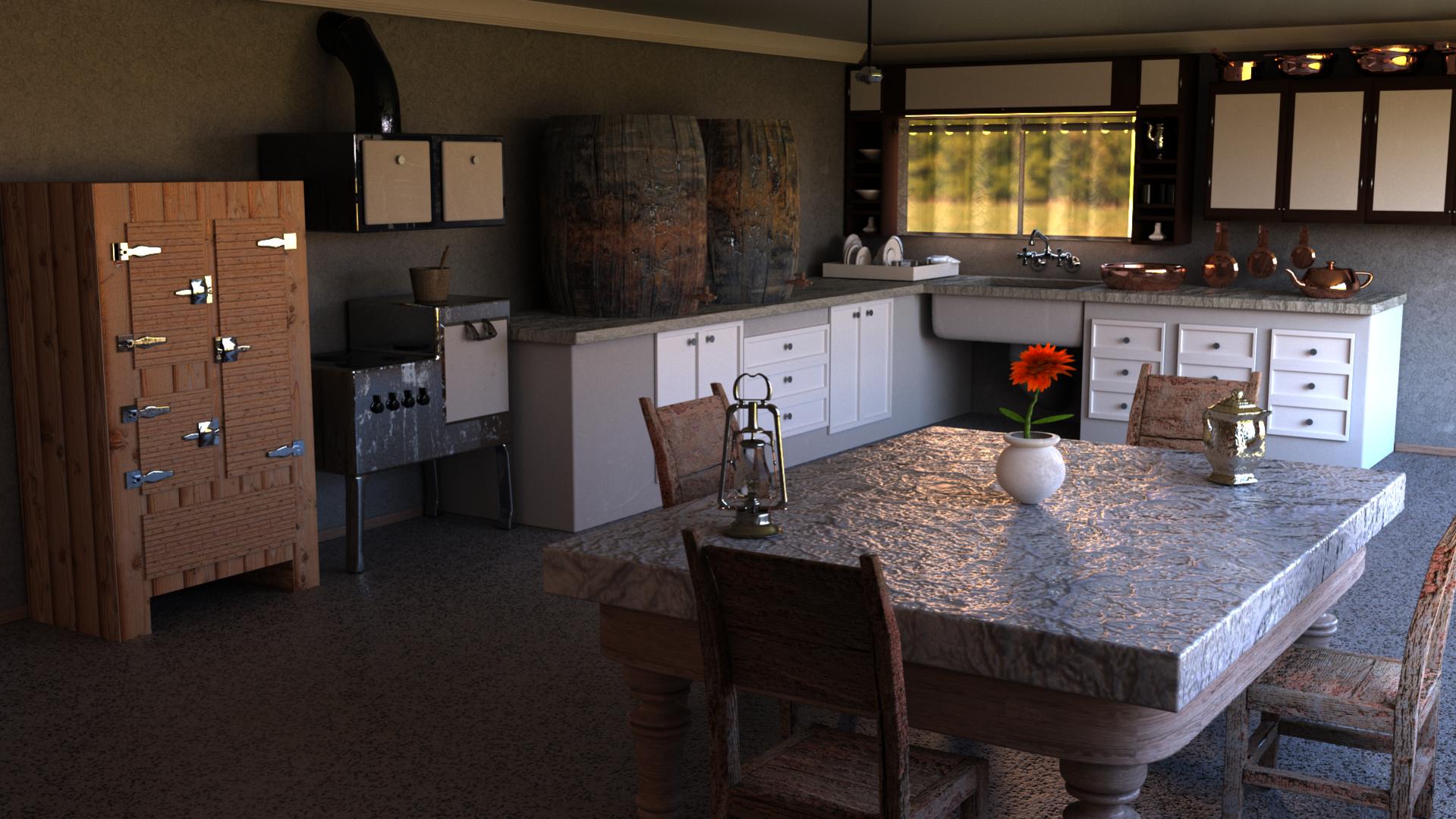
Hello guys. I need some help on light path, used transparensy max. 5 - min. 0, bounces at 5-0 also, diff- gloss- trans at 5 and vol at 1. Filter glossy is at 0.50 and 2000 samples. I used only enviroment light(hdri) from 1 big and 1 small window, 1 portal also near the big window. I tried to use a sun lamp but it was too much noisy. Any help+criticism is welcome to become better!
P.S. Is 4k samples good for last render?
I’m new to CG in general but I think the colors here are a bit too cold.
Looks grainy for 2000 samples. Go to world multiple importance settings make sure the map size is 2048 which can smooth out noise that comes with hdri lighting.
Maybe you’re hdri doesn’t have a lot of dynamic range which is why your textures look so flat, but there are a lot of reasons you might be losing contrast.
Thank’s guys for your help. Tried some things and the result is this. Can i use this image as the first one in my portfolio or is it too bad, and needs more work?I tried to make the composed image look dusted


looks nice but i have some tips:
- take another texture for the floor. make a new grey looking floor but put a good old surface imperfection on it. now the floor has one color and turn in one surface with the table.
- take a focus point on the table. the flowerpot is good in 1/3 composition. just put a old texture or dead flowers in it. it will break the 1 collered image.
- make the joint less glossy. they look like new.
- like Lee said. it still looks grainy.
1 last possibility but it needs some trail and error.
old and poor themed images and dramatised by shadwons falling under a very low degree. this conclude long shadows and displays all the surface imperfections and dust. the focus point (flowerpot) will be the border of the light and shadow.
good luck!
Much easier to see what’s going on now.
The fridge wood texture looks flat compared to the metals nearby which suggests that the lighting is okay, but there is something wrong with your material setup.
I can see polygons in the table and tabletop, check the smoothing.
I like the cool blue shadowed version better, but you could use a curves node after the hdri and work on the blue channel which would let you warm the sunlight and keep the shadows reflecting a sky color. Contrast is always good.
I don’t think the dust effect is necessary, and actually hides the work you did on the materials. Counter productive for a portfolio piece about lighting and materials.
Keep it up!
Added the flower as you said and changed the floor texture. Added 500 more samples and this is after composed.

Forgot to say, that all the dust effect, is removed from the images and the compose. This is a raw version at 4.5 exposure with some changes at rgb.
It’s a nice Scene but this White cabinet in the Corner Looks too modern.
If you apply a wooden material on it it should be fine.
Hey,
to get rid of the noise, maybe you need to fake some lighting confguration. Cycles is not so good when it comes to pass light through material. In the window that is visible in the scene you have the light to pass through the curtain. Does the right window also have a curtain or glass in its frame? You could improve maybe by removing this or to check which rays the curtain etc. affects (checkboxes in the object properties, or move the items to different render layers, or disable caustics). You can then try to fake the missing details (colors, shadows) by using a colored lamp or adding an invisible object as a mask to cast shadows.
I remember a tutorial from Blender Guru where this is explained quite good: https://youtu.be/-Ya-7olrPyc?t=8m25s
Even if your last render does not show very much noise, maybe this can save some render time for you.
Thank’s guys, i will try what you said. Mywald, you are right man i got a sum lamp, that is going though the window targeting the pot on the table.I will try render the curtain on a different layer.
good improvements!!
i like the lightning on the table a lot (but i should make the bump a little bit smaller)
in my oppinion the left low corner is too dark. i think it is stonger to have a same effect of the wooden parts of the table as the right side (but then darker)
flower works good!
if you want to make the model better:
take a look at the cabinets. it looks like it’s made of clean prefrabricated concrete with wooden doors. apprach it like: https://s-media-cache-ak0.pinimg.com/736x/db/96/1d/db961d22ef5f6c43b4956ab1f96d6614.jpg. with a texture in different directions it looks like a man made object.
try to do the same with the shelve. the texture is good but i cant make a shelve in the way you did (there is no upper en botton planks.
good luck!!
Changed the cabinets and the shelves. Rendered with filmic view. Also changed, the hdri and the strenth is up to 40. It is a low res,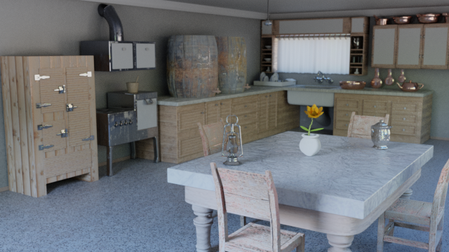
because i was rendering on cpu. Tell me what else, i should change for the final render. Do you think it’s ready for my portfolio?
Amazing work for starters!! one thing that’s really bugging me in this shot is the wood cupboard on the left. It looks too flat/smooth. I’d recommend increasing the strength of the normal/bump map if you’re using one. Or perhaps actually model the planks entirely. Obviously that would take much much longer.
Also the feet on the cupboard touch the ground too flat. Maybe bevel the edges where it touches slightly just to get a really slight shadow. I feel like it will help make it more believable. Imperfections make things perfect.
Other than that perfect! Good luck
It`s new kitchen renovated in vintage style. Or really old kitchen?
May be you need to turn your camera up, a little. To make your vertical lines really vertical?