i’m a student in architecture. In my free time i’m working on making good renders (to use in my future job)
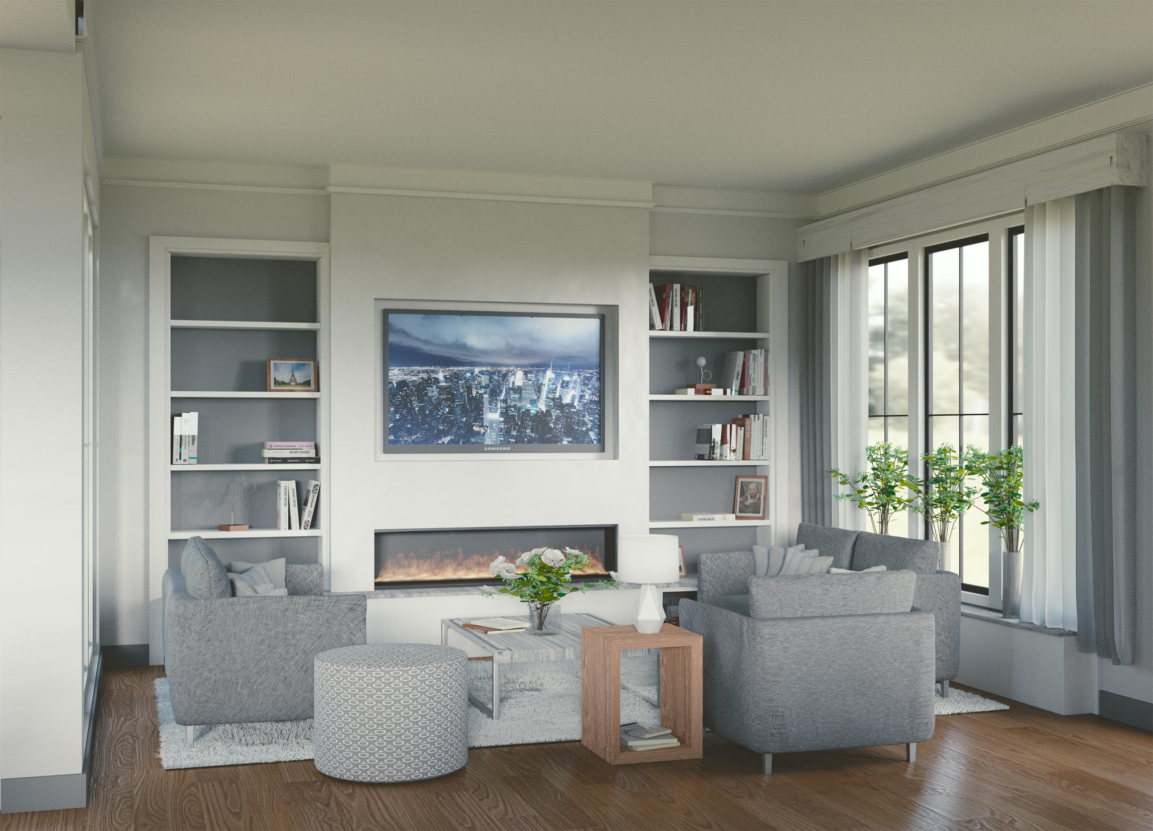
so here is the first of all my (interior) renders.
i hope you like it and can provide me with some good feedback.
what i already fixed:
texture on the couch
image is 3600 x 2600 pixels (now cropped to 2400x 1700) and 800 samples
Hi, welcome to the forum.
The first impression is nice, I like how it looks so warm even with white walls and grey furniture.
Here’s what I think can be improved:
The lighting is good so far, but it looks like there’s a very large window behind the camera.
This might be caused by the lighting, but it seems like an empty house, with furniture only where the camera can see it. You might want to add some objects that are not entirely shown at the left/right border, or in the foreground near the camera.
It is not easy to reach the couch, when there’s decoration in the way. If I lived there, I would have moved some things out of the way.
The TV and fire look like plastic or paper. I recommend to turn off the tv or make it brighter. Not sure what to do with the fire though.
The top left corner seems to be open. On the bottom left the thing-I-don’t-know-what-it’s-called ends a few pixels too early.
hahaha yes the upper corner went wrong but is fixed.
1 true, the window is big, so thanks.
4 also true. fire is just baked on a low resolution. so crack the resolution up will help (i hope)
about the composition:
better to delete the first door in the corver and move the kitchen to the living room?
and the kitchen island between the kitchen wall and the couch?
and move the small couch/chair towards the kitchen to make move space between the couch/chair and the table?
Oh, not as empty as it looks!
I also just realized there are windows on the left wall. Didn’t notice before. The light makes more sense now.
I thought the house pretty much ends behind the camera.
I’d say there really is much open space between the kitchen and the living room, that could/should be used somehow. (Depending on the size of the house, of course)
As a noob in architecture I can’t really tell how to change the room structure.
To 3.: try moving the lamp to the right side of the chair and put the small table a bit nearer to the fire. This would create space, but could break the balance of the render.
This might be caused by the lighting, but it seems like an empty house, with furniture only where the camera can see it. You might want to add some objects that are not entirely shown at the left/right border, or in the foreground near the camera.
I agree with Cebbi. Having a foreground object cropped by the border suggest a world outside the frame. But if I’m not mistaken you rarely see it in Archviz whereas it was a rule of sorts in illustration. Also adds depth and you can use the lines as a compositional tool leading to any specific center of interest.
Oh and this is an amazing first attempt. Very nice render indeed. Maybe simply increasing the emission on the TV and having some glare would help. also what if the roses were a bright red. Once again very nice IMHO.
thanks ghost
i don’t care about rules in archviz. they changed a lot during the years. for me they have one purpose: let someone fall in love with the image so they buy the home
i will definitely try to make a border item (move the kitchen)
another update
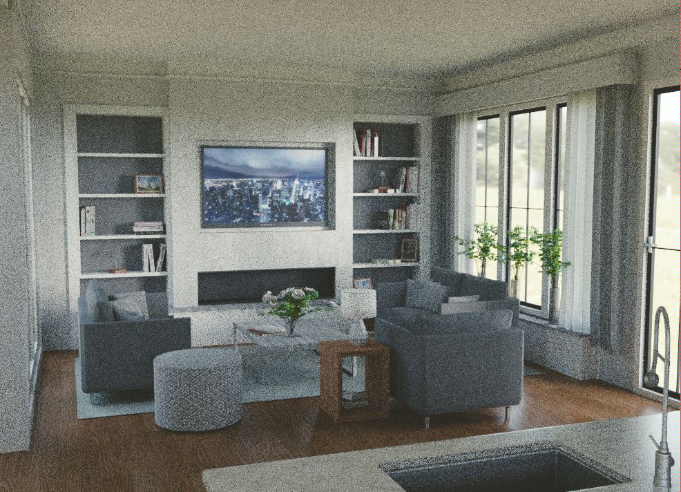
i changed the composition and put the kitchen as a border filler. but i need to much surface to show what it is.
the border filler should on this position to get a readable composition. but maybe is a plant enough?
The sink doesn’t do it for me. And, I’m rethinking my entire remark. A illustration isn’t trying to sell simply a space or look. The illustrator while having a room would be working to sell a mood or environment while using it to highlight his center of interest.
I suppose one could say in Archviz the entire room is the center of interest. Obviously I need some study here. And, your perspective lines (Walls seams, Ceiling, etc.) are suggesting a space outside the frame. Now that being said a plant would be interesting but of course a cutout might not hack it. Then you will get into visual weight in your composition. Like I said I need to Google here. Surely Archviz must have some tried and true rules. Still a nice render through. : )
I think the sink already gives a better feeling of where the room ends or how far the wall is behind the camera.
But I also can’t really see the room as I saw it when I only knew the first render.
The latest render seems to have solved the issue with the furniture blocking the way, as the table is now darker and less prominent on the background.
Is there a glass pane in front of the fire, or is the wall glossy? Try to remove the glass/make the back rough, as far as I know things next to fire don’t stay glossy after a few uses. Might look less like plastic after that.
hey ghost. hahaha you are right. there is a lot to discuss about archviz.
thanks cebbi, there is a glass panel in front of the fire. removing it will make it less realistic in my opinion.
about the wall… i have to cheak it, i think it is al mix shader between difuse and glossy. every wall has a kind of glossy on it(just because it’s painted). i think the best improvement will be to put a black burning blur on the glass en put burning material inside.
the point about the roughness of the background of the fireplace is a good one.
above all i’m going to change the plan.
it’s a big project… but i hope i can make a VR image of it.