Hi,
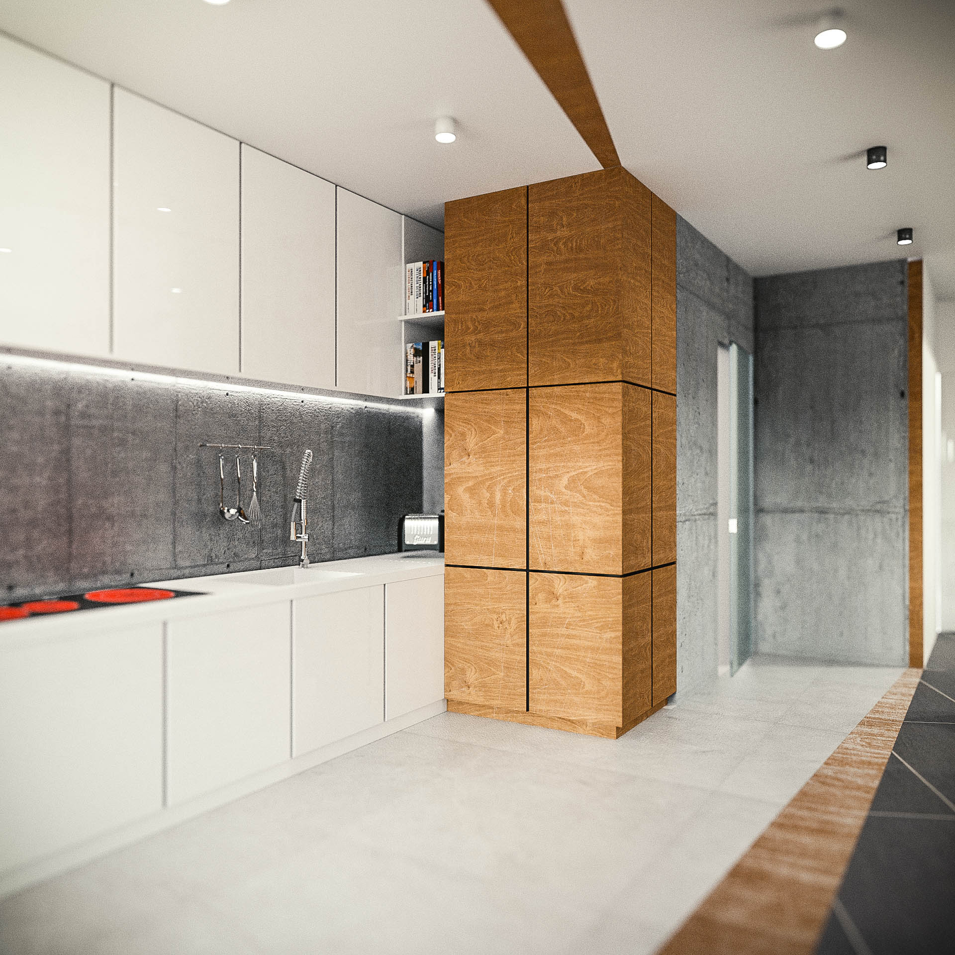
I’m interior designer who work in blender from the beginning. Now is the moment to fix my old works to make portfolio better. I’m curious about your’s opinion about this improvments.
Hi,
I’m interior designer who work in blender from the beginning. Now is the moment to fix my old works to make portfolio better. I’m curious about your’s opinion about this improvments.
It’s a lovely image.
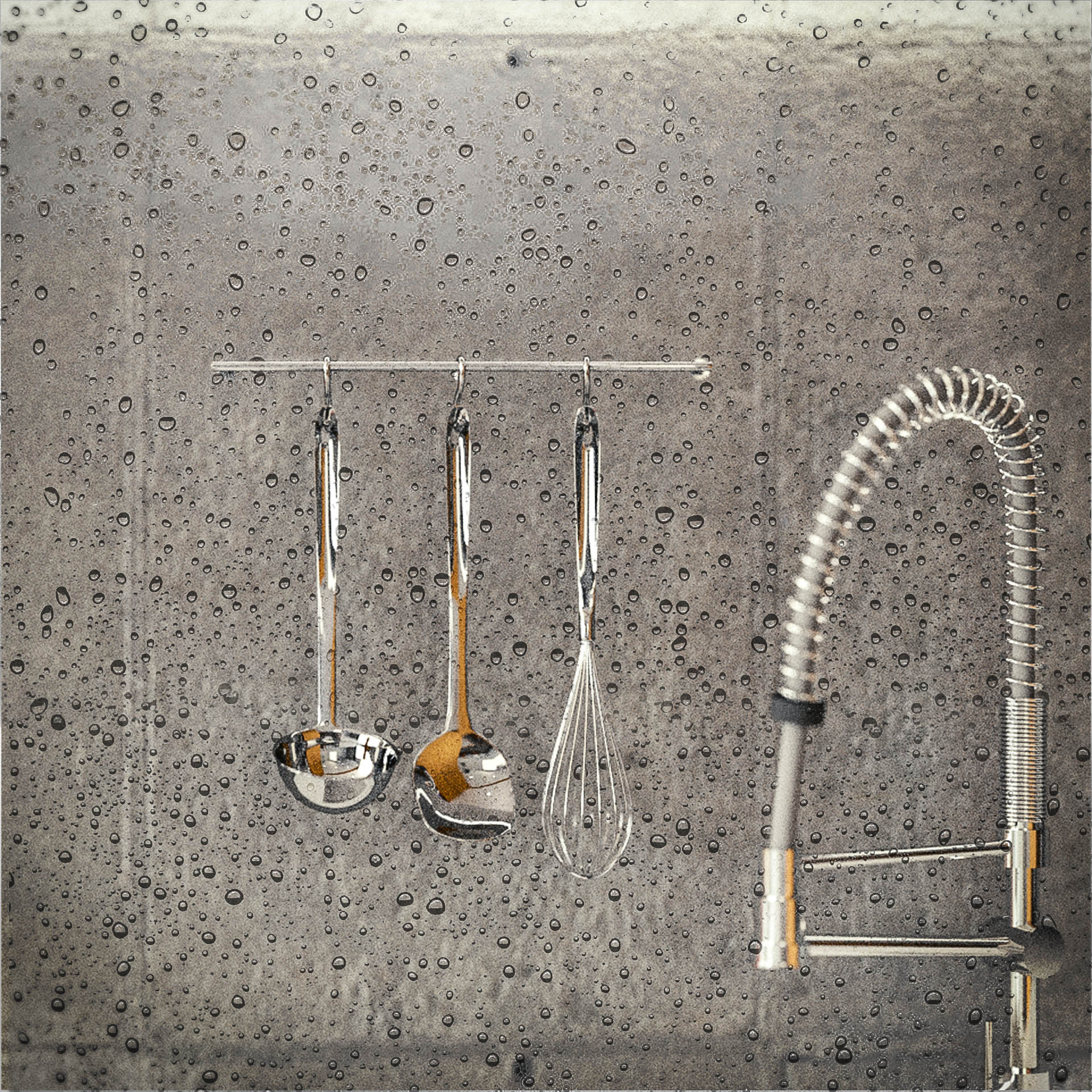
Are those droplets of water or dimples in the concrete of the wall surrounding the ladles and whisk? To me they look like droplets, but there seem to be too many of them, and too arbitrarily spaced. It’s as though it rained indoors. If they were the result of washing things in the sink, there would be a direction to the spray, and the droplets would thin out with distance.
Be well,
Zack
Firstly, you could design my kitchen any day, it’s fantastic! I’m assuming the water droplets are something you added in Photoshop/GIMP(?). I would lose them. The blurring in the room shot looks like it was added in post as well. It’s not super distracting, but the image will probably look better if you can produce the effect within the rendering itself.
I believe the dof effect - this shallow is better for closeup shots. In this kind of picture it doesn’t make that much sense to me (apart from hiding interesting details) Try a deeper depth of field and focus the viewer with something else (maybe a color accent). After all this is a general overview of the kitchen design (meaning the upper shot) let the viewer see all of it not just the sink and close surroundings 
I have to agree with @djtartak. This depth-of-field effect that you would potentially see in a large scale scene, but using a tilt-shift lens, has the effect of miniaturizing the appearance of things. I see it a lot with renderings where an object, like a car, looks like a toy. It’s not quite doing that here, but I don’t think it adds anything to an otherwise excellent shot.