A set of lightpaths that i made into a blender symbol. I think something might be missing, but i couldn’t figure it out. if you can see something a comment would be nice.
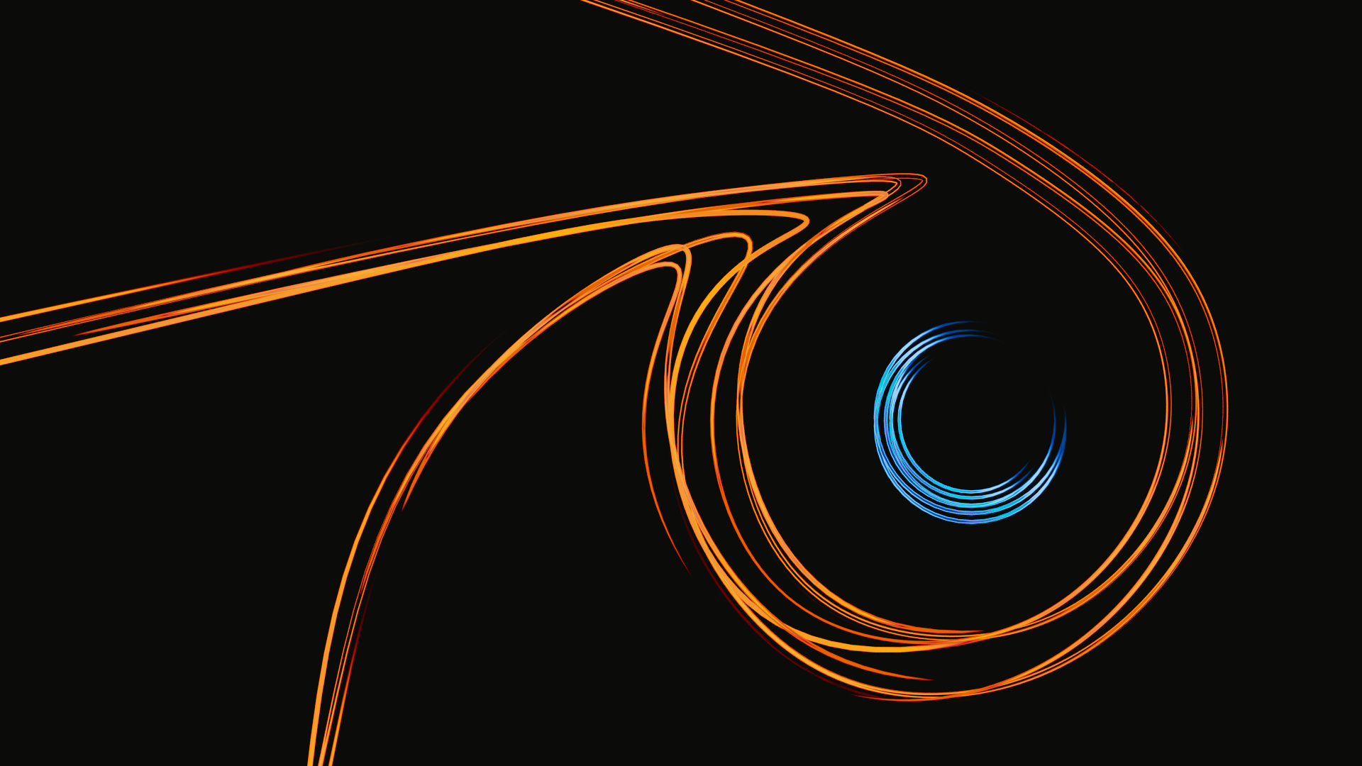
nice and simple, i like it.
maybe the background feels empty!
Would be an awesome wallpaper! Just needs so glare and to be brightened up a bit to really give it some punch.
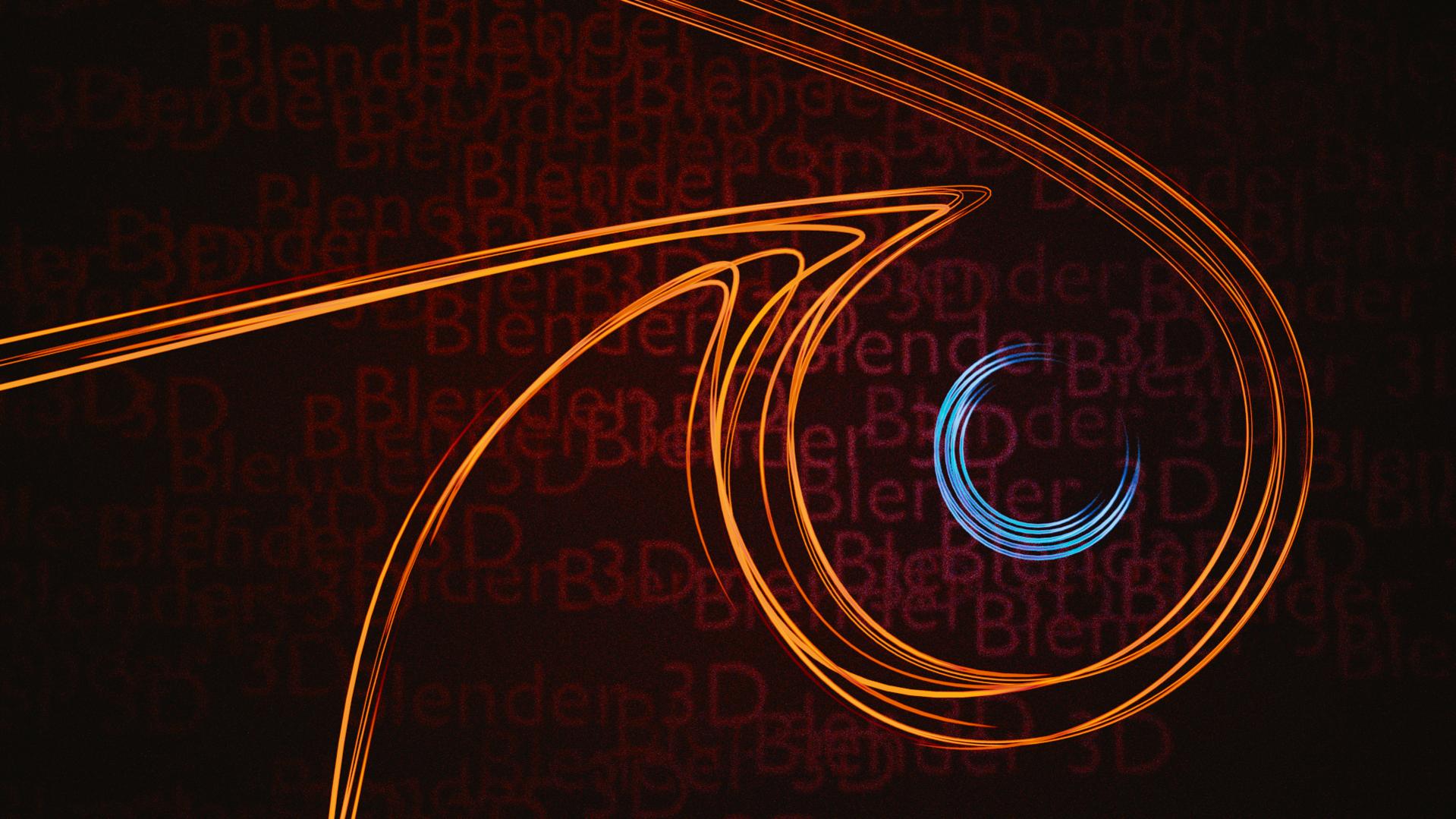
To me this approach of the Blender logo has a feel of luxury but your background looks nerdy and usually those two concepts don’t match, which is why I definitely prefer the black background over this one (not to mention that the red color of your background doesn’t help your logo pop out).
I would personally either make the background very dark (but not pure black) or put a slight gradient (either dark grey or with a different hue than the logo if I used a color). This would match the style of the logo better.