
Just looking for some feedback. All items were modelled from scratch and I learnt everything I know from Blender Guru (Andrew does fantastic tutorials)
The glass bowl looks weird (shader). Nice details and it looks good but its a bit borig there is nothing
to focus on.
Nice glass in the shelf. I think it would be better tham you change something with this wood accessory, i think that wood is to orange. Second think is sink, maybe try to use pbr materials? it will be much better.
It doesn’t focus on the window. In fact, in seems to have no focus at all. The saturated colors attract attention, but all of the colors are at the edges and corners. The black counter top also snatches attention away. On the other hand, the window is white on a white wall. It literally blends in. Maybe you can remove some of the items and arrange them to focus more on the window. Use a more light colored counter and changing the wall color to something darker to help the window stand out more.
This wall is white for you, did you have a toaster as monitor?
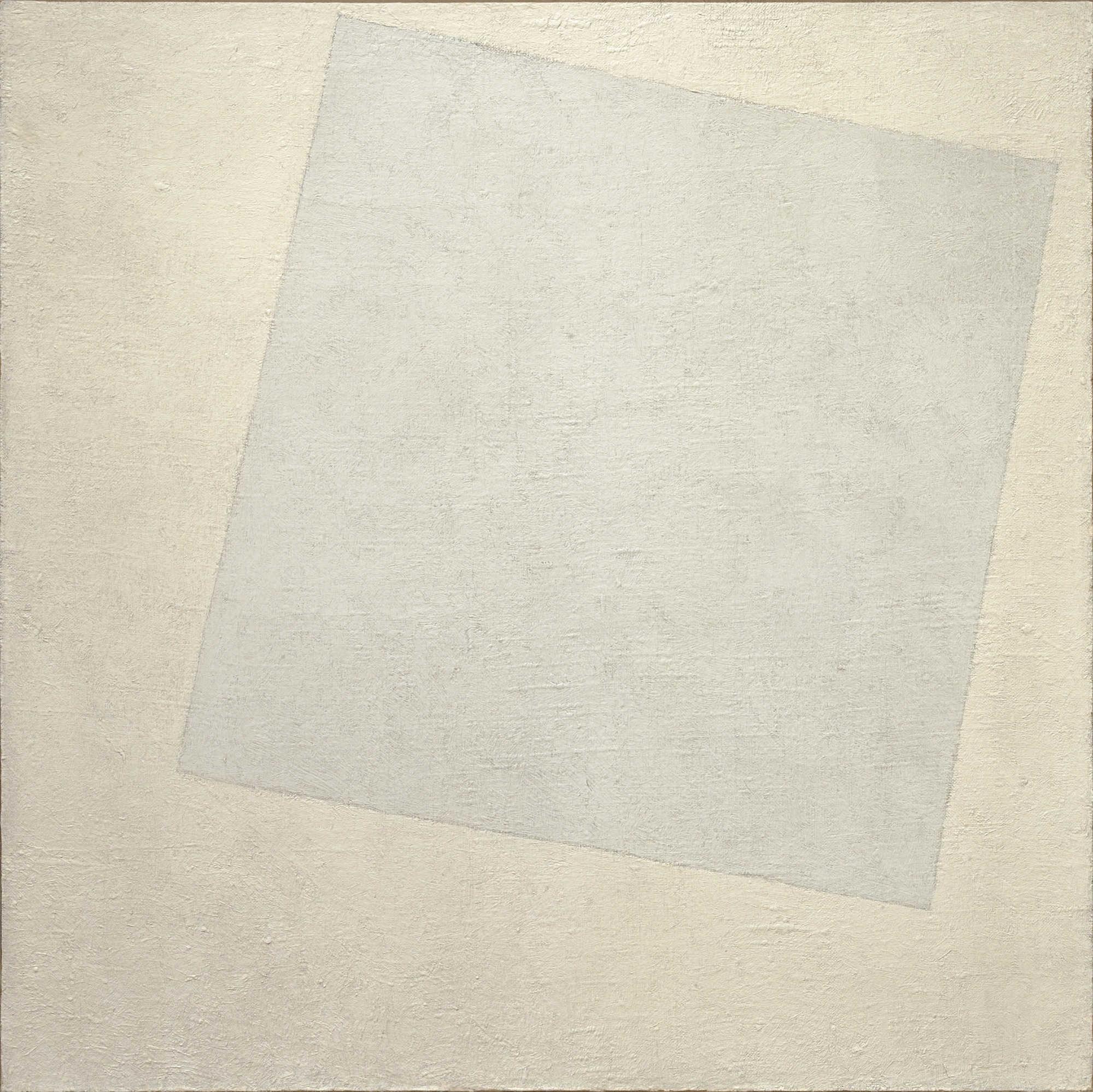
It is white, a version of white. Others would could it off white, eggshell, cream, beige, etc. but it is essentially a version of white. If you have a cool white (like the window) against a warm white (like the wall); it is white on white. The difference is small and the effect is subtle.
You can see this used in the painting called White on White by Kazimir Malevich:
If you are an artists, you should know what I meant when say white on white. A painting exist with that name. Or are you just dumb?
Teach me senpai!
At what point it change from white to cream? I think there is no rule, SENPAI.
OVER AND OUT. :*
Alright. There are colors collectively called as White. These includes: Eggshell, Beige, Ecru, Cream, etc…
You might be more familiar with this concept with the other colors. Example: Green. There are varieties of Green: Apple Green, Teal, Avocado, Harlequin, etc. . Again, these are collectively called as Green. If you choose one Green (say Teal) and paint it over another Green (say Avocado), you are painting a Green over a Green. Green on Green.
Now apply what you know now to the variations of white.
As to what point it change from White to Cream… this doesn’t make sense. Cream is a variation of white. It still is White.
You must also note that this is not scientific and more of culture, tradition or practice than measurements.
Now, your educated you can go. Never be ignorant again, at least about White.
As I said it is a variation of White. Just look at the painting called White on White. There are two major blocks of color there right? And you know what, the two colors are both White. One is just warmer, the other cooler. This creates a very subtle effect.
Now back to the window. The window against the wall is similar to the painting White on White. The window still separate itself from the wall, but it is so subtle. Compare to the counter against the wall. There is a more marked contrast.
Now, Jax wants the window to be the focus. However, the subtle treatment on the window and wall makes the window too unnoticeable, especially if you compare it to other stuff like the counter. That makes us focus on the counter (and other objects) instead of the window. That is not what Jax wants.
I appreciate the feedback! The image will be used on a website that will allow the user to change the colour. Anything from a dark mocha to cedar to white. The blind is very boring in white and the additional elements are designed to create visual interest for a very visually plain product.
I’ve created a new image for a different blind that I’ll upload for feedback as well.
BTW All materials are using PBR nodes from Blender Guru.
I was going to suggest opening the blinds, lol! If the blinds are intended to be the focus, perhaps crop it a little less tightly on that left side. Not by much. Looking great. Do post a link to the website when it’s done.