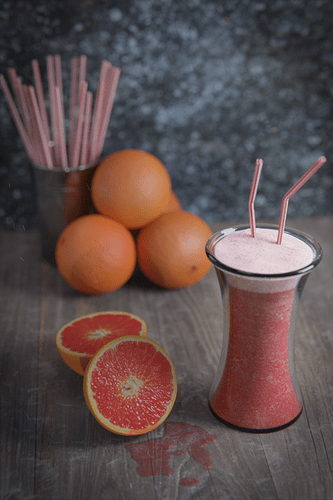
Any feedback on this scene would be greatly appreciated! My main goal in this project is photorealism and improving my lighting techniques.
The smoothie looks like stone/marble. It doesn’t look like a liquid. But then, liquids like milk is very difficult to get right.
The sliced orange is almost right but is still off. The most obvious one I could see is the rind. The rind is too matte instead of being glossy.
The liquid spill doesn’t look right. It reminds me of nail polish.
The wood doesn’t match well with the other objects. It especially clash, really harshly, with the drinking straw. The angular, saturated, synthetic nature of the drinking straw doesn’t play nice with the wood.
the overlay on the wood is too strong and it is goes over the gaps of the wood planks. This breaks the illusion of realism.
The light seems to lack any character. Is it plain white? Try making it slightly yellow to imitate real world lights.
Also, are everything made to scale? It seems like all the models here are several times larger.
The thickness of the glass, and the size of the straws made me think that the glass looks more like a flower vase. But then maybe it’s a really good smoothie and you wanted a lot of it.
You made a smoothie…with blender…
I think composition-wise, the smoothie could get a little more focus as the title seems to imply it’s the subject. I would personally angle the camera to look face the smoothie a bit more straight on. The flesh of the cut oranges could probably be turned to face the smoothie (to direct people’s attention toward it), and the rest of the oranges could be placed behind the orange part of the cut oranges. Instead of a tin with straws, I think it could be more interesting to have the straws laying on the table, pointing in the smoothie’s general direction. Of course, without knowing how exactly it will look after those changes, take my suggestions with a grain of salt.
