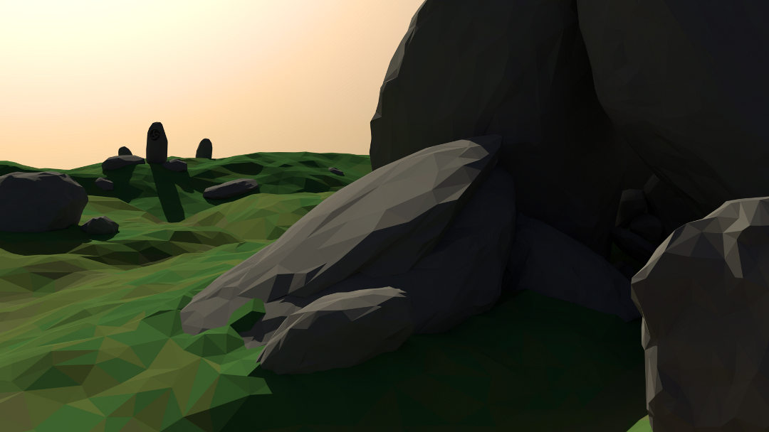
Hello blender artists, this is my first time posting after a few months of lurking. I am predominantly an analogue artist but have been integrating digital tools into my work flow for a couple of years now. I have a somewhat-functional working knowledge of blender but have yet to produce very much in the way of finished products. I am very fond of the low-poly aesthetic (when done well) and feel confident enough in my simpler low-poly renders to not bother much with feedback. This, on the other hand, is my first attempt at an organic landscape and I would appreciate some pointers on taking it to a higher level of quality. The attached image is ~300 cycles and has a few obvious modeling flaws (that have mostly been corrected) and I am predominantly interested in feedback on the composition, lighting, materials, colors etc. Thanks.
I like the way the land and the main rock in from look. I think better use of contrast might make the image more coherent, for example the dark sides of the rocks, shadows, and everything are all the same shade, making them look more like black blobs. Also, the color value of the grass and rocks is very close, making the cave-rocks lighter might help bring attention to the cave, because right now the attention seems to go to the center rock. It’s not entirely clear that the black are is a cave (if it wasn’t for the name of the file, I would have guessed it was just the dark-side of rocks, similar to the rocks in front). But, you were going for organic, and you did a good job of keeping an organic flow, without the low-poly making it feel rigid, so it’s going well so far.
Thanks, the advice is appreciated, I think I will loop back to this scene and work on the changes you’ve suggested after finishing up my my current wip.