So this is it, and what I want you to do is critique it, and I will continue to better it. But remember how earlier I said this was my first time? When critiquing I want you to throw that all out the window and act as if I had been doing this for a while. That’s all I have to say here. Thank you! P.S. I did use filmic blender
Most of the light seems to be coming from the ceiling lights.
My suggestions would be:
Since its day time I think it would give the scene a more realistic look, if you turn off or lower the indoor light, and let most of the light come frome the window.
Or Change the daytime to night, your choice
Also the shadows at the window look strange, like it was extruded into the room, instead of outside.
It might also give a nice contrast if you use dark wood for the floor.
I Think the rest is okay for now, my main point was the lighting.
I’ve added more light coming through the window now as well as making it a hallway leading into a room rather than a dead end. Wallpaper is added:eyebrowlift: and I didn’t like the hole in the wall so I gave the flower a shelf to be on. Critique to your hearts’ desire!
The architecture improved a lot but I think it needs some life in it. Maybe throw in some props and make it look as it is actually used. Start out with some magazines on the shelf or tings like that. Check out Ikea or more luxury architectural magazines or sites to get some ideas how they do their styling.
Personally I don’t like the color of the lamp over the picture and would like to see it more color corrected. Also I think there is way too much fill light especially on the frontmost floor.
A subtle DOF might improve the realism a lot.
What’s causing the bright light splotches at the doorway? I feel they are a little distracting.
Maybe also try to move the camera forward a little so that the picture frame on the right gets cut a little, that might serve as a guide for the viewer.
Lighting in general looks a somewhat artificial. Try to think of where light comes from in real interior and of what quality the light from each specific source might be. Try to tell the viewer how the architecture expands outside of what is seen on the picture.
Might sound like I totally hate this image but I don’t just some directions on what you might improve on.
Much improved over your original render. But a few things to note. It’s bright daylight, so there is no reason for the lights in the house to be on. Also, from a design standpoint, there seems to be multiple styles in the house.
A light floor, with white walls and ceiling, but then a dark brown side table, and a blue seat at the back, and then what looks like some sort of impressionistic art on the wall. I’d say try and make the style of the interior match a little better.
Maybe have the picture as a canvas instead of a framed piece, and remove the light above it. Make the skirting a little thicker, as it seems very thin. I’d say about 2-3cm thickness. I’d also maybe add a coving along the top of the ceiling, but thats preference I guess. Little details too like plug sockets and light switches help to complete the scene too.
I also think there needs to be some sort of main focus to the piece. Atm I’m drawn to the big black frame on the right, but composition seems to want to lead me down the hallways into the room at the end. As mentioned above, check out reference images, and draw inspiration from them. It really does help.
This is a vast improvement. The architecture is more interesting and it isn’t a useless dead end. It looks good already.
For some improvements, I suggest:
-more subtle side table and picture. The way the objects are arranged suggest that the focus is on the opening but the table and the frame bars access to it. Maybe you can loose the black frame of the painting and replace the side table with with a hallway table like this:
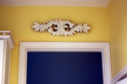
-You can try to add some decorative element over the arch opening. This would help add more focus to it and block the eyes from straying. Something like this:
-Since the focus is what can be seen beyond the opening, it is good to add something that is visually interesting there. The chair and the blanket isn’t interesting enough. Ideas includes a more visually interesting chair, curtains for the window, pillows, rug on the floor, scenery in the window and maybe a bigger more complex window.
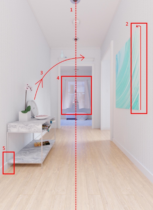
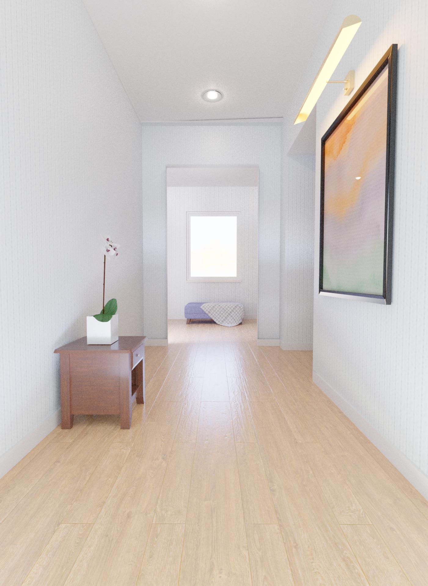
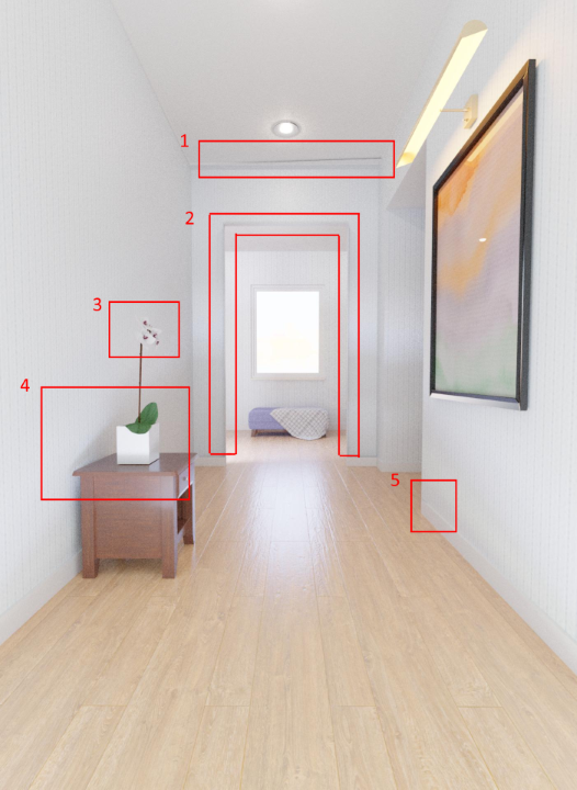
You have made a huge improvement over the first render. I am seeing five issues that really stand out though.
Not really sure what is going on there. It looks like a shadow, but at the same time, it looks like the roof isn’t aligned correctly with the wall.
There appears to be a very thin frame around the archway at the end of the hall, which is casting an odd looking shadow. I would suggest removing the frame, or making it a bit more subtle.
The flower petals blend in with the colour of the wall, so it might pay to give them a slight colour tint (light pink as an example). It would just help them to stand out a bit more.
There seems to be a light behind the camera that is low to the ground and pointed up slightly, and it is causing shadows to be cast upwards, which feels out of place.
It looks like the geometry of the wall is connected to the outer edge of the skirting at this point.
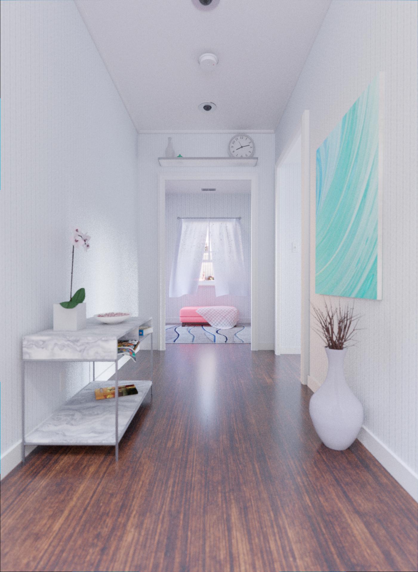
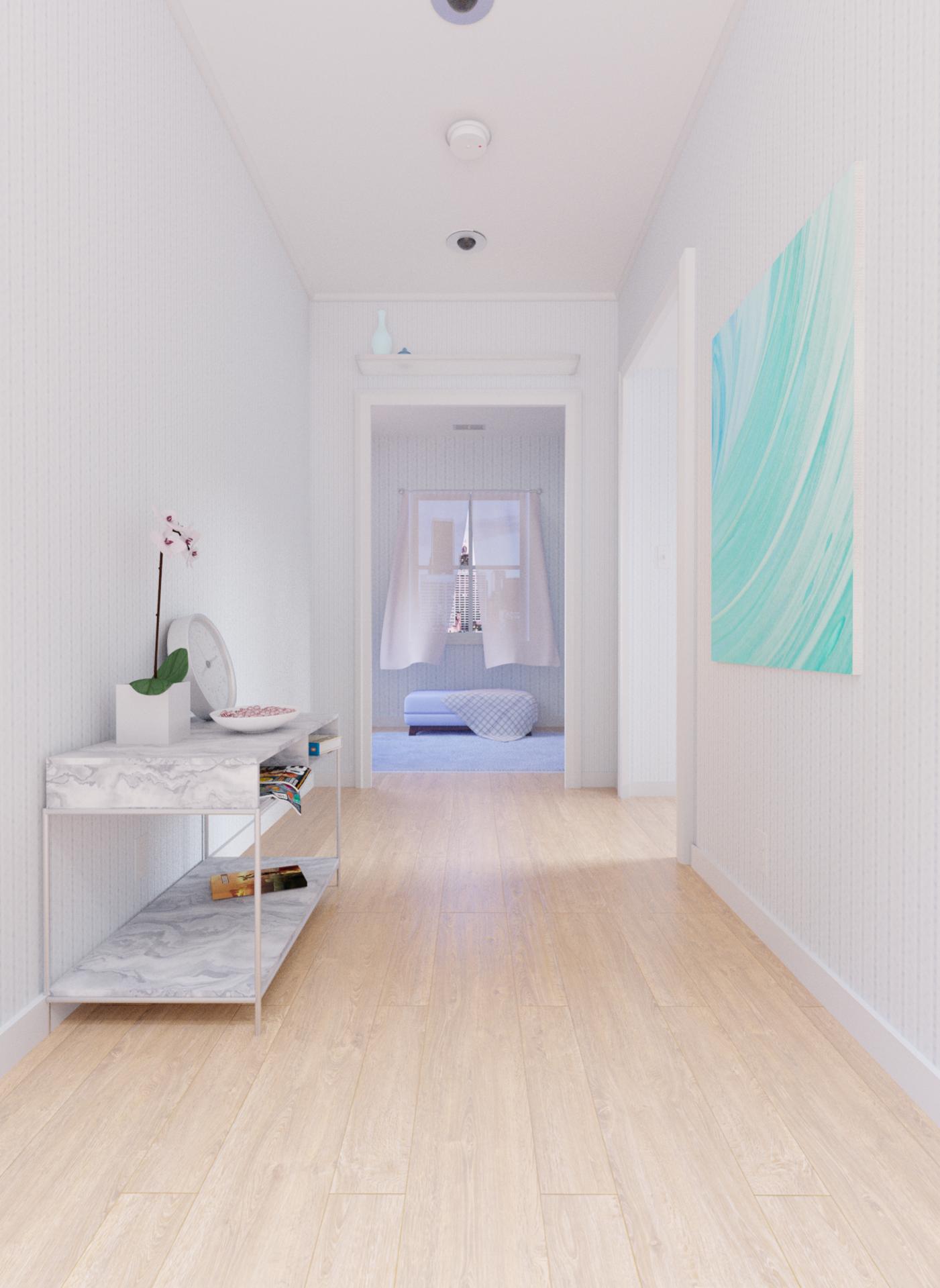
UPDATE: it’s been a while, but I’m back! I added a marble shelf to the left and tried to make it look like someone had been living here. i added a shelf with some vases above the doorway. And curtains and a carpet. I’m still working on the vase materials and the window so those are not good yet, but other than that you can critique to your hearts desire!
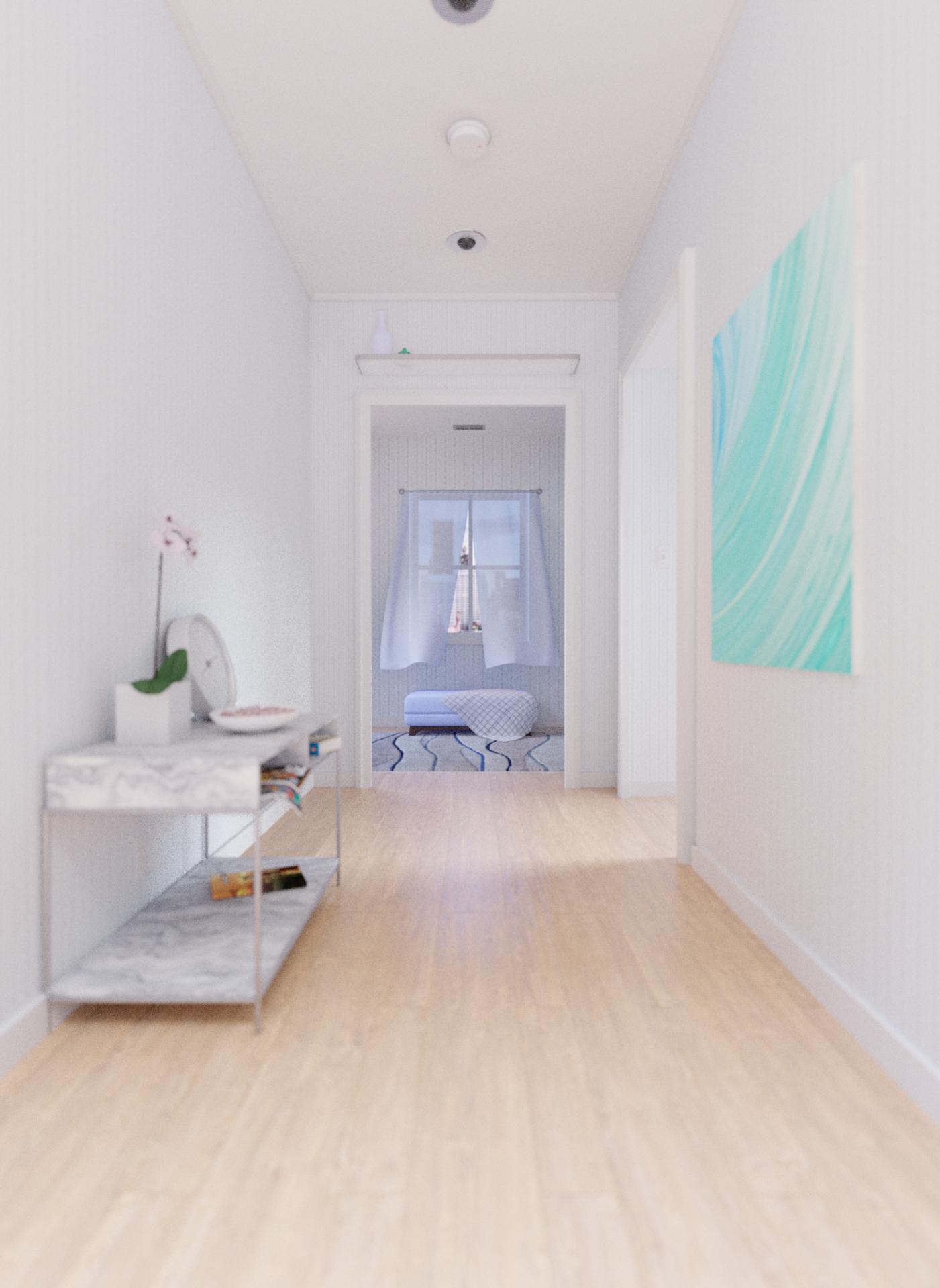
The adjustments that you made have improved the scene. However… I have another list for you to consider. I’ve used the pre-DOF image so that it is easier to see the items I am pointing out.
The right half of the image feels empty-ish compared to the left. The amount of clutter on the table, and the two items on the shelf above the archway make the image seem unbalanced. Maybe try adding some items to the right side of the shelf (point 3 is related to this).
It might help to give the painting a slight tilt outward, flush-mounted paintings (to me) look a little odd. It may also help to create a slight shadow behind the top of the painting, which would prevent it from blending in to the colour of the wall.
I haven’t seen many wall-mounted clocks sitting on a table before, and it’s positioning would make it awkward (IRL) to view the time. It might help to shift the clock to the shelf, which would be a more realistic placement for a clock like that.
The window appears to be closed, but the curtains are affected by a breeze… try altering the window so that it is clear that it’s open.
The new table seems to have a phasing ability The leg of the table is inside the skirting board, either scale the table inward to make it slightly narrower while retaining it’s position, or move it outward slightly.
Hi !
I had some remarks but phil said it all x)
Well, almost, I’d just add that your image lacks a point of focus, as Peter said above. I know that’s hard to create, I’ve always sucked at it, but it’s important : i’m looking at your image and my eyes are going everywhere, and they never stop anywhere. The table, the painting, the window… what’s more important ? What should we look at first, and/or stop our sight on ? Ask yourself this questions and you’ll get what I’m talking about
Second point : more contrast would work imo. It kind of looks flat atm.
But keep going, look for references, try some stuff : it’s okay if it doesn’t work at first, just try some things and you’ll get there !
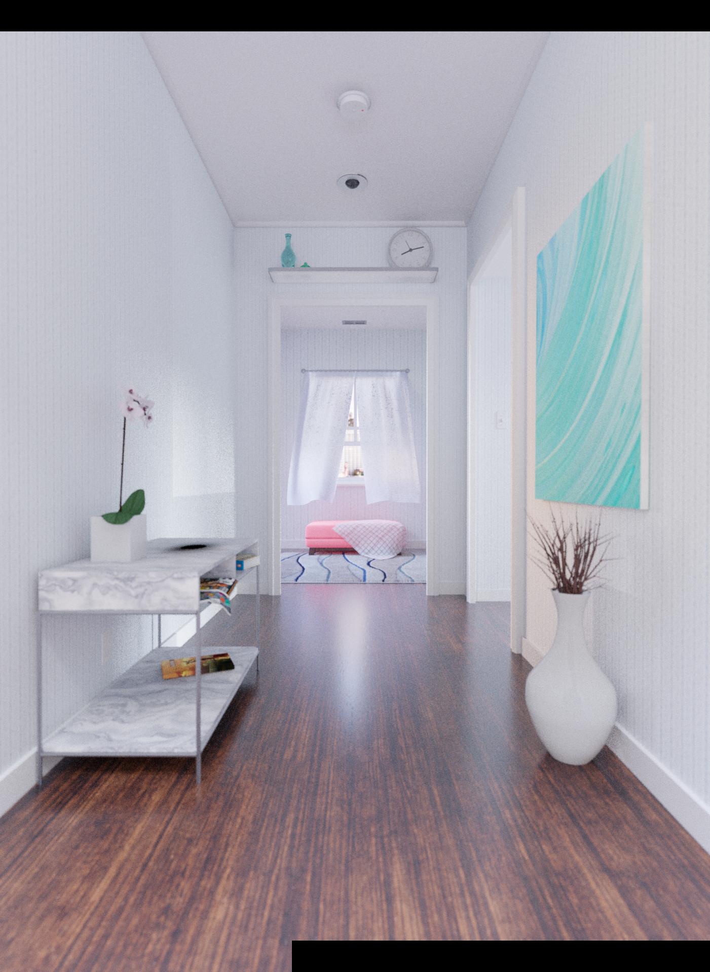
UPDATE: I haven’t gotten much done with school and all that, but here’s what I have.
I changed the floor so I would be more contrasting, as well as added a plant to even the scene out.
The window it opened and I moved the clock. The ottoman was changed to red to try and draw your eyes to it, what do you think about the new color? That’s all for now, critique to your hearts content!
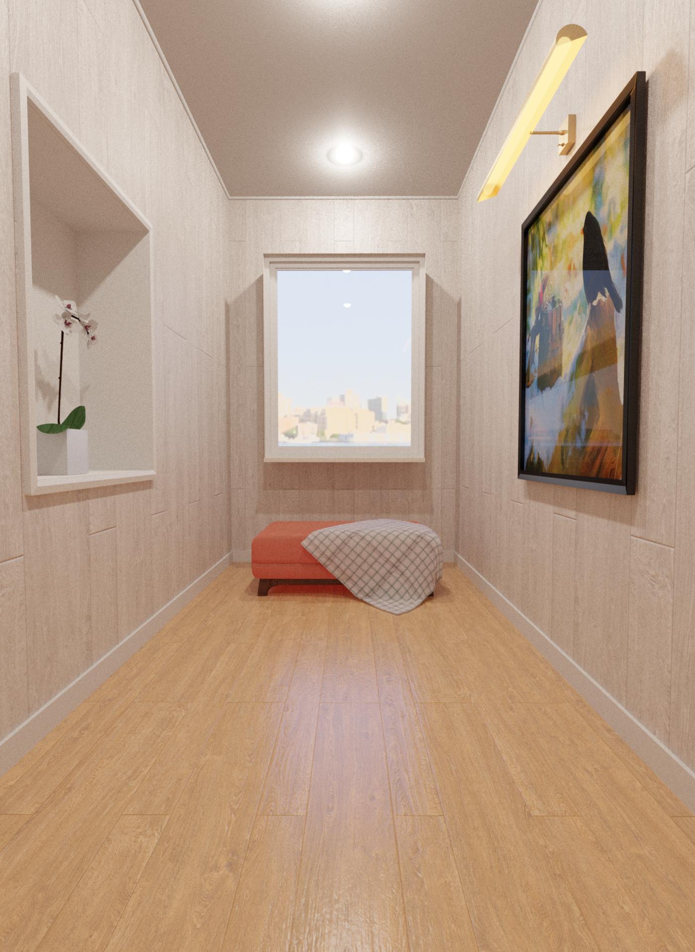
I’ll be honest now, I forgot about this scene and thought I might come back to it. I changed the vase as well as fixed the curtain speckles. I lightened u the scene. There are still some stage shadows I’m trying to fix. Particularly behind the large vase and next to the table. The bowl of mints is missing in this one, but it has not changed from the last one. The next update will have much more and be sooner. Promise.


 just some directions on what you might improve on.
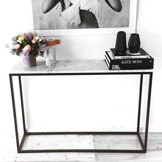

 The leg of the table is inside the skirting board, either scale the table inward to make it slightly narrower while retaining it’s position, or move it outward slightly.