Hello ,
I am willing to do project for Configuration Splash Screen for gsoc 2017 https://wiki.blender.org/index.php/D…ode/2017/Ideas here is the more detail .
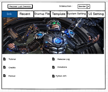
I want suggestion from you guys that what additional option you want to see in splash screen or any modification you want to see . I am thinking to add following menus along with existing option :
· Various startup files
· Various templates
· Basic system setting like render device, language etc.
· Basic UI setting like themes, input maps etc.
Also i have created a basic layout for splash screen below it is .
I want help from in following point :
which things do want to see in splash screen
2)Do you like this layout
If you have any suggestion for layout can you give mock ups .
Startup File
The default file to load with this template.
User Preferences
Only certain user-preferences from a template are used:
Themes.
Add-ons.
Keymaps.
Viewport lighting.
Splash Screen
Templates may provide their own splash screen image.
Python Scripts
While templates have access to the same functionality as any other scripts, typical operations include:
Modifying and replacing parts of the user-interface.
Defining new menus, key-maps & tools.
Defining a custom add-on path for template specific add-ons.
Therefor there is not a need to include this in the splash screen
but a automated setup for example for retopo, sculpting, baking or boxmodeling directly from the splash screen would be great ( you can choose highpolymodel and lowpolymodel everything will be setup, or you can choose backgroundimages and a mirrored cube will be setup) etc
Recent files should be ones to be on the default splash screen, and under that, some links for legal stuff (yeah, blender gpl link) and manual links. Tabs could be on the left side vertically. Settings should not be on splash screen, templates are ok.
Finally, another UI thread! How could we last so long without one?
I’d say don’t work on this. For one, this is an “Unconfirmed Idea”, so it may not be be accepted. Also, to quote Ton:
“this is not a good GSoC imho, the design/prototype phase is most of the work (and very hard), code then is possible to do in few days.”
Secondly, why should there be more things in the splash screen? Settings need to be duplicated anyway, having them in more than one place just adds overhead. Adding another indirection to the “recent files” (the only thing most people will use regularly) defeats the purpose of quick access. I don’t need any of the features mocked up here in the splash screen.
I only see one real problem with the splashscreen: It’s the only place where you can copy over settings from a previous version, if you upgrade to a new version. Once you have saved anything in a new version, that functionality disappears. This is so obscure (a link shows up below recent files), most users probably don’t even know it exists. It could be made way more obvious by changing the splash screen drastically, telling the user that an upgrade was detected and NOW is the chance to copy over the setting automatically.