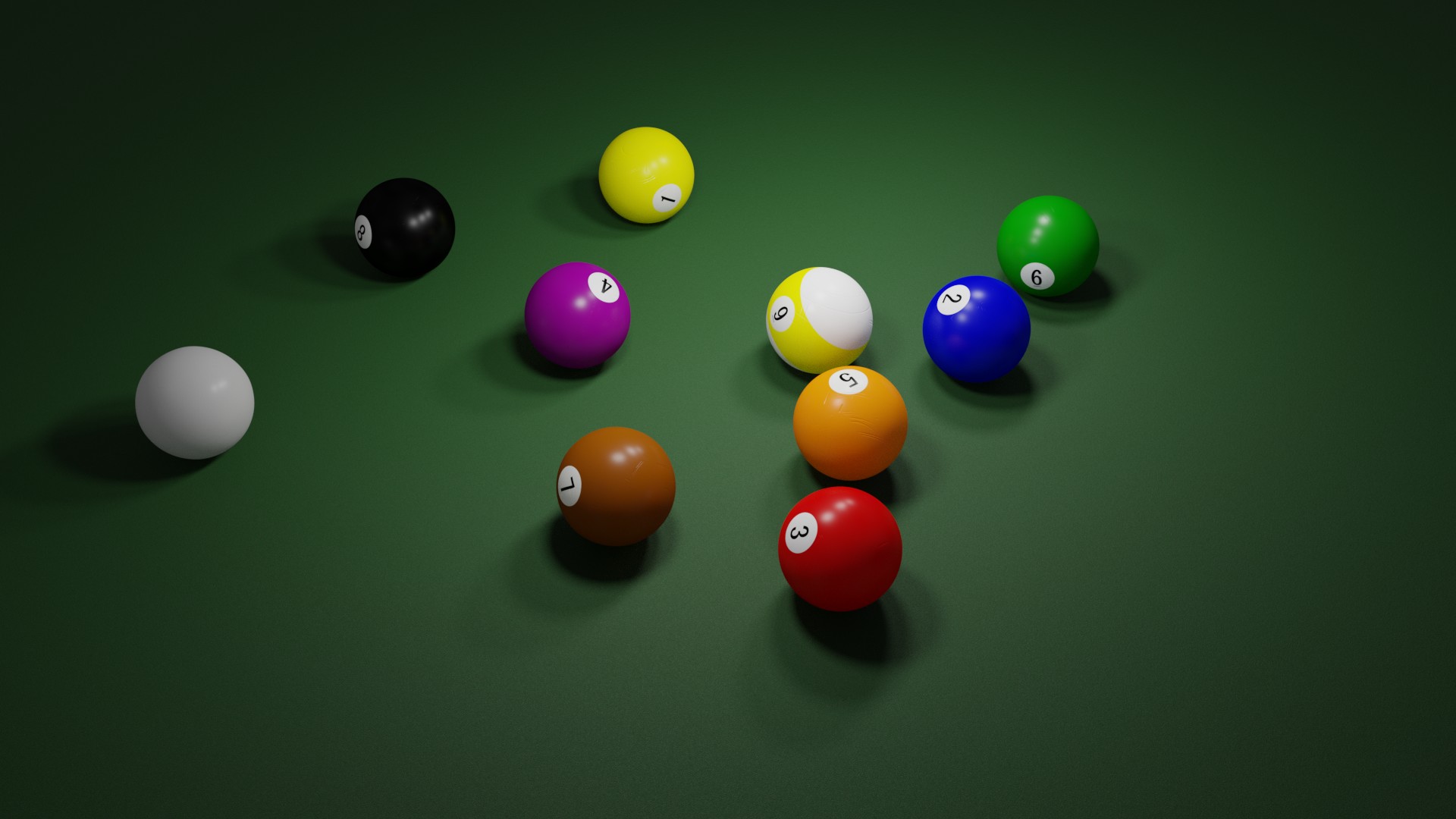
It struck me that every time someone does a pool or snooker set of balls, they are always nice, and shiny, and new. My days of playing pool meant local pubs, grimy floors, stained cloth and knackered balls, so I figured that’s what I’d go for.
This for now is just the balls, and I’d like opinions on the texturing. There’s a smidgen of SSS, and the obligatory damage from being knocked off the table, into beer glasses or (for us Brits and the Aussies out there) bashed against someone’s head.
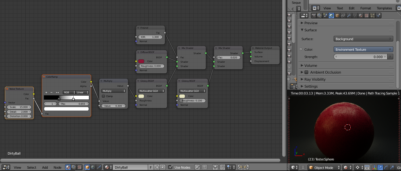
The balls seem a little too much like plastic. If you used a noise or Musgrave fbm texture as the roughness value, you could get a more realistic dirty look.
Thank you for your reply. I actually don’t think it’s the texture, I think it’s the lighting which, at the moment, is very rough and ready. Once I finish the build, then I’ll start on a proper light setup.
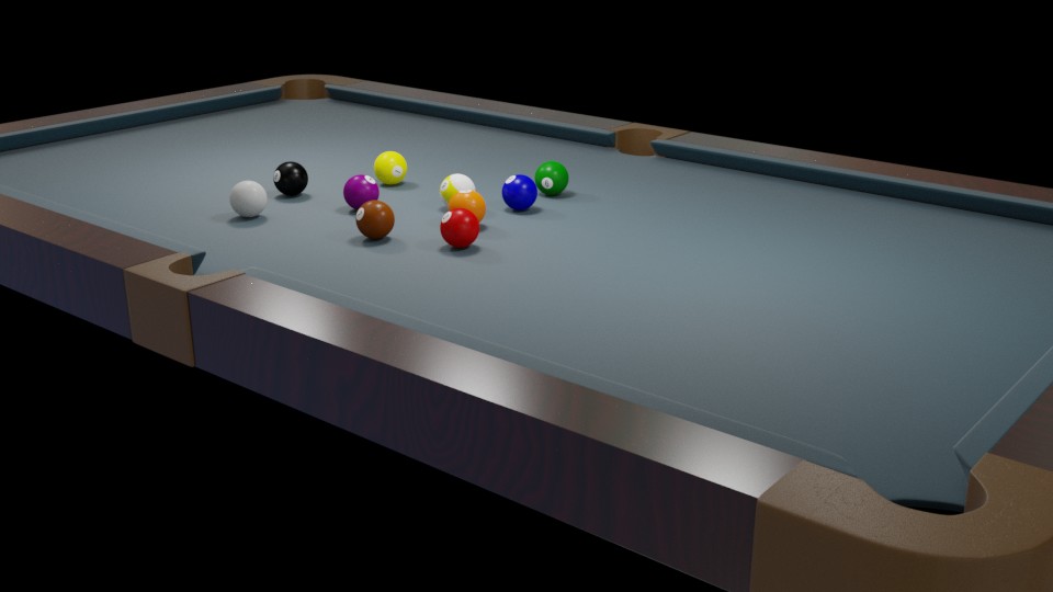
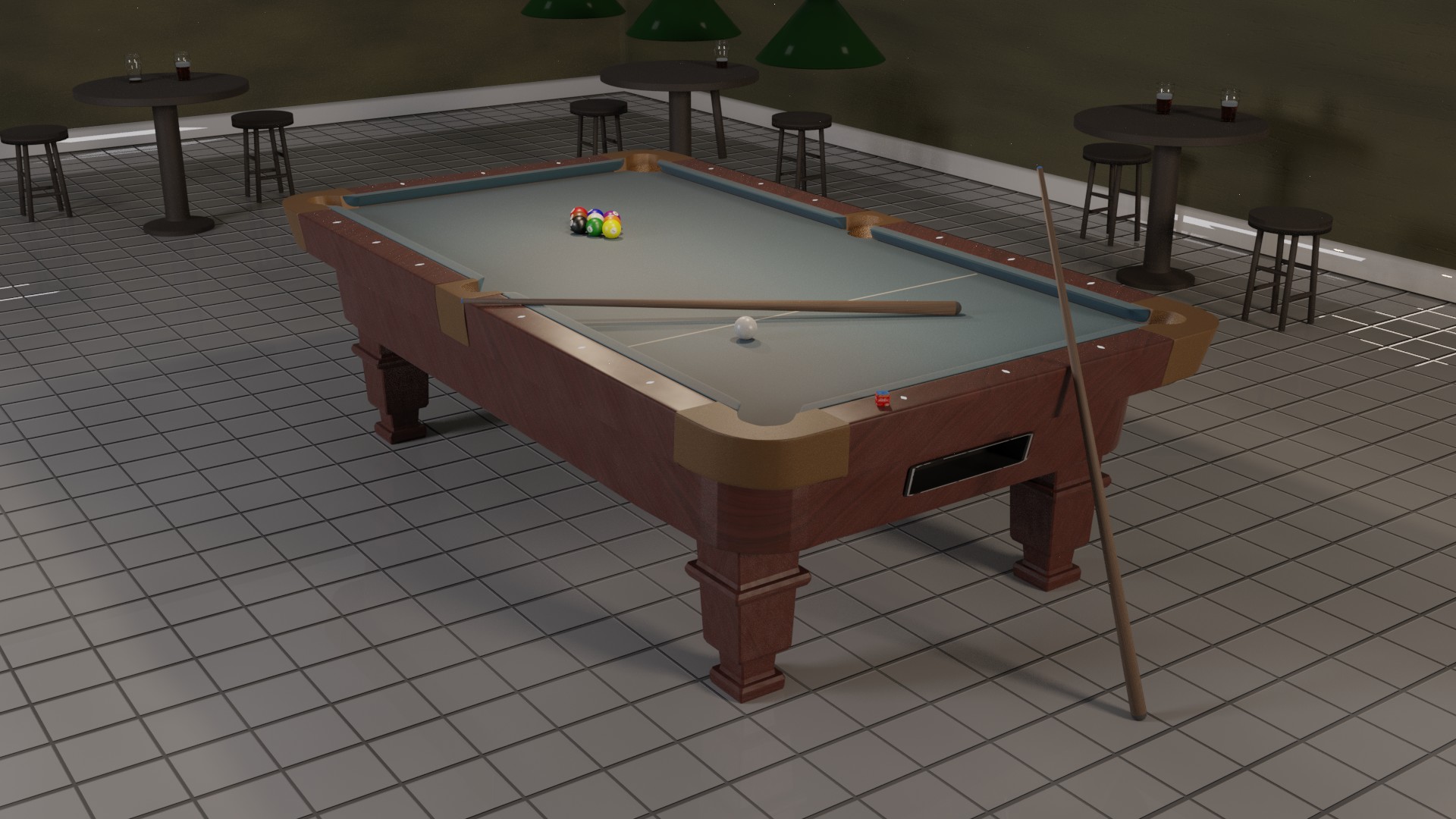
An update. Still need to check the scale of the balls and cues - everything else is real world scale. 9 foot table, playing height 80cm.
Worked on the lighting and started tweaking textures. Probably still need to work on the wood UV on the table, been spending a lot of time cleaning up the geometry, so the UV is probably screwed up now.
Started to fill the scene out. The beer gave me some huge problems (transparent except for the edges, without the aid of fresnel), but fixed it by shrinking the mesh by .001 inches).
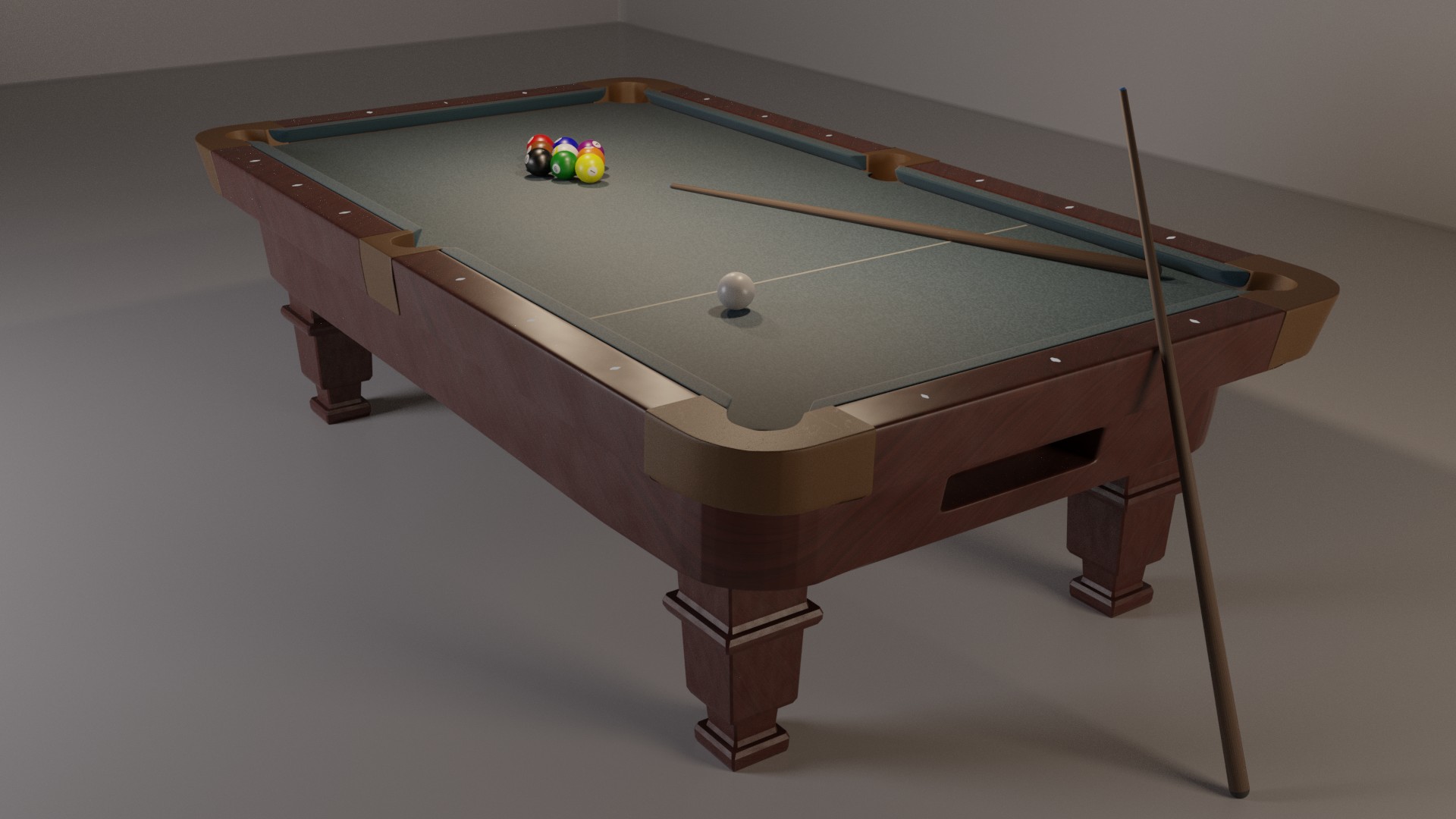
getting closed to finished. All the dimensions are real world, UVs are practically (still a touch to do) fixed, as are the materials (still a touch to do).
May need to add more scenery, but the jury is still out on that.
And then there’s the post processing. At the moment, this is still right from the render.
EDIT: Yeah, just spotted the weird bar on the drinks table centre - now gone. Dunno what it was?!?
EDIT 2: OK, Cues are too short. 4.5 ft. Switching to 5 ft.
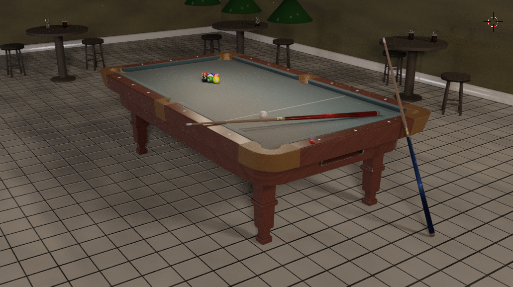
Hi, I practiced 8-pool regularly for a few years so maybe I can help with a few things. I don’t say that to look pedantic, that’s just what comes to my mind from my experience when I look at your picture.
The cue material doesn’t look realistic : generally, it’s quite glossy because it’s varnished, yours looks like it has too much roughness. Also you can use 2 colors, in the bars where I’ve been it’s rarely one uniform wood like this.
You may check the cue thickness too, the thin end looks quite large at the moment
At the end between the wood and the tip, there is a metallic ring (the ferrule), which seems missing.
On a used table the white line is generally very worn out and partly erased, especially around the middle.
The ground tiles look too clean, I think it needs a texture for exemple to make some parts more reflective than others.
Sorry about the post length, don’t take it wrong, it looks very good but that’s just some ideas
Thank you for your reply and you have reminded me of something I forgot (more on that below).
I played 8 ball for better than 30 years (and still have the odd game). I have two 8 ball cues and a 9 ball cue here. I agree, back in the day cues were glossy, but the varnish tended to cause stickiness on the stroke. Both my 8 ball cues are matt finish (one sanded, and one bought that way). The less expensive cues and pub cues tend to be glossy, but not the good ones.
There is a two colour wood texture on them, but at the scale, it’s probably not too noticable.
Point 3: Thank you. I should have at least got my 9 ball cue out. I forgot all about the ferrule, but on 9 ball cues it tends to be plastic rather than metal (8 ball cues share the metal with snooker), but I’ll certainly fix it. On that note, most 9 ball cues are two piece with elaborate decoration on the butt end, so more work on the cues to do. Nevertheless, I’m grateful for bringing my focus back.
As for the white line, there is some noise distortion, but I agree it’s too subtle and needs work.
As for the tiles, there’s an overall noise controlling the glossy, but again, too subtle, and needs some work.
Thank you for pointing out 1. my failure to remember what my cues look like and 2. for highlighting where I’ve been too subtle. More dirtiness is definitely required
EDIT: In my defence, I got fixated on the beer - who wouldn’t?
Wow, that’s some nice cues now
In pubs as you said they generally have cheap cues, so it’s improbable you would find some nice ones like what you did here, but visually I have to admit it’s better looking.
You are probably right about the glossiness, you have more experience than me and I only know 8-ball (yellow and red balls). And about the ferrule I remember playing with metallic ones but a Google search tells me they are often in plastic too, so that’s not important.
I’m happy you took my notes into consideration, looking forward to seeing a full render.
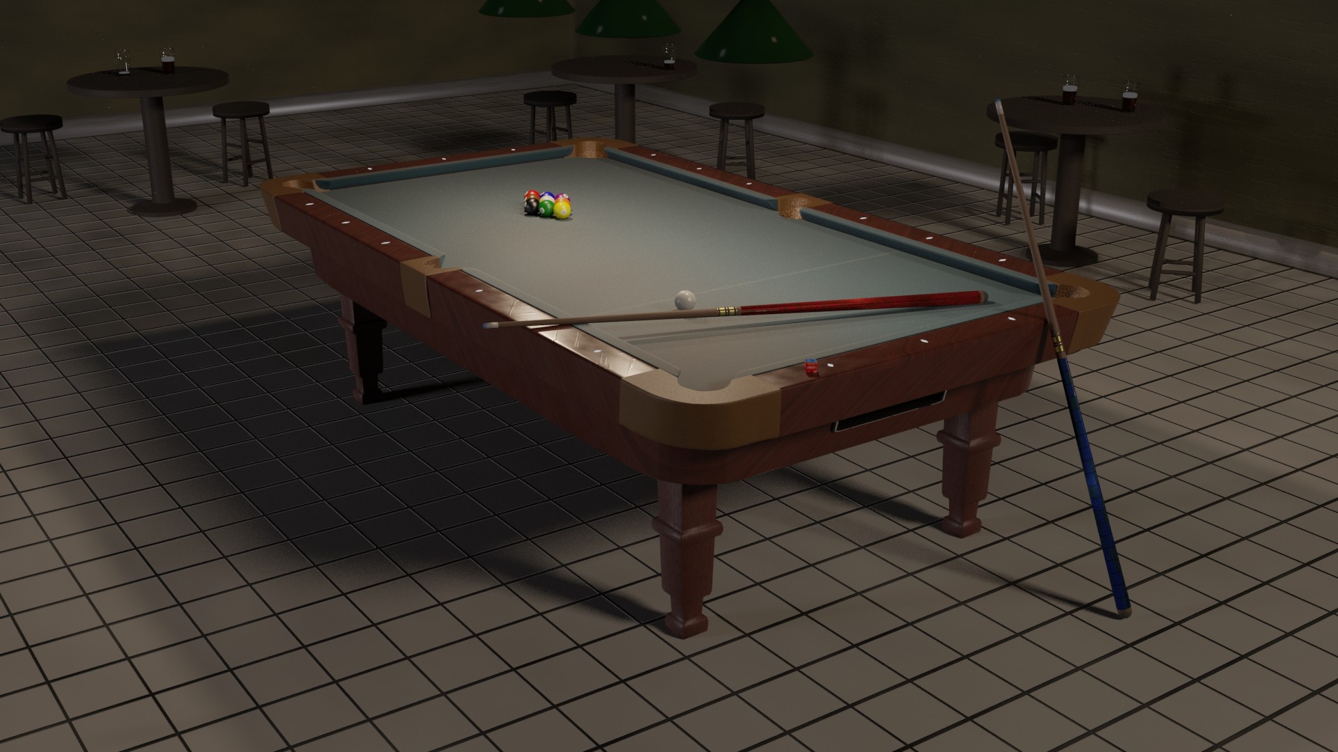
I’m glad you like the improvements. This is a low sample (500) render after some more tweaking, particularly table damage, though I’ve been far too heavy handed with it (it looks like someone took a hacksaw to the table). Nevertheless, I think this shows off the dirtying up of the scene, now, too make it less gleaming and perfect.
I think I’ve nailed the grease from hands on the table affecting the specularity, but happy to hear opinions on that. The scratches on the wood need to be taken right back, as do the gouges in the walls. nevertheless, I think I’m approaching final.
I’m happy with the majority of textures now, so if you spot anything else wrong, now is the time to speak up.
EDIT: Forgot to say, the cue leaning against the table may get moved. I don’t like how it’s interfering with the specularity on the ball return, but a fairly minor point, and may just be me being anal.
EDIT 2: Thought of a name for the final image. The name gives it a story
The table has seen some violent fight… Haha you may reduce the damage as you said.
The specularity on the wood seems right to me.
The cue leaning against the table doesn’t bother me personally.
I wonder what is the story here exactly. The balls are well placed, but the cues are left like that, so it looks like some people wanted to start a game but had to leave and let it this way. Also there are some beers in the background, but they are not finished yet no one is at the tables. So everyone left for some reason, I can’t exactly figure why. Maybe the title will explain ^^
Maybe you could add something in the corner of the room, I think it’s a bit empty. For example a plant or something would be great.
Another thing is bothering me : the main light seems to come from the right ? In my opinion the main light source should be above the tables, with almost no other light sources in the room but I’m not sure, and maybe it’s more difficult to light the scene correctly without the light coming from the right.
Anyway it looks good, maybe other people have another opinion on what you can do to improve it.
The light from the right is probably the bar/rest of the room (and yes, without the extra lights it’s just too dark. I don;t want to use an HDRI on this scene. There’s also a more subtle light to the left).
I agree about the corner - house cues are now in there.
As for the name - two words. First word, where everyone may go after beer between games, second word, what you do at the start of the game, and may also be an interval
Next post may be in final, so you have to figure out the not very cryptic title