Congratulations! I really appreciate the bokeh detail, besides its only an image! Also the illumination is super!
Did you tried the same scene with no filmic color management and what did you notice different, besides the look? Render time? Number of samples? Or other?
Thanks!
i had not tried without filmic, since i discovered it i’ve never gone back to default. but with default i think i’d have to change the light… filmic usually gives a better feel, i don’t know how to explain it
this one is 900 samples, and it took just two hours on my old phenom 955, quite painless :-)… the previous scene i posted (about two weeks ago) had volumetric lighting and, even with branched path tracing, it took 18 hours to finish!
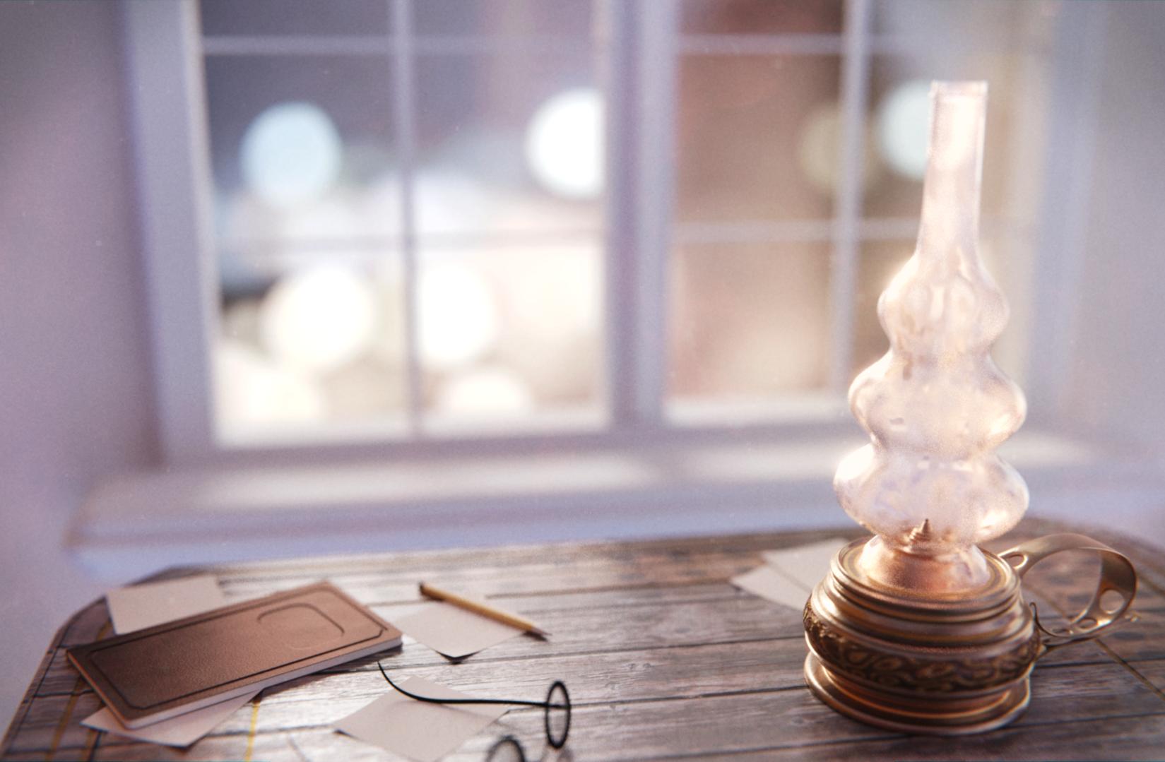
This needs a better composition. It is strongly unbalanced with the lamp weighing the right but virtually nothing at the left. The window is lit from bellow? The other objects are ugly, especially that notebook. I like the way the lamp is lit, though the lighting doesn’t work well with the other objects. It would have been best to just focus on the lamp. Crop the image and remove everything else. They are just are just detrimental to the whole image.
First, thanks for the reply. True, they are quite bright but i tried reducing them and the image lost much of its visual energy, it turned out duller (if such word exists) and not much appealing. So i chose the risk of having two elements and not only one. Those other takes felt flat to me, this one is stronger but still pleasing to the eyes, at least in my opinion.
I hope i am objective however, which doesn’t always happen when you’re looking at your own images
Thanks for the comment, it allows me to clarify a few choices. Maybe i am not objective but to me the image doesn’t feel unpleasing or unsettling to the eye. The window is giving weight to the left, and as sundialsvc4 said (post above) that’s quite a strong presence.
The window is a flat image with an emission shader, i know that particular photo is not a perfect match with the sun lamp but it has the feeling i wanted for the image and when i saw it on pixabay i thought that’s the one.
I know it is not realistic, those street lamps don’t match with the sun coming through the window on the table, but they have visual impact and give energy to the image.
That’s curious, one of my very first takes (the ones i do before recording the video) was quite close to the one you are suggesting, a square image with only the lamp, the window and the table. However, the square image felt very cramped even if i zoomed out, so i experimented with different ratios until i chose this one.
At first i hoped the wood table alone would fill the image but that didn’t happen (especially after i widened the view), so i had to add other objects.
And yes the other objects are simple but they’re just there to fill the void, and they’re mostly blurred too so i saw no need for more details that we won’t be able to see.
But i can’t say if they’re simple to the point of being ugly, that’s up to individual taste.
It is not that unpleasing or unsettling, but it isn’t really pleasing either. The composition is just weak.
The window doesn’t balance the image because it is in the background and blurry. It is distracting though because it is so bright. Also, energy isn’t always good, especially for background objects like the window. It distracts from the focal point. In fact, many people deliberately blur or remove the background (remove energy) so it would not interfere.
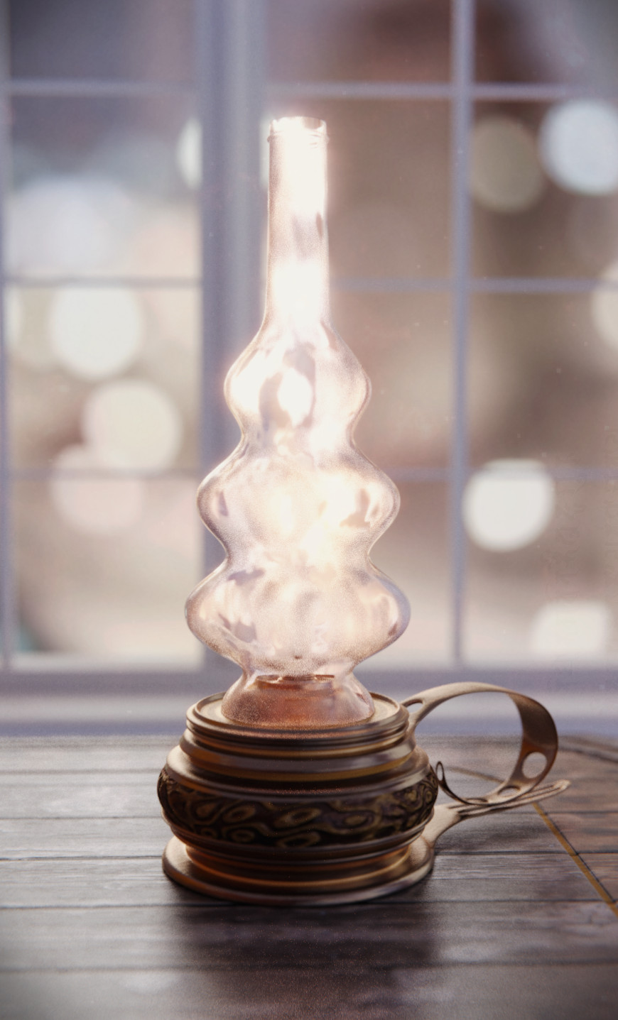
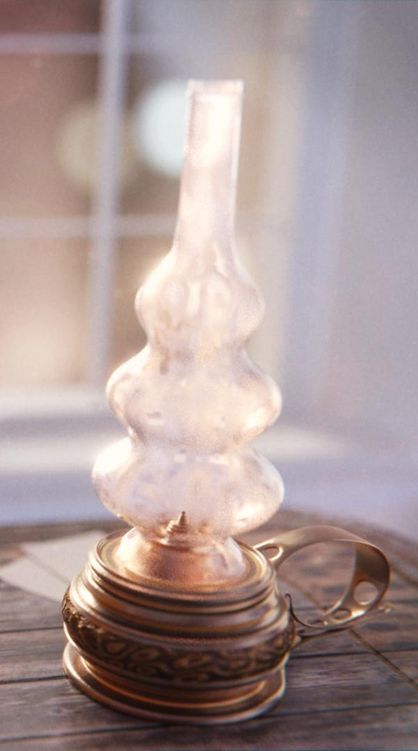
Square, is not the best shape for this. It doesn’t harmonize with the lamp’s shape. Here let me crop it for you:
Some more space at the bottom and top would have been better, and a few little more space at the side, but I can’t add the missing things so this is the best crop that I can make.
The other objects are ugly for me because of the lack details. They just look very CG compared to the lamp. It is the uncanny valley phenomenon.
i like this angle too, and i agree with you, it’s a better way to show the lamp… but that’s not too different from the camera angles i tried during the making and (at least to me) this way the image feels like it’s missing something… i have the feeling that this is the image of just a lamp, while the wide one i decided to use is more of a composition, like it or not… i know in the title i wrote old style oil lamp but it would be ridiculous to write old style oil lamp with bokeh window and wooden table…
clearly this is simply my opinion, and other people with different ideas will think differently, which is a good thing… we are 7 billions on this planet, if we all thought the same it would be boring…
and i myself like these angles very much, they also make the wood look better, so i’m editing the first post to include them… they are different from the idea i originally had in mind but they are indeed better to show the lamp alone… and again thank you for the replies and the constructive criticism, i like to hear other people’s point of view