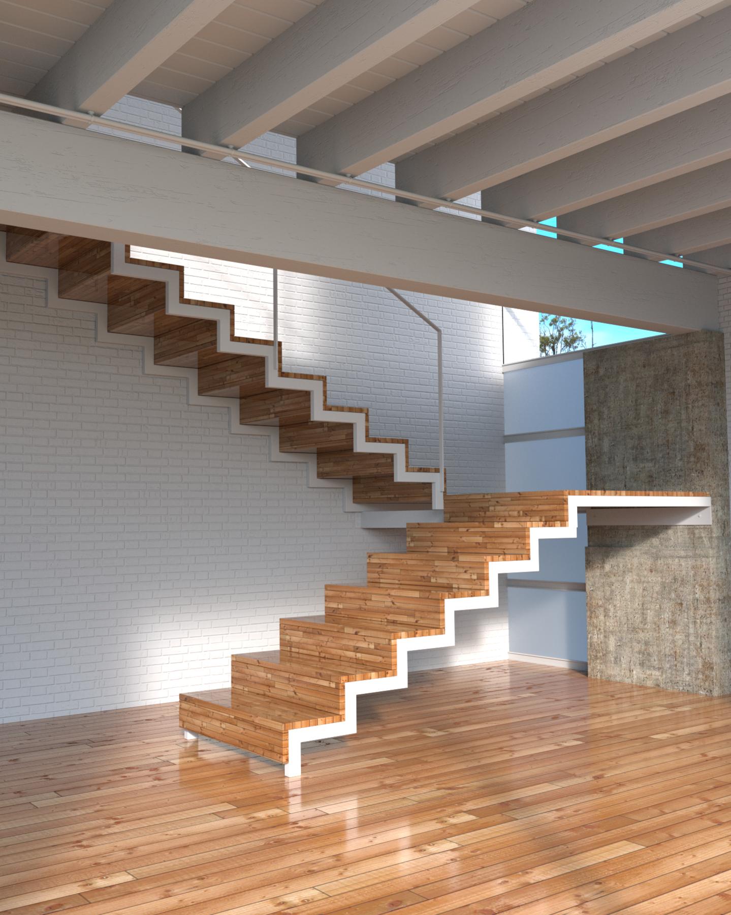
Hello,
I share with you this render of simple interior scene. I would like to have some feedback from new eyes. In particular the lighting and the materials.
The stairs are very neat but…
you should turn the glossiness down a bit, it looks like it’s made of ice
You should add a bump map, generating it for wood is very easy
There isn’t really much going on, there are too much unused place on the picture
Some skirting for the brick wall would be nice to see
Put something on the wall
Hey, nice work. I like it a lot, even thou it’s not that creative work. I would also take a second look over the shadows. That shadow beneath the stairs it’s not that great.
Make the concrete wall also more soft, you wouldn’t want your kids to be to close to your wall because they could get scratches very easy :).
Also increase the bump on the wood on top.
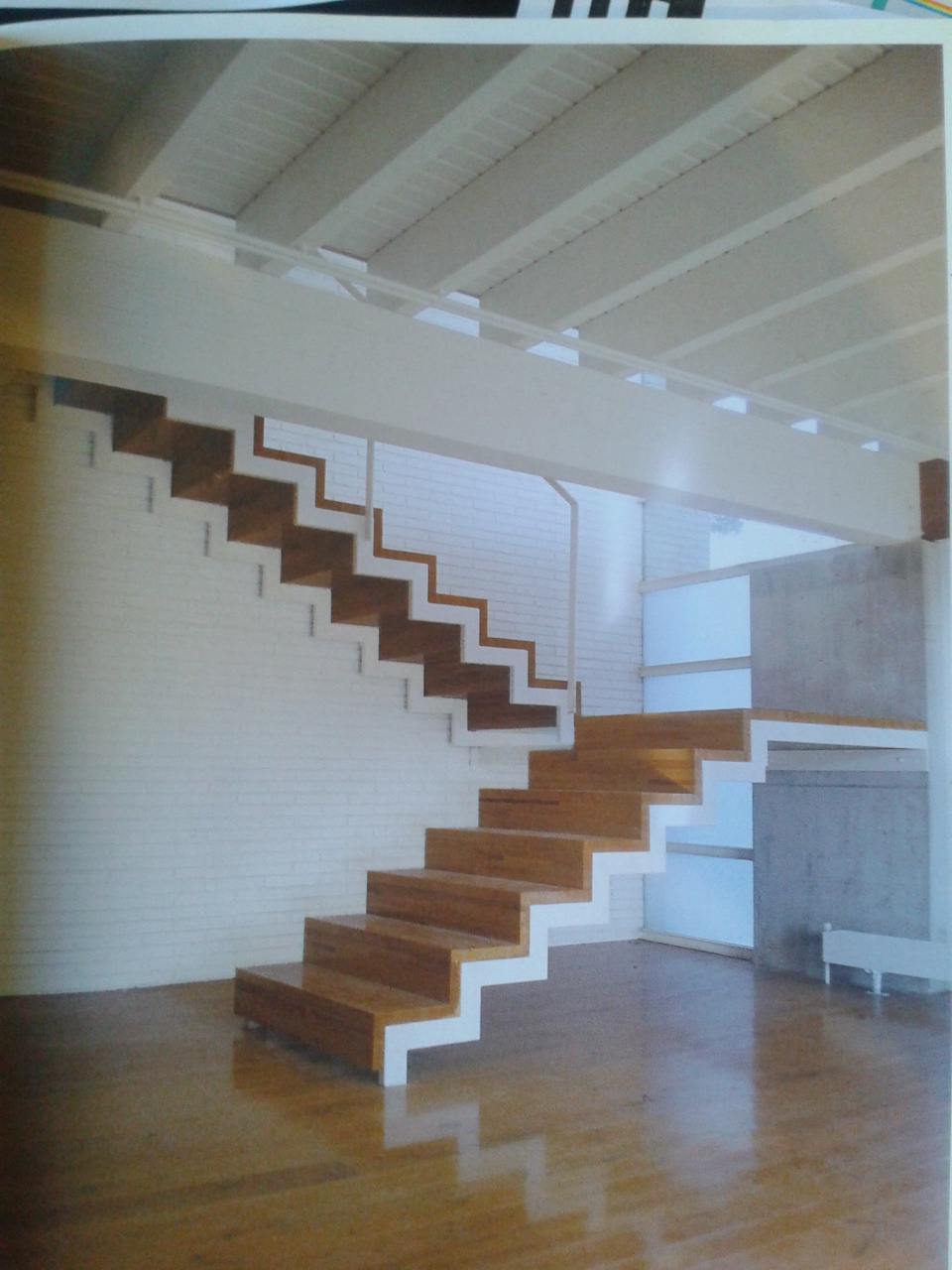
Keep the white balance as it is, I personally like it more in your render than in the magazine.
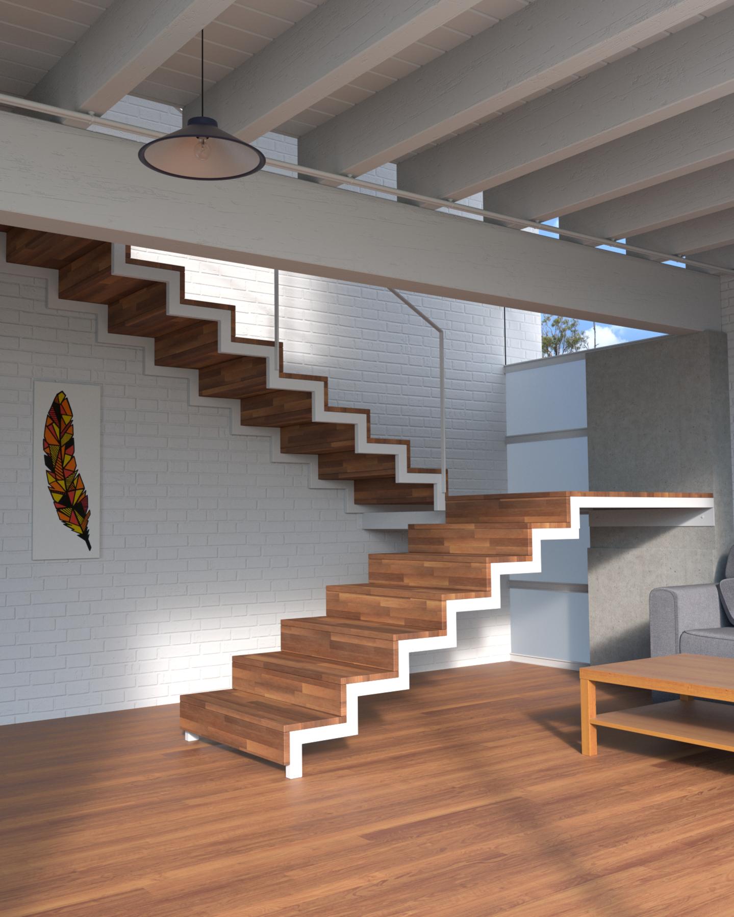
I made some changes following the feedback I’ve had.
I modified the sky in the background, the material of the floor and the stairs and added some objects, while keeping the sobriety of the reference.
The plume picture is not mine. I used a paint from Leïla Thébault.
I will modify the lighting and add some details later.