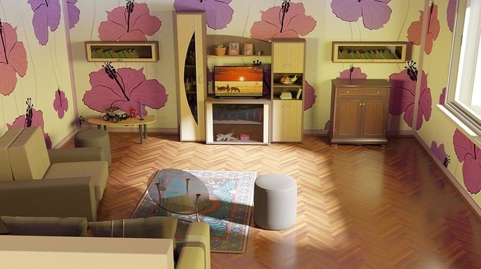
Hello people, I started my second interior but first lets say ‘serious’ interior. So I want to hear your thoughts so I learn and upgrade. Thanx!
Maybe reduce flowers or change the wallpapers. right now, the eyes are drawn to the flowers, cus its the only thing with colors in it.
And the scale of the chair seems a bit to big, and the cupboard and shelfs seems too small.
But all in all, its nice modeling and good Lightning. Rug could be bigger to.
I agree with the comment above: the scale of either the table or the chairs is a bit off, and the wallpaper is a little bit distracting. Also I suggest a change in the camera angle. It makes the scene look a bit cramped, and I’d imagine that to take a picture like this you would have to be standing on a stool quite close to the ceiling, which is weird. But then, maybe that’s completely intentional on your part.
I would look up some professional room layouts in professional photos. Check out how artists place cameras in rooms like this. Also check out how the furnature is arranged. It looks like the couch in the foreground is meant to face the side of the armchair in front of it instead of facing the coffee table. The coffee table also should be rotated 90 degrees. The angle it is in currently does not show off its geometry well. It looks like it is tilted towards the camera, but fixing the camera position may fix this anyway. Also there is a weird light hitting the back of the couch in the bottom left even though there should probably be a door or something along this wall and it doesn’t make sense for light that resembles the window light to be hitting the couch. Maybe there is a window back there and a different camera angle would make it apparent. I would add a bevel modifier to the glass table so that the edge catches light as well
