why did you choose to make this box almost unreadable?
black and white would be much better.
Attachments
why did you choose to make this box almost unreadable?
black and white would be much better.
Thanks for the heads up. This is likely a theming oversight. We’ll see what we can do to fix it.
I believe that this has been fixed now. Please check and confirm.
nothing has changed.
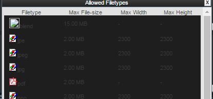
and the ? should be replaced with File Upload MAX sizes"
thanks
You may want to clear caches and what not. I’m actually having a difficult time seeing the part of the UI you’re referencing.
it is no different
what you see in an earlier listing is what i see now
Let me rephrase. How exactly are you getting to that listing? Also, what browser are you using?
In the File Upload Manager, click the help button (?):
I see those dim colors as well (Firefox 52.0.2 on Win 10 Pro x64).
yes i know about the ? which is why i wrote
nothing has changed.
and the ? should be replaced with File Upload MAX sizes"
thanks
Alright. Just wanted to make sure that we’re all looking at the same thing here.
Not sure that the question mark can easily be replaced (it’s an image icon, not text), but I’ll doublecheck on the text styling.
Check now. It should be a bit better on the eyes.
i am sure you can do better than this
more contrast- white fonts?
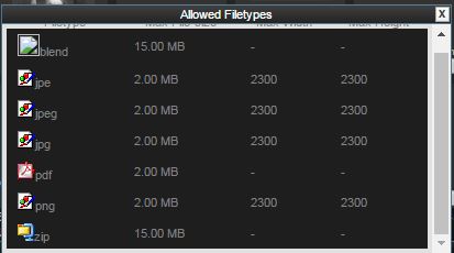
To be clear, I’m not the one who made the specific change. Going full white would certainly have higher contrast. However, I don’t believe that the current setting is intolerably low. I’m actually more concerned that the Blender icon appears to be a dead image link.
we are not all young you know,
i shall give up now.
thanks