Blood Berserk need critics

OK, after so many time I decided to learn rendering, texturing and lighting.
I started using blender because I want produce characters artwork, but after years I use it only for modelling for digital prototyping. I did some basic illustration before, but all I do was a simple rendering and compositing AO into gimp/krita with some texture under it. It work but now I want doing more and better so turn back to my original goal, doing 3d character illustration with paintish look. What drove me away from my goal was the initial frustration (as all of us, I think) and the idea 3d illustration (for this type of illustration) was more time consuming to be effective on a job environment compared to 2d digital painting. But some of my favourite illustrators use 3d so now want find my way (my goal is arrive as possible near Allessandro Baldasseroni quality)

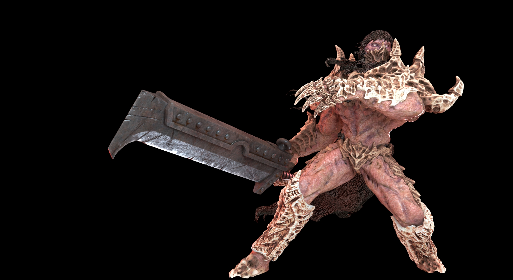
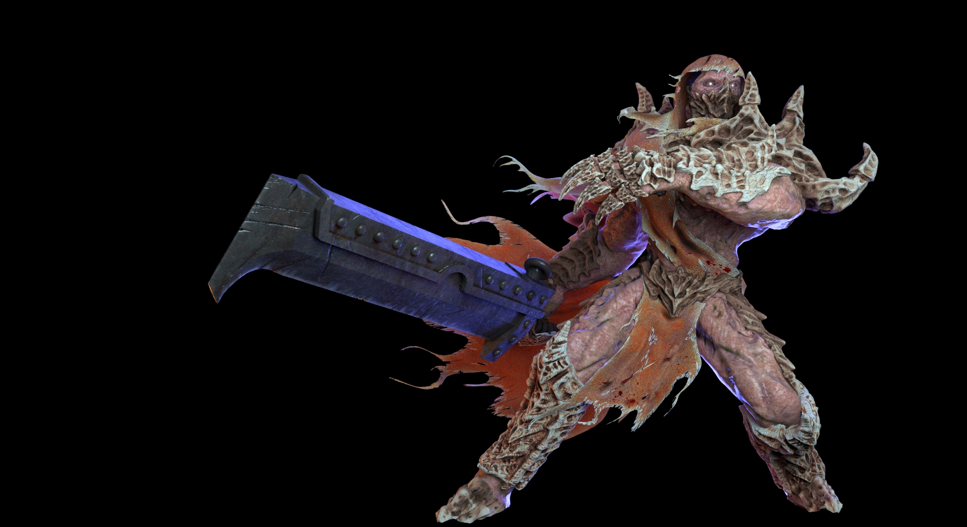
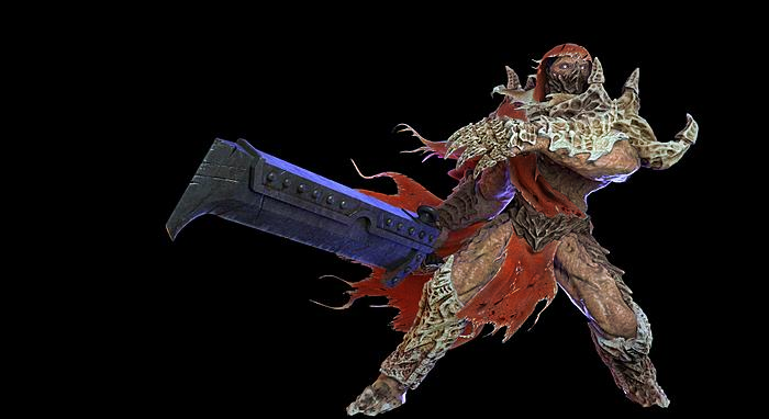
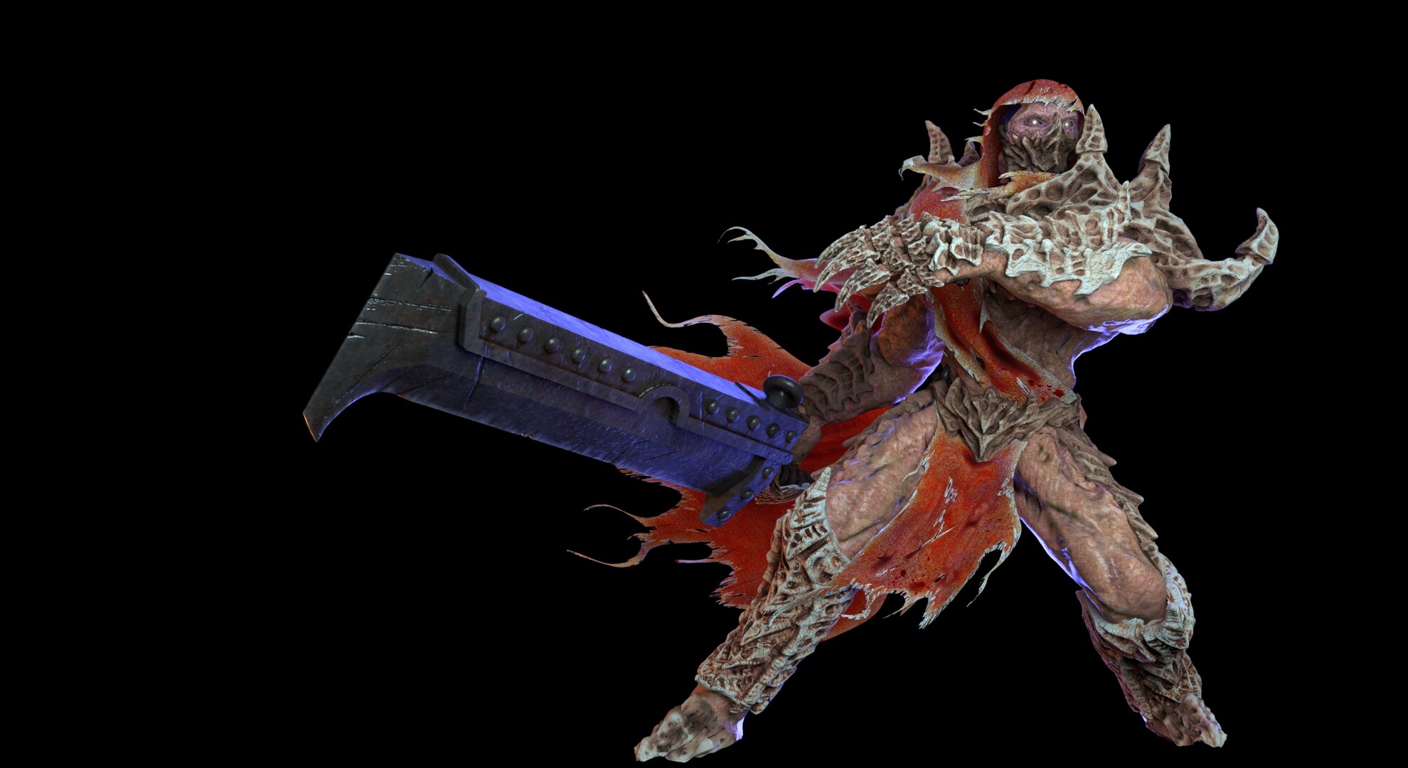
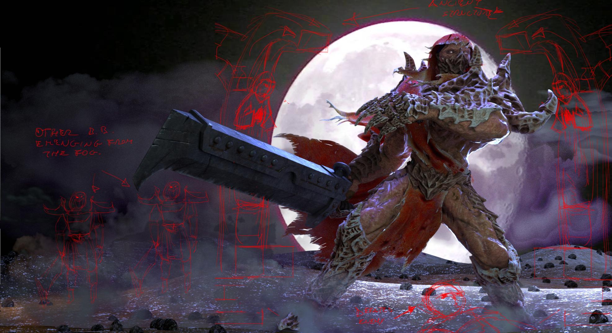
So, this is a model I previously sculpted for printing (32mm scale model), when I did was not designed for doing a illustration, but I like it.

Blood Berserk, is a creature born from genetic experiment. Blood Berserk skin is like burned and scalded, more leathery compared to regular human skin. Their muscles mass is very similar to human anatomy but some change make it weird but powerful on the battlefield. Over the body BB are covered with bone plaques, forming a sort of natural armour, more old is the BB and bigger are his bone armour. Cannot eat, but only supported through infusions of a special liquid at the laboratories that created them. Appear blind but is not clear if they can see or have other sense type.

I retopo the body, start retopo for other parts, but after a test I found more fast decimated then unwarp. So the UV are not the best but is not a problem for what I want want (IMO), I need to find a fast workflow for the models I create for 3d printing. I’m not happy at all about fabric. Feet will be covered by mist, so not a problem and I don’t care about too much. Moderately satisfied about the skin and bone plates

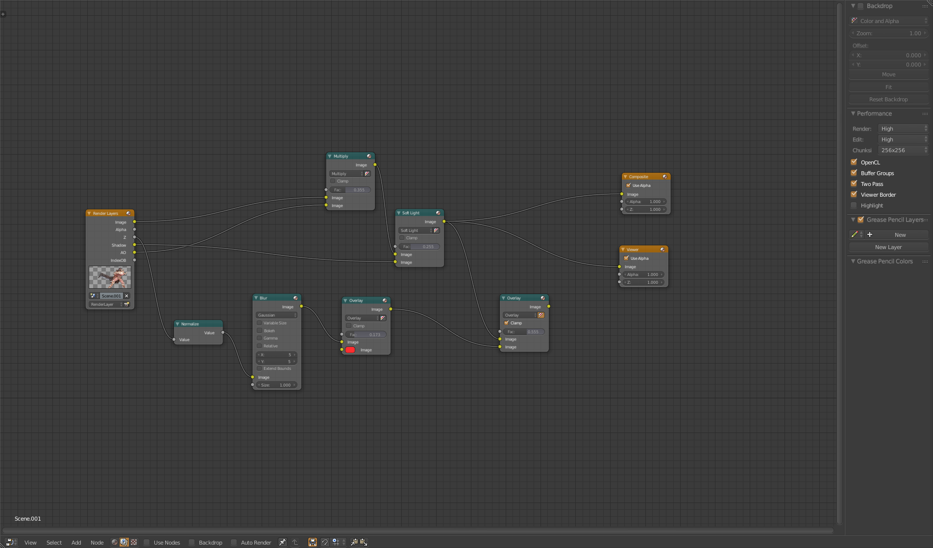
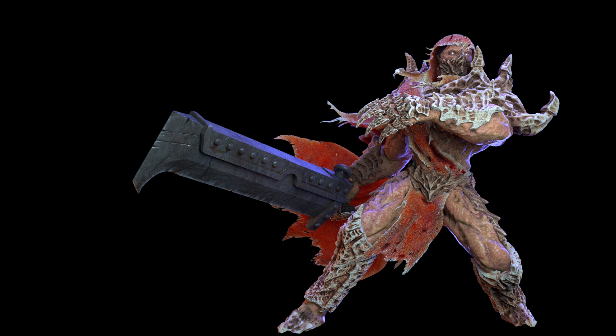
Light are the classic three point area light in cycles.

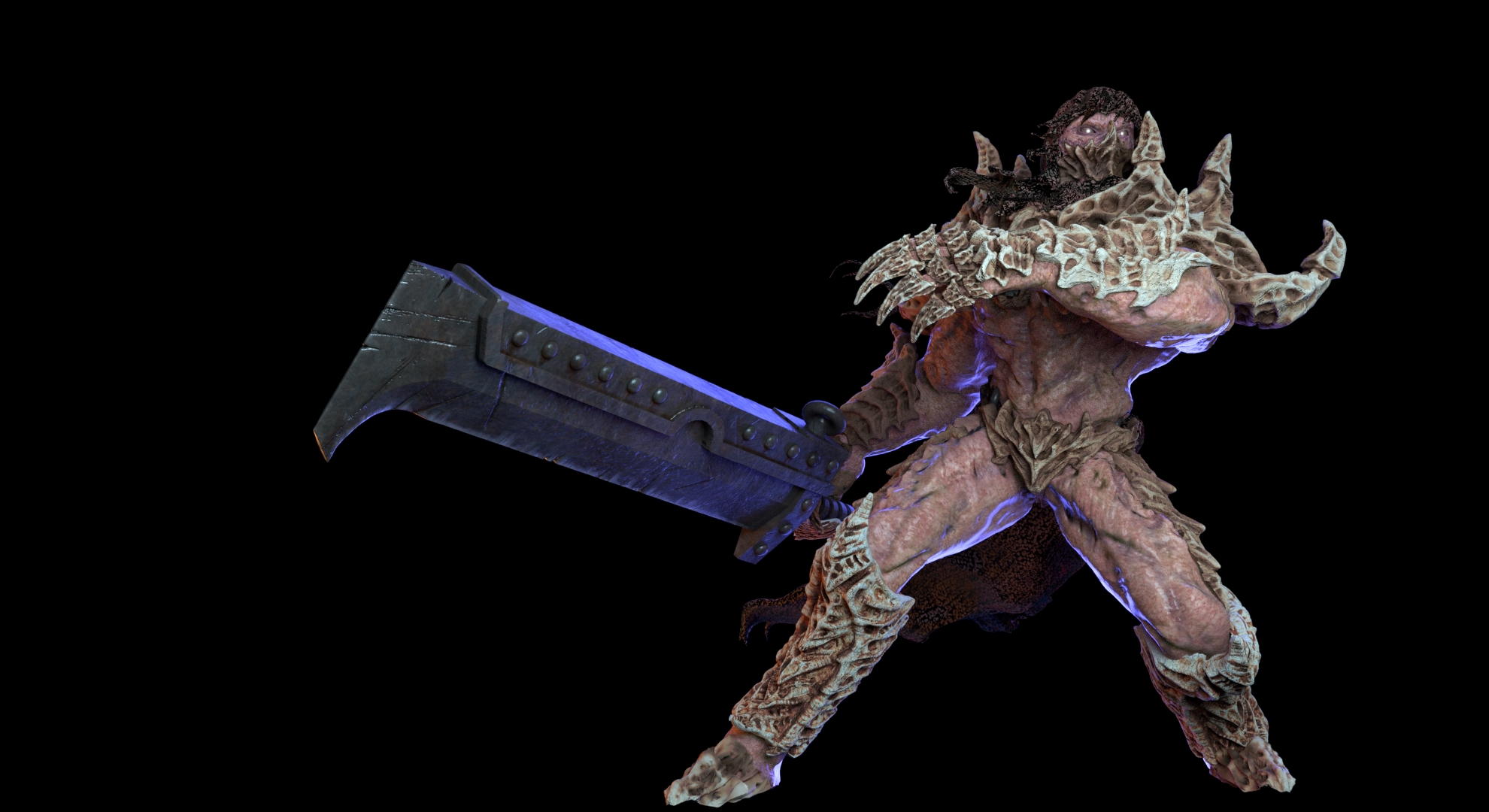
Post production is pretty simple, and to be honest don’t know how doing more or better (layers nodes attached)

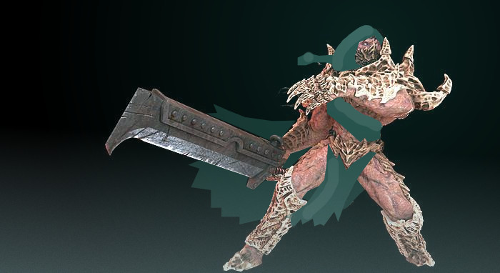
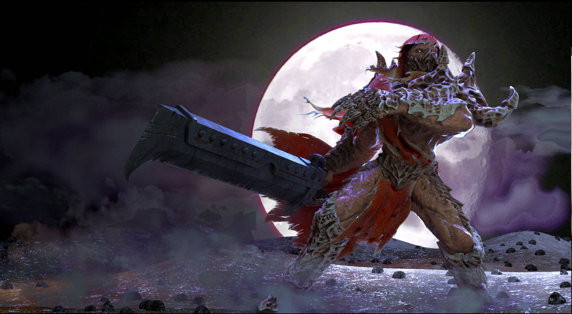
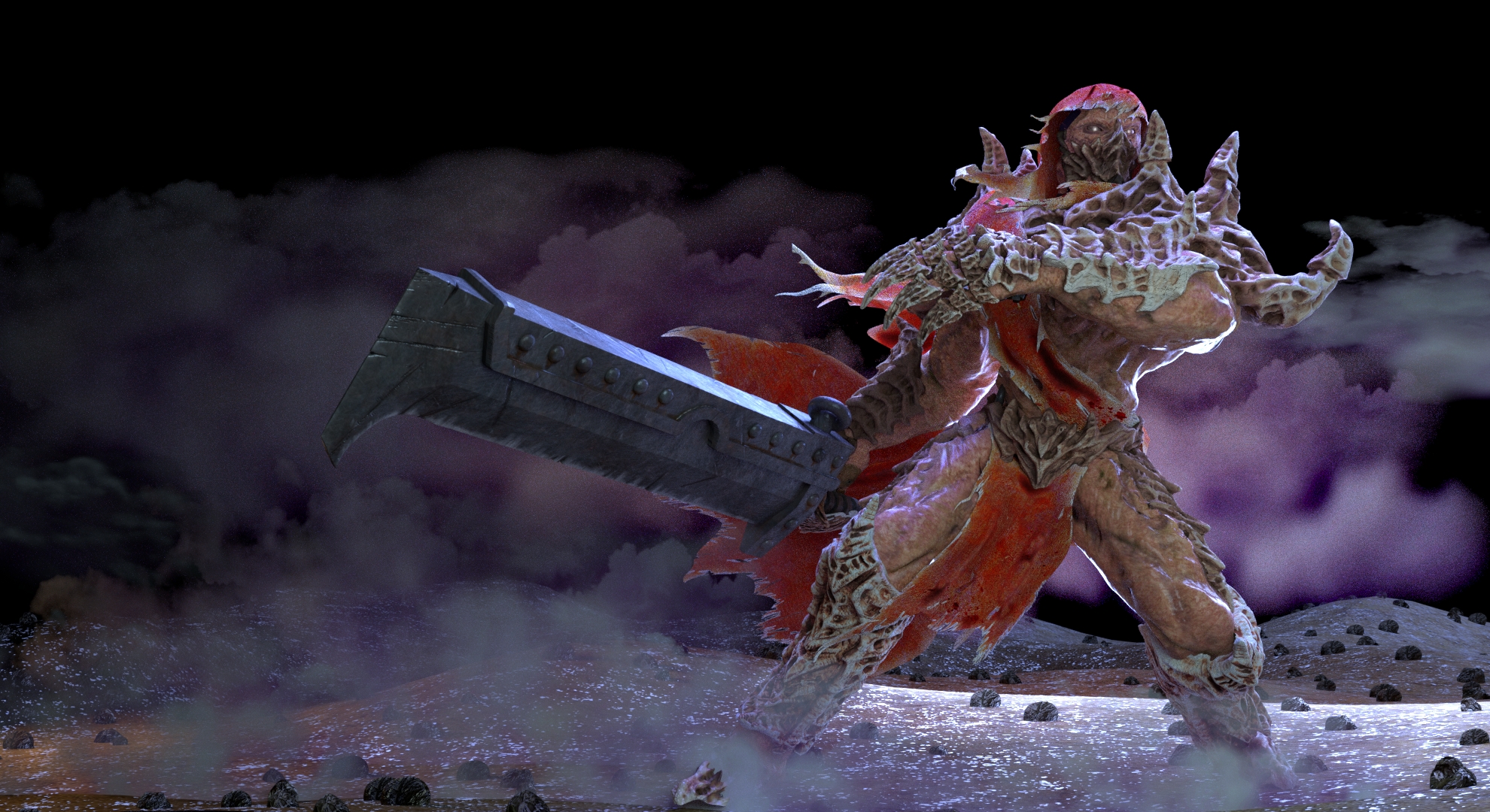
Another point is the background of this image. Want add details and makes it attractive, but also don’t want distracting too much.

Any critics, comment and help are really welcome.

Thanks for your time.

Attachments


Hey man,

very nice weapon and cool pose there! The model is increadibly detailed, this must have been a lot of work. So respect! But I think there lies the first problem: from a general aesthetic point of view I would say there is way to much detail all over the character. The viewers eye has nowhere to rest. It also makes it hard to read the overall form of the body. I would cover some areas of the body with cloth and make the texture and shading very “quiet”.

I’m not happy at all about fabric.
You can use you disatisfaction with the cloth as a motivator to make this changes. :slight_smile: i agree that you should be very careful with the background. Maybe some dark rocks, fading into black in the distance. But again: Carefull there because you already got a lot of detail.

I made a qick (very quick actually) paintover to show you how It could be done. Just a suggestion:


One last thought: I think if you go for a dark background like this (witch i find very fitting) the lighting of the character is a bit to blight and uniform. You could try a more “sinister” lighting with a hard rim light to make the model pop out and much less key light. This will hide some of the detils too. If you want to show the detail alone, you can always atach a second demo render with just a matcap or something. But for the presentation alone I think it would be better to reduce it somehow. Even though it hurts hiding all that hard work I know. :wink:

So, I hope you find that helpful.

Enjoy your easter hollidays if your into that kind of thing!

Aaron

P.S.: I just looked up that Baldasseroni guy. Impressive portfolio. Not the worst inspiration i guess. :wink:

Thanks for yor reply 4ar0n!

I agree with all you wrote, and I think your paint over improve a lot the silhouette, so not only probably will follow your advices, but also will modify the models for 3d printing. Also I think even the dark grey colour is more indicate for fabric.

Will stay all all Easter experimenting as much as possible with light follow your advices about. My only doubts about is, as you state, the strong backlight will cover too much the model, no interest in showing model details, my interest is the whole result, learn a strong composition and creating a conving and appealing image.

Thanks again!

Hi did fast render test.
I forgot to mention I had an ambient light on world texture (HDRI). Eliminated that now lights are more simple (a minimalistic 3 point lights)
I think now work better, but bone and fabric material don’t work well with back light for some reason (shader attached)


So modified the fabric mesh (as suggest by Aron) and material. Now are more happy about the result. Any critics about before moving on background? Any critics (even harsh, don’t worry) and comments are welcome.

Want add some hair particles on body and fabric, probably will improve the result, will test to day.


You’ve improved it since the first version. So, nicely done. Speaking personally, it doesn’t have much in the way of contrasting values between the different elements. Like the bone relative to the skin, or the cloak. Right now it feels as though the values are quite close, making the different parts meld into each other. Intensifying them a little might help.

A rough idea of what I mean:

Attachments


Thanks for your reply and your advice. Testing soon your idea making more yellowish the skin and a bit more red the fabric elements

You’re welcome. But do try out different ideas yourself. The cloak might look better in another shade. Or the skin could go deeper in colour. Maybe even a small base of sorts would help with presentation, if that’s something you’re interested in. Similar to the ones you might see with high quality miniatures.

Thanks again Macser, agree, but after tested your advices want concetrate on backgeoud, compositing and postpro. Anyway if you other have some other critics about the actual stage I more than happy to know.
What you mean with “small base of sort similar to high quality miniatures”?

Are you trying to put together an interesting image? Or are you looking to present the model itself? I just mentioned a base because I’ve seen quite a few 3d models presented that way. Where the focus is more about the model than the scene.

My goal is a interesting image, an illustration like done by Alessandro Baldasseroni (as explained in my first post I want arrive as close as possible to match the quality of his artwork)

Did a fast test following Macser advice, what you think? I think now is more contrasted, don’t know if is fine for a illustration, but for the moment leave as actual is.


Hi again,

it’s really cool to see your project grow! I think you’ve done a nice job with the rim light and the cloth is a lot better. I think if you push Macser’s advice about value a little further, you can achieve more readable shapes as I was saying in my first reply. Looking at your newest render, I noticed some other things

  1. (minor issue) the shoulder and arm part of his left arms exoskeleton are not distingushable very well. They kind of blend togeather due to the same material and lighting. You could try to adjust the lightng so that the arm has a sharper contour.

  2. I like what you did with the cloth even though I had something more quiet in mind. What you did is really dynamic, almost like flames, witch is cool. But I think you can improve your cloth shader and textures a great deal by observation of the real thing. Some details look a bit random. Also look at how Baldasseroni treats cloth in his renders: Some of the warrior characters on his portfolio wear scarves or cloaks and even though thei’re torn like in your case they make a more uniform impression and are a lot less noisy. I think you can afford to take it down a notch and it wil still look super aggressive.

So again, I hope this was helpful. Have fun going on!

Aaron

Hi Aaron,
thanks again for your post.

Here come some personal technical limitation, I don’t know how influencing with light only the arm for a sharper contour. Cycles, as far I know, had not exclusive light (I mean a light that influencing only an object on the scene. Can play a bit with the back light, or maybe add one, I guess is the only way.

Yes, the fabric are not realistic, not a problem in my opinion, but look too different compared with the model style, so try to modify it. I’ll try to improve general shape, but not sure I can improve too much the fabric material, will study a bit about it.

Again a technical limit about push more the difference between the materials, I tried to follow Macser’s advice but I had some problem doing more without lost actual material look. Again doing another test

See you with more update, thanks

I did a fast rendering after modified the fabric mesh (now look lesser flame and bit more realistic), also modified a bit texture and add (first time of my life) particle hair on the fabric (mix feeling about).
I tweak a bit skin material.
About the arm I add a spot light over the model, some colour of the back light, now is a bit more contrasted, but no a precise idea if I prefer now or before (will rest until tomorrow and will comparing the different light setup)


Now, please let me interject this “completely off-the-wall” comment. I know nothing about the storybook history of this character, no back-story, “no nuthin’” except purely visual concerns.

To me, this is an amazingly visually-busy character whose design works in several ways against the fundamental mission-statement of all such characters:


I am gonna kick butt!”

I: That means, “face!” Eyes, mouth, expression. Everything. How much gee-gaw is standing in front of this character’s face?

Kick”[b]: That means, first(!) [B]fists. Where in the heck are the appendages by which this character will impose his will upon the world?"

Due to all of the “window dressing,” you literally cannot see the character’s hands. (He doesn’t even seem to possess(!) a right-arm.) The same appurtenances obliterate the neckline, therefore the face and head, and in any case appear to occupy almost twice as much “screen real-estate” as the character’s head.

Go ahead and take a design-cue from Disney: their character’s heads are routinely at least one-and-a-half times as big as the rest of them, and if their eyes actually existed, they’d be as big as grapefruits. But they get the job done!

Yeah, there’s something back there that might possibly qualify as a “kewel weapon,” but it seems rather like a travel-trailer: it’s about as big as he is, and in any case he’s not holding it. (Frankly, it looks like he’s attached to the rear bumper of an invisible trailer.)

Hi sundialsvc4 , thanks for your post.
not sure understood all you said, I’m not native english. The backstory is condensed in the fist post.

I’m generally happy about character proportion and general silhouette. He probably cannot move if was real, but is not my aim.
Mouth, hands and other body parts, are covered with bone plaques for a reason described into the first posts.

The illustration will accompany a commercial release of some figures where the whole design is just accepted and will be produced in the next months.

sorry, doubled post

I did a fast composition. Actually not sure about, only another test (note can change the materials and light anytime), let me know your thought about. I diminished the key and side lights increasing the back light, now I see I have over-exposition on the left elbow.
The mist is an element I must add because is part of setting.


While I think a scene is important to add some interest, I’d be wary of letting it overpower your character. If I was asked which image I’d like to see developed further it’d be the first one of the three. I think the lighting has enough to show the form of the figure, without washing out the contrast. I’d keep the moon a little less bright in the final version though.

In the last one, it looks like you’re considering a few other elements. It could help lend some context to the scene. Or give the viewer some information about the setting. Although I wouldn’t let it draw too much attention from the character.