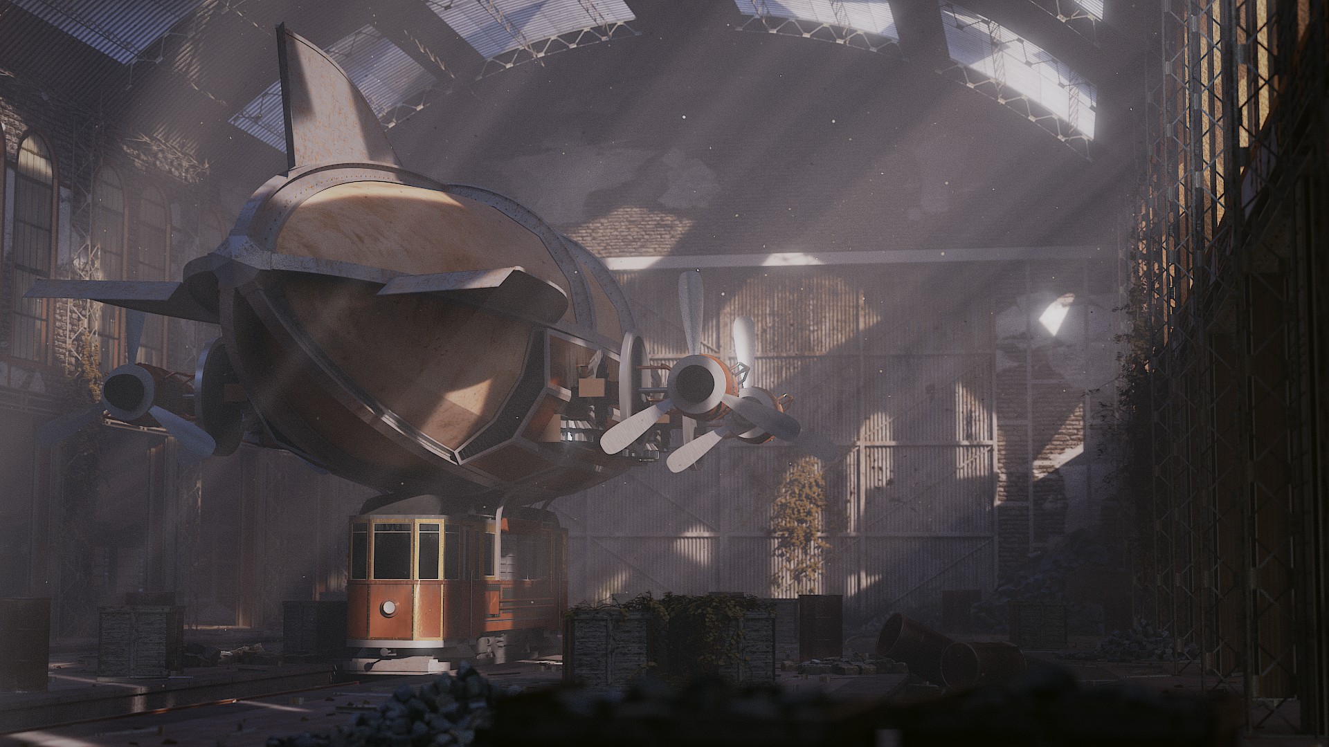
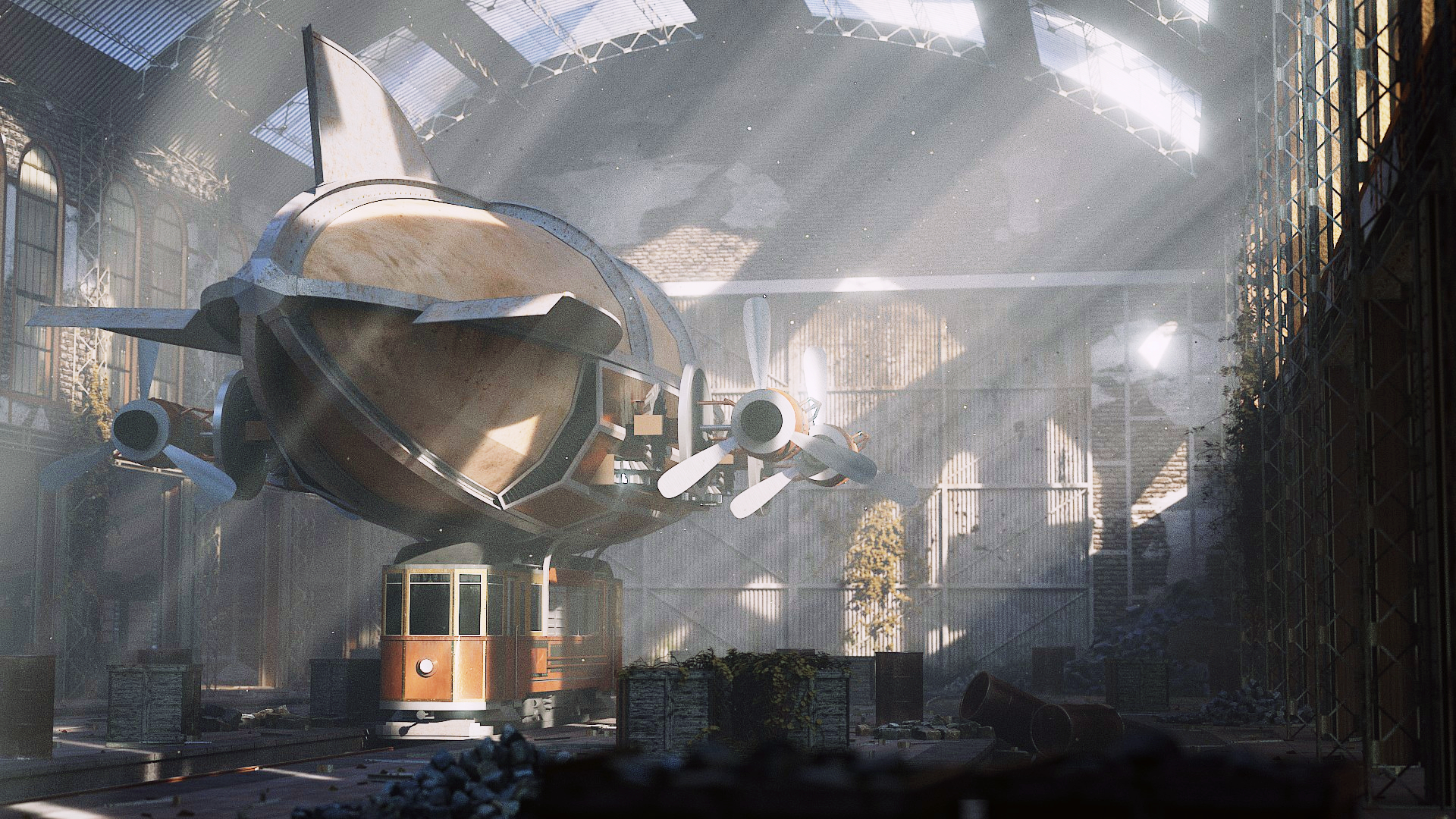
Nicely detailed. Washed out. Lacking depth clues and a sense of the front of the airship, I could be persuaded that, having very-improbably landed on top of a streetcar (that isn’t on a track), the front of it could be sticking out of the front of the building. The lower-left blade of the left-side propeller is virtually lost in the mist: consider turning off the “misty god-beams” altogether. “Gratuitous beam details” in the mostly-invisible right wall don’t match the left wall. Those beams are much too flimsy to be structural members and if so what are the bricks for? There is a “bluish cast” to the entire image.
@foxrender, well I started it in June 2015, but it was on pause several times, I worked on other projects. I took a long time to play with the volumetric light, to adjust details, and work on the composition.
@sundialsvc4, I’m sorry I did not get all you said… it’s a streetcar (being on a track) converted into an airship by adding on top air balloon… You’re right I set the windows on the right wall invisible, I should not, so we see shadows from the window inner frames. The beams on the walls were just to support a bit better the whole brick structure. The bluish cast? I did a bit of color balance and the rest comes from the HDRI… I did not see that was so obvious…
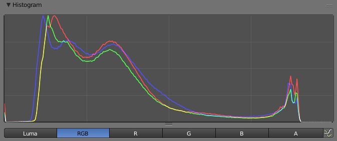
A good thing to do both with a render and with a digital (or, scanned) photograph is to use the various tools such as Histogram. Also, to use a “spot meter” to sample the lighting at various areas of the frame against another. I used the term “washed out,” not intending to be perjorative, but rather to refer to both a general bluish color-cast (evident throughout the frame) and lack of contrast. For example, even if there are god-beams streaming down on the dirigible, I suggest that the back walls should still be darker and maybe have some sunlight playing across their features. Also, things like one corner of the streetcar being clear while most of it is indistinct. You’ll see a curve distribution with a large spike on the high end (especially in blue), and an opposing spike from the nearly-opaque junk in the foreground. The curve should be much more bell-shaped. [i](See Ansel Adams’ many discussions on his so-called “Zone System,” noting that it was devised for paper not video (subtractive vs. additive color) yet still is meaningful in general principle.