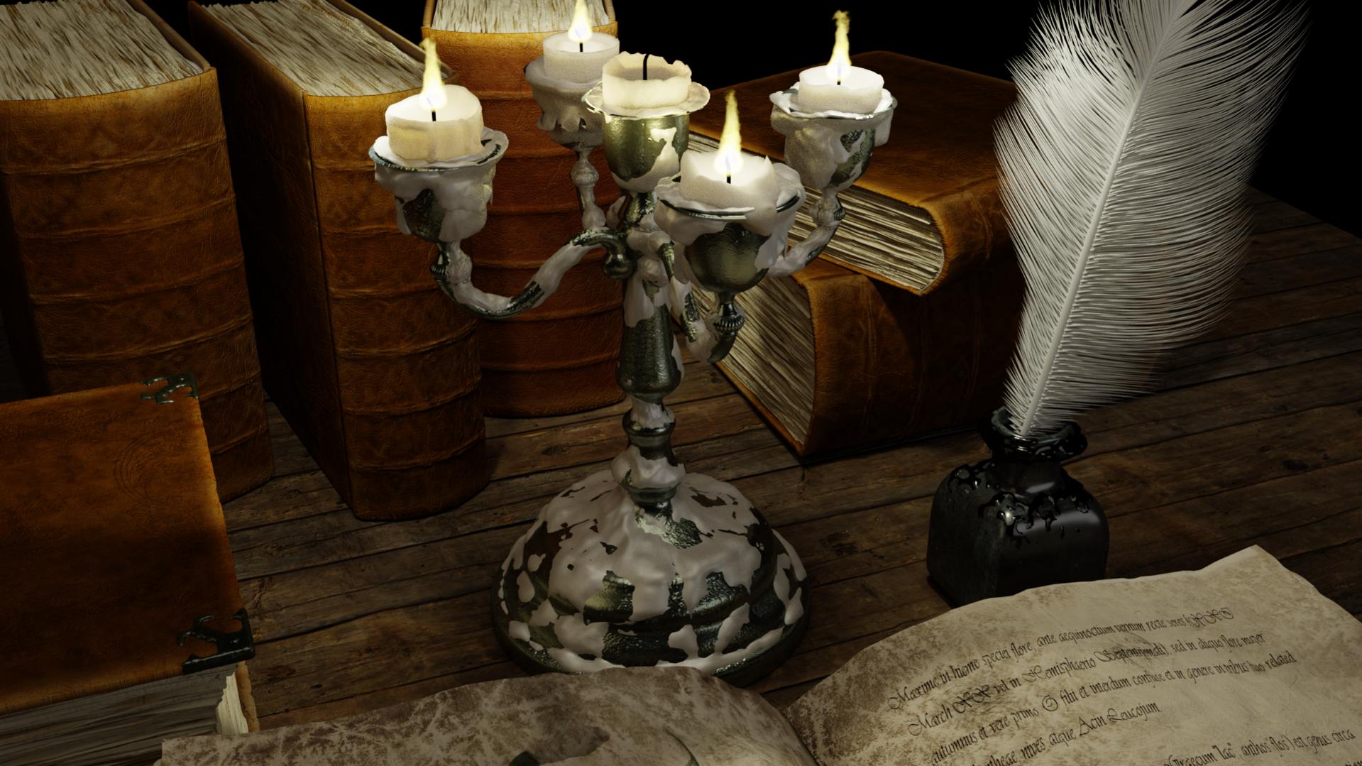
I know that I have posted almost the similar picture in “Finished”, so this is quite the opposite of what I’m supposed to do… but never to late to learn :).
Every time I think it’s finished, I find out some more stuff that I just “have” to do on it. The last change was that the Candelabrum did not reflect the candles… but now it does :).
I don’t know how you think when posting an image, but every time I don’t get a single comment on an image I automatically transfer that in my brain to “Ok, this what not a picture that gave any reactions… so it must be better than bad, bad worse than good. Have to do better next time!”
BUT, to do better is to know what you are doing wrong, so if you have a minute please give some feedback on what I could do to get if from “OK” to “Wow!!” :).
So, here is the picture and if you feel like giving a comment, be honest. I can take it :D.
I added more light when compositing (glow effect), so perhaps I did over do it. You can see the image below (before I did the compositing) if that’s better.
About amount of stuff… perhaps. I would like to show all those books, but it could be that I liked the candelabrum too much and by that loosing the focus from the open book at the bottom. How about if I lower the camera a bit? Showing more of the book and less of the candelabrum?
About the light. I would like to have it dark. We don’t get that much light from the candles, so I don’t know if I should change that. The tone of the colour… hmmm… yes. Could be that some parts should have a colder light. I have really tried to make it warmer ;). I’ll post a picture from the start with “original” light on, which is way colder.
I think technically you have done a gr8 job on all the renders. May be some blender gurus can provide better advice on that part.
When I look at the image i feel its a good render, but I do not have a reason to look at it again. There is no story/mystery keeping me to explore more. I would say, may be take a step back and think about the story/idea. This might give you ideas on what elements to remove or add and what to focus on. You will have to explore some compositions also (from movies etc) that would fit the focus element.
By the cool tones I meant that overall the image is very warm (which is fine) but adding some cool color (like moon light coming from the right) will balance out the image.
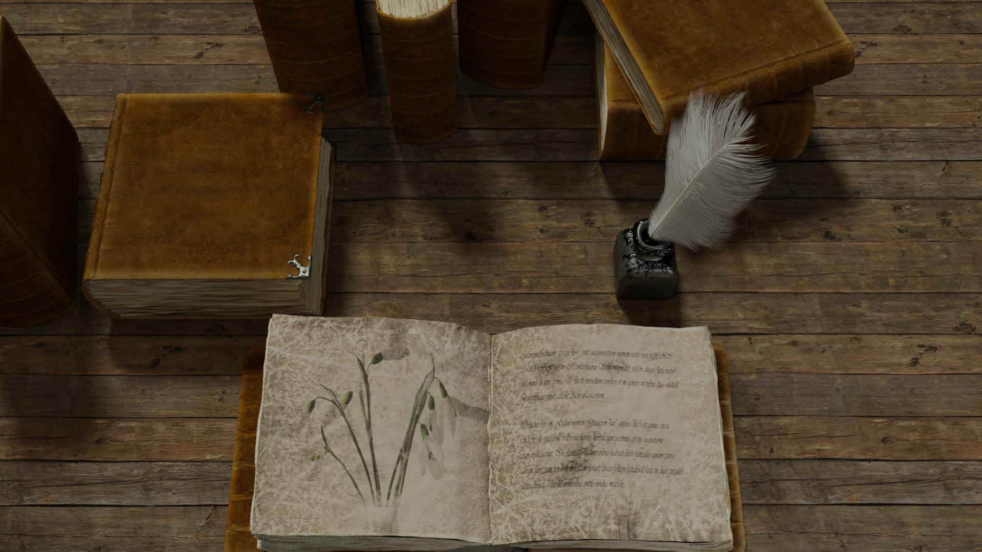
Ok, so I’ll take the feather pen out, make a perfect text that slowly starts to get harder and harder to read because the person have a hard time (will die in a few seconds) and then an unfinished word and letter… the feather pen over the book and the ink container on the side with ink pouring over table and the book?
(And a cold, blue light of the moon shine coming from the left…)
Then I’ll be back in a week or so :D. Was just kidding a bit with the story, but I’ll seriously try it.
Could be a really good challenge!
A real thank you for the input!
The candle light is red from what i know. So your lighting is a big factor here. Also the leather material for the binding, you might try some other variances. Wax on the table as well makes sense if you are using the sconce, some ink on the part of the feather that touches the ink well is an idea. I feel like the feather should bend more. Try natural beeswax candles perhaps. Tassle/ ribbon book marks. Sample of the dried plant being drawn. Scientific instruments, Mortar pestle type stuff, beaker, burner, sulfur,
It seems like I have two paths to go and I stopped before entering either of them :). One is to simplify according to the first suggestion and the other is to add a lot of stuff as you @springwatet suggested to get a more scientific/magical touch to it.
I have now taken out the pen from the ink and changed the feather. Will probably make more variations of the book covers as well. Then I have to think about the goal for this piece I think. It started out just like a texture exercise… but an image should tell something to get noticed. On that we all can agree :).
I should add that yellowing is common in old paper, in modern paper there are special expensive types that don’t yellow. I don’t think it will necessarily be the number of objects, but there are ways (dark an uncountable)
to achieve the composition you are looking for, This can me achieved through lighting, highlights in some areas, color,focus and defocus, foreground objects, atmospheric effects. Personally, i like to think, would I put this on a wall if I we rich and had lots of walls or the space to do so? And for this picture, it would take something special, dust in the air, a dagger, a note, herbs, A virgin immersed in arcane study. lastly, pollywog’s in a jar. Ok, I’ve said it all now. God save us.

 but just to probably give a few pointers …