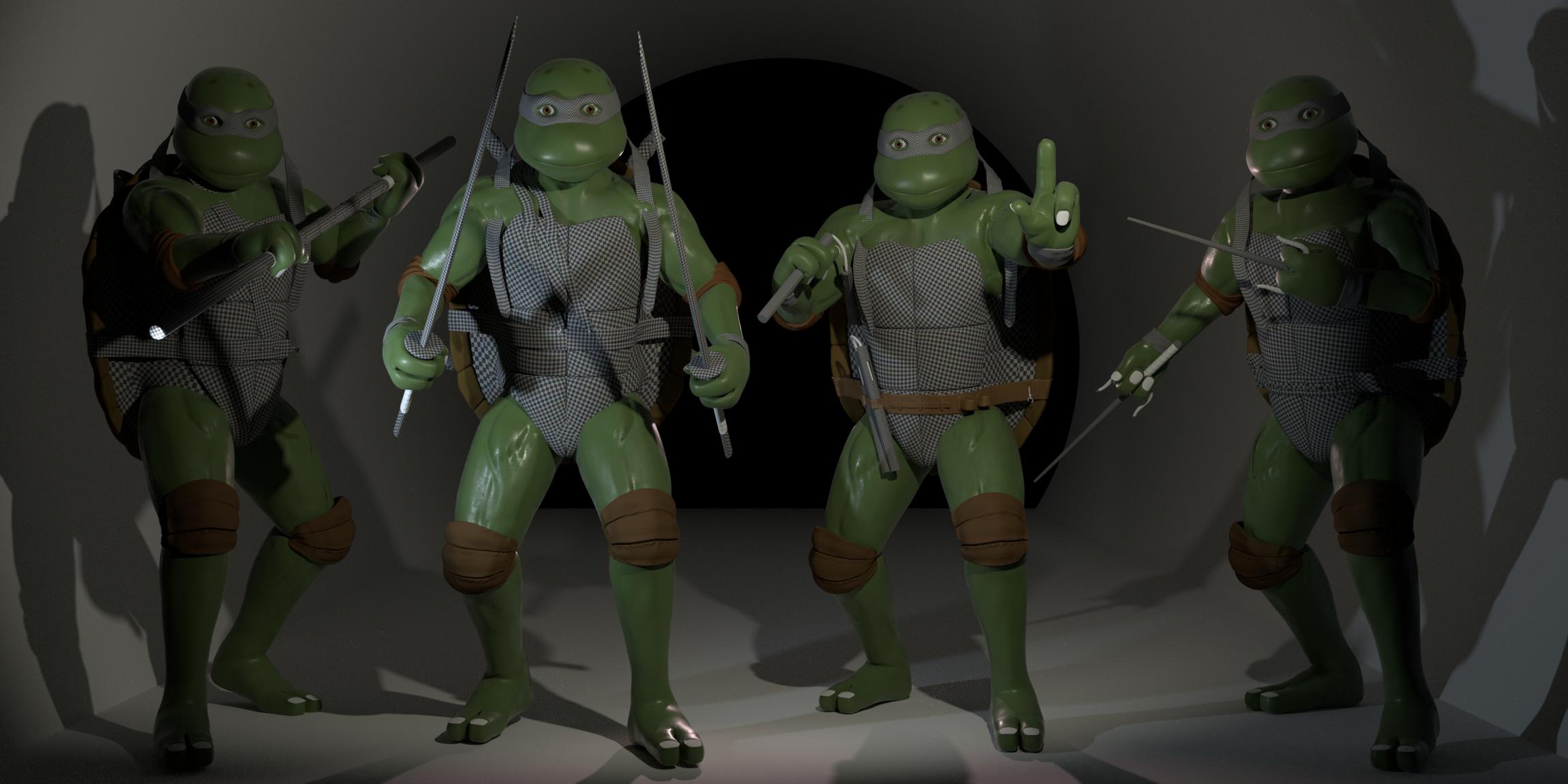
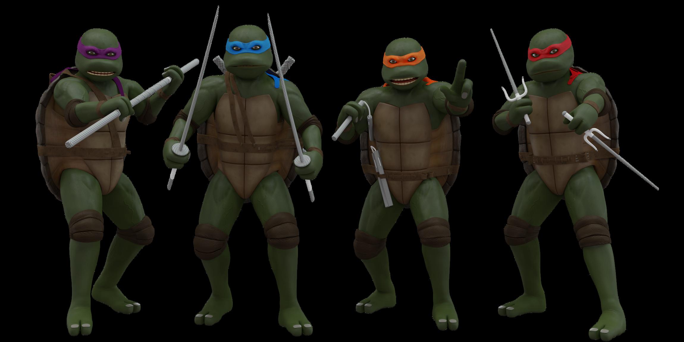
Updated.
This is what i got so far.
Feedback appreciated.
What should be the background?
A sewer? Streets? pose them differently?
Hows the materials?
Cheers!
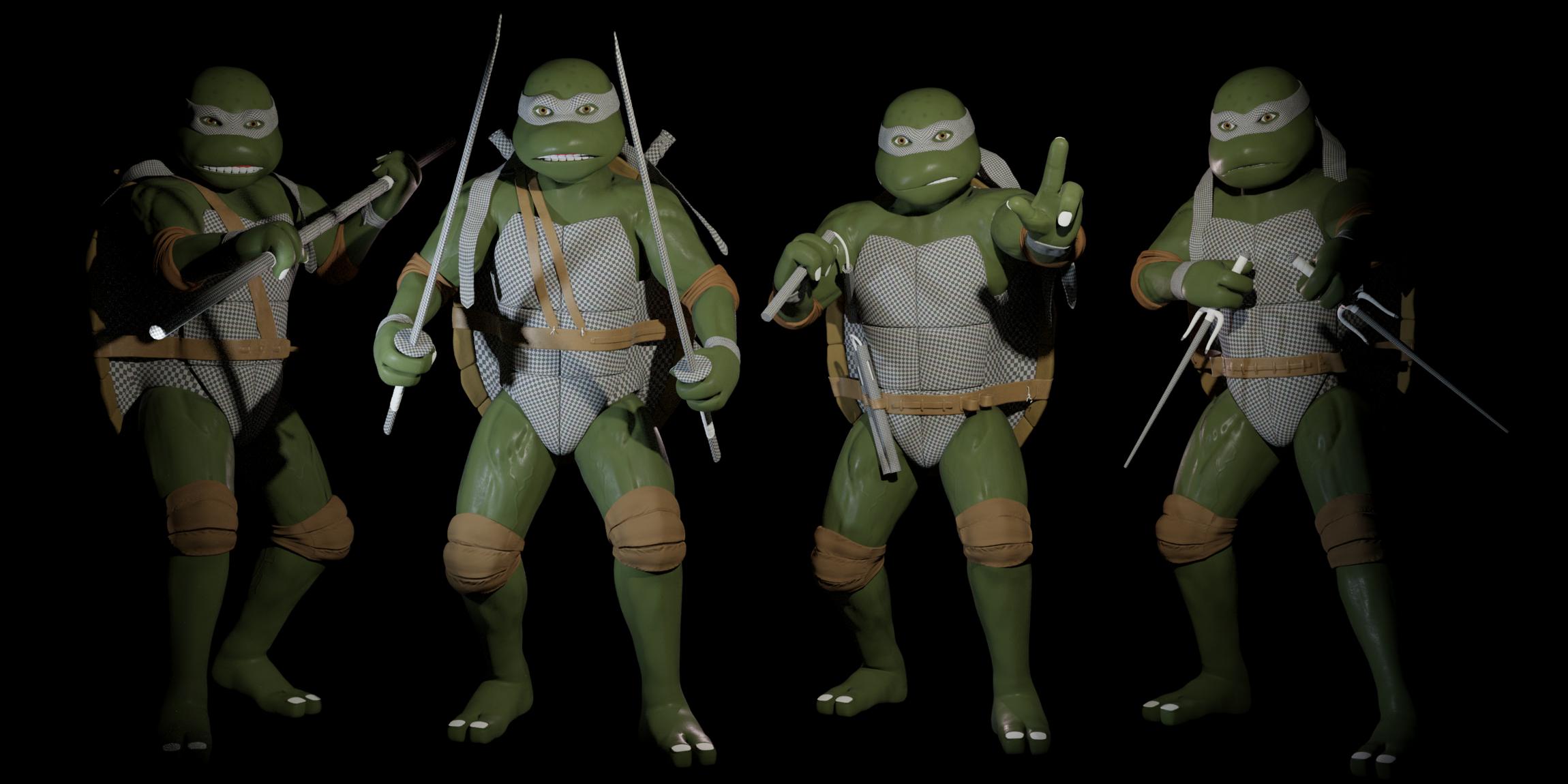
Updated.
This is what i got so far.
Feedback appreciated.
What should be the background?
A sewer? Streets? pose them differently?
Hows the materials?
Cheers!
I don’t get it… you don’t like the cgi version because it have to much 3D and you are doing them in 3D?
but hey ok, now, your models lack in anatomy, the references images I find in google all have really visible the anatomy, so is not that you didn’t find it, is that you didn’t put it in yours models, any particular reason?
Maybe if you put some ground so we can relate to something for the pose.
Keep it up you are almost there!
Hey, no i dont like the CG version because they look like they are on steroids, and the constant action and Quick cut-scenes just kills it and is giving me a seazure. I like the classics 
What do you mean they lack in anatomy? The models themselfs arent anywhere near finished. I really just did them really Quick to have something to use as i set up my scene. I will ofcourse work on them alot more after i finish how i want them to stand.
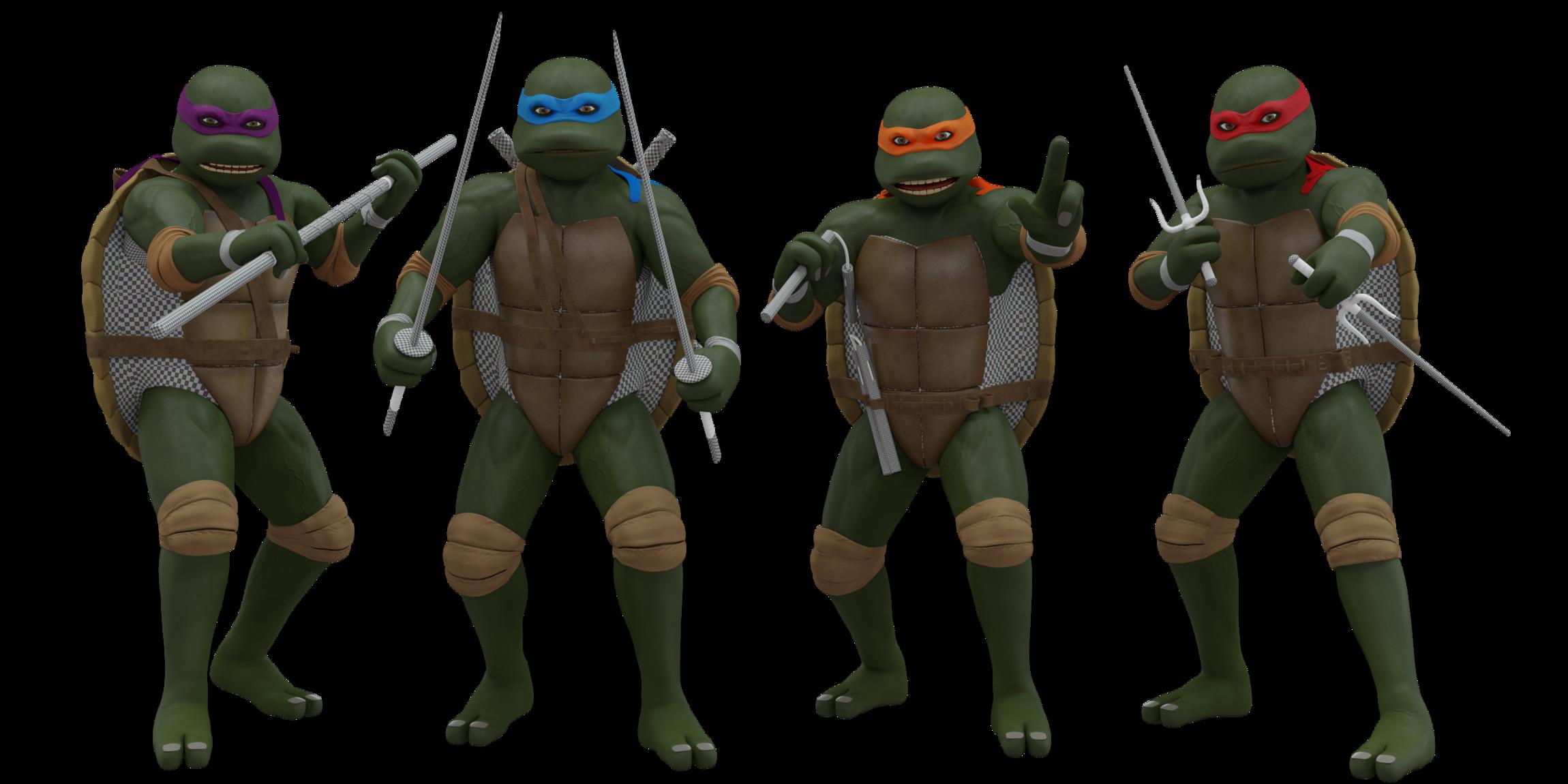
Well that is more like it! The pose is very similar on every one, but definitely you have improved them a lot! But the original caractera had more exagerated muscles, not biger, but exagerated transitions. Maybe you can make,that hapen with textures, ao or dirty vertex
I understand what you mean about the last movie… But not for the use of cgi, but for the artistic and directional part.
I’d suggest just looking at some comic books / manga for references, that stuff is all about over the top hero poses. Google comic splash pages or anime promo posters and you can probably get some ideas.
Also I feel you on the reboot aesthetics. Pushing stuff for the sake of pushing it. The 90’s look was gritty, but still had a clear clean silhouette. You’re capturing it well here.
Their faces look like their about to cry. Also, why do you hate the reboot designs ? Those were awsome, the movies by themself sucked. The 90’s version just have the nostalgia value. And also, even in the 90’s version, you could tell the turtles apart from one another without looking at ther bandanas or weapons- mostly by their physicque, colors of their skin. Where right now their just like “shift+d”.
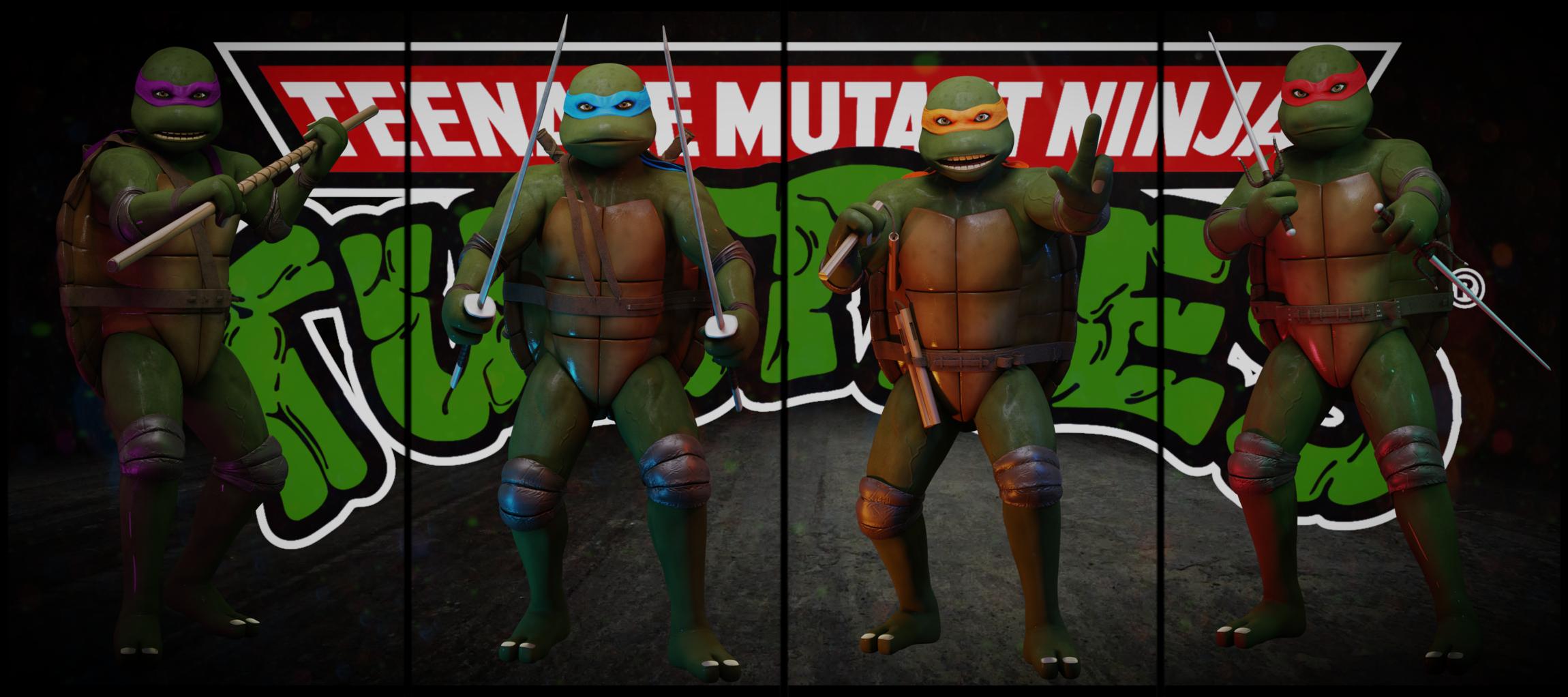
Was this done in cycles?
Yes. Why do you ask?
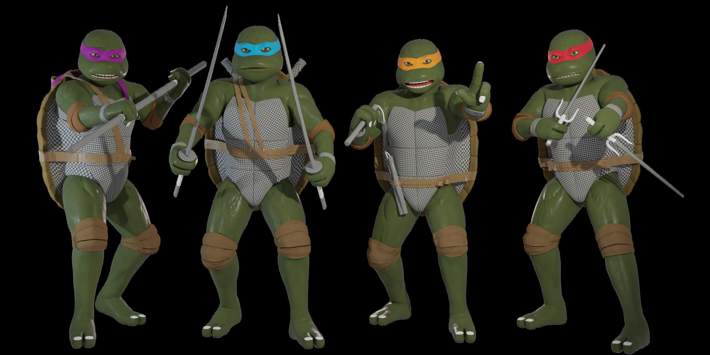
This is wat i got so far.
Later tried this, hmm…
And this. Also tried SSS for the skinshader but it didnt do much difference except increased rendertime.
Any feedback so far?
Latest render. Im trying to do some materials and stuff cuz i really do suck at rigging and posing.
Any feedback so far?
it looks really good - I like this kind of graphics!. But the background is bad (logo is ok, but it’s disturbing the view). You can make a movie with these turtles :). I liked the turtles cartoon and games in my childhood.
You could make backgroud like this
https://i0.wp.com/www.dzikabanda.pl/wp-content/uploads/2016/05/Tmnt-coverspread-IDW-1st-issue.jpg
they could stand in the water. but the water is hard to configure to get a good effect. the logo could be above them :).
edit: top light could be more intensive. The colors are a little bit dull (if I call it precisely in English)
I liking it judo chop sorry u dont have to take my criticism maybe just the lines and the feet need a bit more scuplt, other than that superb matey