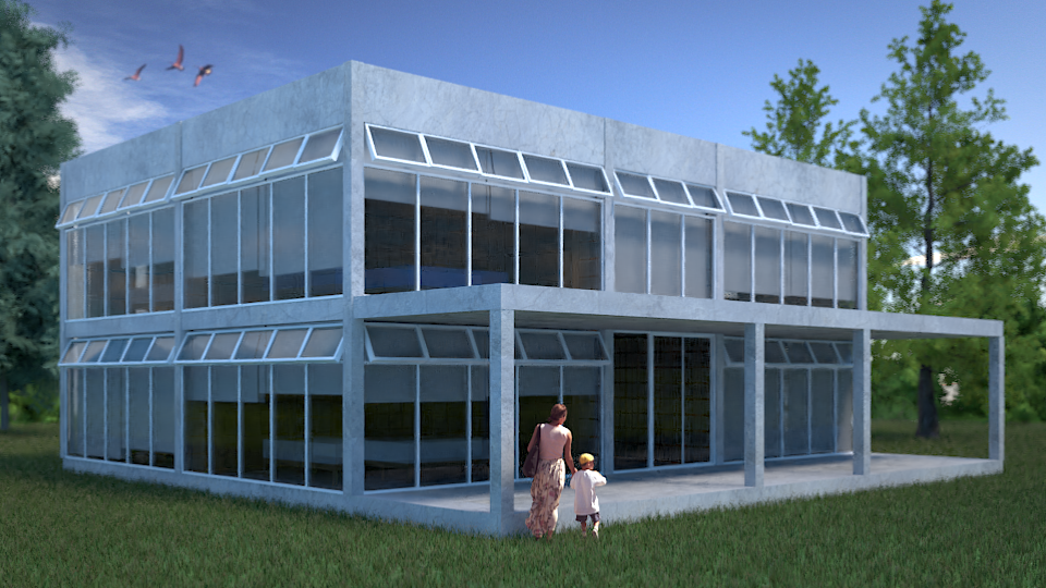
I want to make this render as realistic as I can so I want some advice. What do you think?

You could apply a LUT in post pro (because you can’t in Blender lol)
Control the white balance. Add some curves, levels.
What’s with the blurred trees? they are not small, base your render in a photography.
Do you mean levels to the plane of the grass? I don´t like to use pirate software so I can´t use post pro :S thank you for the advices :D.
I think that the picture in the previous post was more realistic.
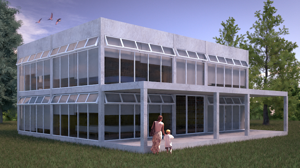
I agree. The lighting in the second one is a little strong compared to the previous one, but that’s just my opinion.
And what the hell did you use to add your post production? dude…
There’s GIMP in which you can add postpro effects and it’s open source, totally legal.
???
I use blender :o
Alright, ok…
Very nice result. Can you show us your compositing node setup ?
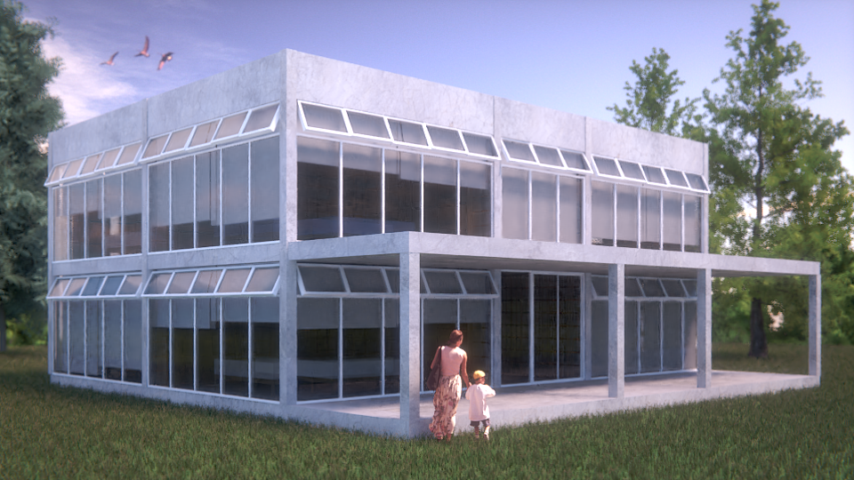
dont know exactly what it is, but something about the third picture looks more realistic to me.
Your renders look nice but some tricks are very helpful. You could make this tricks in Photoshop (paid) or in Gimp (free), as juancarlosgzrz said. Watch some postprocessing tutorials and use it in you works if you need. Some effects in cycles are very hard to achieve (soft volumetric scatter - foggy effects - consume your CPU or GPU). It is easier to do or improve such effects in Gimp.
Hi Juanrav, you have already a good visualization of this building here. I think the lighting of the scene doesn’t match the lighting for the cutout people. I would expect to see more direct sunlight on the building as well as on the trees - compared to the cutout people. All in all the render looks a bit dull to me.
I wonder how realistic the render can be as long as it shows a brand new building standing in the middle of a brand new field of grass (btw the grass is too high and the strands are too think, imho). There is no entry way leading to the entrance. Don’t get me wrong. All that is perfectly fine if you want to depict it in such a way. But it raises some questions in the viewer and makes it a bit uncanny.
hey,
In architecture this will be called a spaceship. A design with no connection with its environment.
besides that:
there is something weird with the perspective. your trees have the same height but the building has a strong perspective.
start by adding “life” to the image: furniture, intern lights, a car, walkpaths, some vegitation and so on.
and move your camera down. now the shot is made by someone it a eye height of 2 meter.
good luck!!
i think your first image with the low cut gras was way better, bcs as happy smurf said, now it just feels like some one droped it there, or it just looks abandond but it looks brand new, its weird. And yes the trees ( image as planes?) just doesent come out right and they are blurry. Make a path in the gras, and keep it short, place as happy said, something that ankers the building. cheers