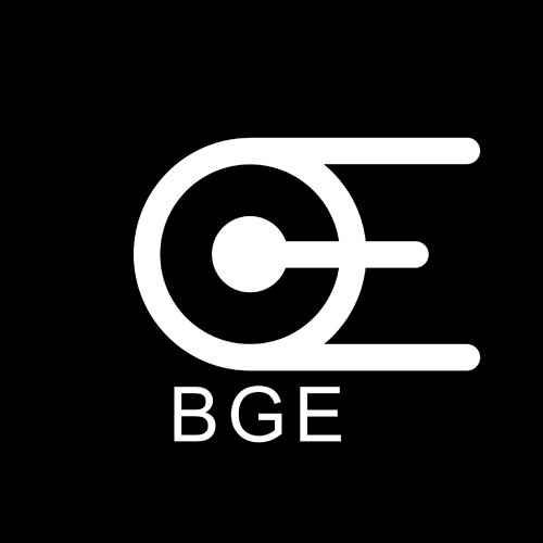
the design idea is simple, it’s just the recombination of blender logo, hope you like it:D
Looks cool! Maybe instead of creating a “C” with the negative space, you could create a “G”
That logo looks to much as a spaceship (startrek)
also the logo it self reads CEO (intended?)
and i agree with the text, it should be an other font.
#edit
i needed to say i like the 666 style of blenders current logo 

