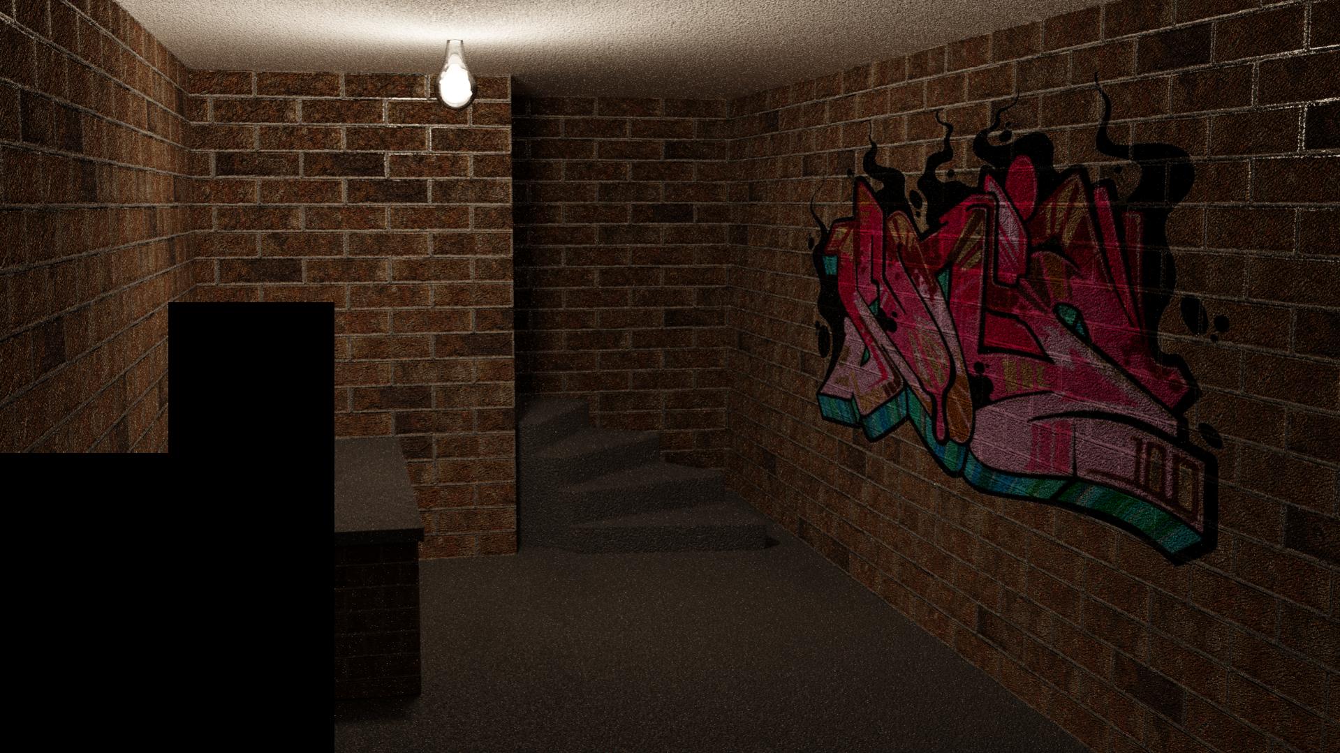
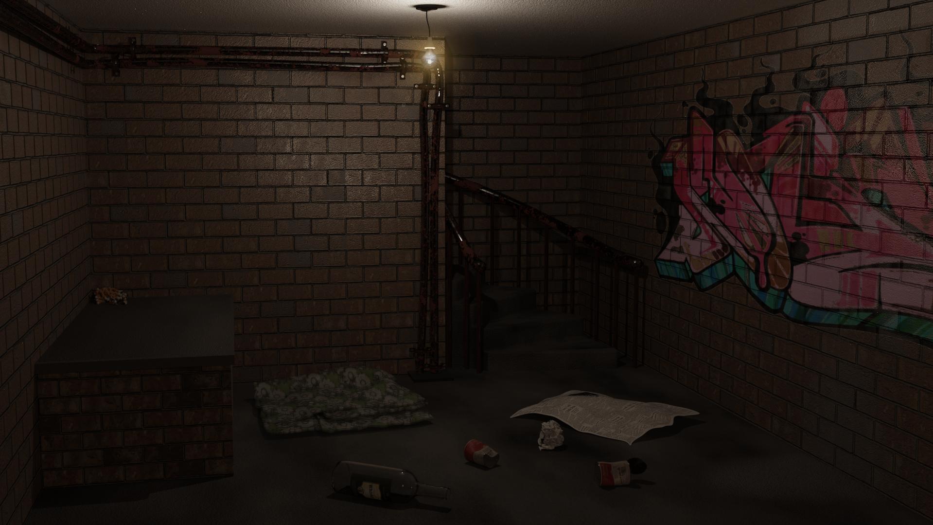
This is a re-making of a previous private project, exclusively Blender this time. I apologise for it being cut off. I see enough to fix to keep me going without the last few buckets, and because it’s indoor with no windows etc. and a single light source, render times get stupid.
There’s more noise than there should be, but I think a lot of that is because the normal maps are too strong. For the final image, the room is too narrow. The wall to the left of the stairs should be at least 1.5x the current width, and the rest adjusted accordingly.
I hate how the lightbuld is turning out. It has a point light inside which is destroying it. However, the filament cannot light the scene (even with an emission shader at 400,000 strength) and so I need to find a work around for that, maybe even mask and render the light bulb separately, then add in post.
There are several assets not yet built, pipes, junk, and some old cloth bedding. And apart from fixing the normals (and scale with regards to the bricks), there is some additional distressing needed on a small patch of brickwork to suggest, ermm, toilet activity.
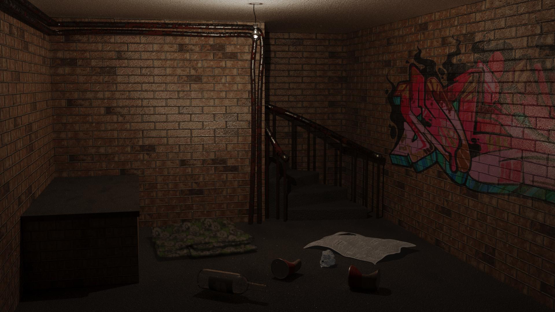
An update. Fixed the room dimensions, and took the normals on floor/stairs and wall down a few notches. I still think they could go down more, especially the stairs.
I now see a problem where the brick texture repeats with the row being off. I can fix this by either stripping a row off the maps, or adding another.
Fixed the light bulb by rendering on a separate layer and then compositing it on top.
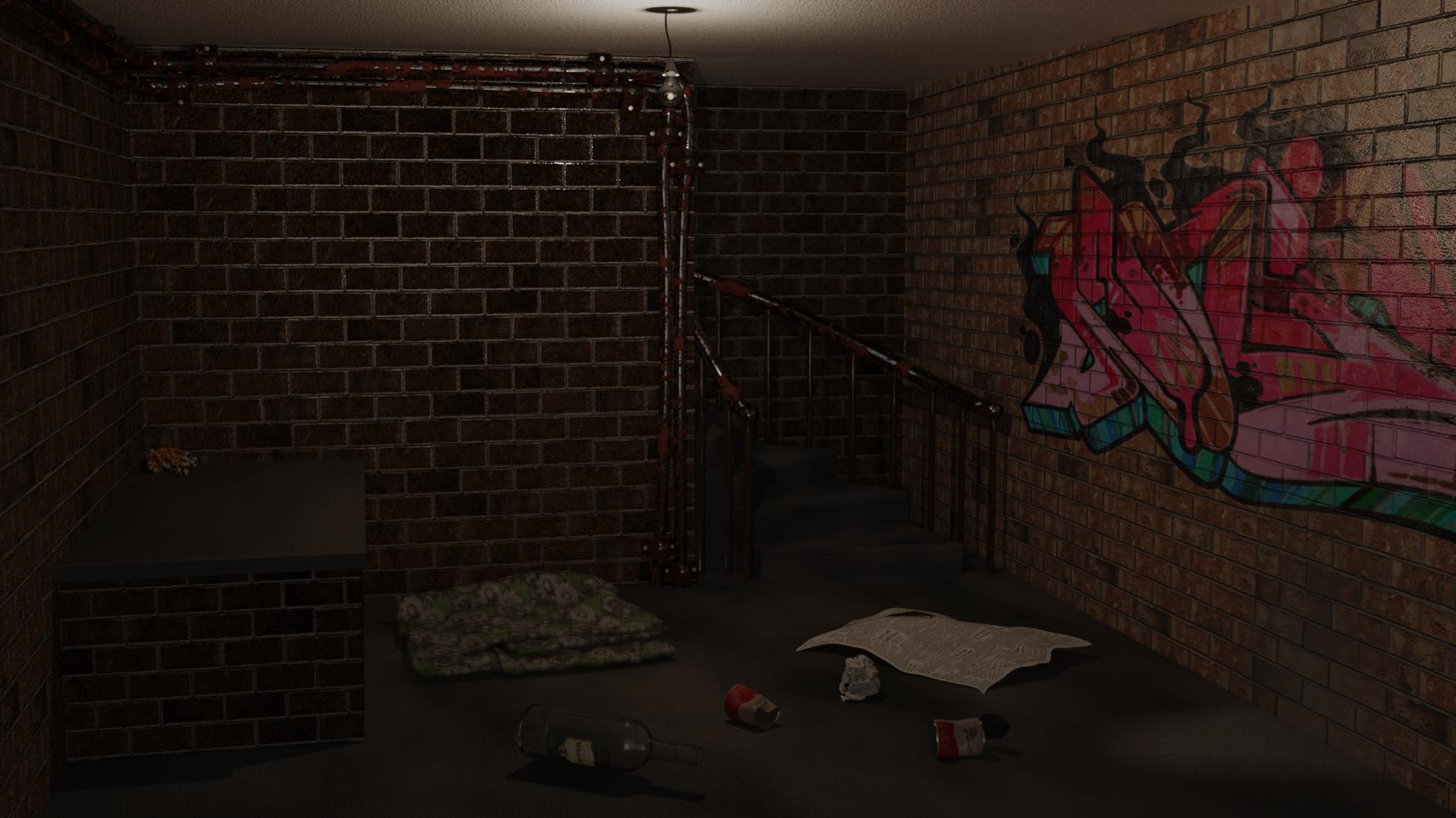
Making good progress. You could try and set the indirect clamping to something around 1 and see if that doesn’t help remove any excess fireflies/noise in the render.
I’ll start clamping when I start rendering properly. The second test was only at 300 samples, so noise is expected. Far less than I expected, though.
I’ve fixed the brick tiling, and finally added the occupants “toilet” area - was a killer getting the texture just where it needed to be, and lining up across two separate meshes, but finally got there.
Still a touch of modelling left (brackets on the pipes, and something for them to actually go into the floor convincingly).
I’ve also started experimenting with my light setup, now. I would have liked to have gotten away with the single point light where the bulb is, but it isn’t cutting it. I think a low level emission plane behind the camera to give an illusion of bounce light may work.
The problem is, of course, the light. (Or rather, the lack thereof!)
I think that you are expecting that light bulb to be the source of illumination for the scene. You are also probably assuming that you must use the Cycles render-engine here, and/or to use it exclusively. None of these assumptions are true.
That light-bulb is what we call a practical light. It is “a thing that’s in the frame, which we know is a thing that ‘produces light.’” If that light-source is “turned on,” we expect to see visual evidence that it is “lit.” We expect to see nearby areas that are “more illuminated” because of the “nearby light.”
However: none of this actually requires that this “light bulb” is a source-of-light at all!
The first thing to do with any scene is to establish a baseline level of illumination: the amount of light that is falling into the darkest shadow. (And there should be some light there.) Global illumination is fine for this. Next, basic and adequate illumination of all areas of the scene. Then, highlights – lighting to direct the viewer’s attention. Last of all, “a plausible equivalent of what those ‘practical lights’ are supposed to be doing.” Throughout the process, consider both light-intensity and color.
There is definitely a creativity aspect here: “what do you want the lighting to feel like?” Is this a scary room? An ominous room? A man-cave? Your lighting decisions are basically going to determine this.
You should also use objectivemeasures of the light-levels within the frame, such as a histogram. Read up on, for example, Ansel Adams’ Zone System.
The single light is intended to look like the only light, but of course it doesn’t cut it. Environmental lights destroy the mood, and so adding targeted light sources is the way to go.
Owing to the placement of the visible light source, the foreground is very shadowed. Many more bounces, and closing the wall behind the camera could fix that, but the render times would be horrible.
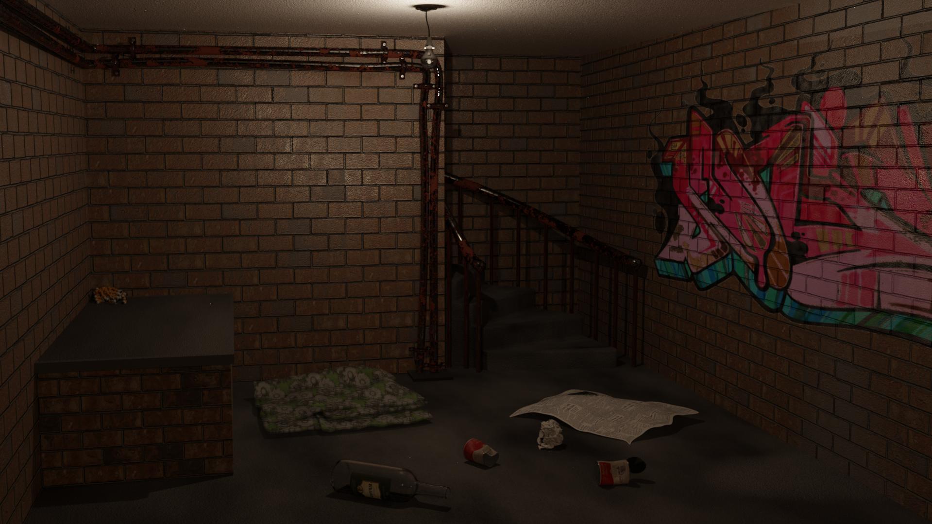
So, I added a fill light behind the camera. A simple emission plane, which won’t visibly affect the look of the scene, but will bring out previously shadowed detailed. A similar effect can be achieved by changing the gamma, though that affects everything, rather than just bringing visibility to areas where it is otherwise absent.
AO would also achieve a similar brightening, but flattens the overall effect (I avoid AO in Cycles if I can since it destroys depth).
So I went for a very soft fill light. The visible light source is deliberately meant to be low wattage incandescant. The scene itself is intended to portray the dark and dismal environment that some people unfortunately find themselves in.
This was the final render, with de-saturation, colour balance, white and dark levels, and glow added in GIMP.