Hey, i posted this in an old Blender Guru competition a long time ago.
It didnt do as well as i hoped, and i guess it is because i did not get any feedback on it at all.
So, i just want to know what you guys think, and what i can improve.
Oh, I like this render.
I am not good in giving feedback, but since you didn’t get any and ask for it, I feel I need give some then.
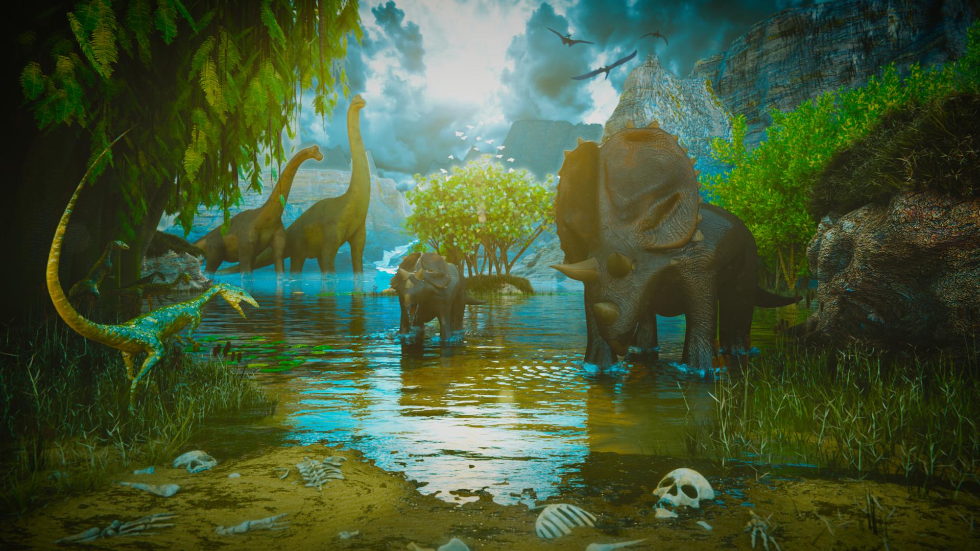
At first sight I like the colors, and then the reflections on the little dino on the left and the SSS-ish material of the big dino on the right.
Composition looks good to me.
I like also the blue reflections in the water, combined with the green on the sides.
What I would change are minor things, like:
The green plant on the right, his leave doesn’t have any reflection and therefore miss some details I think. Maybe they are a bit to saturated as well.
But really, I wish I could come to such a composition.
This doesn’t make sense from a historical standpoint. Humans didn’t come along until millions of years after the dinosaurs.
On to the actual artwork: The background rocks and stuff kind of look like they don’t fit it. Especially the one above the right dino, just feels badly composited in.
The lighting and water look amazing though, along with the right rock in the foreground. The foliage looks like it’s using one leaf repeated many times. Also the dino skin looks too glossy. After years of roaming the lands, you would think that their skin would be dry and crusty. The fog in the background looks kind of weird, but I guess can be overlooked because the main focus is the foreground.
Keep in mind I’m critiquing individual items, not the piece as a whole. As a whole, it’s pretty to look at, it’s just when you start to break it down you see stuff that could have been done differently. Also, take my opinions with a grain of salt, because I am god awful at modeling organic stuff, my forte being architecture.
Organics are hard. Bottom line. I think you have done well enough with what you have.
The only real issue to my eye is the lighting.
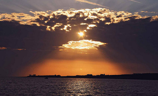
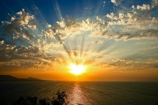
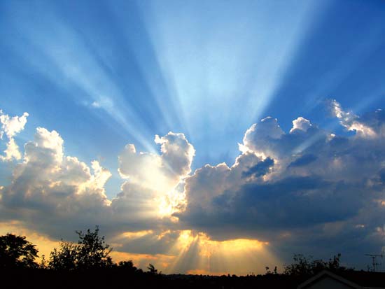
I see a lens flare, but can’t find the source. Usually, clouds obscuring the sun result in darker images.
Reference images do not belong to me(photos):
Hopefully these pictures illustrate what I’m referring to. In each instance, the foreground is dark. Even the middle one where you see the sun isn’t really covered, the foreground is dark. While, artistically, you obviously wanted the foreground brighter because it was the focus of the scene, it sends my internal fact checker a red flag and breaks the cohesion of the image because the sun is visibly obscured, yet somehow this image is well lit.
Otherwise…I like the premise and how you managed to incorporate your meaning without throwing in ruins of our buildings (like most movies do).
The problem with this picture is that everything looks decent except the dinosaurs.
Their geometry is too simplistic, too smooth and their materials look fake.
the composition looks pretty good. might want to reduce the color saturation on some of the plants. and the triceratops look too shiny and kind of like claymation. And the waterline is way too jagged at the shore. otherwise looks pretty good.