Hi, this is my last artwork. Any feedback or suggestion is welcome 
[ATTACH=CONFIG]489650[/ATTACH]
Trying some textures, nothing definitive yet.

Cheers!
Hi, this is my last artwork. Any feedback or suggestion is welcome
[ATTACH=CONFIG]489650[/ATTACH]
Trying some textures, nothing definitive yet.
Cheers!
Very rustic. I like it.
Thank you! ![]()
pretty nice… keep it up
Thanks a lot! ![]()
Hadn’t spotted this before. I like it a lot. You’ve really got the proportions right, for what it is. The overall feel is great fun.
Thank you so much. I’m glad you like it ![]()
I like this a lot. It definitely has that cartoony look!
A few tufts of grass around the buildings might help.
Thanks for your kind words. Yes, some vegetation would be fine, maybe some shrubs or a cactus too hehe
Thanks for the idea. ![]()
Looks fantastic! Maybe tumbleweeds?
You already got a storyline?
Thank you very much. Already there’s a tumbleweed (to the left side of the gallows, maybe it looks little because of the shadow xD), although perhaps it would be nice to add some more… ![]()
And no, I don’t have a storyline. I just thought to do some about the wild west, but without thinking too much about a possible history, etc…
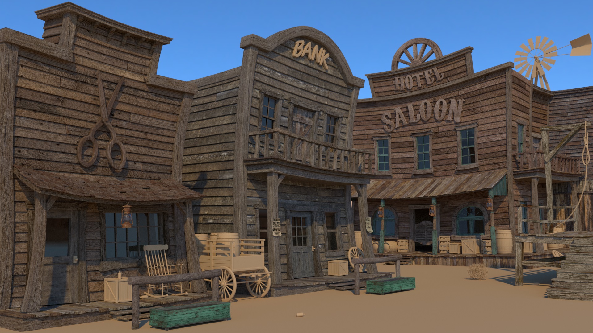
Continuing with the textures … I have slightly changed the lighting and I have also deformed a little more buildings (I don’t know if too xD)
Cheers!
Continuing… I changed the textures of the bank because I think there was very little color variation… I also started doing the ground a bit (for the moment only with textures, displace, etc…)
Cheers.
I think there’s a bit too much distortion now. The original looked better to me. Textures are looking good though.
Yes, maybe it’s too distorted, but the original was too flat for a scene cartoon I think. Maybe the ideal would be something intermediate… Thanks for comment. ![]()
scissors could be white, cause they probably would’ve painted it? the wood grain for whatever reason seems a little distracting.
The font for low cost loans is not the right font i think. And this is probably just my preference, but I would take out the widening of the wood bases on the scissors building just a little. Cause I think this scene looks mostly realistic with a hint of toon.
The blue wood grain that frames blue building, the bump is a little too noticeable. Still need a material on the fan thing on that building. Sky a tiny bit too blue?
Hope it helps. This looks like it has some real potential to it, so make it perfect and you will have a great portfolio piece.
Hi Vice3d,
your renderings really caught my attention because of all the nice little details you put into your scene.
The one i like the most are the doors of the saloon with the grid pattern on them. And the look of the blue wood texture is spot-on!
However here is some some critique concerning the cartoon style of your scene:
Although I have to say I’m not an cartoon expert there are still some things which stand out to me when comparing your renderings to other renderings of cartoonish buildings.
The intensity of cartoonish stylization varies quite a bit in your scene which causes it to look a little odd in some parts. What I mean is that the general shapes of the houses are deformed very strong however all other shapes are kept rather realistic. Therefore I’d suggest that you apply some deformation to all objects. For example I’d bend the wagon so that the axle is a little curved and the wheels tilted in opposite directions.
The buildings look like you applied a lattice deform modifier to them, stretching the corners here and there. But the smaller components like the winodw frames are not deformed in themselves. Here’s an example I found where some deformation is applied more evenly to a building giving it a more convincing cartoon-look: https://www.artstation.com/artwork/EO1JK
Of course this example is rather extreme concerning the deformation but even a little less would have a great effect I think, like the tilted edges of the air conditions in this artwork: https://www.artstation.com/artwork/6owor
Other than that I’d suggest to add some dirt to the corners of the window they appear to clean to me considering the sandy surrounding of the buildings. And I think the scale of the wood textures is a little off making the structures too big (but maybe this was done on purpose as it looks cool though…?  ).
).
But overall your rendering definitely evokes some wild west atmosphere!
Thank you for your feedback Sandra. About the scissors I tried several materials already (wood, metal, etc…) so I’m a little tired of it, but could be a good idea. And yes, the font for low cost loans is too “modern”, I have to change it (I did it in a rush I think xD).
About the wood grain, bump, etc… you’re right, maybe is excessive. I’ll try to improve that a bit (and the sky, it’s true it looks too blue).
Thank you very much for the ideas and criticism, I don’t think I can get it “perfect”, but I’m sure it can be improved a lot. ![]()
Thank you very much R.R. You’re right about the variation of cartoonish stylization, I still have to deform a little some things (like the wagon), although the windows frames already are a little deformed (maybe not enough). Thank you for the examples, I’m not a cartoon expert neither so any help is welcome. ![]()
About the windows I agree, I have to add some dirt there, in fact it’s the next thing I wanted to do (and texturize what’s left). About the scale of wood is the maximum that allowed me the textures, being planks it’s not possible to change the scale too much… ![]()
Cheers!
Continuing after a time stopped (holidays, etc…) I changed the lighting again and added some more things (some vegetation, cactus, etc…) I also finished all the textures and changed some that I didn’t like, although there are still many that I don’t like xD
Cheers!
I really like the wryness of the buildings! The only thing that bothers me is the giant scissor on the front building. All the other buildings have windows there but here is a blank space with a giant scissor :D. I would scale the scissor down or replace it with a simple sign and add windows to the top. Maybe sand on the floor could be a bit more displaced, it looks a bit to flat for me. But overall really cool!