We’ve been working on a short film and I’ve been doing the lighting.
The look we are going for is a sunny afternoon.
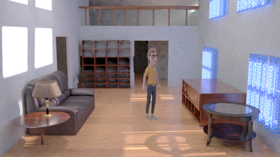
And here is the test render (I denoised it, so the background looks a little strange)…
Please share your feedback, suggestions, and brutal critiques :evilgrin:.
usernew
July 23, 2017, 11:32am
2
The table on the left is too thin and lacks a base for the stand.
The lamp should be in general in the center of the table.
The table and the chest of drawers are too big.
The windows are too low. Lighting feels okay to me. Wait for more critique.
Roken
July 23, 2017, 1:41pm
3
Focusing on the lighting alone, generally OK (though a shot with the character in some direct light would help).
However, I’m not convinced with the almost neon look of the light on the right, though I can’t tell if that’s lighting or the curtain texture.
I think that you should try to separeate the character from the background to make it more readable. The lighting IMHO is to flat. And you have set the point of intrest and contrast to the sides. Has the light from outside anything to do with the storytelling?