this looks great and very modern.
Hi there,
First, I would like to congratulate you for this amazing piece of work, good job!
Second, I would like to say that I am no professional or veteran and that my critique has no artistic weight. But, my remarks will be purely logical and not judgmental.
I have created an account just to give you my opinion on this.
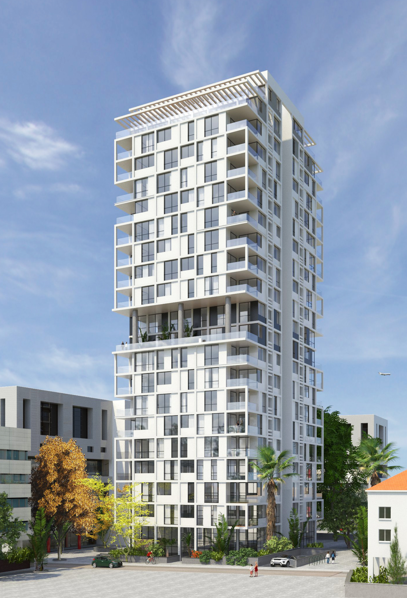
The plane in the back is not really necessary, like not at all. The focus is the building, and that small plane in the back is not needed. If you look under that plane, there is a building with some emptiness to its right. I think there should be something there. Perhaps a bit of the roof of a building would do the trick? it sure would make this more realistic.
The palm tree next to the main building, that shouldn’t be there. It’s too big to be that close to a building and the building looks new, so the palm tree shouldn’t have had the time to grow that tall. Furthermore, it would hide the view for those who live there and block light from getting inside. Logically, there shouldn’t be a tree as big as that so close from a building. The other tree is great though.
Is that underground parking exit over the sidewalk? This looks like an expensive place to live, the flats must be pricey too. Some inhabitants might have cars that aren’t that high from the ground, like some expensive sports cars. They wouldn’t be able to park. You could perhaps lower the sidewalk or something like that just in front of the exit?
Finally, that huge empty space on the other side of the road doesn’t make sense. There is no emptiness in a built city, everything is there for a reason. You could convert that space into a park or something like that.
Once again, I’d like to say that i’m not talking about the quality of the work, which I do not question, but the logical choices that you made. Well, humm, perhaps just one remark about that. The shadows of that big orange tree don’t match the shadows of the building, which indicate the position of the sun.
Overall this image looks very good, and I’m sorry if I was a bit harsh on you but you asked for opinions. 
Keep up the good work and good luck with the rest!
It looks great. I would suggest doing something to break up the pattern in the sidewalk/square in front of the build, it’s a bit too noticeable.