Challenge #737 Voting CLOSED

This week’s theme: Repurposed

After 2 days of voting, a winner is declared: The voting will close on Wednesday.
The winner picks the theme for next week.

[ If the winner doesn’t supply a theme before Thursday 22:30 GMT, the organizer will select the theme. In this case, the winner’s theme will be used the next time we are lacking a theme on Thursday 22:30 GMT. :slight_smile: ]

Having selected the theme, the winner will not be eligible to enter that week. They may however still submit an image, but it won’t be included in the voting.

Pure Entries

  • Fulip
    Child imagination
    https://blenderartists.org/forum/attachment.php?attachmentid=493732&stc=1&thumb=1

  • 3dnotguru
    simply repurposed
    https://blenderartists.org/forum/attachment.php?attachmentid=493849&stc=1&thumb=1

  • purbosky
    Disk Box
    https://blenderartists.org/forum/attachment.php?attachmentid=493890&stc=1&thumb=1

  • fcharr
    Charrua
    https://blenderartists.org/forum/attachment.php?attachmentid=493906&stc=1&thumb=1

  • kr4st
    737
    https://blenderartists.org/forum/attachment.php?attachmentid=493935&stc=1&thumb=1

  • YAFU
    DIY: Convert obsolete robot to trash can
    https://blenderartists.org/forum/attachment.php?attachmentid=493966&stc=1&thumb=1

  • polyboy
    Lightbulb-Oil-Lamp
    https://blenderartists.org/forum/attachment.php?attachmentid=493973&stc=1&thumb=1

  • caz747
    F H I Swatter
    https://blenderartists.org/forum/attachment.php?attachmentid=493982&stc=1&thumb=1

  • fdo
    lamp
    https://blenderartists.org/forum/attachment.php?attachmentid=493989&stc=1&thumb=1

  • RayVelcoro
    Skateboard
    https://blenderartists.org/forum/attachment.php?attachmentid=493995&stc=1&thumb=1

  • str11
    Repurposed F1
    https://blenderartists.org/forum/attachment.php?attachmentid=493967&stc=1&thumb=1

  • Miatpi
    Steam balloon
    https://blenderartists.org/forum/attachment.php?attachmentid=494092&stc=1&thumb=1

  • Aki049
    Polythelene
    https://scontent-sea1-1.xx.fbcdn.net/v/t1.0-9/20663846_1770705962957430_145789341217535700_n.jpg?oh=3615941e109af7dc9bde5ed3de91ebe7&oe=59F9A84E

Non-competing Entries

  • OLG
    bar scene
    https://blenderartists.org/forum/attachment.php?attachmentid=493889&stc=1&thumb=1

  • RobertT
    UMBRELLA
    http://www.artofinterpretation.com/images4/wc737-Umbrella-FINAL-byrjt2017.jpg

  • Helge
    Blub
    https://blenderartists.org/forum/attachment.php?attachmentid=493896&stc=1&thumb=1

  • Photox
    Muddy water
    https://blenderartists.org/forum/attachment.php?attachmentid=494043&stc=1&thumb=1

Okay, so that was my first one, and it looks… unique, the way it does because I ran out of time. The picture quality is also much lower than I thought, and it’s kind of hard to see what some of the stuff is. The blue things are pens, and the claws are those grabby-things made with wires.

Helge, I wonder if the artist name and title are placed in a confusing way. I remember we had this problem a while back, but basically I normally assume the name would be below the image, or that there would be some kind of break between the entries, I almost accidentally voted for the name below my choice.

To me it is fine in the current mode, but maybe we could better separate each entry with some line?

In advanced mode, there is an “Insert horizontal line” button.
Testing…

***Entry 1
***Entry 2
***.
.
.
***Last Entry


So, each entry (Author, title and image) contained between a line up and another line down.

I agree. This could be a little clearer. I think, in the voting thread, the artist’s name / title has always been above the image. So changing this may lead to even more confusion. But maybe an additional line break between entries would already help with that.

However, there should already be (a little) space between entries:


What browser are you using? Maybe it is eating the double line breaks… :wink:

P.S.I just noticed that Aki049’s entry is missing a title - maybe that is what tricked you here. I’ll get rid of that empty line in a moment.

It’s not that big of a deal, but I tend to focus on the image first and then look down for more info. There happens to be a large black top border on Miatpi’s teapot (my vote) although this is what it looks like to me:


I’d also like to say that Helge has done an outstanding job running the WEC.

@YAFU: Hm… I guess, lines could help. I just need to find a way to include these lines into my voting script output. (And keep it all copy&paste-able at the same time.) Maybe I’ll find some time for looking into this tonight.

Makes sense to me. The big black area seems to be part of the image. (Maybe it’s just the balloon colliding with the end of the world.:rolleyes:) Let’s see if the YAFU lines help to clear things up.

Thanks!:smiley:

Fulip: a very touching and solid render, I really like the mood of it. I voted for this.

3dnotguru: haha, simple yet so effective. Really solid render.

Purbosky: Ahh, floppy discs, the memories… not so cocky with that 32 TB blenddrive beside. XD At least they work as

penholders. Hilarious, I’m so in love with the idea, though the lighting feels a little flat.

fcharr: Whalehunting made easy! Nah just kidding, though I’m sure hunters would love some of them in their arsenal. I saw the earlier versions of the render and I must say the ground texture made a big difference in breaking up the flatness, it’s much more pleasing now.

kr4st: I like it, though the text is hard so see.

YAFU: Space DIY! This is just hilarious, and I’m not even sure if the “trash” sign means R2 or not XD. There’s so many out-of-the-box entries here, and this is certainly no exeption. However, I dunno why but the room feels a little flat on the left.

Polyboy: solid and creative, it’s just great.

Caz747: Begone flies! I love the creativity in this, and the textures are just great.

fdo: Not sure what it is, or it’s purpose (maybe if you iron cloths during the night?) but it sure is cool! And the small cord is a nice detail.

ReyVelcoro: cool, a lot of details here. Overall it look very solid, though plant is kinda flat.

str11: great lighting and very detailed. What is this made of, a car? The ground look a little flat though, i I’m not mistaken it’s a displaced texture and not particle grass.

Miatpi: my own render, and it’s clearly the best of the century!!! Not the least biased…
Nah, theres a lot of problems here: black spots on the rope, noise the denoiser didn’t handle, the steam is barely visible, a huge black bar on the top (which I don’t understand how I could miss). But noneless I’m very proud of it.

Aki049: I like it, it’s cute. You said the smiley was painted on afterwards and I must say it doesn’t loke like that.

Olg: fantastic render, can’t believe it was done in 3 hours!

RobertT: I’m so in love with this style. You said there were a lot of things you weren’t happy with, well I sure can’t image what that would be.

Helge: certainly one of the best renders, I really like it. Very creative as well.

Photox: if only my render could be close to this. The mood, the colors, wow!

Haha, the black border is indeed a part of the picture. I thought setting a render border would be an easy way to crop the picture… and well… it was half-true. I can’t believe I didn’t see that before putting it up.

Let’s just say it’s the end of the world and let it be. :slight_smile:

I decided to create a stylized benches of the wings of a formula 1 car


For ground added a simple grass texture with a normal map.

@Miatpi, Good to know that it was hilarious for you!, funny entry was my intention. The sign on the wall was meant to be the silhouette of a stormtrooper soldier, but as I had mentioned in the other thread, it ended up looking more like He-Man :slight_smile:

@Helge, Doing some tests with the dividing lines, but having problem with “List” item on the first line:
http://pasteall.org/502699

Or maybe just avoid first and last lines, I do not know:
http://pasteall.org/502702

And it’s true, as Photox pointed out, grateful with Challenge maintainers (Helge, rarebit, and other users earlier I guess)

Thanks for the comments, Miatpi, they’re much appreciated.

Just thought I would mention, the device I created for my render is not for fly swatting, rather it’s for fairy swatting. The F H I in the title stands for Fairy Hunters International. An organisation of which I am a proud member. :RocknRoll:

Thanks Miatpi. My intention was to recreate an example of turning weapons into ploughs. Les armes en charrues. Yes, that’s what my last name means :wink:

First, I’d like to respond individually to the amazing array of images we’ve been blessed with yet again in a great challenge:

Fulip: That is some powerful image, and one that speaks to the inevitable victory of imagination and innocence over a all too worldly world. Very well done!

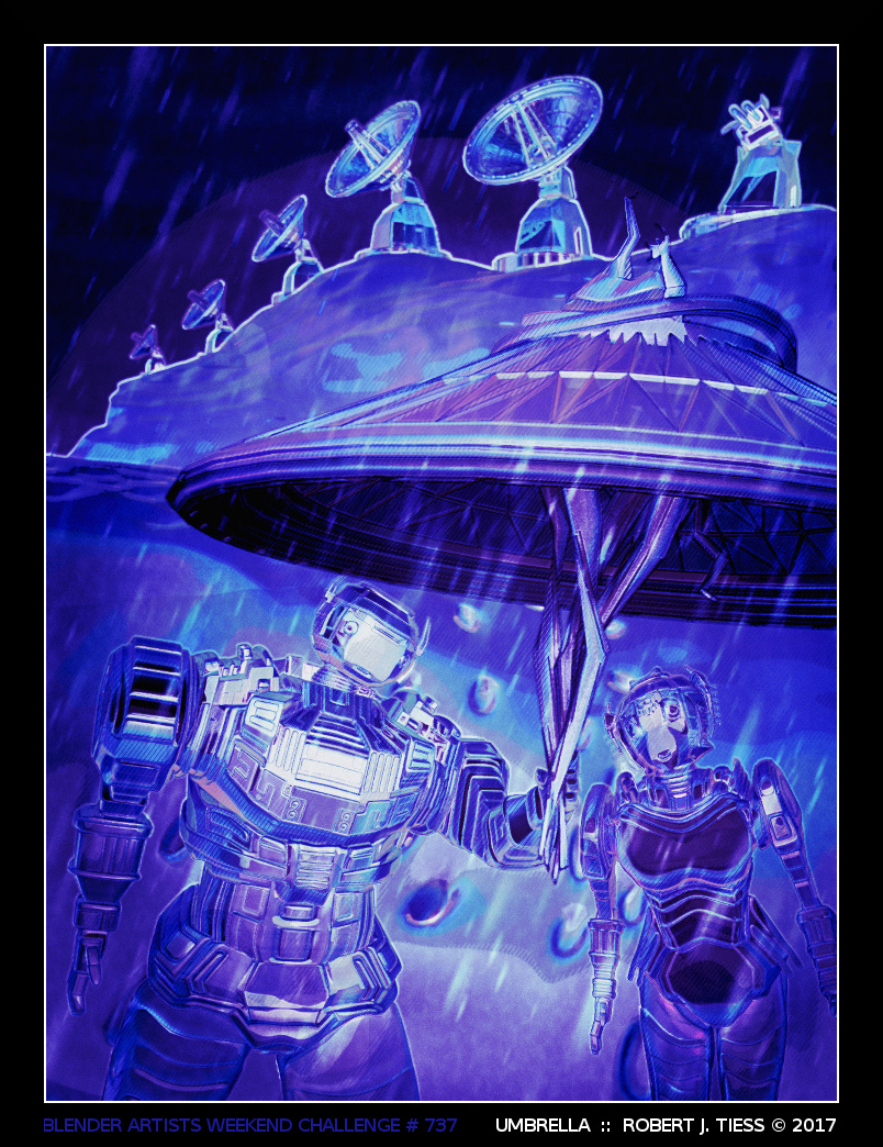
3dnotguru: I enjoy the realism, viewing angle, and compositional layout of this piece.

purbosky: Great to see some floppy disks put to some new use! Nice colorful treatment, too!

fcharr: This is very thought-provoking and yet another fine example of how imagination can really help to repurpose destructive things into constructive things.

kr4st: Great idea and nicely done! I like the whole setup and how you were able to work in all the primatives here. I had a funny thought when I noticed something placed to the right of your image (paraphrasing Swayze’s famous line from the movie “Dirty Dancing”): “Nobody puts Suzanne in a corner.” LOL!

YAFU: Very funny and very well done! Poor R2, though, right? I could just hear C-3PO off camera, looking on and saying, “Oh dear…”

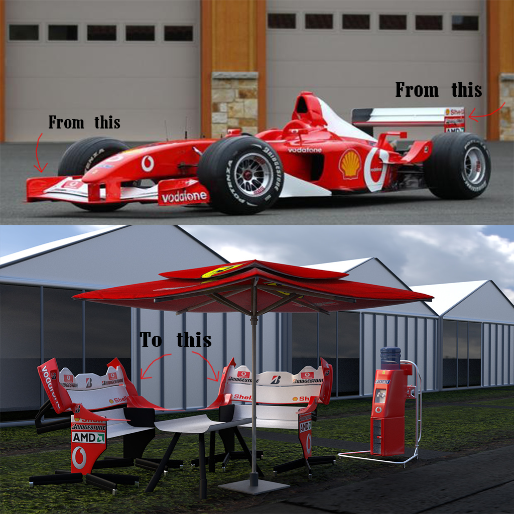
polyboy: The juxtaposition an electric versus an oil-based lamp is a very cool concept, and you realized it wonderfully with great materials!

caz747: After seeing YAFU’s image, I’m now thinking of Star Wars and imagining Chewbacca somehow holding this =) Very creative and well done!

fdo: The realism in this piece, particularly concerning the shaders, is admirable!

RayVelcoro: Very cool! And another Suzanne sighting! Always a welcome thing =) Love the other Blender allusions you fit into this piece as well!

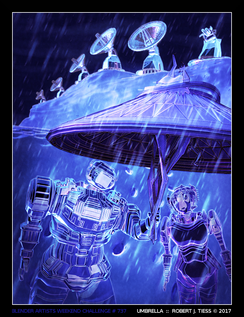
str11: Very creative and realistic this is! That came out very Yoda-ish :wink: Nice idea with the water bottle dispenser! People can “refuel” without getting up =)

Miatpi: I’m so glad your entry made it in time! I voted for it, and I love the way this came out. The background and foreground realism elements come together perfectly. Now I’m just wondering where the balloon is going off to…

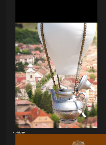
Aki049: This is such a fun and creative piece – and that it’s also a character you designed (and a happy one at that!) makes it even more enjoyable. Congratulations on completing your first challenge! I look forward to seeing more of your work.

OLG: Wow, that is very realistic, pretty much photorealistic, and very well done. I don’t drink, but I at least know realistic glass when I see it =)

Helge: Another fun and creative entry. That could very well be a cousin or a friend to Nemo or Dory =)

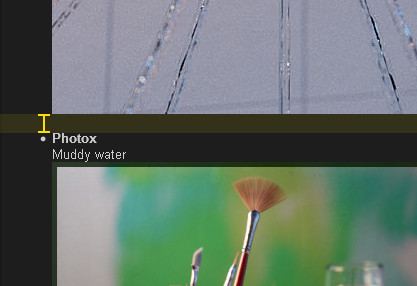
Photox: Perfectly executed realism balanced with a figurative and literal artistic approach. Superb stuff!


YAFU: I like your idea about the lines!

Miatpi: Thank you very much! I go by feeling, most of the time, and I had the lasting sense it needed some more attention, but, as I’m also currently learning Cycles after spending most of my Blending years with Blender internal, I know the materials and stylistic treatment could have been pushed further.

I revisited this project since the close of the entries and got a little closer to what I was hoping for

http://www.artofinterpretation.com/images4/wc737-Umbrella-FINAL-Toon-byrjt2017.jpg

I was able to work in my Cycles Toon Experiment (from the entry thread) to get closer to what I was hoping to achieve here stylistically.

For more on that, if anyone’s interested, please see my Cycles Toon Render Shader Experiment post (with two free .blend files) in the entry thread for this challenge.

Congratulations and thanks again to all our participants! You are all winners!

RobertT

RobertT: ah yes, the lighting it’s more centered now and draw the focus to the robots. Again, I really like the style. How cool wouldn’t an animation like that be?

Great, I love transformers!

Thanks everyone for the kind comments. Not getting much better but I am getting faster.

  • O

Thank you! That saved me a lot of time. To get around the hr/list item/indenting issues I’m now using a new ‘list’ for every single entry. It doesn’t feel right - but it seems to work quite well. I just updated the starting post based on your suggestions a minute ago. I think, it is looking much cleaner now and if this isn’t causing any problems, we could use something like this for future voting threads.

@RobertT, @Miatpi:
Thank you for the kind words. :slight_smile:
And thanks for taking the time to go through and comment on every entry. I know it takes some time to write these posts, but helpful and friendly series of mini comments like these are a nice read every time they show up.

@Helge, Cool! Thank you.

@RobertT, thank you!. Initially my intention was to add to C-3PO in the scene, but little time and few modeling skills on my part…
Seeing your excellent work with Cycles, it’s good to know that you apparently will not miss Blender Render too much in 2.8 :wink: