Hi All,
I’m looking for some critiques on my latest piece. I’m looking to make it more realistic, but don’t know what will help the realism.
Thanks!
Hi All,
I’m looking for some critiques on my latest piece. I’m looking to make it more realistic, but don’t know what will help the realism.
Thanks!
Image looks underexposed.
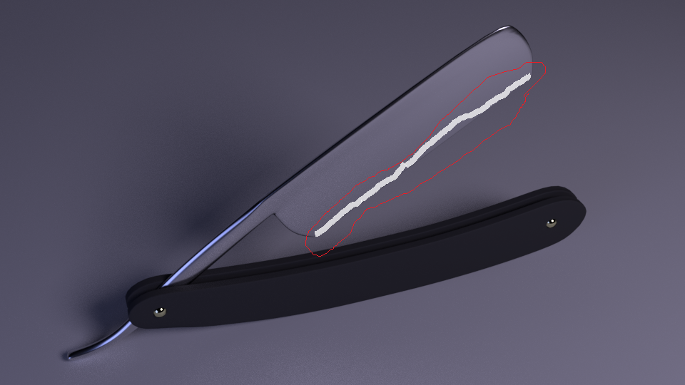
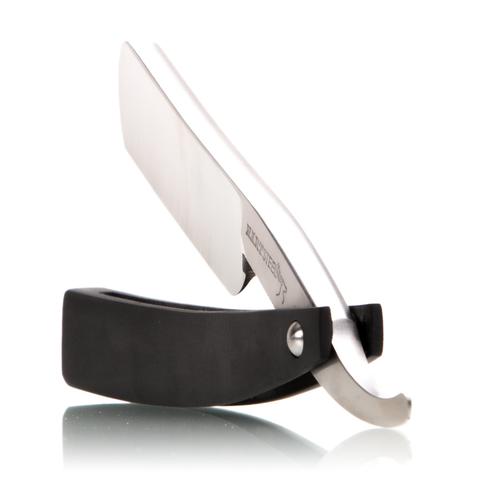
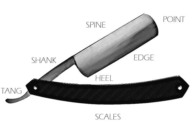
I’m assuming that the lower edge of the razor is what does the cutting. You probably want to bring attention to that. Increasing the roughness on that lower section can help give it that sharp look.
I’m assuming that the lower edge of the razor is what does the cutting. You probably want to bring attention to that. Increasing the roughness on that lower section can help give it that sharp look.
oh my, sorry about that, terrible internet
I agree to Kareem: That razor doesn’t look sharp at all. Usually straight razors have some kind of hollow grind, which should be clearly visible on the sides.
KareemAlgalaly - I gave it a bevel. I did this by decreasing the roughness . You had suggested increasing the roughness, is there a reason for that? That isn’t a challenge , I’m just trying to learn from those wiser then me. 
IkariShinji - What you can’t see from my camera angle, is that there is a slight concave grind.
I also Increased the overall light in the scene, and opened the blade a little more.
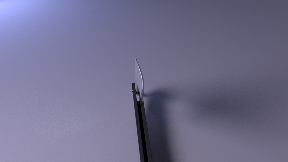
For some reason it just wasn’t looking right so looked at some reference images. The blades on all of them are much thicker than your model. Maybe that’s why it didn’t look right to me. Growing up the barbers still used these (I am old). Nothing like a super sharp knife scraping the stubble from you neck just inches from your carotid artery.
No kidding shiver at the thought :eek:
Yes, You are definitely doing some great progress. If you work a little bit more on the metal material and lighting it is going to look great. Make it a centerpiece with the lighting and vignetting so all your hard work really stands out.
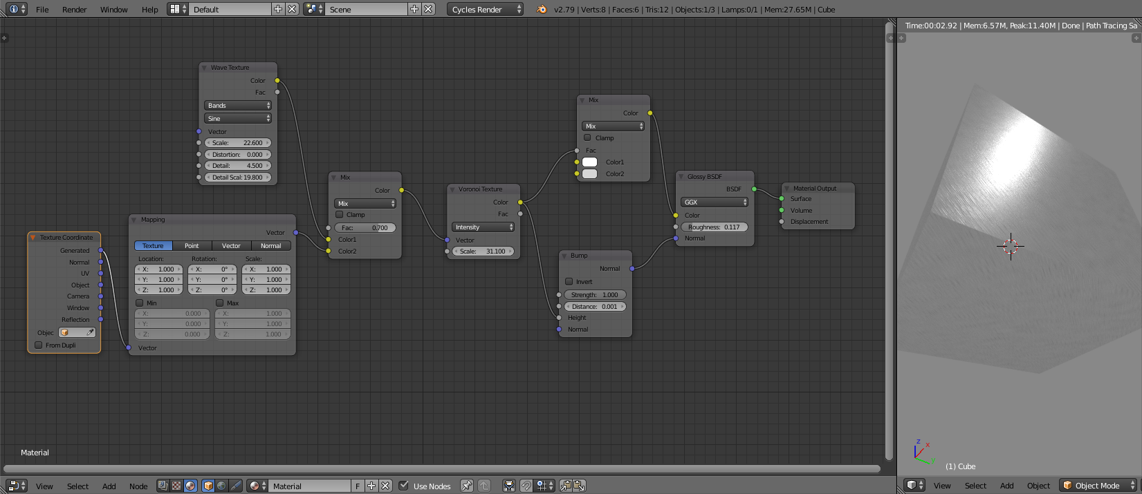
Are you using cycles? There are some great tutorials on brushed steel/chrome node setups.
Thank you!
I am using cycles. Can you think of some good tutorials? I have very little data per month so I can’t watch a ton of videos. A writen document would be even better.
Thanks.
Sorry for the delay. There are several different procedural ways to go about it. Here is a simple one from Brandyte at https://www.youtube.com/watch?v=Z2tSLdgPIWQ
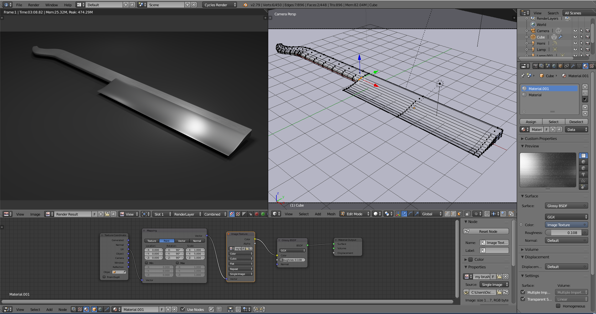
The other way is to use a texture UV unwrap to get the metal look. I hope you don’t mind but I modeled a very quick straight razor model to try a few different looks for it. If I was going to do one I think I would include some file work on the spine of the blade. There are very good brushed metal textures you can find on the web. They are fairly straight forward to make with a decent graphics program.
Good luck
good progress!!
but don’t forget the material of the holder. now it’s not known if its plastic, wood or metal.
and (maybe it’s the lightning) but i get distracted by the upper corner (with the light spot), it looks too round. mabye a combination between yours and the simplistic version of OLG?
and something stupid…
does the razor fits in the holder? isn’t the razor too high for the holder?
good luck!
OLG – Thank you! I will wok on it, and post the result in the next few days (busy schedule).
happy smurf – I was just going with a plastic holder (like everything else these days).
Here is the reference I stole from online. Note the round end, but your right the lighting makes it stick out like a sore thumb.
The angle of my Render makes it look like the blade won’t fit the holder, but the handle is long enough for the blade.
Thanks for all the critiques.
And a HUGE THANKS to all the help!
So here is the latest version. redid: textures, lighting, camera angle.
Thanks! you guys have been a huge help.
Nice!
maybe a nice logo on the side?
You should look at some of the cool lighting stuff that real photographers use when shooting things like this. One, which I called “the octopus,” is a flash-head with many individually-poseable fiber optic cables coming out of it. It’s used to create small point-light sources that can be very quickly positioned to emphasize edges, chrome, and so on. Your lighting of this object is right now uniformly flat, except for shot #16 which throws far too much light on the surroundings. The brightest thing in the shot should be the highlight at the edge of the blade, but the lighting should vary slightly up and down the length of the object. This calls for – as the “octopus” provides – many small point- light sources, placed very close to the object yet (just) out-of-frame.
You should also apply tint to the various lights. Very few if any of them should be “white.”
Hey all! here is a (Almost) completely redone render. New lights, camera angle, background, etc.
Any thoughts now?
happy smurf I thought about doing that. I think I’ll put a logo on after I get the lighting.
sundialsvc4 I’m not sure I picture what you describing:(. Could you post a picture?
Thanks all!
I’m no expert, but some ridges on the side of the handle would make it look much more realistic, I believe. Perhaps some scratch marks on the blade maybe?