(Image seems little blurry here :P)
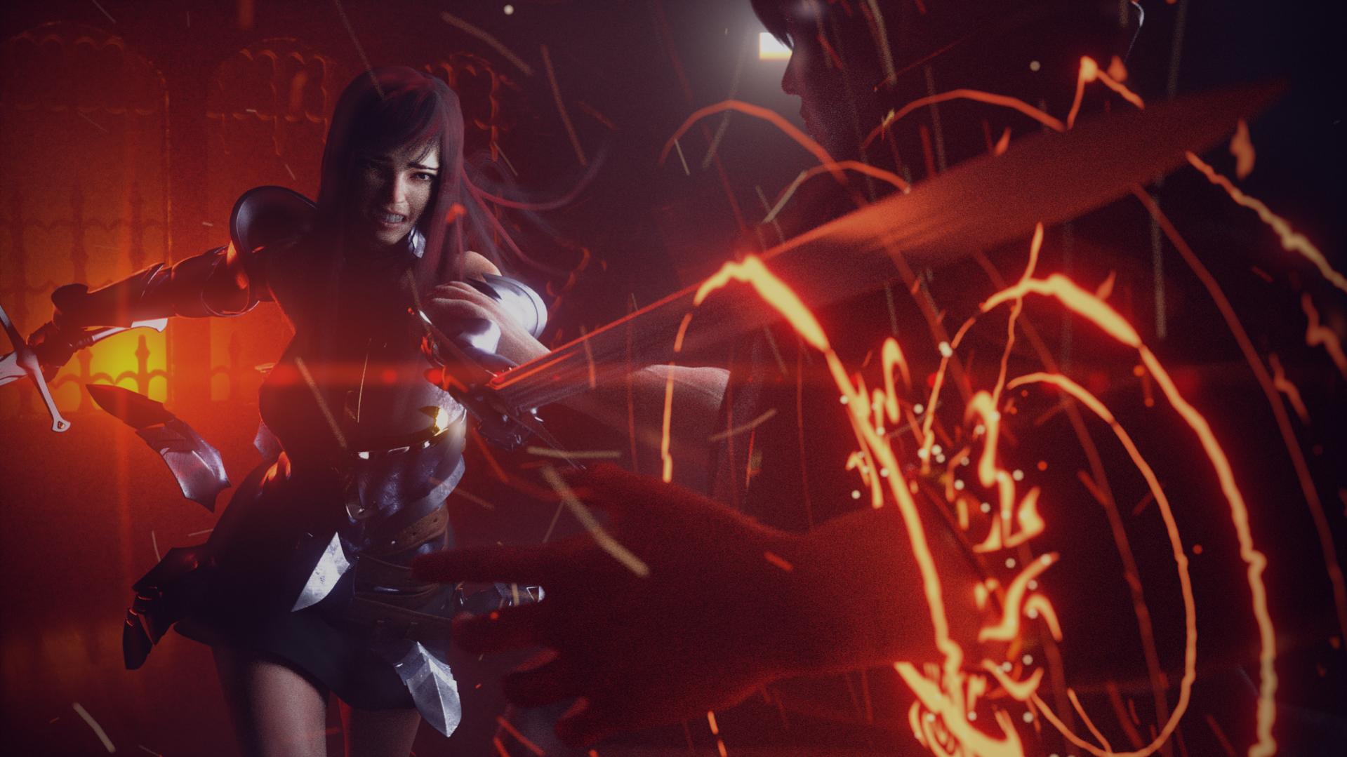
So, this is the state of current project of mine. I wanted to create rather good-looking and perhaps interesting fight scene between the two characters I made (which are originally from anime, Fairytail).
I took some liberty on their design, but I kept most of the features intact ( or else there’s no way of people knowing which is which )
Now that scene is nearly done, I’d like some constructive critiques from you guys to improve my scene better. currently, the sample size is reduced to render a bit more quickly, although it still takes three hours to render all this…
So please understand the noises of the image. Hopefully at the final render, there won’t be as much as noises as this one.
Any critiques are welcome, I am willing to change everything if that’s necessary.
Thanks!
Good work so far. I would say that right now it is hard to tell that is Natsu. Mostly because it is too dark and his most recognizable features are not visible. His hair is out of frame and his vest/scarf is occluded by the sword and dark. You could either tweak the pose or move the camera to make these parts more visible. Mostly his hair would inform us as to who it is. I would also possibly add some light emiting from his hand spell so that illuminates him more maybe just enough to see the pink of his hair since the focus is on Erza more than him.
Hey bro! His hair is out of frame and his vest/scarf is occluded by the sword and dark. You could either tweak the pose or move the camera to make these parts more visible. But it is a cool pic
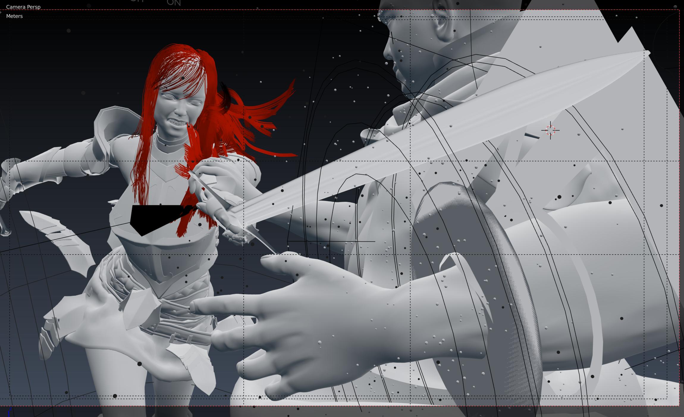
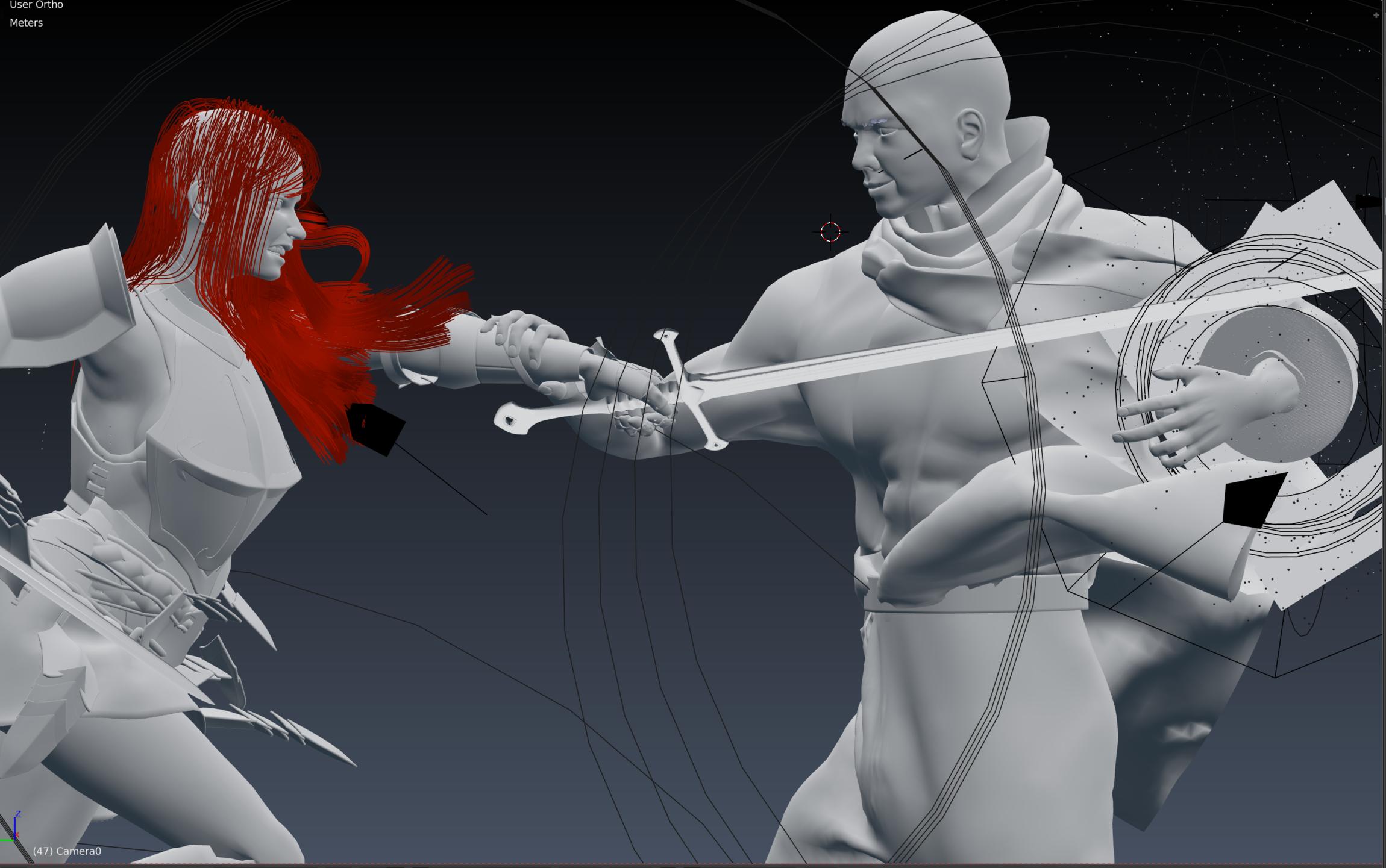
I agree with you guys. Natsu’s hair and face is being occluded too much. I didn’t exactly changed the pose because I didn’t wnated to go through trouble rebaking the entire simulations… which its caches seems to magically disappear after I bake…
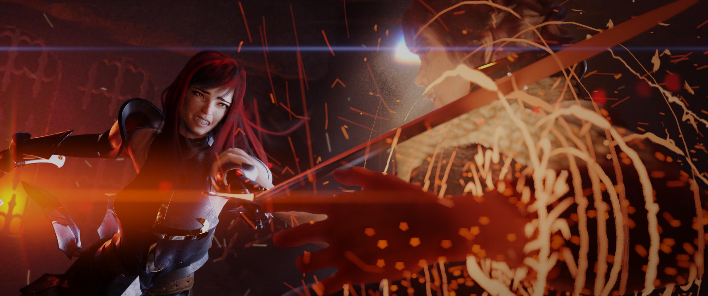
so, I decided to focus on changing the camera angles, and changing the composition a bit.
Here’s the result.
As mentioned above the camera angle is the weakest point of the composition. Having the spell in the foreground is blocking out most of the image. Perhaps shifting the focus. Mirror the poses and place the defending character in the background with the spell charging behind them. I know it’s a fairly drastic change but would but the emphasis on the clash instead of everything being drowned by the spell. If this was a sequence of images and that was the climax it would work but as a single image the spell is to dominant.