Some thoughts:
LeoBlenderToon: I like this, it’s quite easygoing and have a soft feeling to it. Also the ground is very realistic.
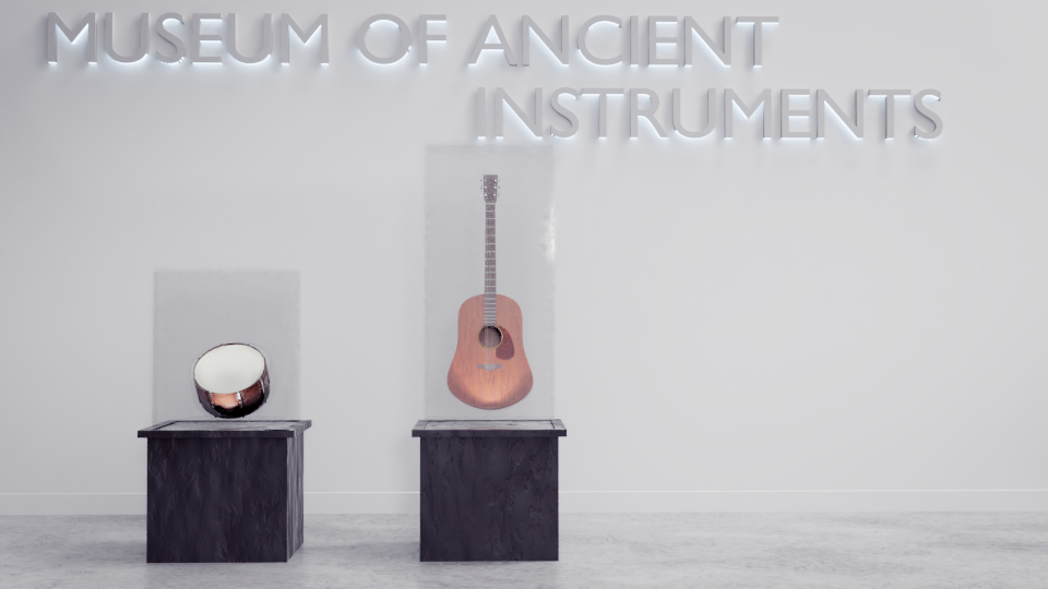
RayVelcoro: the concept is great here! The guitar-thing in the background is amasingly detailed, maybe to that point that it steals the spotlight from the guitar in focus (which to me looks a little flat). Oh, and the choice of font is really fitting.
didierv: at first I thought the Air-sign was a triangle (the instrument) 
Anyway, the idea is really clever. I’m a little confused about the melancholic mood as the content is fun.
asterio: as I said above I love your style (please reveal the secret  :)) and it nails the mood here. The girls pose, her shadowed eyes, the dirt, the siuettes, it’s just perfect. Very cool.
purbosky: cool yet cute in some way, and the neon-lights are a nice touch. Maybe it would stand out more if it was brightened up a little, especially the background light.
dm9: this would work great as a post card. I love the colour scheme and composition here, it overall feels calm and interesting. Not to mention it’s quite realistic.
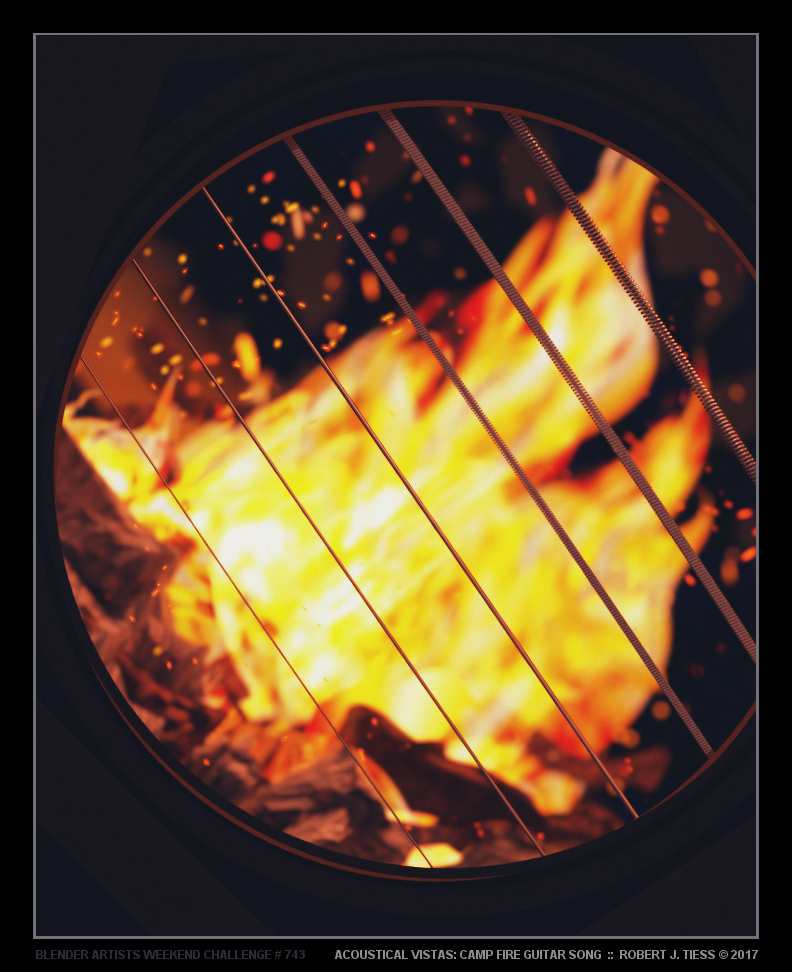
BlenderrMan: I don’t know what an acoustic guitar does at an amplifier, or what that metallic-leaf-thing on the cable is, but it looks cool. The subtle spotlight on the guitar draw me into the scene, which I really like.
BenitaS: not bad at all. Nice details on the (guitar)neck, which I think also should have been on the rest of the guitar too.
fcharr: haha, cool. That’s all I can say. I don’t really know what it is (or rather why there are so many of them) but… it’s cool. I just wish the text weren’t obscured (what’s it saying?).
AdventCrown: this one is reallt good. The lighting, the realism (escpecially the ground), the style of the guitar-ish instrument… it’s so soft and warm. The only thing that bugs me is the rocks the instrument lean on: for one thing there’s grass penetrating the one to the right, but my biggest issue is that they seam to be “floating” on the grass. Maybe that’s just me, that I think it gives them a lightweight impression.
Ryeath: this is really clever, and the style makes it stand out. Nice!
FlyingBanana: what’s better: a flying banana or a guitar-fish? Sorry, I just had to :P.
Anyway, the fish is just cute. I could easily think of it as some childs stuffed animal. It looks very stiff though, and maybe some SSS wouldn’t hurt.
jishwinkler3d: at first i thought this was a real guitar left in the sand, but now I see it’s a broken sign of some sort. I really like the look of it, but the sand seams to be very jagged/low poly.
robproctor83: you’ve done it again! How in the world can you have only been working with blender for a month-or-so??? The details are all perfect and thought through (I can even feel the tension of the strings). There’s a blender logo and even a hidden Mickey (I’ll never forget you if you get that reference).
How did you make belt texture? Gazillions of hair strands?
vaguehorizon: haha, I didn’t realise the guitar-pool at first, but I’ve gotta say it’s very clever. Very detailed too. I just think the saturation is too strong, and maybe if it was taken from a slightly higher angle the guitar-resemblence would be clearer.
caz747: Is it a memorial for a musician? I tried too google 1959, but didn’t really find anything on “eight miles high”. It’s probably just me, I’m not very educated in music-history.
Render wise it’s quite good, maybe the lighting on the guitar could be stronger, like a spotlight or so.
Evilos: Strong mood, I really like the reflection in the street. I think it would have done raindrops look a little fake, some of them are just blue. Are their material glossy (should be glass)? Anyway I really like this one, and also want to hear the story.
david.speer: I’ll be totally honest: I have no freaking clue what’s going on. Is it a bomb? Are they torturing the guitar? Poor guitar 
Nah but seriously, this is quite creative. It’s interesting, and the box+light bulbs look really good.
Apart from not understanding what’s happening my biggest issue is the style clash: the guitars body nad the orangy streaks look too cartoonish compared to the rest of the scene. If the streaks are supposed to be sparks, then particles should be the way to go.
strr11: another guitar-lying-on-something, but it doesn’t make it look worse ;). I really like the look of it, escpecially the design. It’s quite realistic and very detailed. Your updated version is even better. Really nice.
NATIVO: as I said, being another guitar-lying-on-something doesn’t make anything look worse (after all you’re leading…). This one is very realistic, and unlike most of the other guitars it’s old and dirty. It’s saying something, the guitar has a story of it’s own. The lighting is very intriguing as well. Very good.
fdo: (another guitar-lying-on…) This is good, and quite realistic. I rreally like the strong lighting and shinyness.
Millani: WHOA!!! It’s… crazy. I… love it. Just imagine meeting him in an alley at night.
bazawedo: know what I like most here? It’s the style consistency. Everything is quite realistic while maintaing a cartoonish touch. It’s very thougt-through as: like the slightly folded paper on the desk, or the slightly skewed light-bulb. The mood really is there.
Miatpi: and finally my own!!! Yeah, not so much to say here. I totally see why it’s not getting much votes, it’s pretty unclear. To think I deliberately added that glow on the guitar…
So that’s my feedback for you. It took quite some time, but I’m happy to do it
In case anyone would want give me some feedback, it would be appreciated.
[Quite some colour correction in Gimp, hence it’s openess.]


 Your contest entry looks pretty good from a technical standpoint, but it’s too dark. It seems that this is a common issue that many artists suffer from, and it can easily be fixed. I hope you don’t mind me reuploading your entry here as an example to show what I am trying to convey. I took your original entry image and just upped the levels in photoshop (you can also do this with blender), it took me literally less than 5 minutes and it makes a huge improvement. Hope this helps.