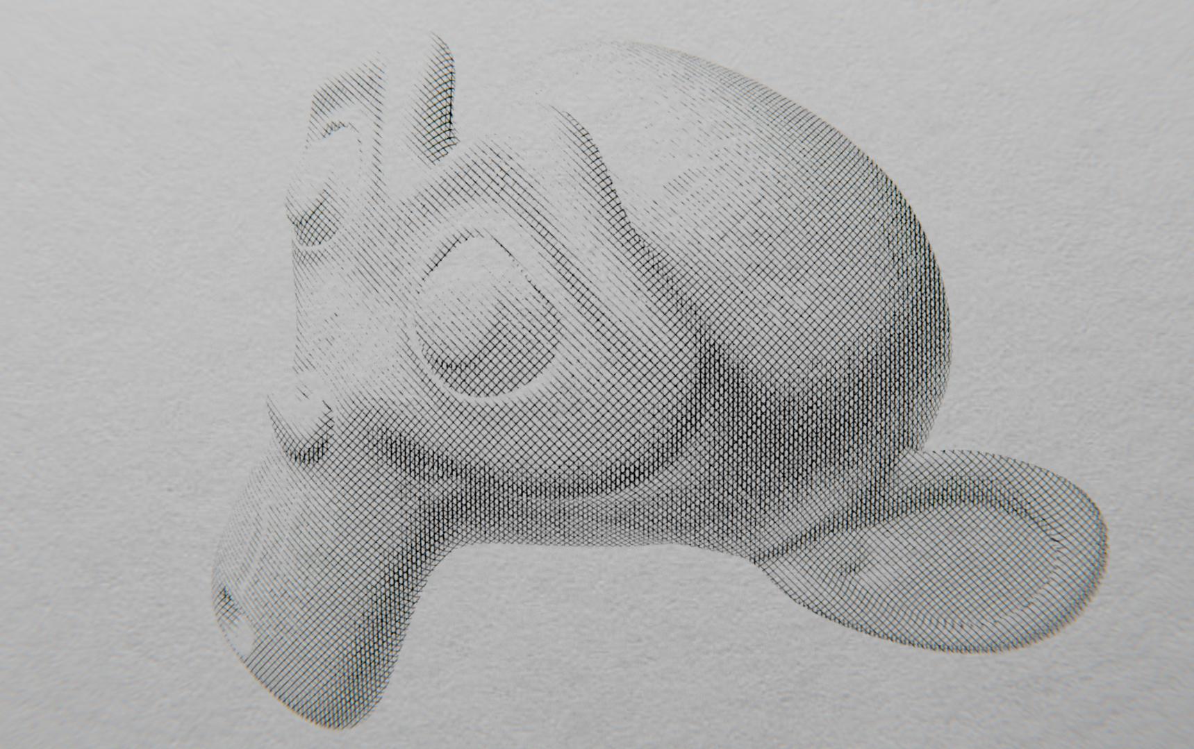
I know it’s not exactly the sort of thing that goes here, but I feel like I did a great job on this and it’s Suzanne so I guess it kinda fits on blenderartists.
It has a very strong “M.C. Escher” / Lithograph feel and I really like how it turned out.
It is indeed generated. I wanted to see if my Cross-Hatching node setup was realistic enough to fool anyone.
This is all done using Cycles nodes, the only compositing is, as you pointed out, the slight blur. I assumed it would make it look like a scanner aberration. It renders near real time on my not-that-great laptop though, so it makes for a really cool effect.
Now, getting rid of the blur is easy, I just have to remove it from the compositor, But when you say “it looks generated”, are there any specific things that make it feel… Wrong?
I think I’ll add some variation to the line thickness and spacing between lines, but I can’t think of any good way to make the lines ‘Flow’ with the object better. I’m currently using a wave texture and Camera coordinates as the base.
The texture of the paper is low quality(also blurry). It would work if the camera is zoomed in and out of focus, but the sketch of Suzanne is way too sharp to match the sharpness of the paper.
Yes, adding slight variation to the line thickness and spacing will help. You may also want to try to skip curved lines altogether, especially the ones on the ear.
Hi there!
I am relatively new to Blender (and completely new to this forum so I apologise if my question does not belong here) and I have been trying to achieve a similar pen-drawn look and feel as you did, tklein (although so far, I had no success).
Would you be willing to share how have you done this?
Is it pure shader-magic or is there also coding involved?
I basically used the layer weight node’s facing value to get the factor for the lines, and multiplied that with a wave texture. There are a lot of little complications that make the whole “Hatching” nodegroup reusable, (I even found a way to allow for variable light direction, though no scene lights are used) but that’s the main point. I multiplied multiple Hatching nodes with different angles together to get the cross-hatching here, then used the whole thing as a mask between a paper texture and graphite color.
I may post nodes later, but I feel like the whole thing would be better off as a fragment shader in openGL so that I can use scene lighting.
Unfortunately, I have used so many custom nodegroups to make the nuances of the Hatching nodegroup work I fear I can’t explain the details without explaining a LOT of details.
Maybe I will have time in the future.
I think that If/When I find time I will post the nodes for the Sketchy effect in a separate thread and title it accordingly. This whole thread is, after all, kind of a lie. I would also like to see about improving the final render before I post again, to resolve the issues that were brought up in this thread.
 so I apologise if my question does not belong here) and I have been trying to achieve a similar pen-drawn look and feel as you did, tklein (although so far, I had no success).