[ If the winner doesn’t supply a theme before Thursday 22:30 GMT, the organizer will select the theme. In this case, the winner’s theme will be used the next time we are lacking a theme on Thursday 22:30 GMT. ]
Having selected the theme, the winner will not be eligible to enter that week. They may however still submit an image, but it won’t be included in the voting.
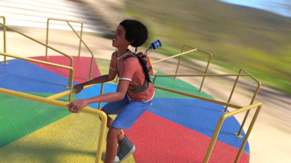
Awe, there is a lot of awesome detail in there, the texturing on everything is excellent (as usually with you). I lke the defails on the character, it’s really well done. Here are a couple critiques that I think would make a big difference. For one, it looks like you tried to add some face melting effect from the pressure of the spinning force. I get it, but it also looks… I don’t know… Strange, almost like a deformation or something. You might need to work on that, maybe just tone it down a notch, or instead just make their expression wide eyed and jaw opened that would also probably work.
My other critique, and more important I think, is the character pose. It looks like the spin direction is going counter clockwise, which would actually make more sense for the pose, but then that wouldn’t make sense for the face deformation as that wind force would be on their hair, not face. But anyways, I suggest changing the direction of the spin, so it’s clockwise, and then your character should (in my opinion) have a more thrown back pose. o help illustrate what I mean I made a purdy sketch. Now I don’t expect you to do any of this, I’m just throwing out my 2 cents
As last week I hadn’t time to finish my rendering (must be some sort of curse).
To bad sad it didn’t compete in a better - more visible - resolution. I put a lot of work into it and got really happy with it turned out, which can’t really be seen.
So I’m very happy to post it now in it’s full glory (and resolution):
Hi Miatpi, your renders are definitely improving, this one is looking quite nice and detailed. I like the plants and rocks, and the materials of the mushroom are also well done. It looks like maybe you tried to make a mushroom character that is break dancing? Is that correct? I actually like the motion effects you added to the hands, it looks very good, as well as the stem, but the cap seems a bit too static. Motion effects like that are hard to do though, so job well done sir. My only suggestion really would have been to tilt the mushroom a little towards the camera so you could see some of the underlying cap, having it at almost perfect profile angle is a bit trange. Also, if I’m right and your intent was to turn the mushroom into a type of character, I would also, maybe, possibley, suggest adding some kind of facial features. Maybe just two little closed eyes and some kind of mouth or something, something to really help sell that it’s a character.
@Fulip I really wanted to comment on your entry, it looks like you put an exorbitant amount of work into the models, a full on motorbike and a character? Wow, that’s impressive. But, your overall scene I think is kind of poor, no offense. You added that filter effect which, in my honest opinion, ruined the entry. I’m not sure what you were going for there, maybe a painting style effect? I would suggest using other filters for that, and also to not make the filter effect so obvious. I would actually suggest not doing any filter like that, unless absolutely necessary. Anyways, I thought you did an excellent job with the modeling, but in the end your entry took a large hit from that filter effect.
Thank you so much! Yes, it’s very intentional that it’s breakdancing, and the fact you saw proves I’ve succeded there. YAY!
I totally agree with you on the cap. I kind of couldn’t deside to tilt it against or away from the camera, so I put it in a middle-position and hoped no-one would notice. Never leave things to chance i guess.
@robproctor83 Thanks for your comment! I just realised that I might be the only one who love strong edge detect filters
I will probably remake this scene and put it on finished projects.
@cas747 go with your heart bro, go with your heart.
@Fulip I think your new renders look a lot better, but yea that could just be a preference kind of thing. I used to use the filter effects like that as well, but one I also had someone tell me to stop using them lol. But, I don’t think there is anything wrong with them, you just have to use them correctly. Basically, no one should be able to look at your piece and recognize the filter effect, which is hard, but typically that means using it a lot more subtle and sparingly.
I definitely like the bike a lot, and the helmet, both are done really well. Have you been modeling a long time? That’s quite impressive to make all of that in a weekend. The character proportions seem good enough, but your pose seems off to me, and the clothing feels flat. And for a final thought, other than the background, is the lighting. I’m still learning a lot about lighting, so I could be way off with this, but for some reason the lighting looks very soft. If you were getting sunlight it should be very hard I think, unless maybe it’s towards the evening. But yea, everything has this soft feeling which makes it look kind of unnatural, almost like clay or something… Hard to say. I’m also being very observant so I don’t think most people would look that much into it.
@robproctor83 What do you mean by hard and soft lighting? From my understanding, hard shadows is what you get with small light sources (e.g., a transparent light bulb) and soft shadows are cast by larger ones. The sun produces very soft shadows.
Just moving the voting thread up again, so we don’t lose any votes.
After all, you still need a few of those if you want to get rid of the 2nd place curse…
 ]
]
***