Hello every body, I’m trying here to create a render that looks professional, but it’s not getting any easier, so here I am asking for your help, any feedback or advice on how to improve this image will be really really welcome, I don’t know anybody in the field so you are kind of my only hope, in return, i promise to do the same for you, in case you want me to! thanks in advance!
It’s a really cool looking model, and the textures look great.
The main issue is your lighting, it’s way too flat. Everything is uniform and there’s no variation in value, or any shadows at all. Without seeing the blend file it’s hazard a guess that you’ve either got a number of different lights all turned up too high, or you’ve got a huge number of light bounces with ambient occlusion turned way up.
I’d highly recommend watching this tutorial: https://www.blendernation.com/2017/10/26/7-qualities-light-everyone-needs-know/
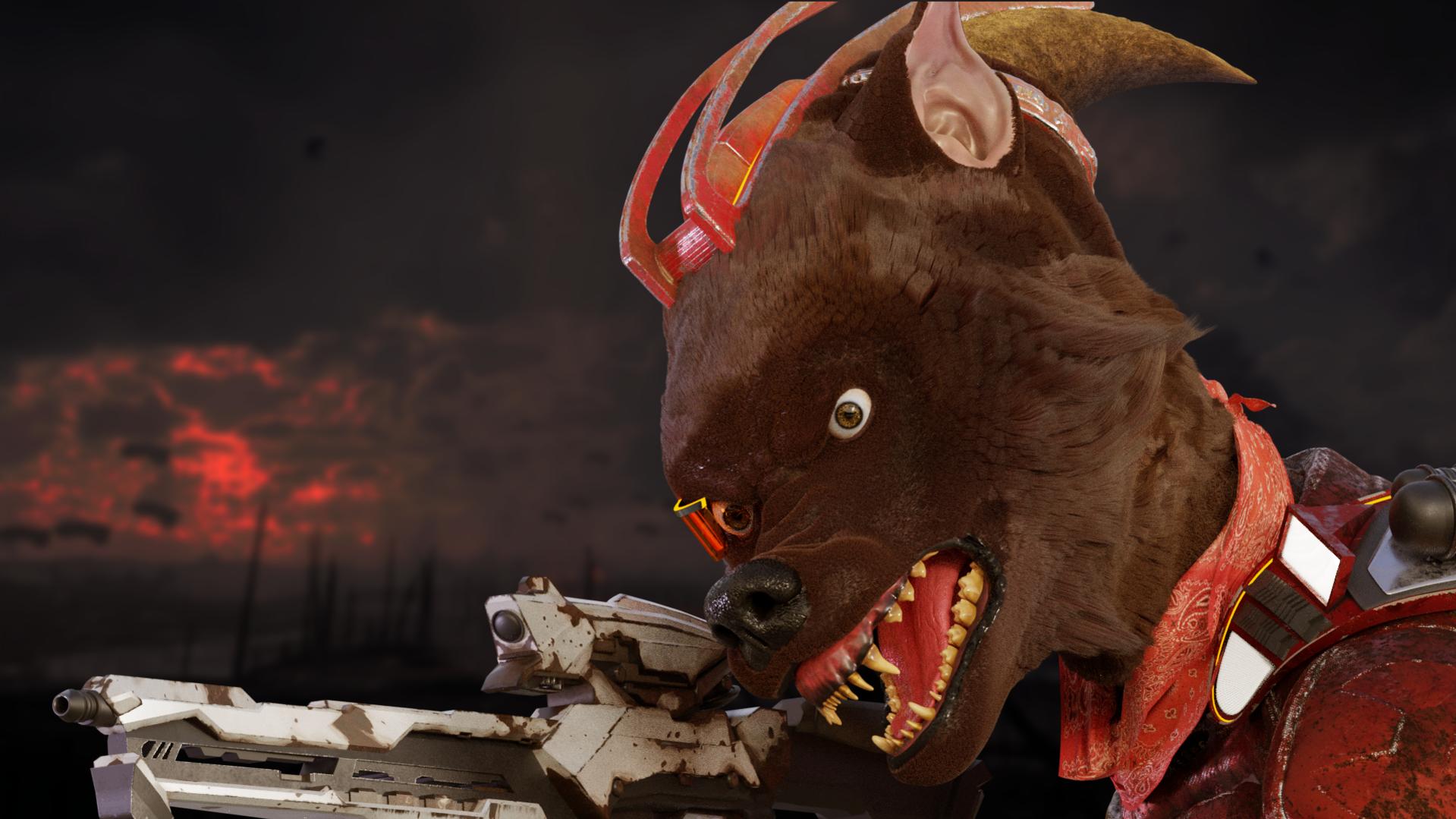
Thanks for the feedback! you are totaly right, actually, I had both options, an hdri image and lots of sun lights. I’m testing with it, same with hair, that is just to fluffy. Made this new one, any thoughts?

A friend send this to me, I founded it really helpful to understand character lighting, that I don’t, but getting there.
eyes and ears dont look like wolf. check pictures.
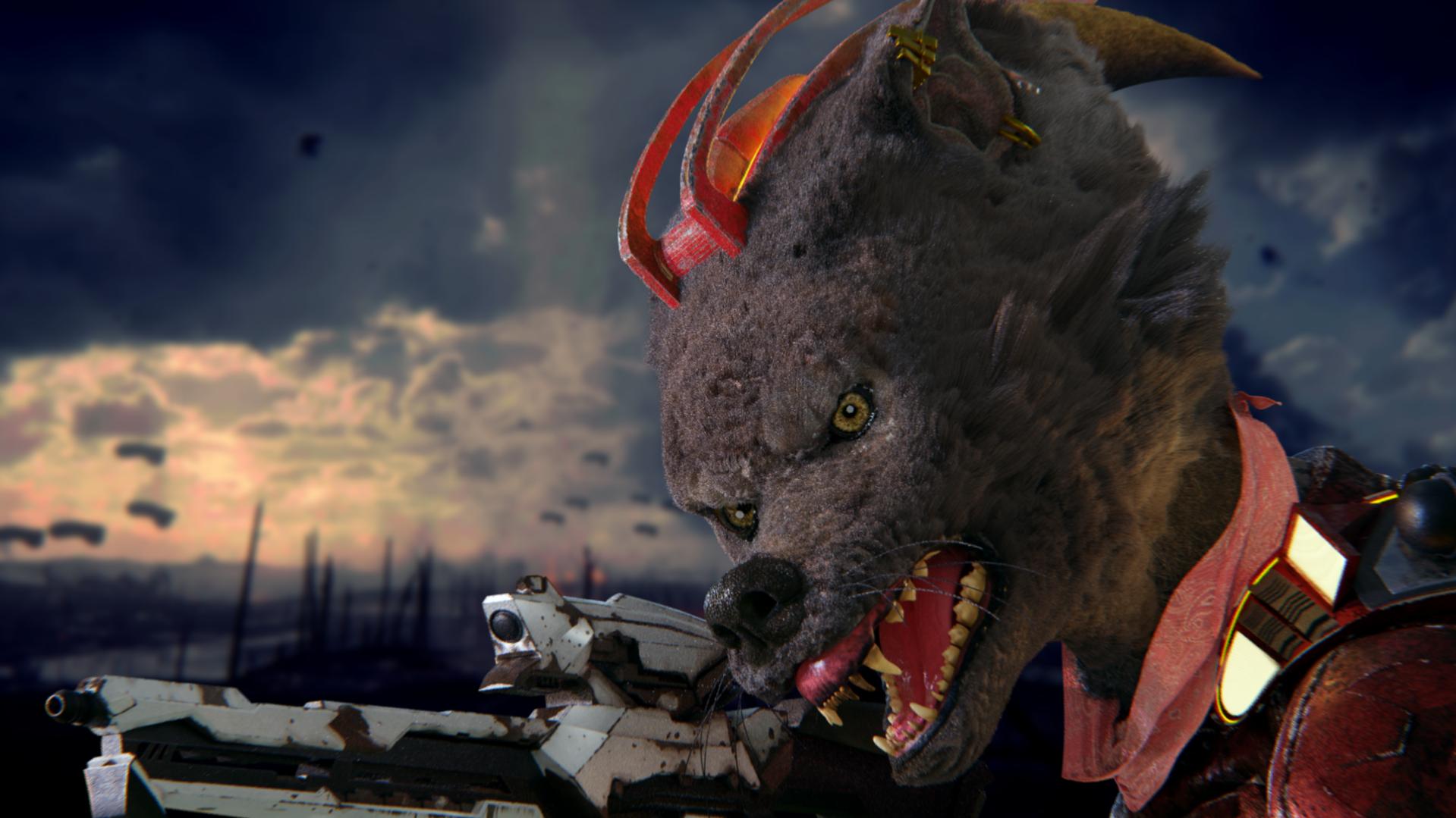
Thanks for pointing that out! I’ve been making some changes in terms of lightning, particles and modeling. I’m steel not happy with the hair, can’t get a realistic look, don’t know if i’ll be able to solve it. Any feed back is very welcome!
I’d work more on lighting, to increase the drama…maybe one strong light coming from left…
Great work! Looks like a really good learning exercise. The biggest problem I see is that you don’t seem to have a goal. A professional is getting paid to make something for a purpose, not just any old neat thing that comes to mind.
Is this box art for a game? A movie poster? A documentary photo? Propaganda?
This may seem beside the point, you just want something that “looks professional” but there are several competing tones at work here, and the piece won’t ever look professional until the tone is consistent.
A few examples:
The hair looks silky and almost groomed, yet the gun is worn and scarred. Polish that gun so it shines, or put some matted filth in the hair to tell us this brute has been fighting for a long time.
The head is very large compared to the other elements, giving it a cartoony feel. Yet all of the elements are modeled and textured with a realistic attention to detail. If you want it cartoony, add some color and clean up the textures. If you want it realistic, make the head smaller, and the other elements larger.
The animal with bared teeth, a mohawk ridge, and a gun says “enemy” to me. Yet the dog in clean clothes, set against a striking outdoor background, in an anthropomorphised pose says “friend”.
Having a goal in mind will really help to inform the solution to these inconsistencies, and tie the whole image together.
The weapon is way too small for such a big wolf. You cannot recognize if it’s a pistol or a rifle.
Beside of this it looks great! Love the look of this animal.
eyes are so much better now! i can live with the ear.
I think the last rendering shows a LOT of improvement. I would suggest to play a bit with the clumb-values of the fur. The areas with short fur still look a bit… of. More like a thick towell and less then actual… fur.
However, why not just calling this scene “done” so far and pose and render another situation with those assets? Might be worth a try to start it over (a little) with the input you’ve got so far 