Some comments.
TSF: I liked the satellite view, with strong vignetting and many scratches on the lenses. And beam of light draws a lot of interest and makes me want to know what happens next.
RayVelcoro: Looks like a fun way to learn a bit of geography. I liked the surroundings, but the lamp is getting in the way, blocking the view of the puzzle.
beau11: Nice view! Looks like a nice way to spend the day, watching the sunset and drinking wine with somebody else.
Lux: Cool idea. I wonder if the Europeans of Jupiter have as many alcoholic drinks as those of Earth  I like how those containers are shaped like beer cans, though this is often a sign of low-quality beer (real bear is served in kegs). But maybe that’s why it is free.
DM9: Haha, funny one. I like the happy colours and the “under construction” feeling of the image.
PyBlend: Nice low-poly models. The blender logo is a nice focal element, but isn’t the Blender Foundation from The Netherlands instead of Germany? On second thought, such a huge logo would not fit in such a small country 
didierv: Interesting story behind the picture. The metallic look makes the objects look like statues, which is nice. Not sure about the colours though. The green supposedly represents grass, but I think it is too saturated. Orange, green and blue do not fit very well together. Maybe you could make only one of them saturated?
purbosky: Does this perfume really exist? Here in Berlin there are bottles shaped like the Fernsehturm (I think with Vodka, not sure). I liked the monochromatic colour scheme, and also the model of the tower as a closed object. It looks a bit like cardboard or plastic, though. I would expect something like this to be only glass.
fdo: Loved the miniature feeling of the image. The material on the land is pretty cool, but the water confuses me a bit: Is that plastic? Glass? The background with the glued stars is pretty nice, and I also liked the message on the image. But what is that metal stick doing there?
fcharr: I liked how the green area looks like grass and the red one like the sky. The small castles are also pretty cute. I think it could’ve made sense to make the image the same shape as the flag (that is, not a square).
MACEPRODUCTIONS: I think I saw a similar entry a few weeks ago when the theme was “Castles”. I liked the castle and the trees on the background. The water is nice, but for some reason it looks shallow, not sure why.
chris.hopper: I really liked the realism here. Those grapes look really tasty! It also has a cold wine cellar feeling. The glass is very well made (it even has an air bubble). But I think the image is too evenly lit, it could use some highlight.
wallacemarino: That’s a cool map, I liked the colours. Are they based on the population of each region? The scene could use a focal element though. Maybe if the camera were centred in one of the red regions?
FlyingBanana: That looks tasty! I liked those strawberries (I mean, they look nice. I did not eat them). The waffles look pretty tasty too. But what is that liquid which is being poured on top of them? Honey? It looks a bit too watery. Also, the background looks a bit pixelated, but that’s the image’s fault
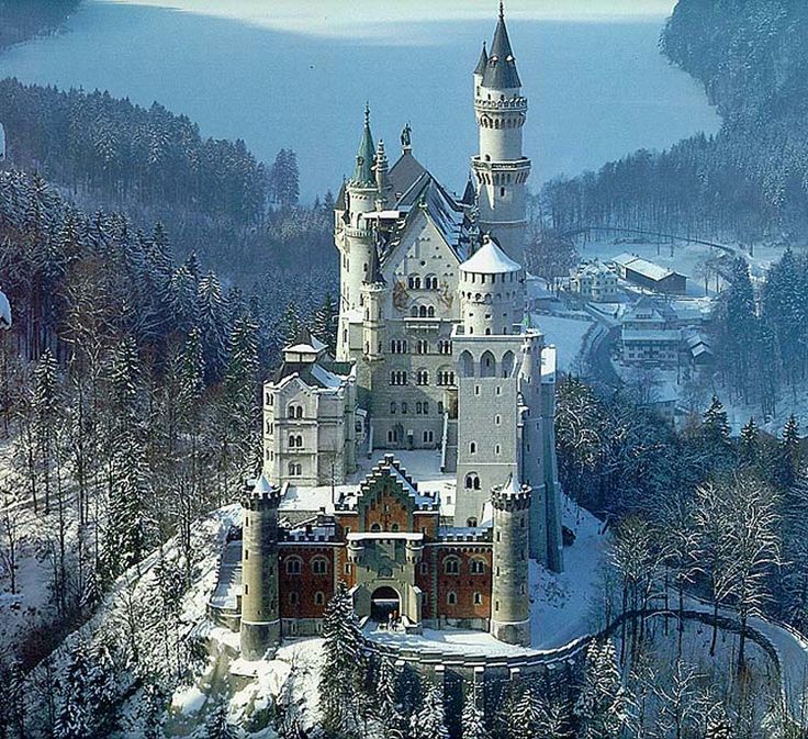
DoriNori: Loved the landscape here, specially the mountains in the background. The castle is also pretty interesting. You captured the feeling of cold pretty well.
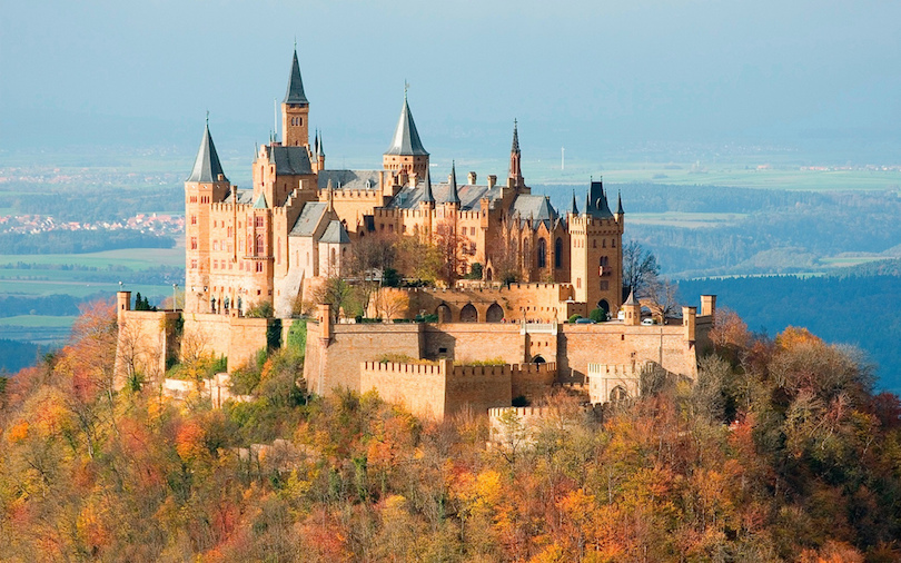
Bunnyhog27: Loved the colours of the trees. The laves are pretty amazing. The brick texture is also pretty nice. It is just a bit strange that the castle looks hollow (I can see grass and some trees from the forest inside). Also, those trees are growing out of stone, which is a bit strange.
robproctor83: Really nice lighting. I liked the details and the amount of objects. The bread is particularly nice. I think the flag was a nice touch (even though the nationality is wrong ;)). You already said that those glasses are too filthy, but it also bothers me that they are too thin: There is no space between the wine and the outer side of the glass. Also, I don’t understand much about wine, but aren’t wine bottles always dark?
str11: Beautiful landscape and really nice windmill models. I also liked the flowers and the way that they are arranged in circles of different colours. Very idyllic!
caz747: Spooky. I liked the cloth and the yellow eyes. I think the darkness is ok here, not too dark. Adding some fog might make the image a bit brighter without hurting the darkness (if that makes sense). But I think you could’ve made his horns more apparent, it took me a while to notice them.
Ryeath: Nice style. I liked those car models. The glossy effect is pretty cool, specially on the car on the front.
MonkeYceBear: I liked those toy models and their colours. The map is also pretty cool. Not sure about the background image though. It is a bit rare to have a wall painted like that.
mirek_snd: I liked how those swords look like “sisters” (or brothers, not sure). The model is pretty cool, but the grip looks like plastic. Also, the scale is not very clear: Are those huge swords, or is the grass very thin?
OLG: Ha! Loved the title I suppose you’re not the only one who feels like this, considering how many entries are about alcohol. I liked the background and the way that you transferred the idea of drinking too much. Also, thumbs up for using European instead of Californian brands  (Sorry rob)
Photox: Loved the colours and the atmosphere. It looks a bit like an old photo, but some towers on the background look rather futuristic. Also, the fact that you used Suzannes for that is pretty amazing.
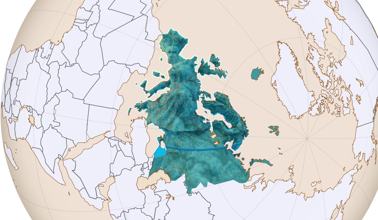
Helge: At first I thought you went lazy this week, making a very strange statue with cheesy edges. I shouldn’t have underestimated you. The fact that this has the shape of Europe is pretty cool, and it takes some much creativity to see a person and a two-headed lizard just by looking at the silhouette of the continent. The stone material is pretty cool too.
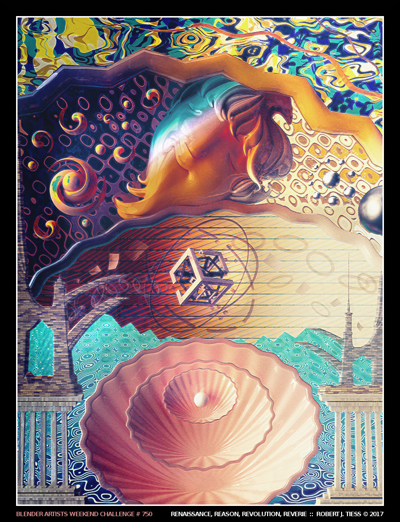
RobertT: I really love your style. It is hard to believe that this is 3D and not 2D art. I liked the sleeping head on top, and the colours are pretty awesome too. I don’t understand much about the history of art, so I think I can’t appreciate this in its true glory, but it looks pretty neat.
bazevedo: I liked the old photo look, with some regions being over and others under saturated. I also liked the contrast between the old castle and a modern city.