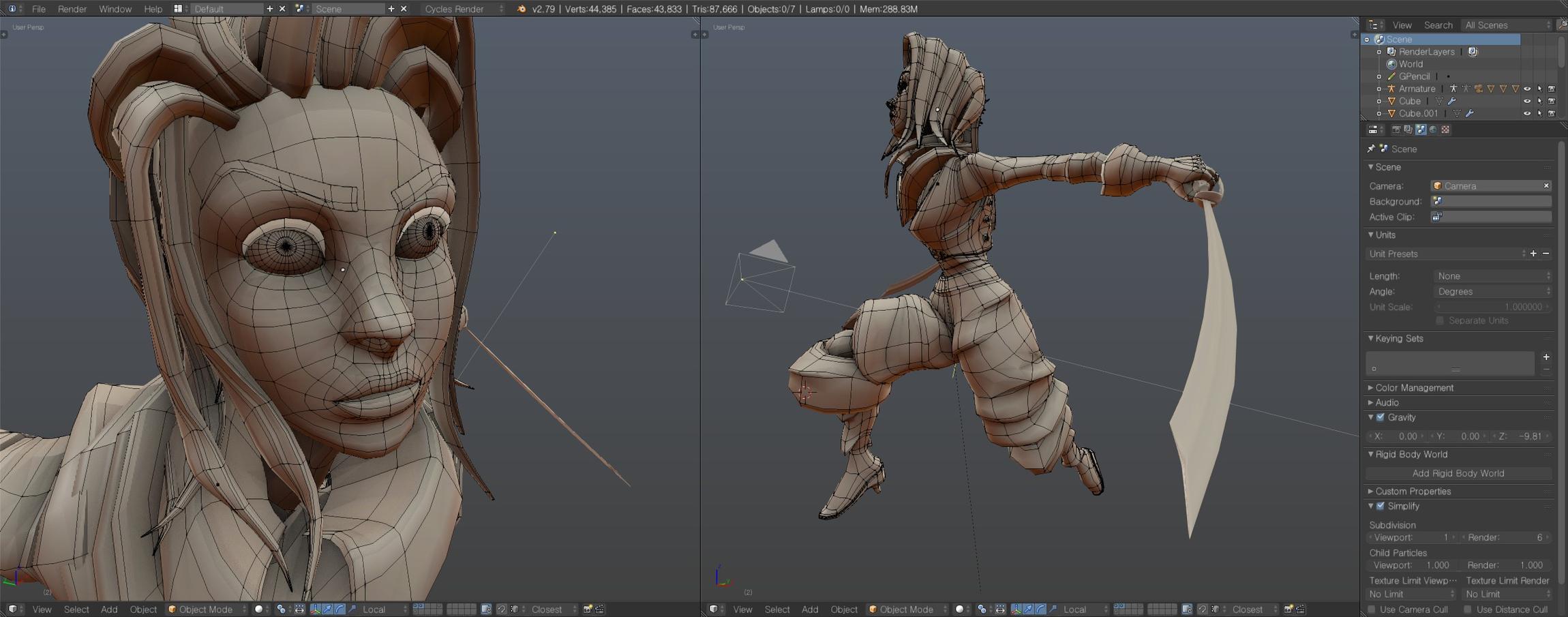
This has been a project since october break, probably put in about 10-20 hours on her. I don’t know what her name is yet!
I tried to mimic the visual style of Overwatch while adding my own twists to it. Some things that are coming next: more work on the rig, more detailing (she’s a pirate so she needs bling).
I need feedback. It’s been forever since I posted here and I need artists to look at my work; my artistic eye has gotten rusty!
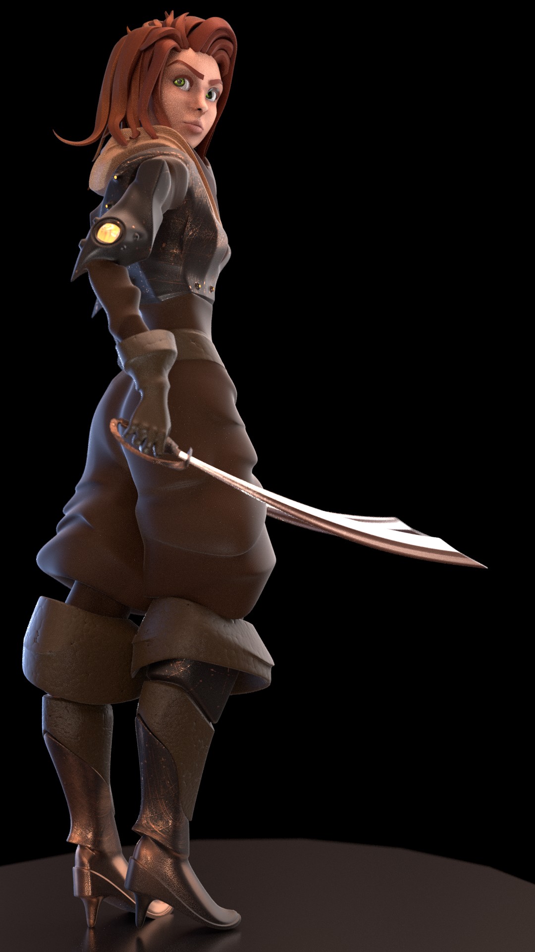
If this is a riff on Overwatch, the first thing I would do is put the model in an Overwatch character select scene. None of them have just a black background, so it’s hard to judge how well it fits with the style given a lack of context.
If I had to change anything, it would be to make her hands and feet a little bigger, and thicken her arms.
Overall, though, looks promising! If you want to commit to the nautical theme, maybe put her in a tricorn with a figurehead at the front, swap one sword for a techno-belaying-pin, just some of that crazy over-the-top overwatch flavor.
Thanks dudecon! I like the idea of switching out one of her swords for something else. I’ll probably do that! I like the tricorn idea too but I think that might be overly pirate-y. Idk! I’ll probably try it too and see if it works well. Here’s some more material tweaking:
If it’s supposed to be like Overwatch, I’m not sure it’s possible to go too far. Case in point, the cowboy character has a spur on his gun.
If you’re leaning away from the tricorn, maybe a head band or something?
Love that she’s modestly attired! Seems like she’s not sporting enough omnic gadgets either.
Hello, I was watching a video from Blender guru last time and he mentioned the discussion he had with the character designers working in blizzard, those in charge of designing Overwatch characters to be more precise. He said that they tried not to add too much detail to the characters but not make them too simple. In my opinion, your character looked best when you had changed the materials of the clothing (#4). Try to add the pirate hat to that model and see how it looks, I think it would look best like that. Good luck!
edit: what I meant to say is that your renders starting from #5 and onwards seem like they have too much stuff on them. Too many details kill the details my friend. Minimalism and refinement are the path that modern art is treading =)
Hey Shenfara,
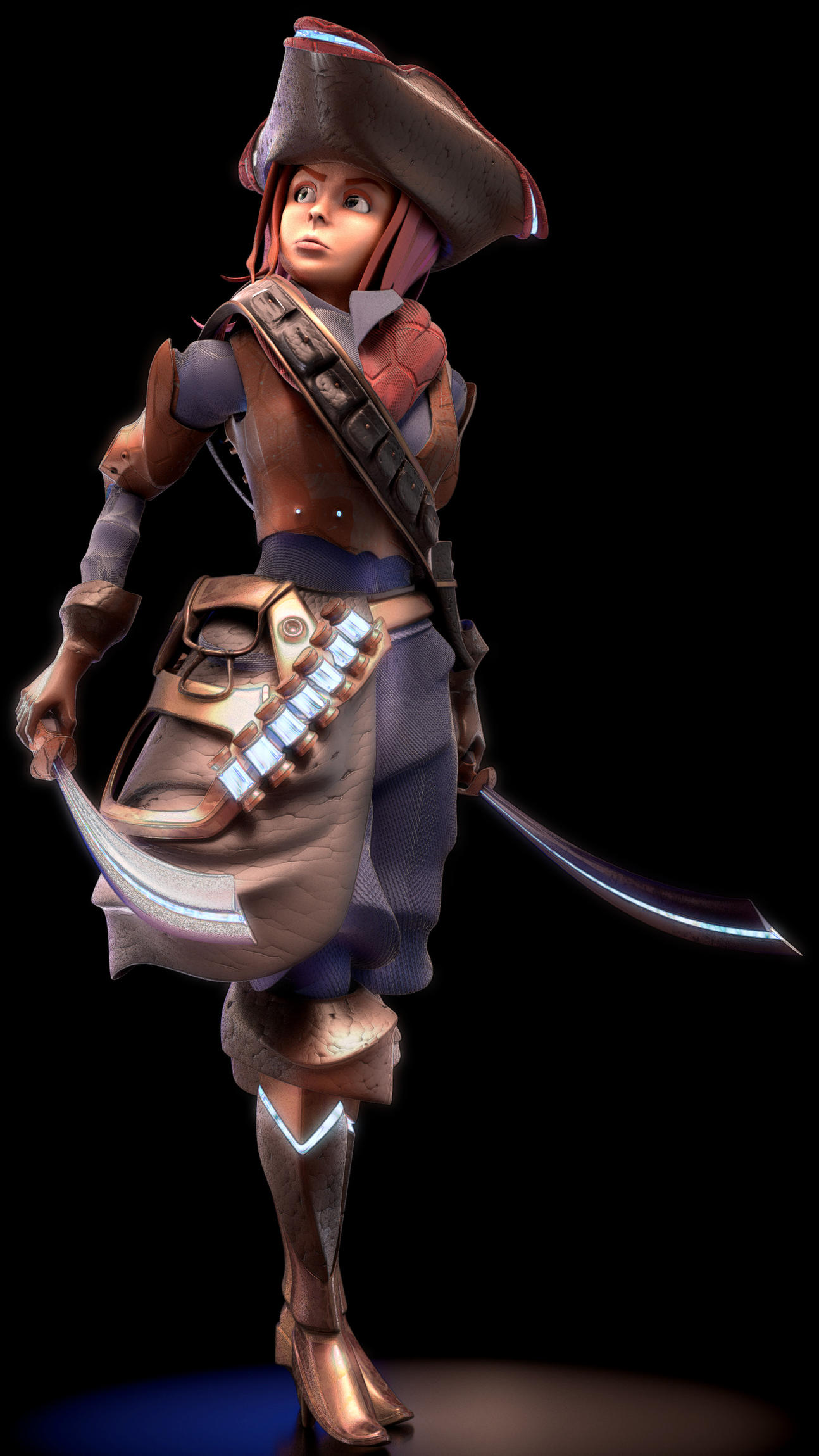
Your advice was super helpful! I made some changes based on it and I think it looks a lot closer to Blizzard’s art style.
What do you think?
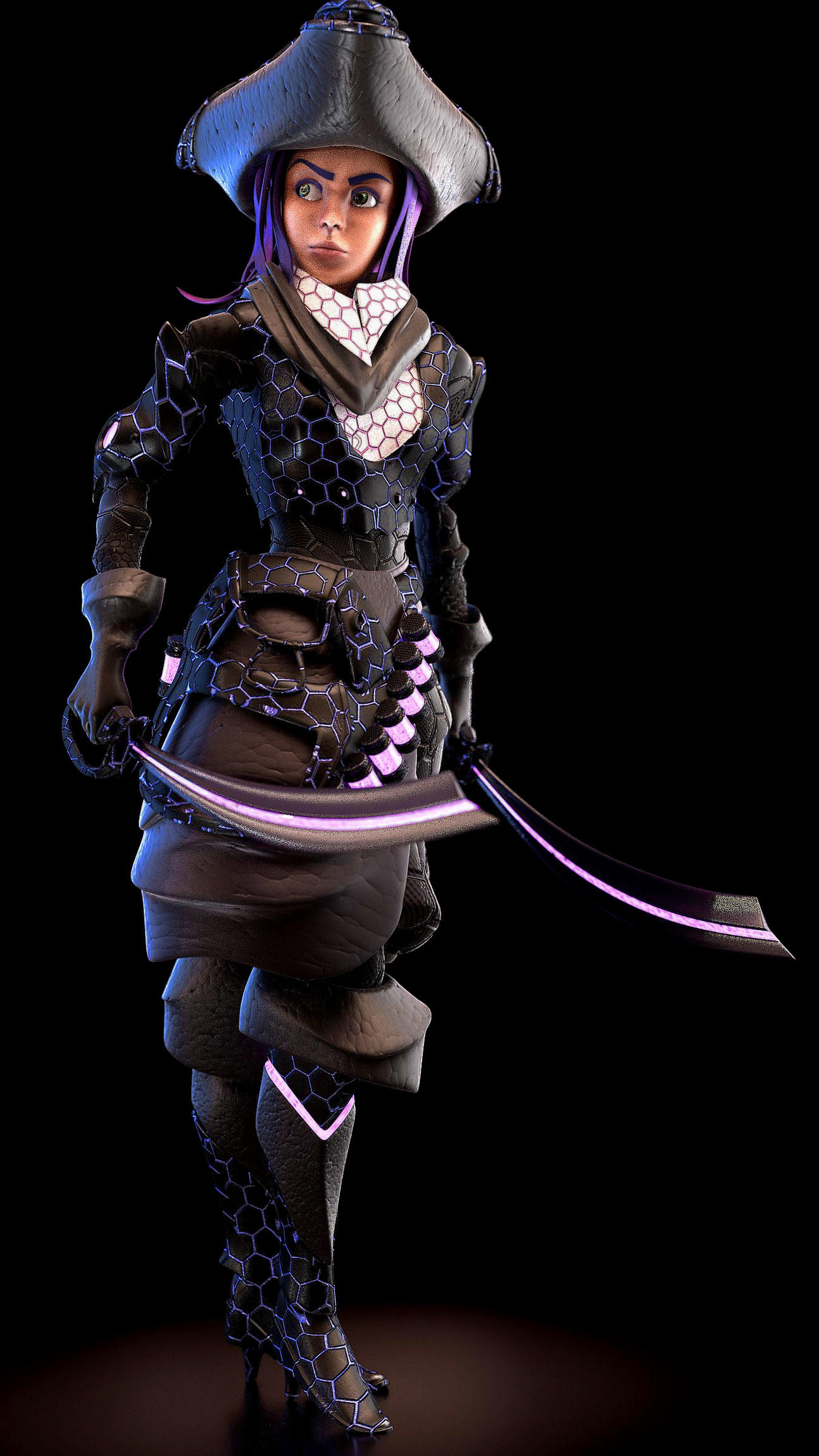
Hey there, well I’m glad you found my piece of information helpful. As for this latest render, I find it a lot more appealing than the previous ones. However, being the big Blizzard fan that I am, I’ll have to admit that this character is still a bit further from it. You used that turtle shell pattern on her clothing and that doesn’t bode well with her theme, which is that of a pirate or captain. That pattern should be used with futuristic stuff. (and in all honesty, it doesn’t look great)
Keep your materials simple and don’t add too many details or give it a texture. The Overwatch characters are stylized and cartoonish. If you have a look at them, you’ll notice that the materials have many colors but all of them are plain. Some have materials that are metallic or shiny like leather, but that’s all.
Lastly, I think she looked best with purple hair and purple clothing. Also, her eyebrows are a bit too thick, if you contrast them with other female characters from overwatch. Almost all of what I said is just my opinion and I could be wrong, so don’t quote me on anything xD
edit: what I meant is that you shouldn’t make her clothing look realistic, it’s a cartoonish stylized character afterall.
Big OW player here, must say loving the pirate theme. Can’t really comment on the work as im a bit of a newbie when it comes to 3D modelling. But what I do love is;
The boots, the Hexagon pattern I really enjoyed, and the strip of glow is my favourite part. Shen will disagree with me, but I felt the hexagon pattern fitted within the OW world, but it may have needed something different with the rest of the outfit. As many of the chars have cyborg/futuristic alt outfits. But if your going for a standard outfit then i agree keep the hexagons off.
I feel the hat is too large personally, along with the sachet thing. I preferred the slimmer silhouette of the previous iterations. They also seem a little bulky on the character. whereas I feel the OW characters have a lot of stylised gear that is often either quite spikey and sharp, or small and stylised. Unless were talking Hog, but hog is supposed to be bulky.
Love the swords. Would love to see a sword and pistol combo!
Good job =) This character is pretty much done. You should move on to the next project and use what you figured out from the previous ones to make the next one better Good luck mate!


 Good luck mate!