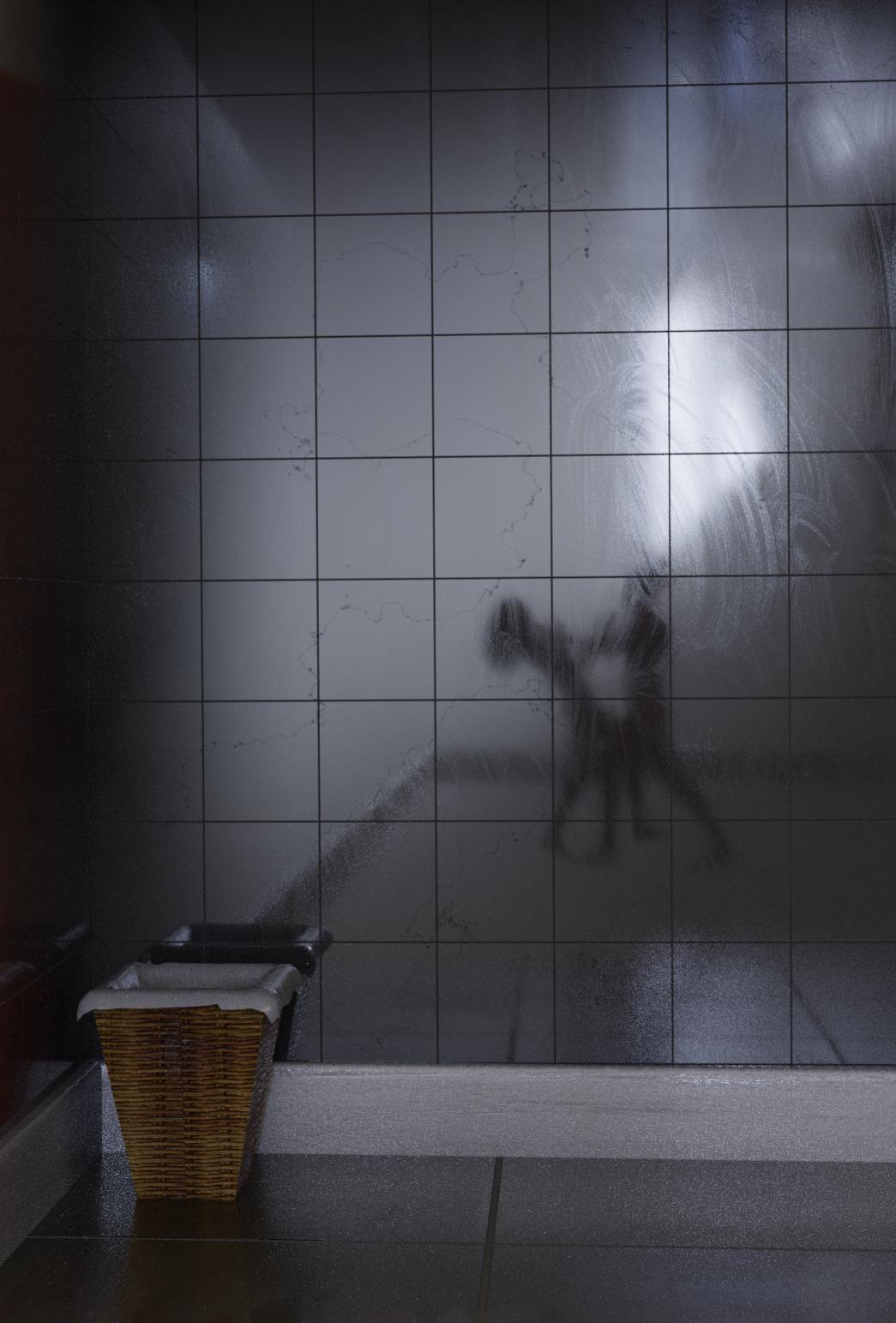
This started as an experiment with textures, but the test scene was just begging for something horrible, so here’s a WIP.
I need some more foreground stuff (not decided what, yet), but the story is in what’s off camera.
The figures are Manuel Bastioni figures. I honestly had to do nothing with them except pose them (and even that didn’t have to be precise). The silhouette is provided by the HDRI, and the characters are just behind the camera.
And it looks more like they are dancing than they are doing something violent. It has to do with the positioning of their torsos and pelvises. In conflict the torso and the head is what people seek to protect as such these are things will be placed in defensive positions or positions that enable escape, as such her pelvis would be much farther away from his and it would be seeking a stable position under the torso. Her legs would not be at all as they appear there (they look like they are in a casual step towards her attacker), they would be being used as either weapons or for escape (pointing away from the man).
I agree regarding the scale, and as for fleshed out, is very much as “As it comes to me” idea.
I agree, also regarding the poses. She was originally both legs hanging back, as though she was being held up by the throat, but it looked like it would take a superhuman effort to hold her.
EDIT: It would probably help if the blurring hadn’t destroyed the knife in his hand
Nevertheless, it is still a WIP, and so anything is possible with it
I’m back at work now, and so don’t have as much time to work on this until weekend. However, I’ve re-worked the poses and hope it looks nastier. I did some testing with pics found around google images and GIMP, and it’s really hard to tell the difference when you blur and silhouette between dancing and killing, but hopefully, closer to the latter (there’s something I never thought I’d say).
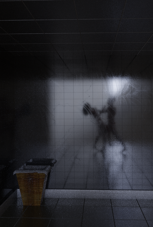
Also started on foreground.
With regards to scale, I have a couple of ideas to correct, both taking artistic license. One is to fake perspective in the reflections, and the other is to extend the back walls and baseboard, but use a gradient and transparency to blend to the background HDRI to give the illusion of more depth. The newly added ceiling has the basic node setup to achieve this, and it’s probably the way I’ll go. We’ll see.
And probably not going to be at my best in work tomorrow, but had to at least get an indicative version of blending the scene with the HDRI. Note, at the moment, this is straight out of the render - zero post work. It’s all done with material nodes. Needs some tweaking, but the concept is proven, IMO.
Is this meant to be a roughly 4m high bathroom? If not, consider scaling up the people so they appear to be ~0.75 of the left wall height (use the vanishing lines to measure). Your tiles, skirting, bin all seem out of scale to me. Specifically; skirt looks large, bin small, floor tiles freaking massive. Perhaps these sizes are common to your market, or you might consider finding some photo refs to scale things to.