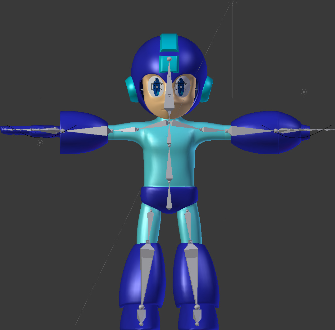
Thoughts? I have my doubts on the lower legs. And I plan to just use shape keys for the face. (Face rigging is hard…)
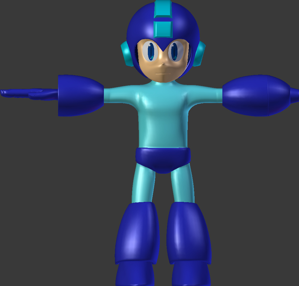
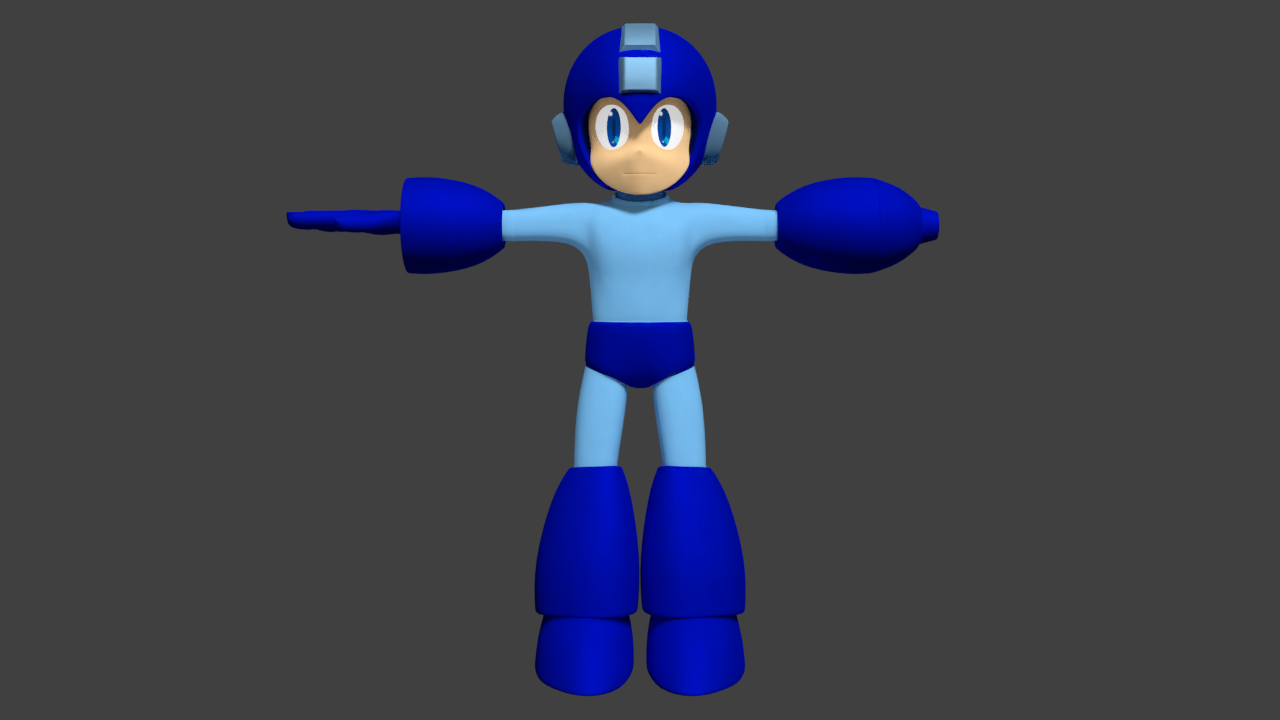
I think there’s a bit too much of a gap between his head and the helmet. Perhaps add some padding to fill it in? Otherwise the shape looks basically spot on (I’m assuming you don’t want any critiques about the materials as of yet). The hand cannon looks a bit off, almost too skinny and that bit sticking out on the end doesn’t look right, but there’ve been several versions of Mega Man. Adding your reference for the version you’re using might help guide critique.
I took a look at the official character reference sheet of the Blue Bomber and there are some things that need so to be changed.
To start, Artistic Lee is right. There’s too much spacing between the helmet and Mega’s face. You have to keep in mind that this robot still looks human and you will have to bring the curve of the fore head into it.
The pelvis is a bit too low. Going back to what I saw from the art sheet, it would normally take up 1/3rd of the torso.
The legs are almost there, but I think I have an idea of what style of Megaman you make be going for.
Where you could be going for this…

You went and took this route instead.
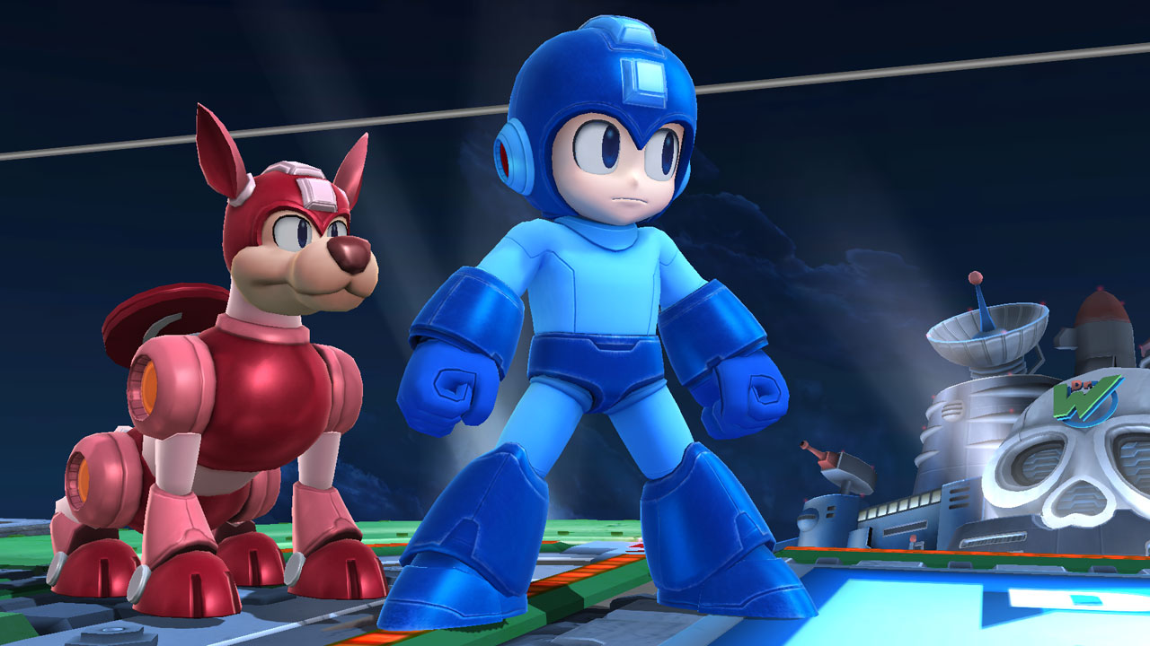
That may explain why Mega’s Right forearm is incomplete.
Now for the color scheme. You have at least 1 color right. The secondary doesn’t have that teal color.
You will also need to get rid of the shine on his face as well.
Other than those mentioned above, everything else looks fine. Once again, I’m not actually sure if which design you are following, but that’s my opinion on Megaman…
After seeing someone in the forums create X and now this, I’m really, really, really tempted to create my own version of him!
I’ve got an update coming, it’s just taking a long time to upload the pictures. (Even though it’s only 336 kb.)
The style I was going for is kinda halfway between archie comics and smash bros. And I have done some work on the materials.
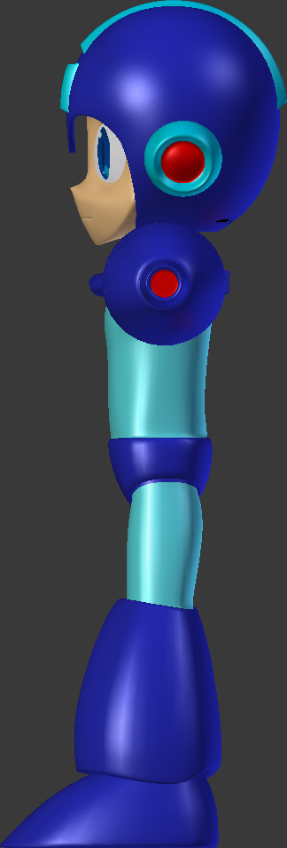
It’s also worth mentioning that the first pictures were opengl and not actual renders. …Which seems a bit stupid, looking back. >_>

I adjusted the materials and proportions, and added more helmet padding. But I’m not sure what to do about the hands.
I kinda like that aspect of the smash bros design, where it’s more armor than a… swollen forearm. (Or maybe I thought this was easier. Whatever.) Think I should put it the other way?
Oh, and he has hair.

Well, that part is up to you. Bare in mind that that would require adding more polygons to the forearm.