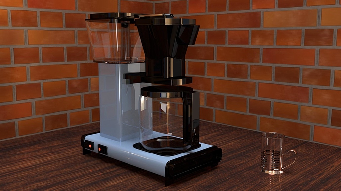
Here is my latest finished project. I have put most of my energy into the perculator. I put some textures as backdrop. I wasnt trying to make art with this one, to me photorealism was more important and thats what i want feedback on. But if you wana give artistic feedback go ahaed, even though i cant change it or the fact that it doesnt apply to me, i can bring it with me to future projects.
Well, photo-realism is not achieved. Seems more like a straight path into the uncanny valley.
What’s your main point, the intent?
Either way, more work on details, have good foundations… so study the theory first - what makes a CG image defined as PBR: Allegorithmic’s PBR GUIDE
Also since you left some info about the product out:
Original product comes from Moccamaster
3D model available to download from Technivorm Moccamaster by Bao Doan aka"baolambor" (@ Evermotion)
& my humble contribution, a quickie with Cycles
Alright, i knew it was gona be brutal , but can you be more spesific on the details? Is it the lack of logo, symbols on buttons and so on?
The reason there is no logo on it is because the image might get used on a youtube video with comercials. I want to prevent copyright isues.
Thanks for the links BTW.
I have read through a huge portion of that guide you linked. It is kinda good but its for another software than blender. That makes me wonder, is the information completely transferable to blender? Especially the parts where spesific value settings are shown. Would they give the same result in blender (or any other software for that matter)as in sunbstance designer/painter.
I don’t think you did too badly on the mochamaster (or offbrand equivalent). The coffee pot part does seem to be missing it’s lid. It also looks like it’s on, which means there should be coffee in the pot. Even if it’s not on, the container would have coffee beans (or powder, whatever it uses) in the little storage bin. Even if you don’t want to use an existing logo (good call), you should use a fake one, just so it doesn’t look subtly off. I usually just use blender’s logo as a placeholder in such situations. The biggest issue here, however, are those textures just thrown up there. It detracts from that painstaking effort you put into the rest of the scene. It’s not so difficult to fix, simply adding a bit of displacement would improve it wonderfully (it would still look fake, but in the same way plastic wood siding is fake, not unrealistic from a photographic standpoint).
Thanks:) Youre absolutely right, it should be cofee in the can. Or at least fresh water in the container to signal that it might just have been turned on. About the beans/powder, did you mean there would be cofee beans powder/beans in the storage compartment on the machine?
Uhm, the lid actually looks pretty much the way i have modelled it. There are diferent types of moccamasters and the one i have modelled looks very similar, even on the photo. You can find it on google images if you want to check.
Yes, I meant there should be beans/powder in the compartment on the machine–or whatever is supposed to go there. I feel that something is supposed to be there, if this is used frequently.
It must just be the angle, then. I have a Keurig and a Mr. Coffee, rather than a MochaMaster. I imagine there are a lot of design differences among models.
i would recomment reworking the wall and the table with a normal and a specualr map.

