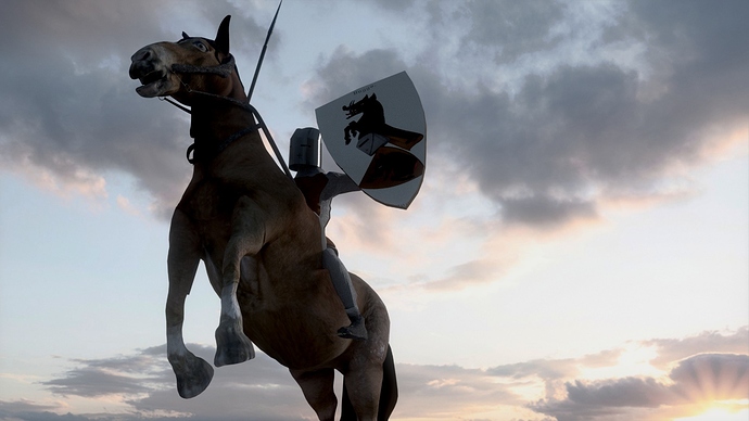
I made this low-poly knight. It is meant to be low-poly as I am going for animation and need to render a lot of other characters in an epic battle.
Before I proceed I’d like to know what you immediate thoughts are about this picture.
It is my goal to use this as part of an castle-reconstruction animation, and early in the movie, this knight will be shown, in slow-motion, making the horse go into this specific pose.
