Some quick comments:
RayVelcoro: I liked the colours. It is impressive that you managed to make this so quickly!
astiero: The ship is really awesome, and the explosion looks really cool. Nice usage of black and white.
fcharr: I spent quite some time watching the animation. I liked how the train seems to be slow and small in the distance, but when it gets close it looks really fast and big. The light on the tracks looks very nice too. The only weird thing is that the train seems to slow down for a few frames, and then speeds up again.
didierv: I also remember playing this game. The motorcycles look really nice. The walls could glow a little more to add to the neon feeling.
Engineer: Nice colours. I also liked how you wrote something using optic fibre.
joshwinkler3d: Nice play on words. The exaggerated perspective looks really nice (or is the building curved?). The little cars and trees were a nice touch.
Evivi: Really impressive. It looks like something futuristic, yet from a near future. I also find it interesting how you used cloudy weather to keep up with the grey look of the image.
beau11: Ha, the tire got retired  The grass and tree are pretty, but I think the scene lacks a bit of contrast. Also, I think you shouldn’t have cropped the tree since it is the main thing on the scene.
EvilDeeds: I liked how the animation loops. The low-poly mountains and trees are pretty cute, specially in the areas with sunlight. The darker parts ended up having too little contrast though.
purbosky: I can almost feel the tension! I liked the model of the plane and the materials.
Munno101: Nice take on the theme. I often think of satellites as being stationary, but some of them have to move pretty fast!
david.speer: I liked the cheerful, colourful atmosphere, with all the toys and drawings. The kid looks pretty nice too. I just think his parents will get quite mad with him doing that indoors!
Gordi: Haha, a turtle might be slow, but a turtle on wheels can be pretty fast! It is nice how you placed a normal car in the background to show how small the turtle is (though I supposed you forgot to add the right side of the car ;)). The light is a bit too homogeneous though, it could use some more contrast.
DreamMaster: I liked the colour contrast, specially between the orange, glowing part of the ship and the background. That model looks pretty alien!
str11: Really nice cars! I can almost feel how fast they are going. The scratches were a nice touch (a little too scratchy for me, but that is a question of taste).
bazevedo: Let’s see who has the bigger button now  I liked the different materials on the rocket, each with different roughness. This makes the reflections look pretty nice. The smoke is also nice.
NiklasWerth: I really like this dusty industrial style. It looks like something from a post-apocalyptic world (maybe the train is carrying prisoners?). The train is pretty awesome.
FlyingBanana: A cool shot, but I think without a very detailed fluid simulation it would be pretty complicated to reproduce this kind of photo. The water looks a bit strange, specially the drops in the edges (did you consider using metaballs?), but the ballon is pretty cool, specially the ripples.
caz747: The forest is nice. It is missing some grass, but the trees are nicely made. I wonder what were the archers aiming at.
Photox: Hell yeah, that turtle is ready to beat some rabbits on a race! The tire are pretty cool, and the smoke coming out of the turtle gives the image a nice sense of speed.
OLG: Nice play on words. I don’t understand much about bikes, but this one looks pretty cool (are those wheels based on real wheels? Peculiar design ;)). But I must confess, it does take some effort to focus on the vehicle instead of the mannequin
Helge: The rocketman looks so happy (in a derpy way, but still happy). He doesn’t seem to have much idea of what he is doing, but he shouldn’t go far as long as he holds tight to the handles on the floor. Also, I liked how he looks a bit like jelly.
DM9: The little genius is quite dangerous! That car has an interesting design. Also, I liked the girl’s hair. It looks a bit like clay or some somewhat hard material used for toys.
kaidoe: Low-poly can be so cute, even when depicting cannonballs. I liked the grass (though at one spot I can see it coming out of the rock). The little details like the ladder and the planks on the background were a nice touch.
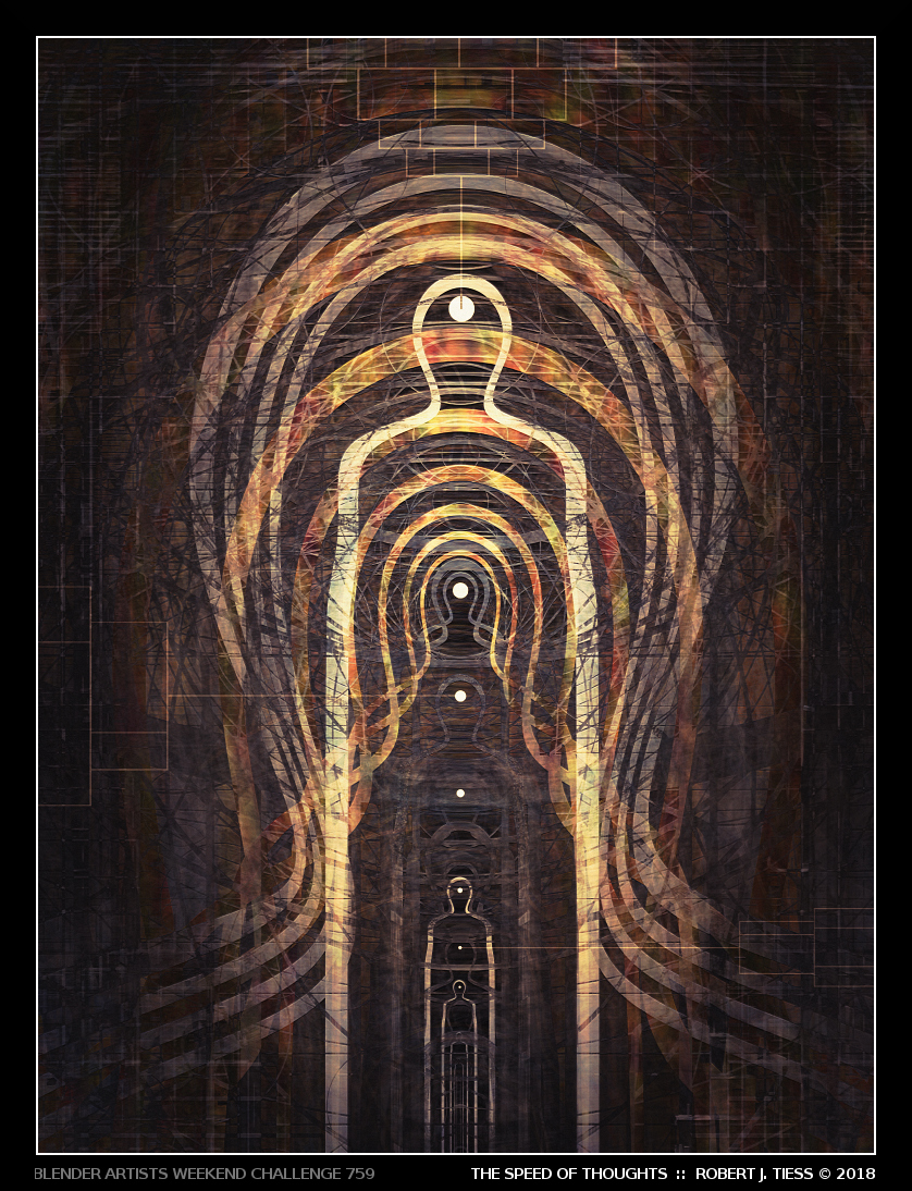
RobertT: Nice take on the theme. I really loved the colours and how you illustrated the idea of thoughts being transmitted from one person to the other. I just can’t help but to see those signs used for target practice
 ]
]