Some comments:
Shenfara: Somebody ate too many beans! The toon style is quite cute, but the scene is a bit empty.
MDO2010: Interesting take on the theme, I totally did not see that one coming. I liked how the two looks melted. The image is a bit dark though.
purbosky: That’s a lot of engines alright! The plane looks pretty cool, and the materials are very good. Looking closely I can see that there are some trails from the engines. I think you could’ve made them a bit more visible/less transparent.
BenitaS: Spooky. I like this kind of picture with a tall structure in the night lit from below. The lighting is pretty nice. I’m just not sure what this is, but that only makes the image even more mysterious!
fcharr: Flower power!  I liked the materials and the defects. The roots also look pretty nice, properly wrapping themselves around the ring. Just one thing: Organic materials are often semi-transparent (just try to place a light source close to your hand and you’ll see). You could use subsurface scattering or translucency to simulate this. The plant looks a bit plastic without this effect.
khalidsrri: Is that a burning star? I liked the “smoky” halo around it. It also looks pretty hot. But I think you could’ve reserved the glare effect only for the stars. The glare from the compositor often looks quite silly/artificial.
astiero: Loved you take on the theme. Very emotional image. Also liked you usage of empty space to enhance the feeling between the two people, making it clear that they are only thinking about each other here.
Iridesium: I liked that alien. Also the concept of a guardian for the solar system is very interesting. With greater power comes great responsibility!
Munno101: Indeed, whoever has this kind of weapon at their disposal has way too much power! The missiles look more like bullets than missiles though. I think missiles tend to not be so pointy, and have some wings on the back.
beau11: This looks a bit like the kind of view you see when travelling around the country. Those wind turbines look pretty nice (maybe a bit too glossy?). I just think that you shouldn’t have cropped the one in the front. Also, vignetting is a bit too strong (I mistake I made a dozen times already ;)).
didierv: Loved reading all the details. It certainly makes the job of the president much easier if he just needs to turn some knobs and press some buttons. My only critique is that some of the text is a bit hard to read (for example “marines” or “air force”). Also, you misspelled enemy  (or was it a joke?)
joshwinkler3d: I liked the derpy face of the dog. But I don’t understand the connection to the theme.
RayVelcoro: I liked the lighting and the sky. The rotation turbines are also pretty nice, and you manage to picture this feeling of motion pretty well.
YAYA: HAHA, poor robot. I guess it was expecting 110V and got 220V (not sure if most of the world still has this problem in some places). I liked the robot and the shards on the floor.
VeinCore: Strong message. The lighting and colours are very good, and I liked how you have some many bank notes there. Just one thing: Those are euro notes, not dollars
str11: Nice model, very well detailed. Like it was already said, I think if you kept only the one in the front and a few in the back the overall composition would be better. Also, I thought your image was about “Automated war machines have too much power over humans”, so I think it fits the theme pretty well.
NiklasWerth: Cool, looks really spooky. The painterly effect was also pretty nice, and I liked those lightning bolts too (are they made only with photoshop?)
DreamMaster: I liked how you depicted the four elements using Suzanne. I think water is my favourite of the four, but the others also look nice.
caz747: Did you model Darth Vader? It looks awesome! I loved the reflections on him. I think the image would’ve looked better without the green light. Red-green-blue rarely looks good.
FuzzyPeachApple: Oops, I guess somebody needs to calibrate those legs I liked the robots. The scene looks a bit empty; it is hard to tell where is the floor and the debris is barely visible. But I liked how the floor and the ceiling “merge” with one another.
Helge: Poor fuse, always having to sacrifice himself for the others… I liked how that wire is very chaotic (and full of duct tape).
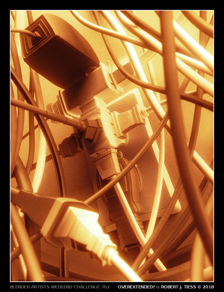
RobertT: Haha, that looks quite dangerous, specially if you need to unplug something. I liked how there are many different plugs here.
 ]
]