I am working on a small animation with the objective to make sure that I handle the whole process to create this kind of production.
The subject of this animation is the assembly of a chair. Not really exciting subject, but rather simple to stay focus on the workflow.
I would like to have some feedbacks before rendering all frames for the final animation.
All the advices to improve the views are welcome.
The black supports could reflect more light from the surroundings, unless it’s a stylized choice to make them pitch black.
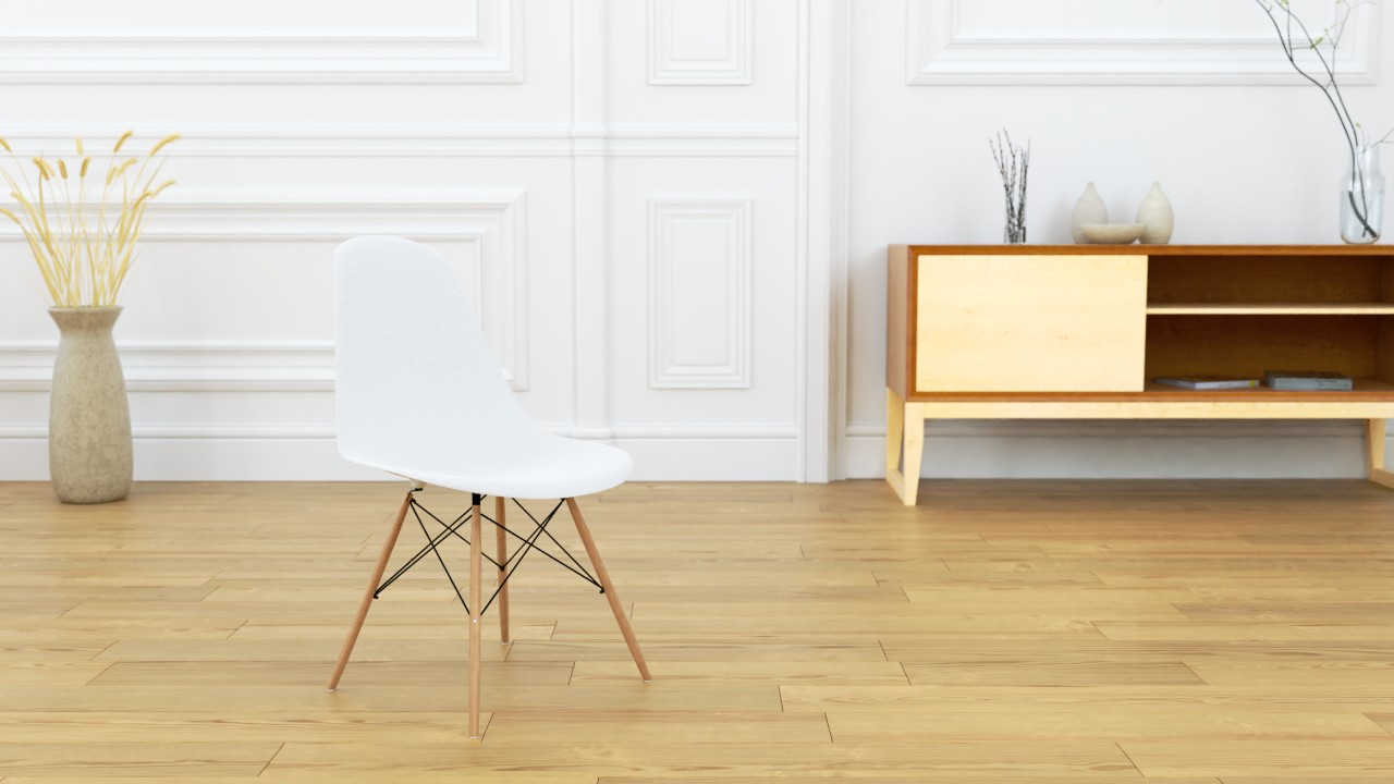
In the first image many things in the frame leads the eyes off the wanted focus point. Floor boards point to the background, as does the wooden leg and one metal support. The black support part also clashes a bit with the black object in the background, bringing the background closer and together with leading lines making the background more interesting to the eye.
Maybe try slightly different angle and not having the floor boards to go vertically but more or less horizontally. There might be better alternatives, but that should at least stop the eye from wondering around and keep focused
The screw also comes in off the frame which creates tension.
You are showing few frames from an animation so can’t really comment much how that would turn out just based on those frames. Is the animation just for practice, or are you trying to make a good instructional video? If the latter, you could compile an animation quickly from the preview with render menu -> opengl render animation. Helps to check the timing, and you could link to it if you want people to comment on that.
A bit of practical english from a non-native english speaker to another:
“with the objective to make sure that I handle all the process” When you’re talking about multiple or many, the object needs to be plural. For example:
One plate. Two plates. Million plates. Some of the plates. All the plates.
Make sure I handle all the processes
If you leave it as singular, it can come out as sarcastic. For example:
I thought I’ve met all your friend. (You barely have just one friend)
You might have meant the entirety of one process instead of multiple processes, in that case “the whole process” or “the entire process”. I notice french artists having problems with singular/plural for some reason. I too make mistakes, just not usually with that one. Native english speakers butcher their own language so it’s not that important in that regard, but you might want to be clear when talking to everyone else.
For the first image, it is about an extract of the animation. I do not think of keeping this angle for a fixed render. But I keep your comment in head.
I would like to make a simple presentation of a product, without the claim to make the ultimate instructional video.
Here is the animation in opengl render in material mode. I am not certain of transitions between sequences.
Thank you for the correction of my english.
I cheat a little by using Reverso. It is the easy way but not the good one …
This kind of error irritate me eyes when I see them in French and that bothers me to have no very good level in English. That destroys all the professionalism which we can put in a project. Thus thank you for having corrected me on these points.
The camera turns so the comments about the background in the composition aren’t relevant. The screw coming in from off the frame is a bit strange, but could remedy that by switching the second shot to be first which shows all of them fully, and then show the closeup. The viewer should instinctly know it’s a repetitive operation.
The image in #2 shows up now. Maybe double check the chair dimensions compared to the background objects, it looks a bit small.
Yea. Not a big fan of that layout of no movement -> movement -> stop, repeat, for both the object animation and transitions between shots.
Maybe it’s possible to dig ideas from what is actually important to the viewer. They’ll need to know what they’re about to watch, the context of what they’re shown, and continuity between shots. It’s not a difficult object to assemble and it’s not a instructional video, so perhaps you could cut corners and
Start with a product shot so the viewers know what it’s about
Fade
First shot with tweaked animation so everything moves in place fluidly, without having to wait objects to accelerate too long
Hard cut before the movement stops
Second shot where components are already moving
repeat with same cut to the next shots -
Fade to the final shot with the assembled product
This would make the animation more fluid and faster to watch, emphasizing that the chair is not difficult to assemble, and leaves a positive feeling about the product.
Looks a quality production. Well done. Suggest that the black surfaces even if they are pretty matte need to have a little specular shine or blurred broken up a reflection on them. They are not readable as 3D most of the time and look 2D. The white chair is too blown out for me. Suggest toning down the luminance value of the diffuse colour slightly so that there is more of a colour variation. Is there a way to eliminate the crawl on the GI on the underside of the chair and on its seat lip top too. Could this be smoothed more with a higher sampling setting or increased GI blurring?
The animation is very stop-start. To me would be nicer to have it more flowing with one thing moving overlapping with the next moving item more.
Thank you JA12 and j3dj3d for your comments. I am back with the changes made to the project. I integrated your thoughts and added some elements.
I changed the scale of the chair and added a sofa to help the reading of the scale of the scene.
I also changed the value of the color of the chair and the properties of the black elements.
I’ve added sequences and changed the timing of animations. I adjusted the animation of the close-ups that the screw remains within field of view.
J3dj3d, what do you mean by “the crawl on the GI on the underside of the chair” ? I don’t understand.
I think it’s a big improvement, much more fluid to watch compared to the first one which was quite lethargic.
Now the animation moves at a constant speed which is still a bit boring. I’m not quite sure what the objective for the animation is, which is important and would of course want to keep that in mind with what is shown and with what kind of progression.
For example, if it were for a commercial, I might start with an isolated product shot where the chair is on its own with a simplistic background, the next shots would be to show the thing is easy and fast to assemble, and then fade to a different product shot or an overlay that tells the pricing and the chair could change colors to show the color options. I wouldn’t add shots unless those need to be shown. If the importance is put on the point that the chair is fast and easy to assemble, the animation should be fast and easy to watch. Less is more in that case.
I would also avoid using much time on redundant information: the base is assembled with many parts, it uses screws/nuts/and covers, and it has 3 unique connection points. The rods need to be attached at the top, bottom, and once the base is assembled, the seat can be screwed on top. Showing that with: #1 connection point has to be screwed in, #2 connection point has to be screwed in, and the seat has to be screwed in. It takes more time to watch screws/nuts turning, like it takes more time to read it.
The information content for the viewer is that there are those 3 connection points, and they’re attached with screws and nuts. If the viewer realizes that it’s screws and nuts from the first shot, they don’t have to spend much time watching screws/nuts turn in the next ones, they already know. And if they have to watch that for too long, it feels mind-numbing. Pacing the shots so that the viewer has time to get to the relevant information and not wasting any more time than that could be important.
I’m just throwing ideas to think about. The pacing and what is shown could change depending on your vision for the animation. If the mood is relaxed and slow, might not want to throw a rapidly changing animation through the viewers’ eyes. And even if it were fast, wouldn’t want to make it Transformers movie fast, where the amount of cuts is measured in fps.
I found some time to work again on this project.
Here is the current result of the production.
There is still some work on the colorimetry or other effects, and sound…