Hello. I’m trying to make a realistic scene. I will be glad to advice and critiques.
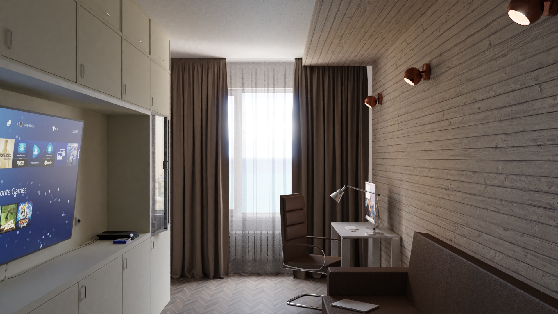
The sofa in your scene looks very square and uncomfortable. also for leather maybe too uniform and perfect?

Hello,
I agree with my neighbor, the sofa seems very uncomfortable. But the rest of the picture is great. I like the lighting of the scene. The colors are great. Maybe add some organic things? Like vegetable, great green just near the windows.
Hey, the floor has too small tiling, you should increase it’s size and perhaps put it at an angle of 45. I think I know what kind of floor you want to represent and I think it should be angles and bigger. Also I think it’s a bit too dark, and I agree with the sofa thing!

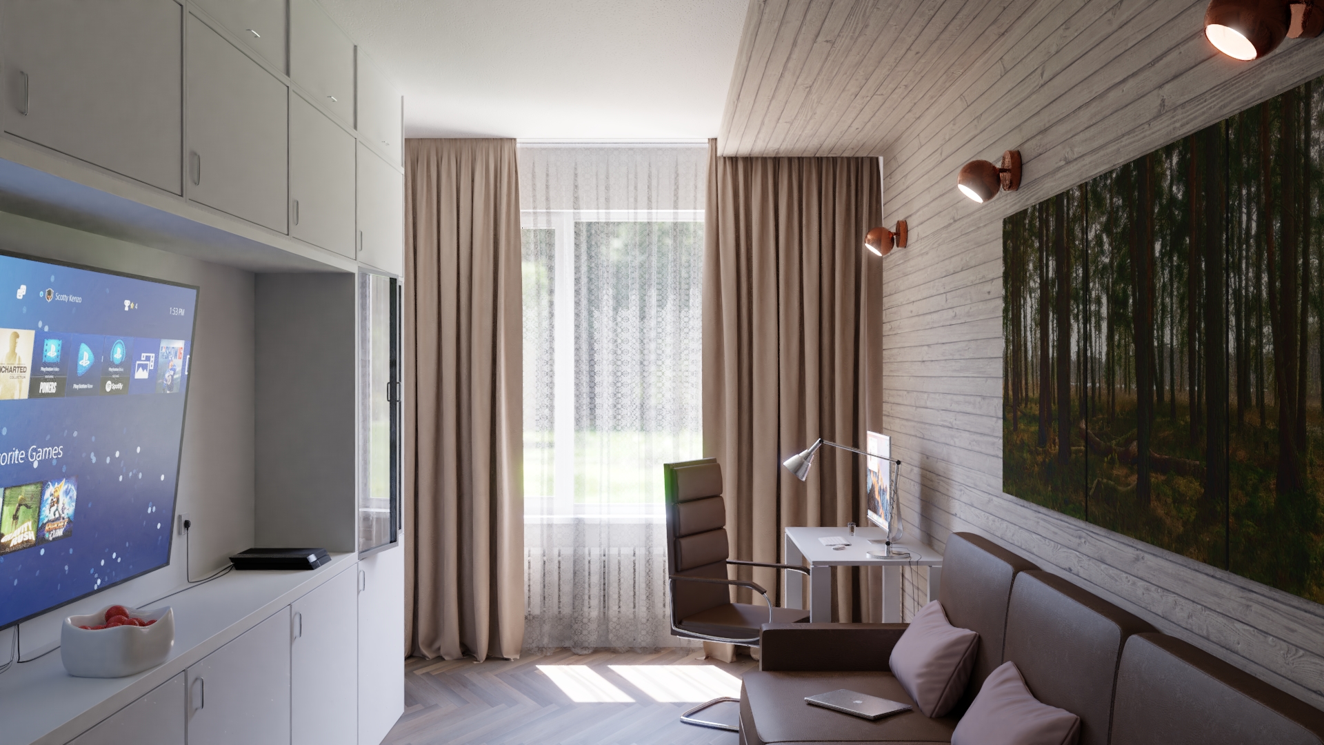
Love the update. The beautiful lighting grabs my attention the most.
The new lighting is great and so is the floor, I would recommend trying the scene with the TV off and to separate the panels of the painting a little more. The chair and the sofa are still a little to perfect, and the pillows look exactly the same. I would maybe move the corners of one pillow a little, and rotate the whole pillow, so there is some variation.
I love the lighting in both shots. Is it possible to know your technique?
Tnx!
Hello. Thanks! It`s pretty simple. i used hdr map with power 30. plus sun lamp with blackbody nonde and portal in window
1 Like
“Updated some things” Much better now. Great.
Tnx!!! :yes:
You’ve done a good job with it.
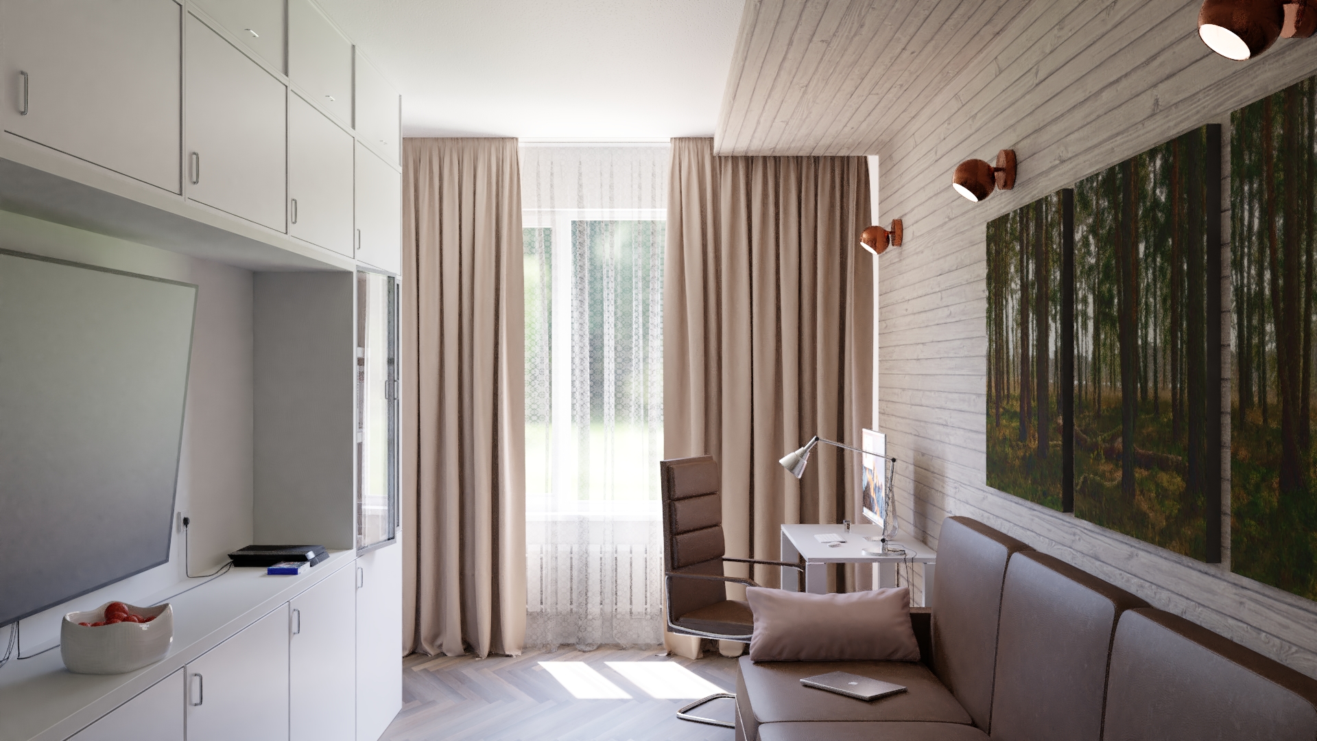
Personally I think the room is confined and claustrophobic. Push out the walls a bit and loosen up the camera.
Otherwise it’s fine.
Andrew_GF: I agree with WeakFredo. If you use wide angle camera because it needs to “fit” in the room, you can just move it outside like it looked through the wall behind.
I’m not sure if the lamps on the right side are turned off or on. If they are turned off, then it would be cool to not leave the inside part as just flat ovals, some shade or detail inside would be good.
If they are turned on, they should look white, but even if they are 100 Watt bulbs, they would be less bright than the sun on the floor in my opinion and now it is the other way.
I would also change the image on the right wall. I don’t think it matches the whole interior and if you tried something lighter, the whole room would get some light and space too.
In general, very nice render, it’s cool to see the progress 
nice work. Now go and do a bigger project