Hi,
Thats one awsome knife
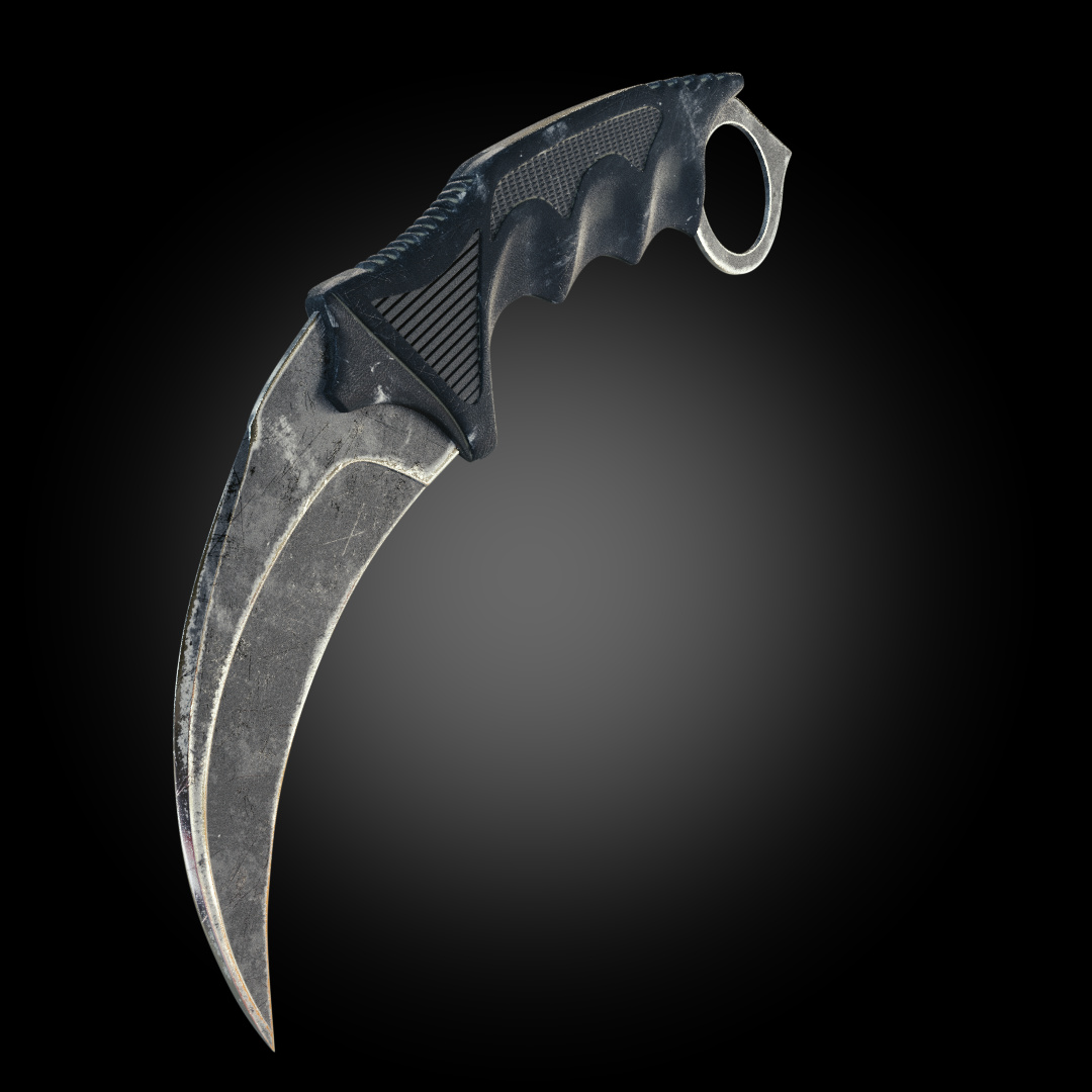
Things I would improve would be:
-
the location of the wear; the edges of the blade are quite uniformly damaged at the edges (pointiness I assume), but I think you should really consider which part of your knife is subjected to wear. Near the handle this is for example much less likely than at the tip. Same for non-cutting side and cutting side.
-
The color of the wear. The overal texturing of the blade makes it seem like it is simply made from some non-coated metal. In that case I don’t think it is likely that the blade will become white on worn places. If you take a look at some images on google you’ll find that blades are mostly damaged by scratches which cause a distortion in the glossiness and a difference in relief but not really in color change.
I think you knife could wear in the way you made it if the blade was for example painted and the paint would come of. In this case however the texture of the blade could be altered to show the paint.
Thanks alot. I will make the changes you have taken note of.
The blade wear texture looks nice. To make it look better turn down the influence. It is just too intense right now.
The handle looks like you put a grunge texture on it and called it a day.
To improve it, think about how the knife got to be this way. The blade is worn as if it was left in a bog, and then carefully but briefly polished. The handle looks like it was stored with some white crayons. None of it looks used.
If you want it to look abandoned, don’t take the grunge off the hard corners of the blade. If you want it to look used, make sure the grip is real smooth where the hand and fingers go. If you want to tell a story, figure out what the story is first. But without a high-level goal, “right, wrong and… better” are mostly meaningless.