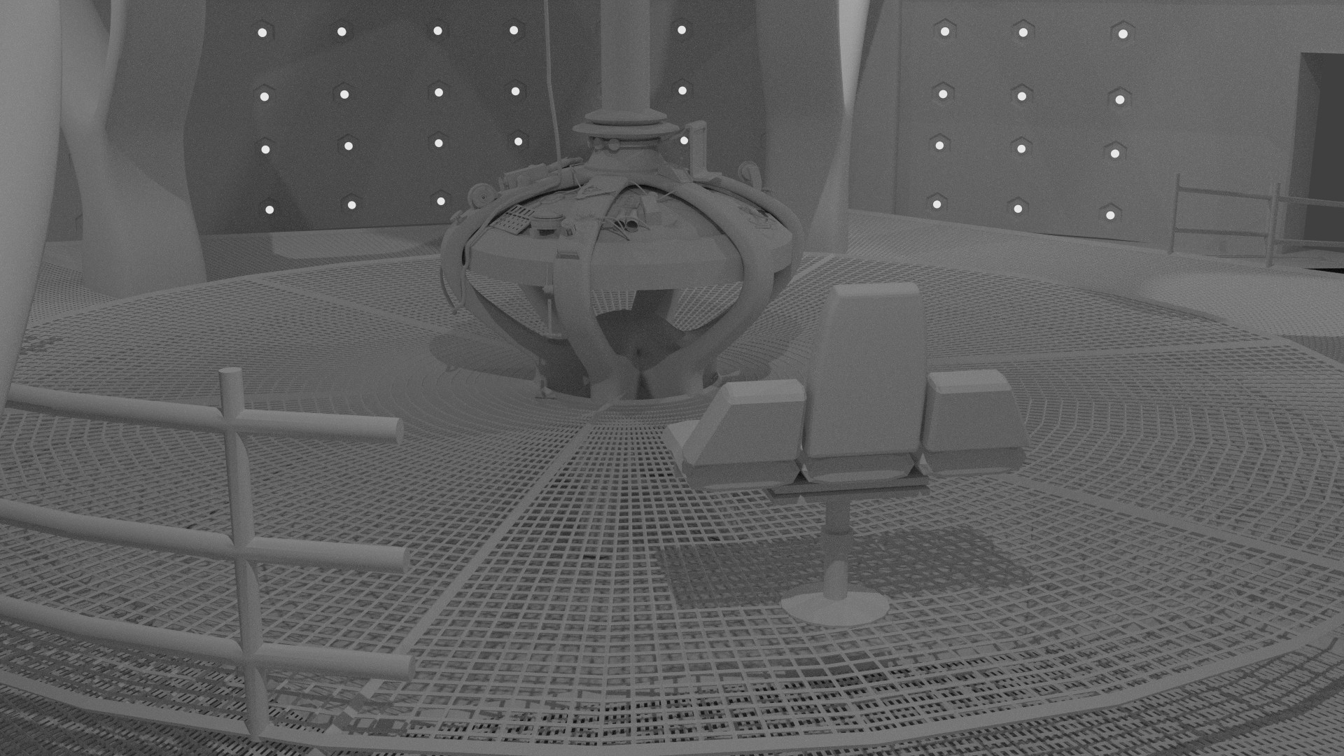
Seems alright to me, but the seem small. It might just be the amount of them making me think that, though. And the pillars seem just a little bit too square. If my memory is accurate they were slightly more rounded at the edges.
Ok, Thanks.
The walls are one probably the hardest things to make. I may look into fixing them though.
There was something I did deliberately as a joke. I’m going to wait a little while before I reveal it.
Imo it’s decent modeling. (the walls that is) The rest is superb!
Thank You. I completly forgot about the padding on the bars. I’m in the process of switching from manjaro linux to linux mint so I’ll do it once I have Blender done installing and cuda working.
Ok. I add a bit of padding on the bars. And I got rid of a few edge loops on the pillars that where limiting the subserf I had on it to make it a bit less boxy (does that fix it?)
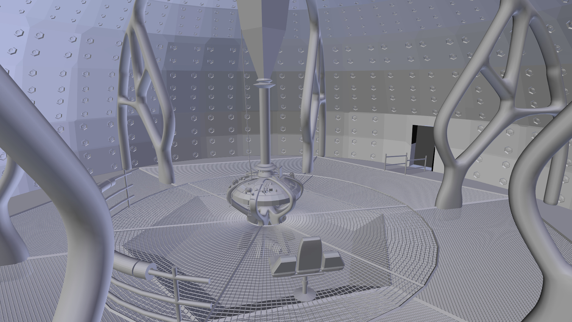
Also add the part on top of the time rotor.
The pillars look better now, yes.
Ok good. I have to agree with you on them looking to boxy earlier.
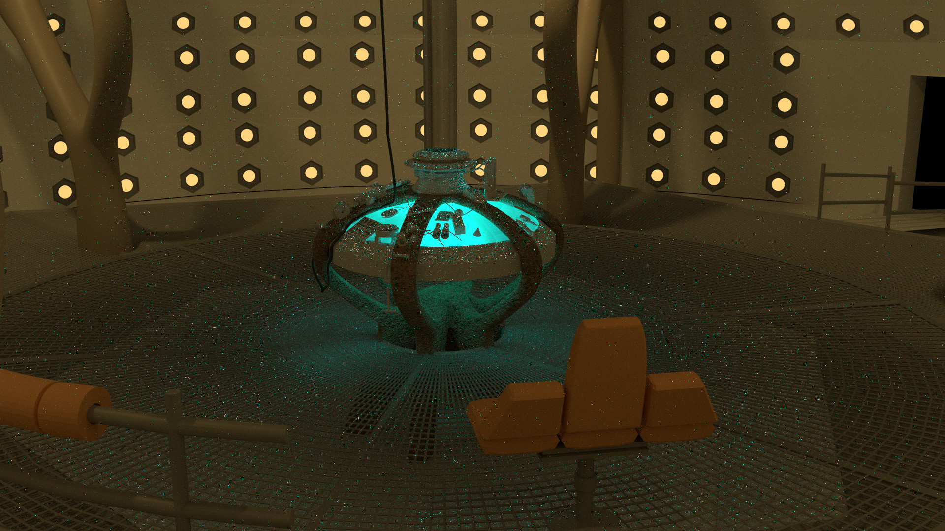
How about a render with the proper lighting?
500 samples. I hate it when I have to use numbers like that.
Starting to come together. Might be a bit late at this point, but it seems very spacious. Even for the TARDIS.
I’m not sure but I think that It might be an elusion with the walls. It might also be that It actually is a bit spacious and the bottom grate is to big.
I’m going to go head over to cgtextures so I can make some better materials than diffuse glossy mixes.
Ok. Just got happy with my material for the separators.
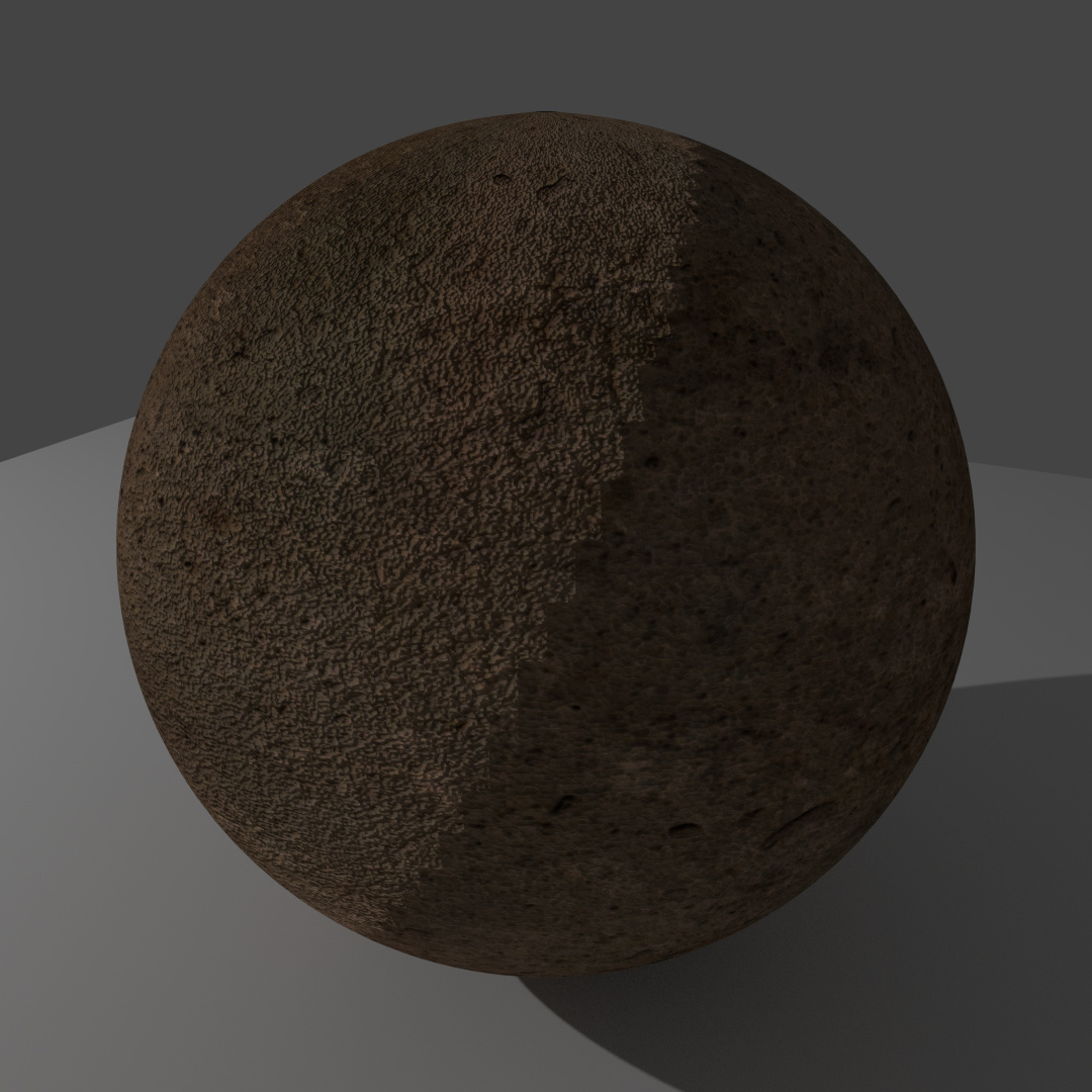
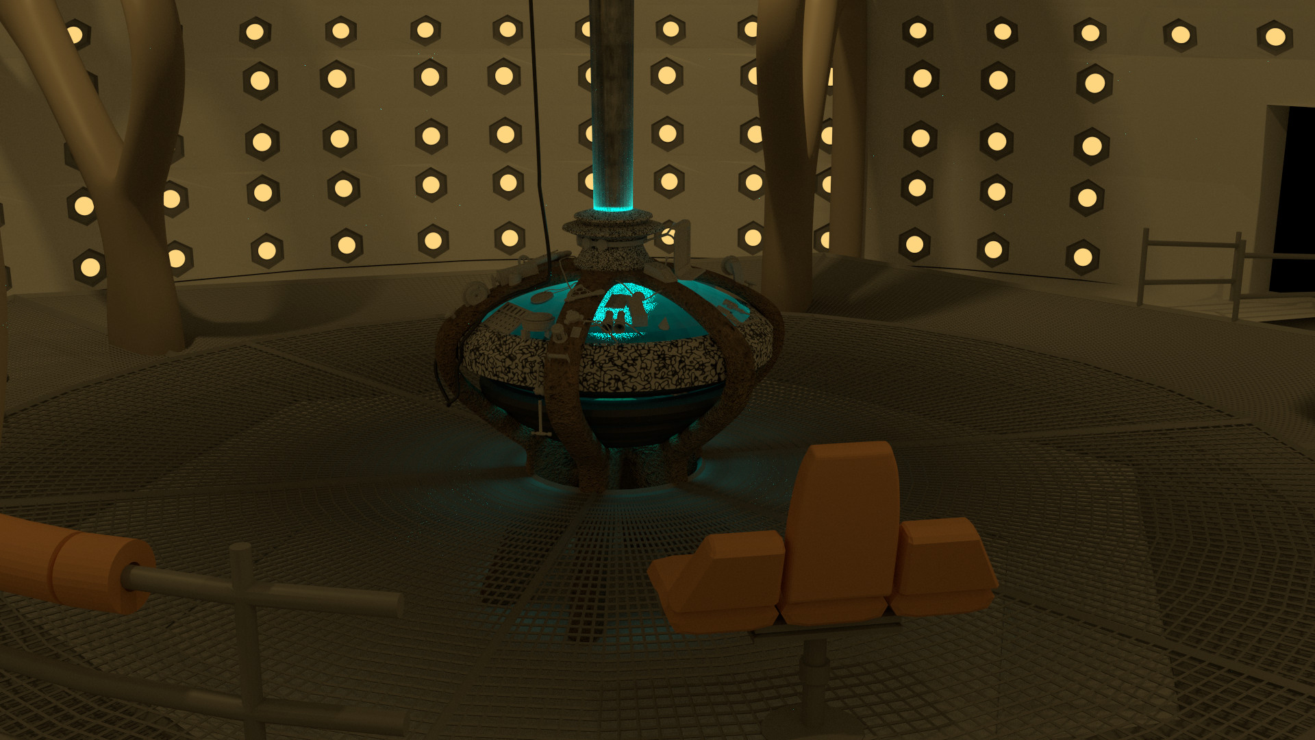
Ignore the jagged line that goes diagonally across the sphere. I think it might be a bug. I hase a subserf and an area lamp on the sphere if anyone has any idea’s on how to fix it.
here’s some reference so you can see what it’s supposed to look like.
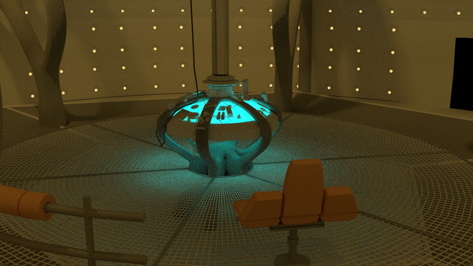
Here’s a new render. The biggest changes I’ve made to it are adding that material from the last post to the separators, and I made the lights on the wall bigger and deleted some of the geometry that isn’t needed.
1000 samples with filter glossy at .5
Have you considered moving your camera to match the shot in the program? That would make it easier to judge scale and such.
Finally you caught it. Where all of my renders have been looking is a big hole in the actual set.
I might do that. I was just waiting to see how long it would take you to figure out what was strange about it.
I see…But yes, the angle does look strange. If you the type of shot they did in the program, it should help for judging scale and lighting because you can compare shot to shot.
Here is my latest render. I messed with the time rotor and add a Fresnel to it. I think I need to turn the blending up and multiply it on a decently dark color.
I also worked on the crackle material a little bit. I need to uv unwrap the objects using that material and make the size of it bigger.
In my next image I’ll have the camera on the correct side. Also does anyone know what camera they used on some of the TARDIS Interior shots. I want to have a physically accurate camera for my final renders.
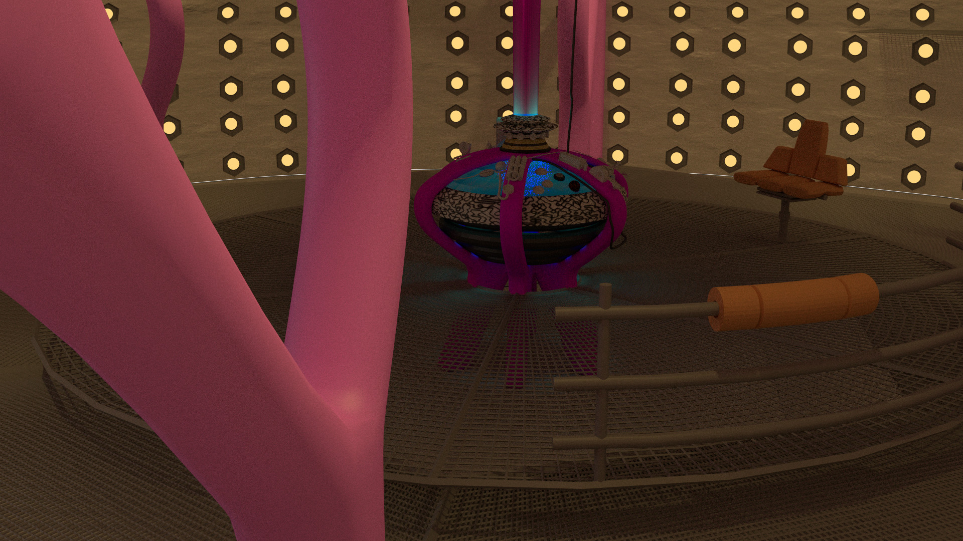
Seems alright. Although, the texture on the ring part of the console is very contrasted. Perhaps a more sublte difference would help? I don’t remember it being that sharp a colour difference.
Yeah, It’s just a musgrave texture. Also to be able to critique it better it might be worth it to go over to tardisbuilders.com and go to the console reference section.